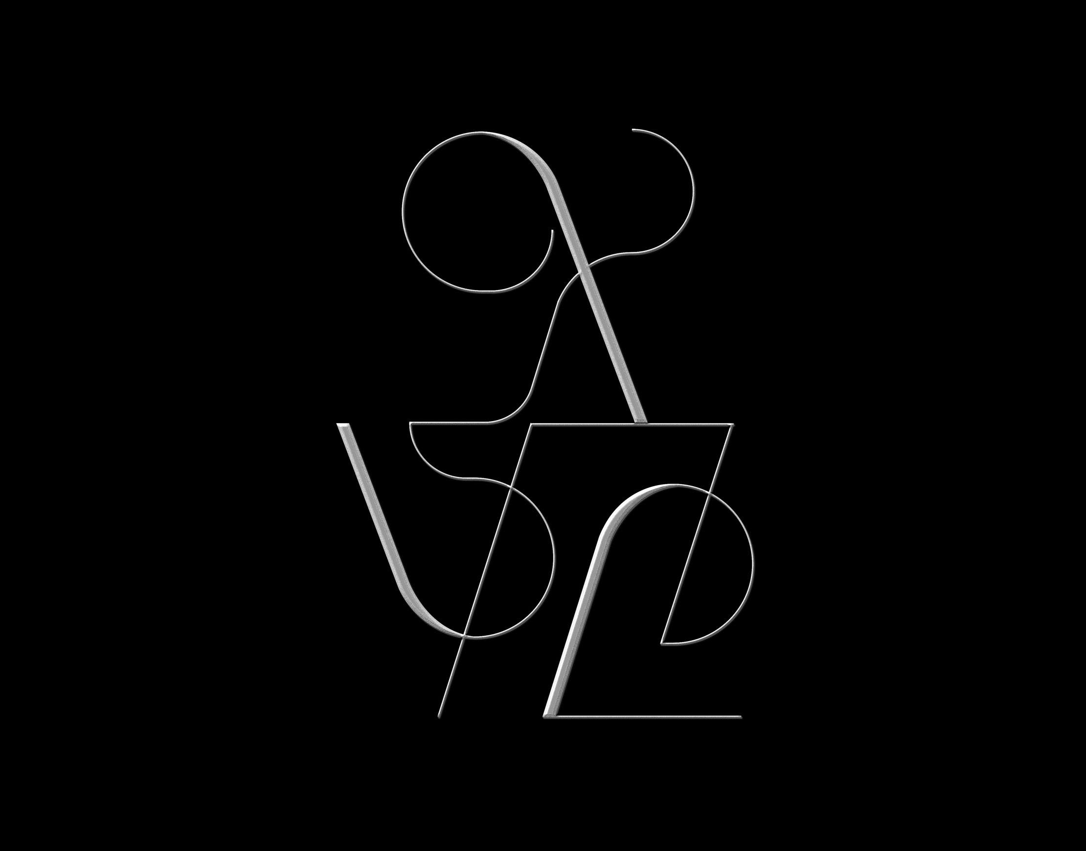
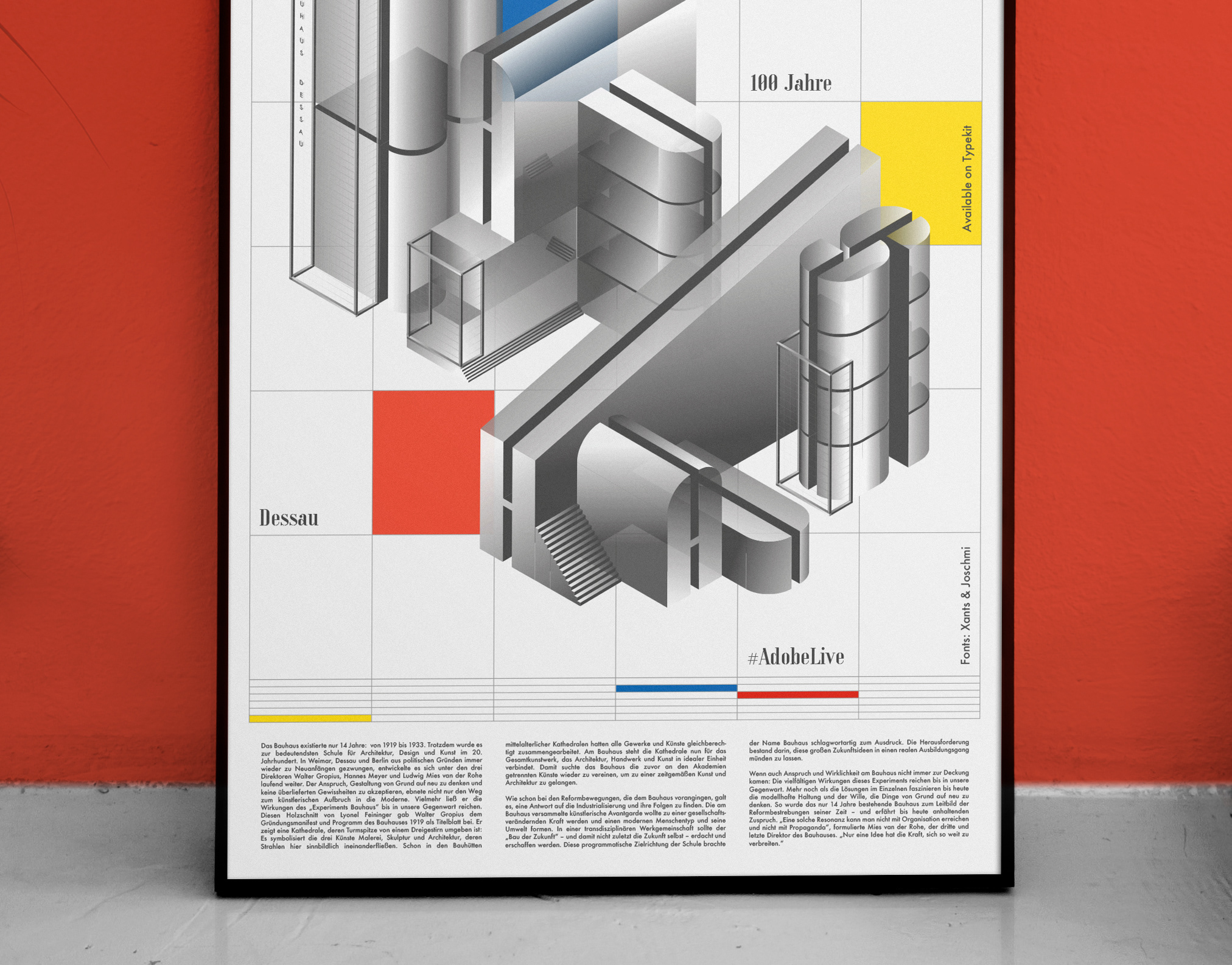
Basic Architecture
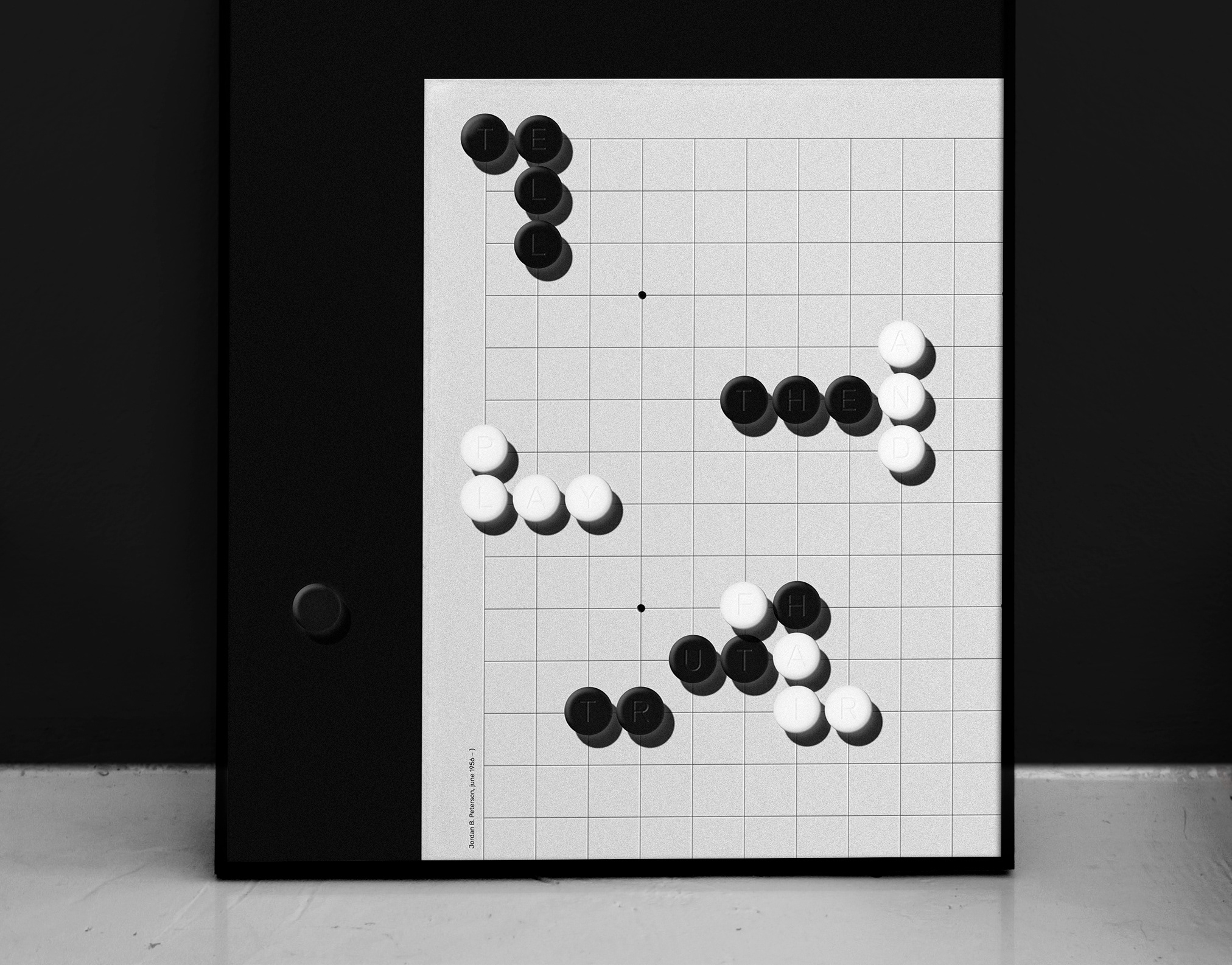
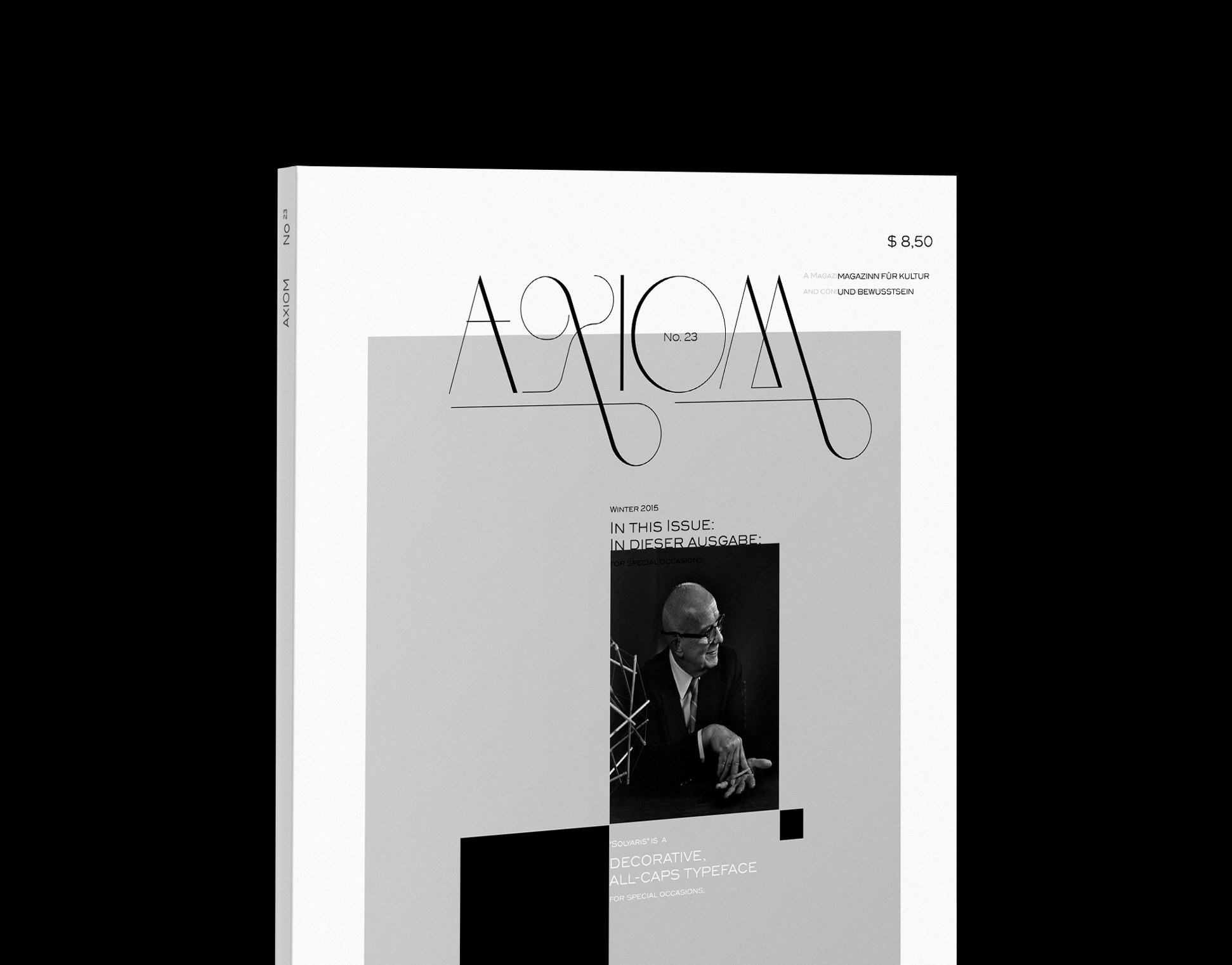
Poster: 60x80cm

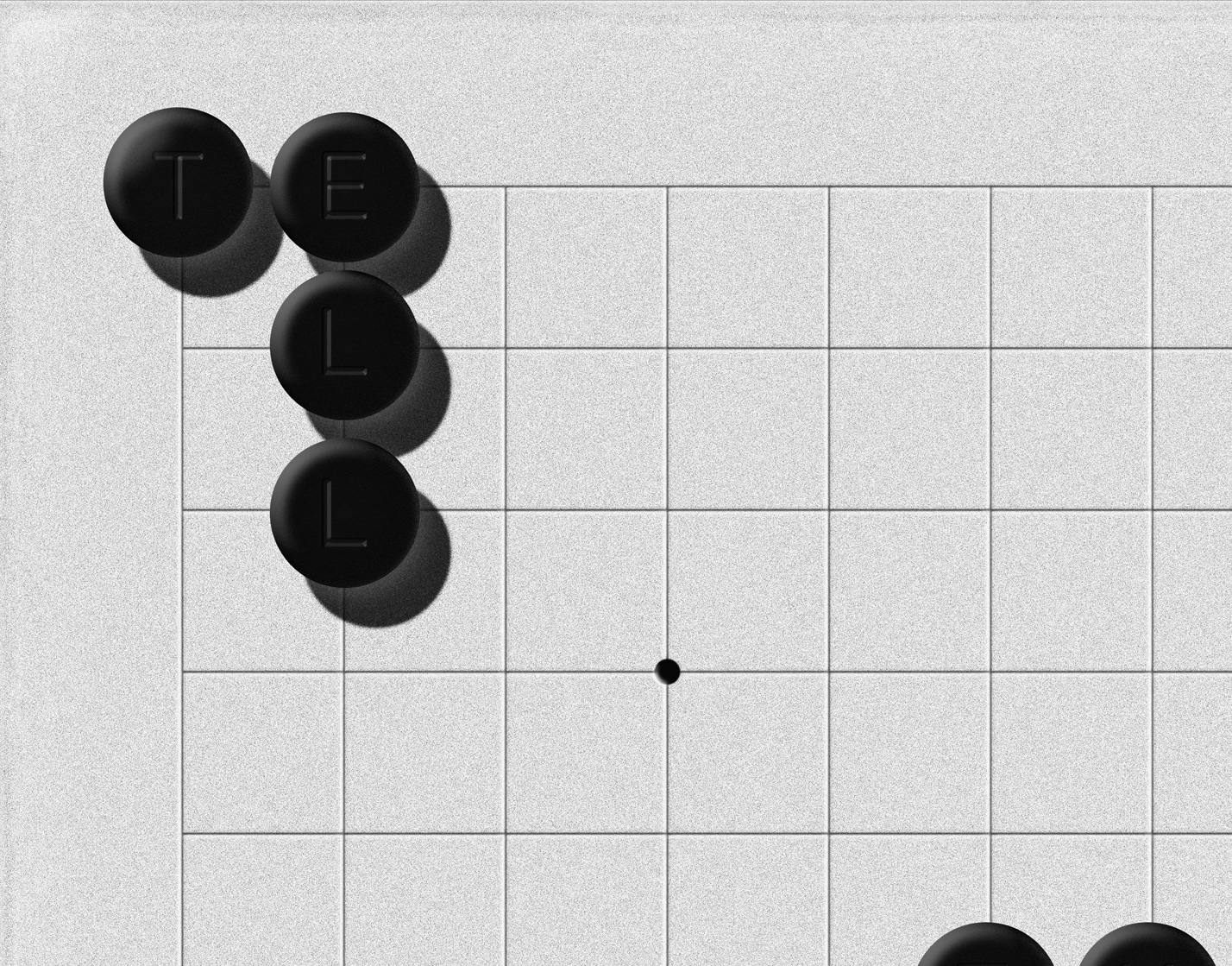
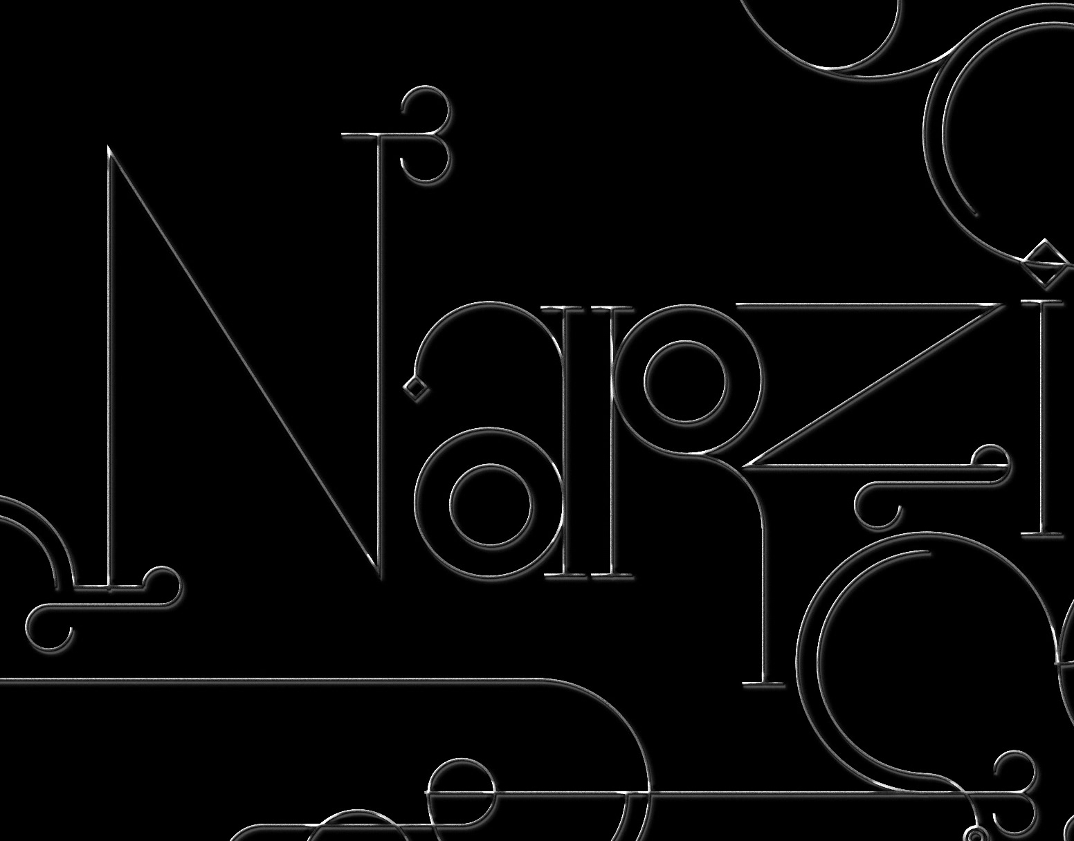
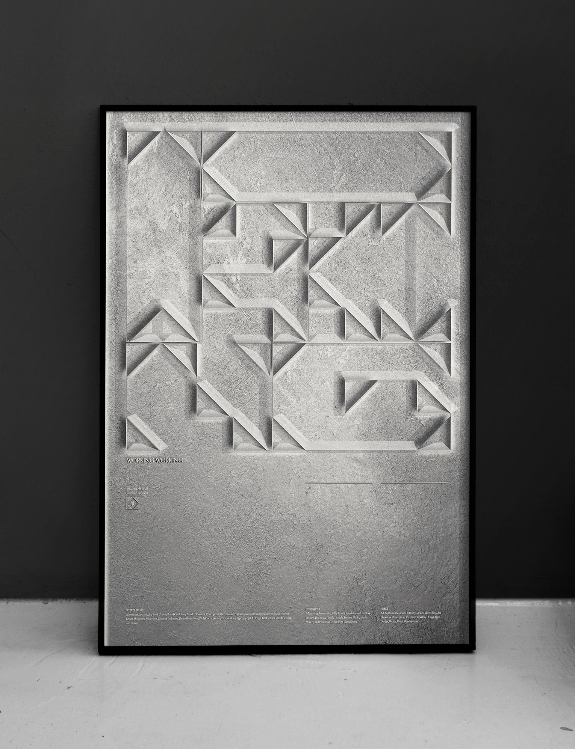
Textured Version

Thank you for viewing.
Inquiries: Studio { at } christophruprecht.com
Additional Typeface used: Orpheus Pro
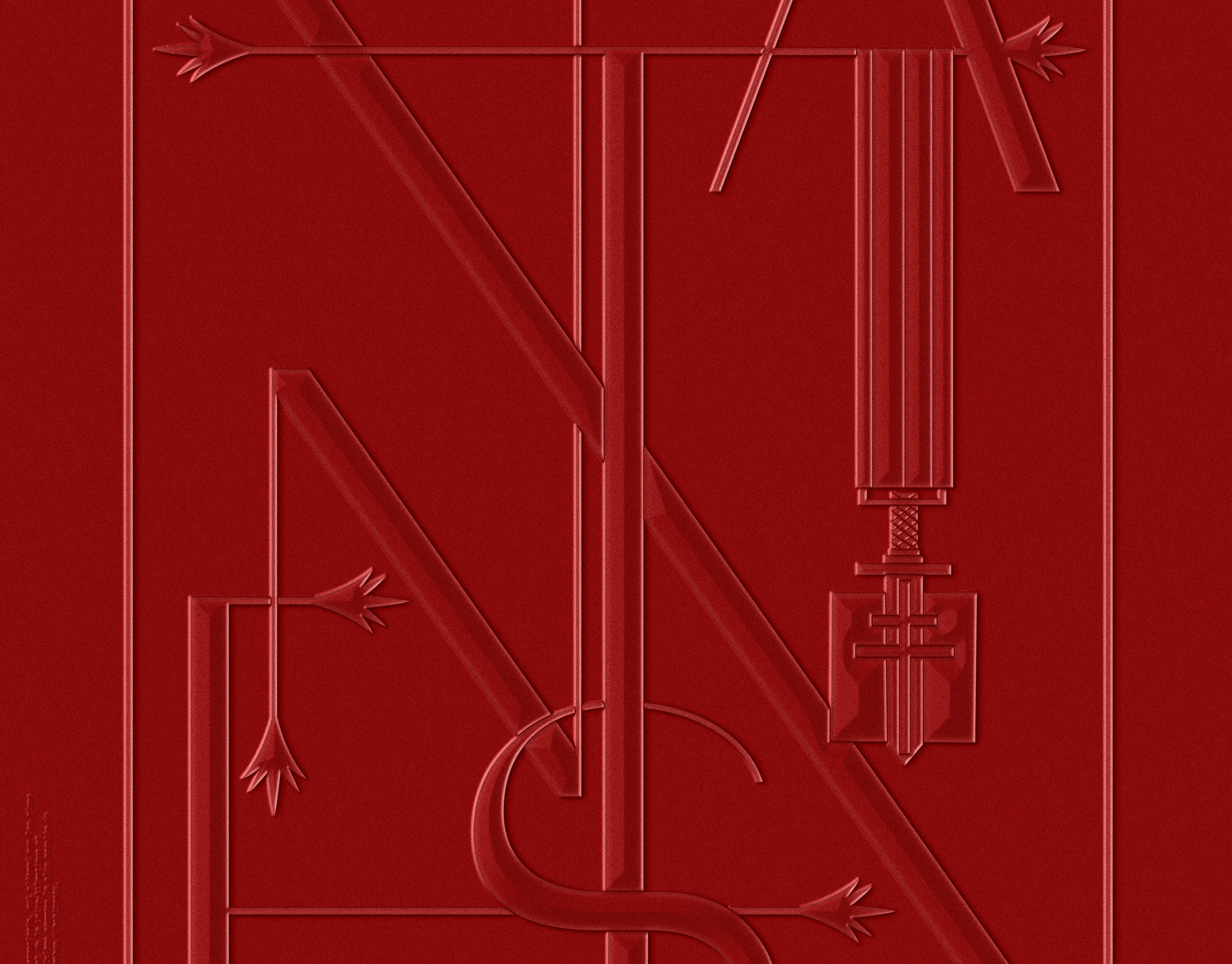
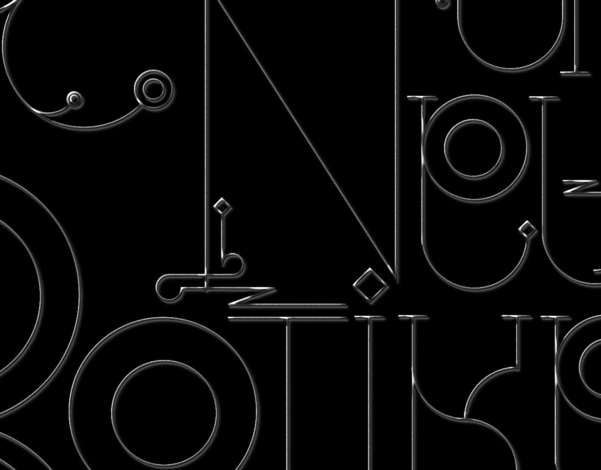
Experimental Typography created to mark my start on workingnotworking.com. Playing with simple geometry and M.C. Escher inspired concave/convex perspectives. Positive space reveals the cryptic letters, negative space a set of simple geometric objects and arrows.