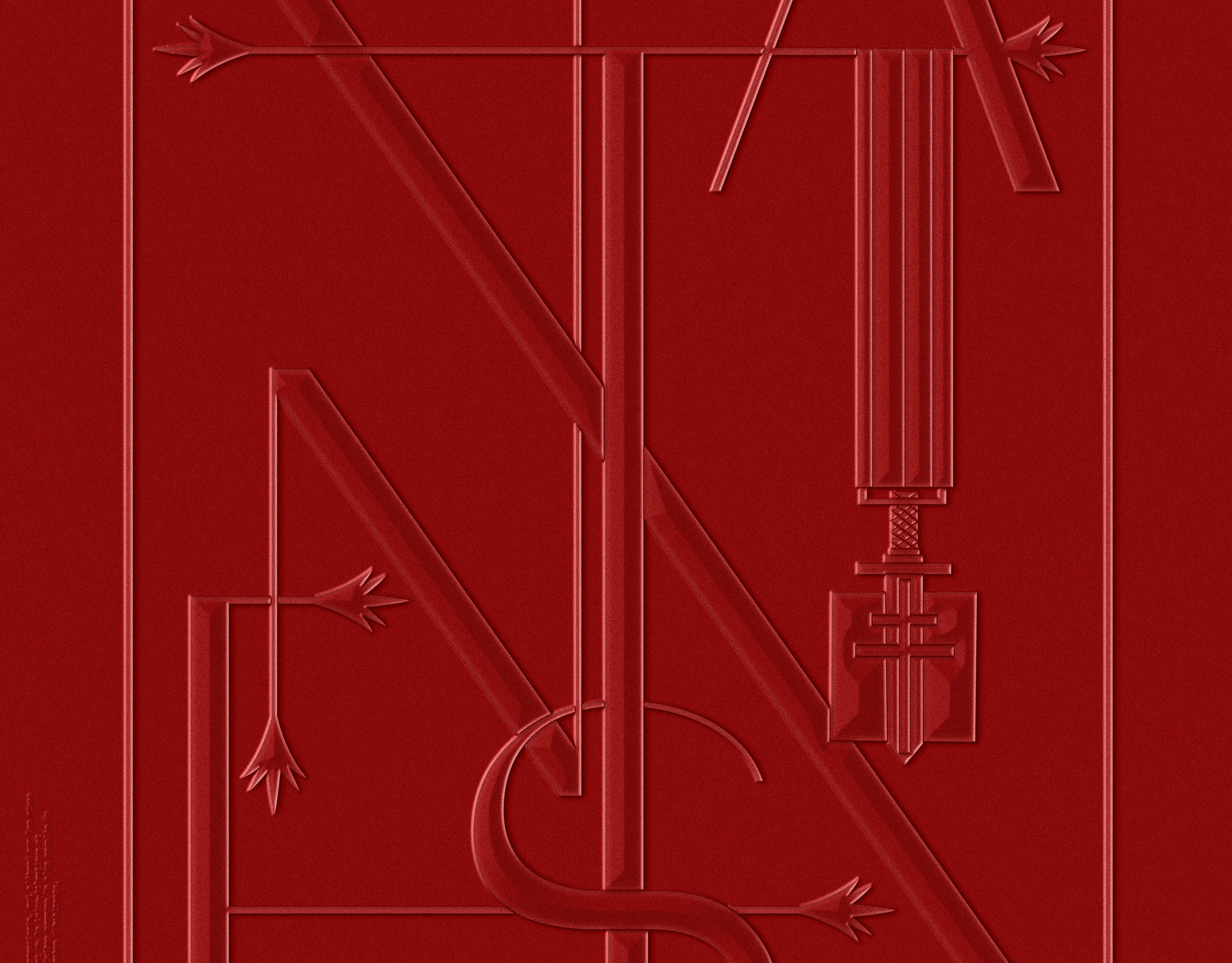
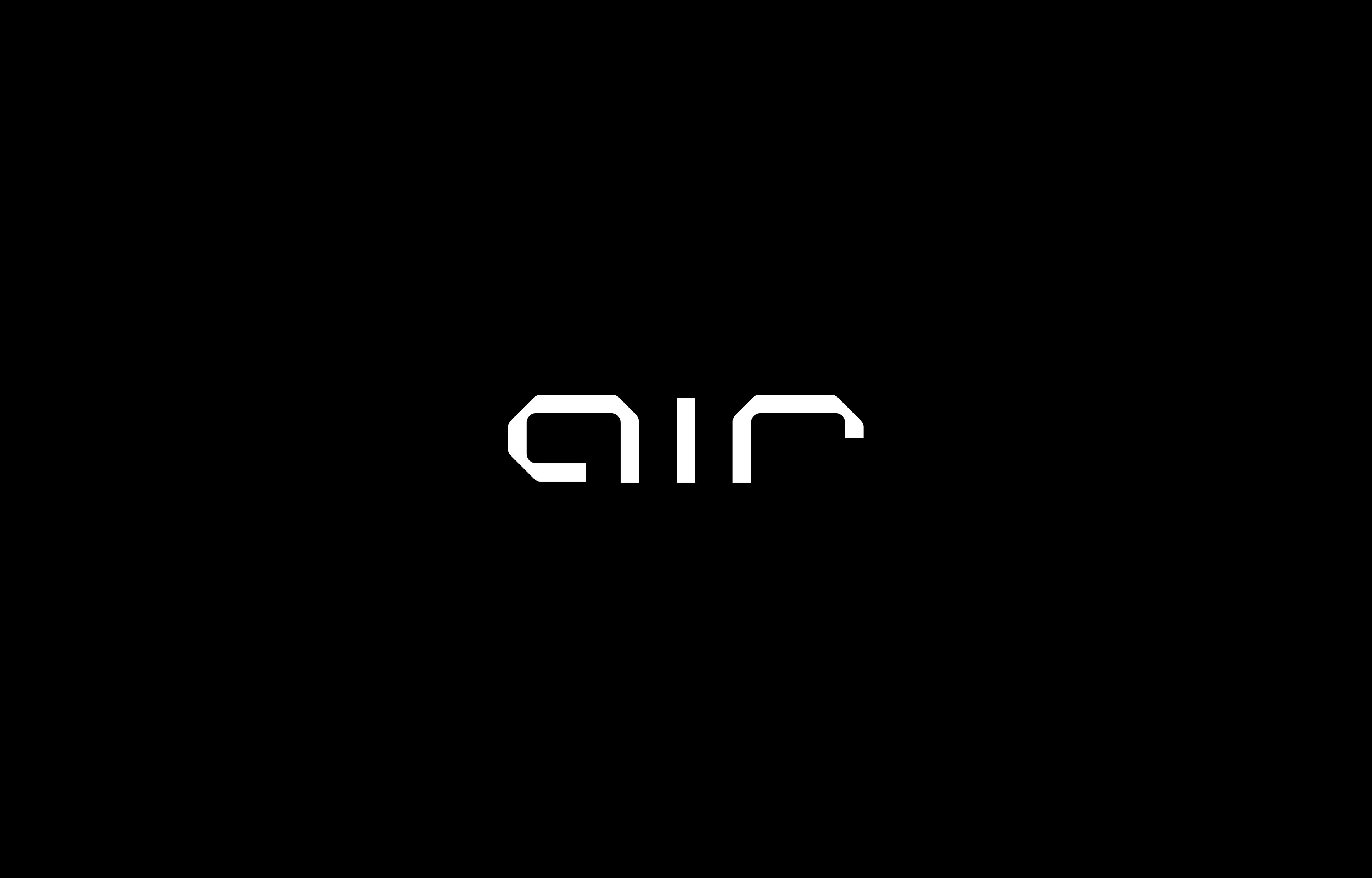
CLIENT
AIR Films
MARKET / BUSINESS
Production Studio / Motion Pictures
THE CONCEPT
Minimalist, progressive and based on the idea of symmetry - the bespoke mark deliberately
diverges from established aesthetics in the luxury / fashion / beauty industry the
studio operates in. Technical yet sleek it makes a creative, bold and professional statement.
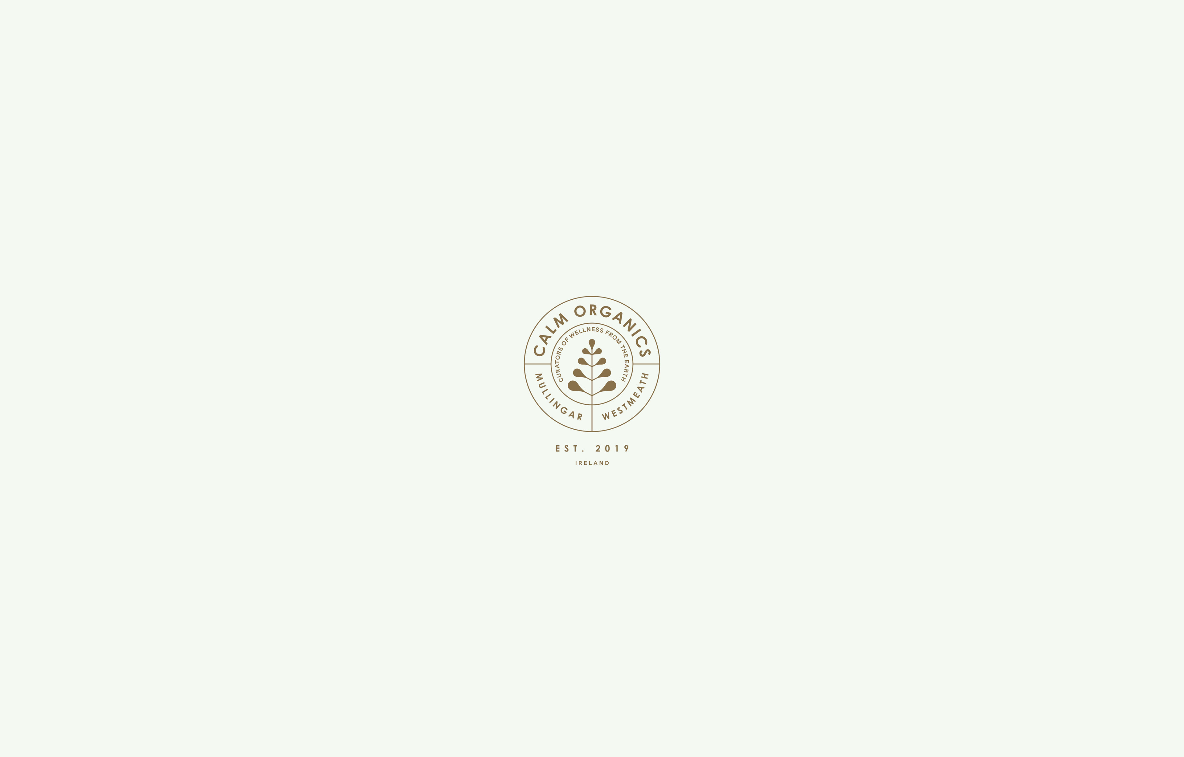
CLIENT
Calm Organics
MARKET / BUSINESS
Medical Cannabis Apothecary
THE CONCEPT
Calm Organics is a small boutique type dispensary in the middle of Mullingar - a very traditionalist small Irish village.
The goal for the design of the logo / seal was to have it fit in with the classical appearance of store fronts found around town,
but to still give it a modern touch in terms of clarity.
CLIENT
Shakúff
MARKET / BUSINESS
Lighting / Interior Design
THE CONCEPT
Shakúff manufactures handcrafted luxury lighting solutions in Brooklyn, New York.
Their attention to detail, and often custom work for clients and architects is reflected in this entirely bespoke word mark
that feels both classical and modern. Other elements were discarded in favor of giving the exotic brand name all the attention.

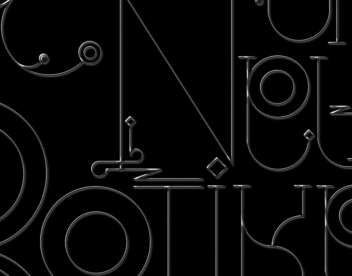
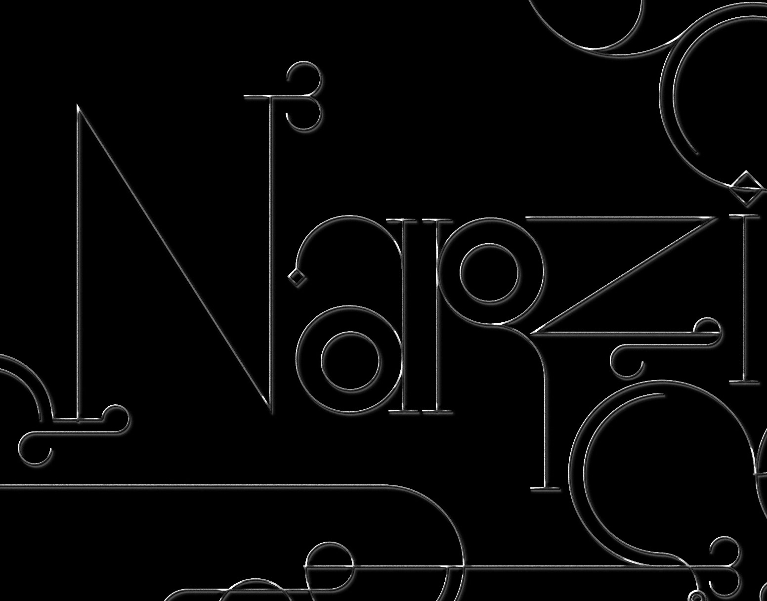
CLIENT
Numa Health
MARKET / BUSINESS
Natural Health / Technology
THE CONCEPT
Commissioned with their re-branding, I took 2 elements from their previous logo mark, the hexagonal structure and a wave form.
I've re-worked these elements to create a modern Monogram, suggesting support, balance and flow. Their technology aided service, via offering their clients
laboratory tests and a designated app to track their health, is also reflected in the design choices of the above proposal.

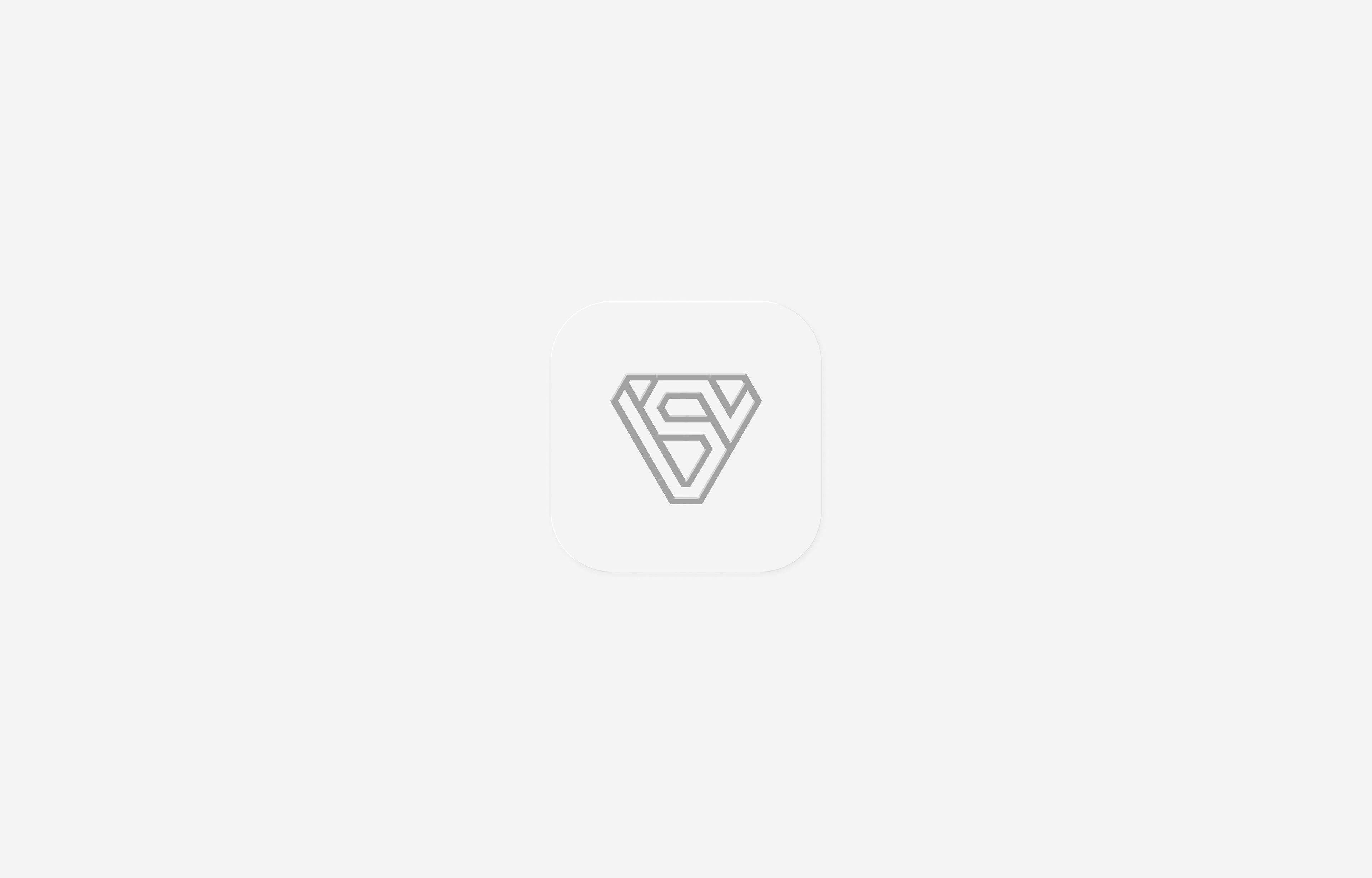
CLIENT
Brooklyn Editions
MARKET / BUSINESS
Fine Art Printing Studio
THE CONCEPT
Brooklyn Editions is a small fine art printing studio, with a big impact. Having served clients such as James Jean in the past,
the studio was looking a rebrand. I've developed a few graphical and simple monograms that could be used
in context of their work, without overpowering it with complexity or typography.

CLIENT
Céleste
MARKET / BUSINESS
Beauty / Make Up
THE CONCEPT
Céleste is a beauty platform with the goal of connecting make-up artists with their clients and further connections and culture
in that space. The service is currently under development. The above word mark, developed in homage to traditional beauty brands
such as Estée Lauder, L`Oreal or Lancôme was the runner up in the branding process.
The final logo is still to be revealed.
CLIENT
X-RELEAF
MARKET / BUSINESS
Plant Extracts
THE CONCEPT
X-RELEAF is a premium brand manufacturing various types of Kratom extracts.
I've developed a simple, modern visual mark, based on the typical Kratom leaf silhouette and the letter X,
allowing the brand to play with finishes and effects on the packaging and to differentiate them
from the often overly organic and earthy looking competitors.
CLIENT
Bahnhofplatzgesellschaften
MARKET / BUSINESS
Premium Real Estate
THE CONCEPT
Working with the Karlsruhe-based branding studio Markentrainer I've had the chance to help with rebranding the Stuttgart-based
Bahnhofsplatzgesellschaften, a real estate company operating in the premium market. They were using a more stylized version
of the main train station before - and we pushed them towards a traditionalist re-brand, re-instilling the values and aesthetics
that are reflected in most objects in their portfolio.
CLIENT
Diagoris
MARKET / BUSINESS
Consultants
THE CONCEPT
Diagoris is a consultancy group from Paris, France.
They are focussed on helping their clients deal with industry regulations and social issues in the workplace.
They've asked for a re-brand of their original word mark, which included the i+D initial.
Taking these elements I've developed a custom word mark that sits maturely in between tradition and modernity.

CLIENT
Global Tech
MARKET / BUSINESS
IT / Technology
THE CONCEPT
Global Tech is operating internationally in the IT, Software and digital security market.
I've developed a simple monogram as an avatar for their brand, which is then supported
by typography, and change of color, to differentiate their different service divisions.
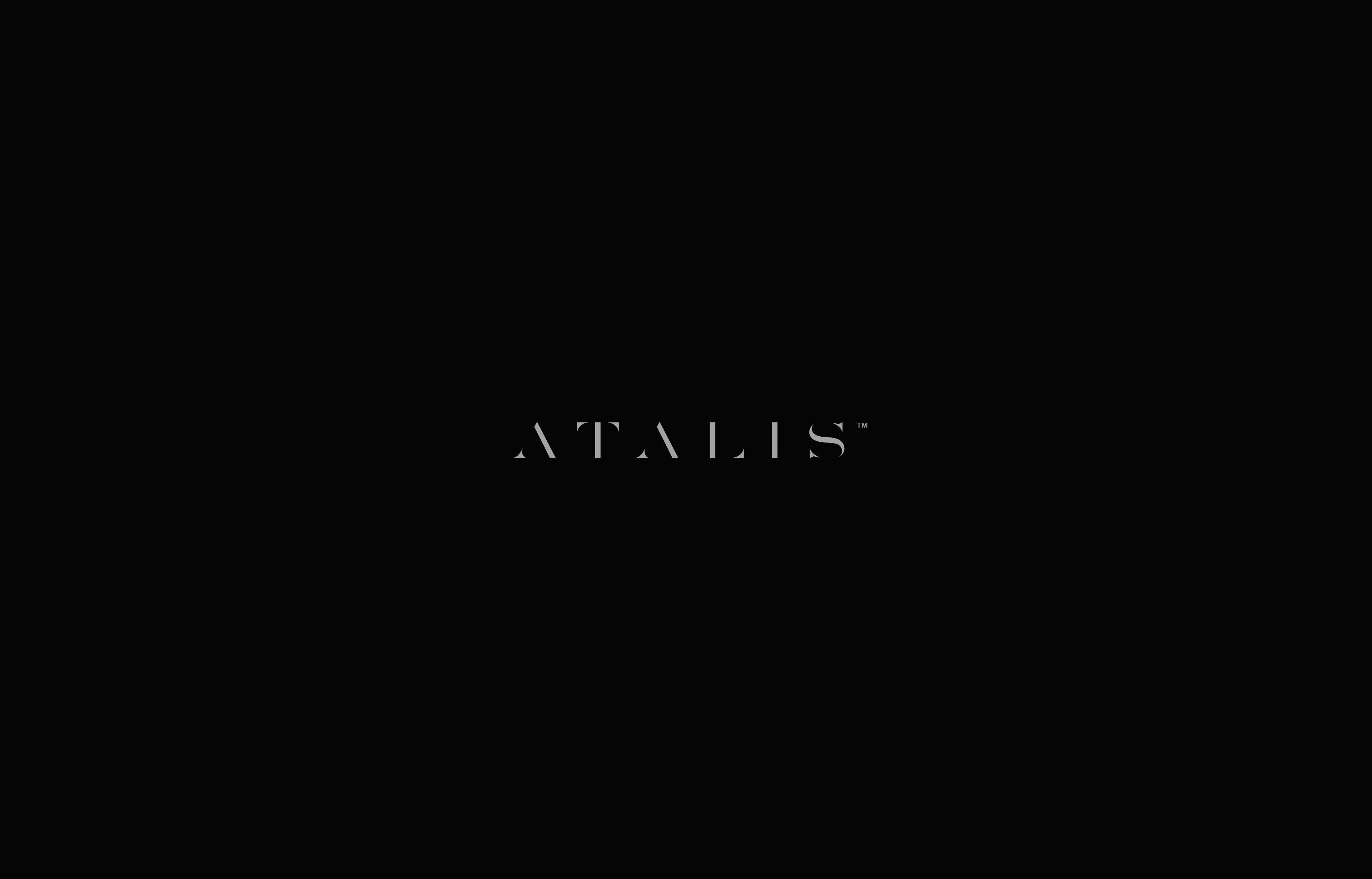
CLIENT
A T A L I S
MARKET / BUSINESS
Undisclosed
THE CONCEPT
Building a bespoke word mark, that feels premium and stands out from the competition.
The above option did not make it all the way through the branding process.
CLIENT
Sports Genius
MARKET / BUSINESS
Sports Betting / Apps
THE CONCEPT
Sports Genius is a gaming / betting app using high level technology, that enables players to bet in real time on strategies and plays taking place in different sports.
I've developed a custom S+G monogram and combined it in an abstract way with the idea of the typical ribbon used to hold medals in sport
In the end the client went with a more conventional solution.
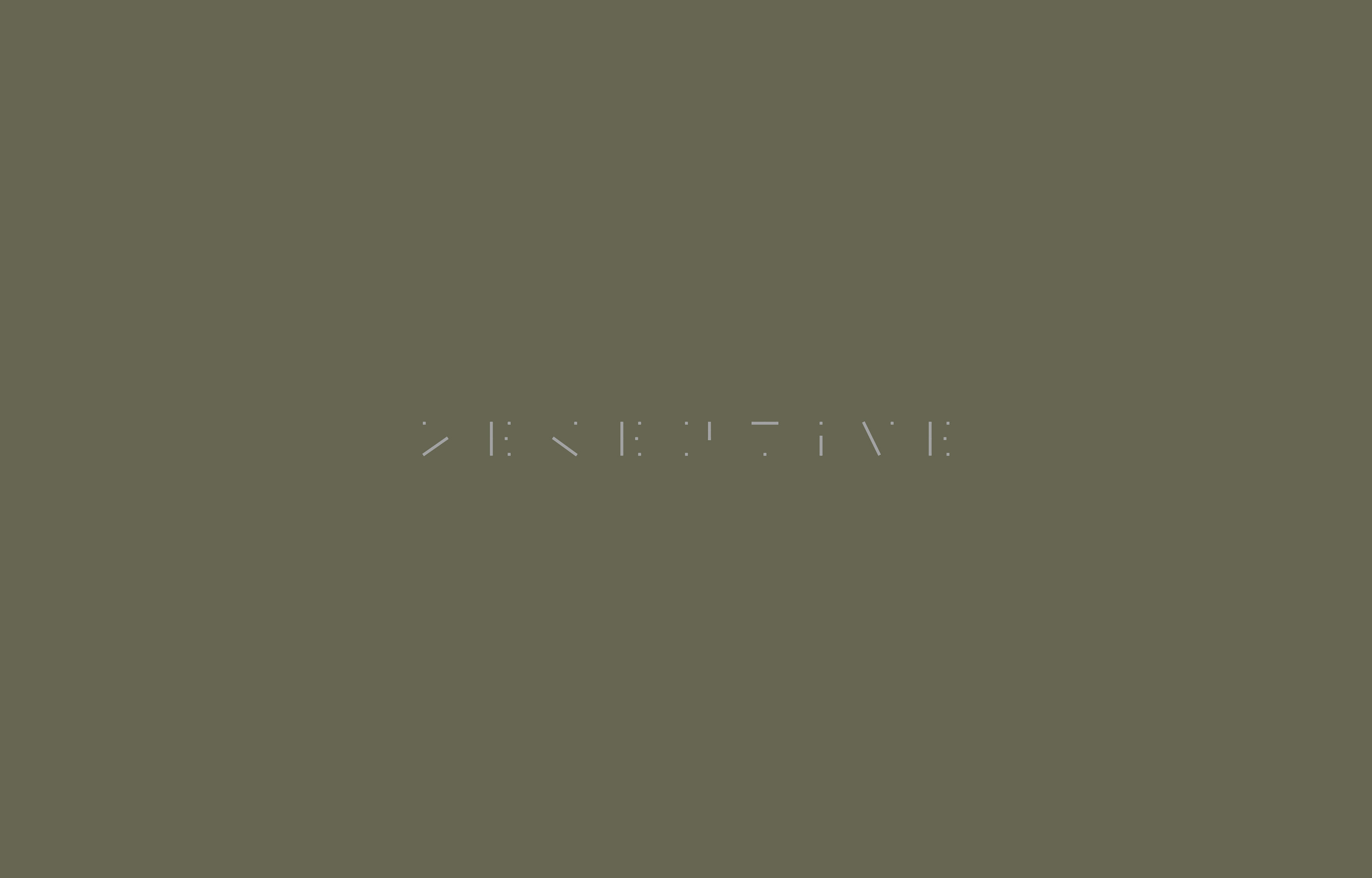
CLIENT
Deceptive
MARKET / BUSINESS
Creative Agency
THE CONCEPT
Deceptive is a creative branding studio that I'm in the process of rebranding.
With the custom word mark I wanted to play with the ideas of deception / progressive design and playfulness,
as well as provide interesting options for animation and to further develop a visual language based on
the utilized system.
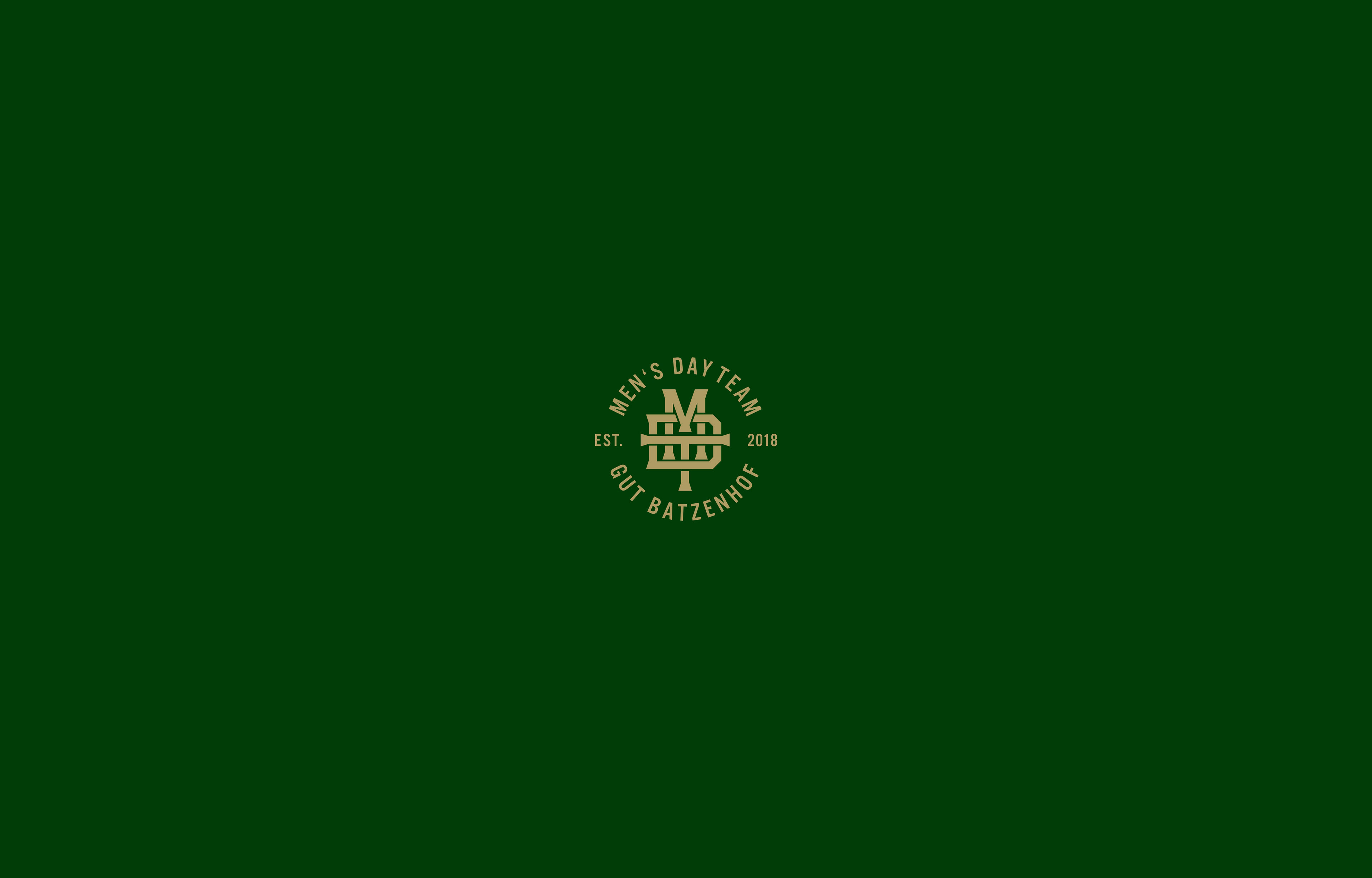
CLIENT
Men's Day Team – Gut Batzenhof
MARKET / BUSINESS
Amateur Golf / Sport
THE CONCEPT
Amongst other options, I've developed this monogram / seal to be used for the uniforms
of the Men's Day Team at my local golf club. The selected option was chosen for it's mix of
tradition and sport.
Thank you for scrolling.