About the Design:
Influenced by the Clients' wish to have both female and male energy shine through the Corporate Design, …
the Branding aims to strike the right balance between a warm, subtle vintage and a boutique style modern feel.
This approach is reflected in choice of color, typography and the custom logotype.

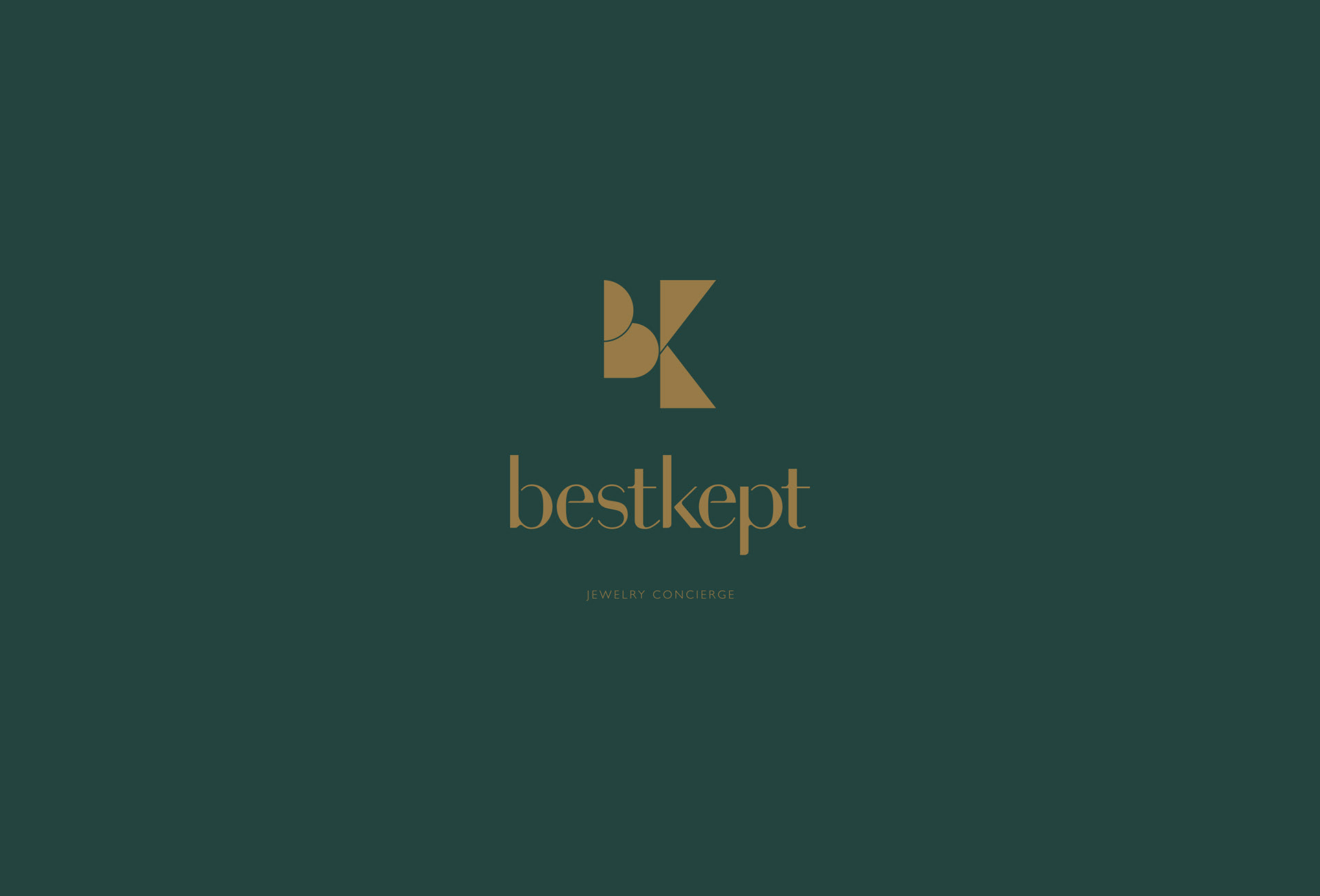
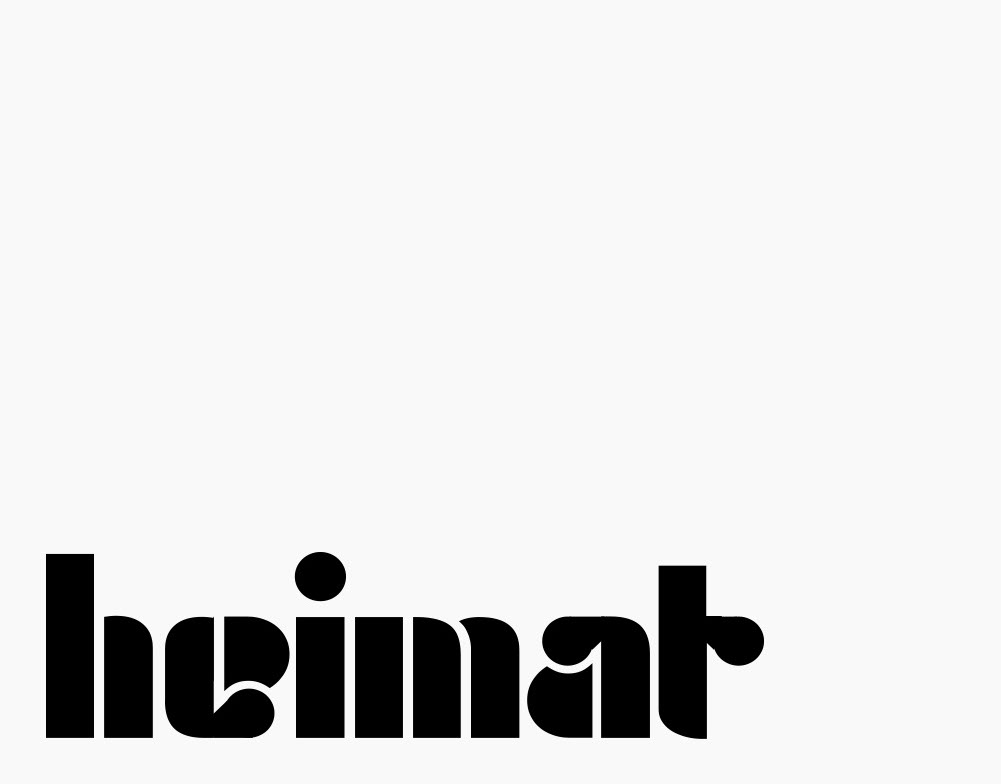
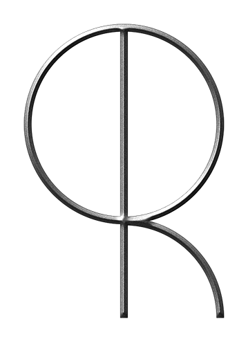
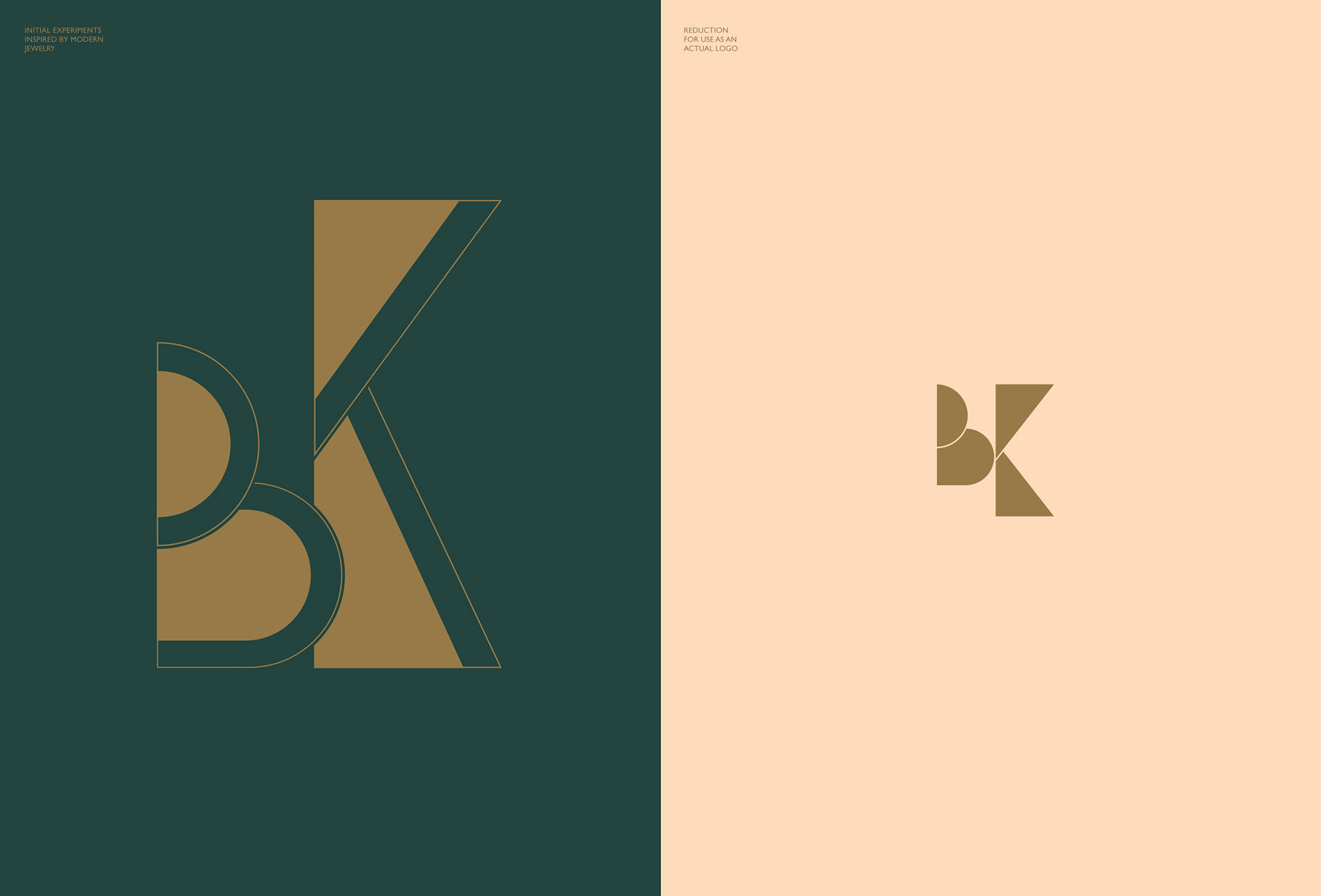
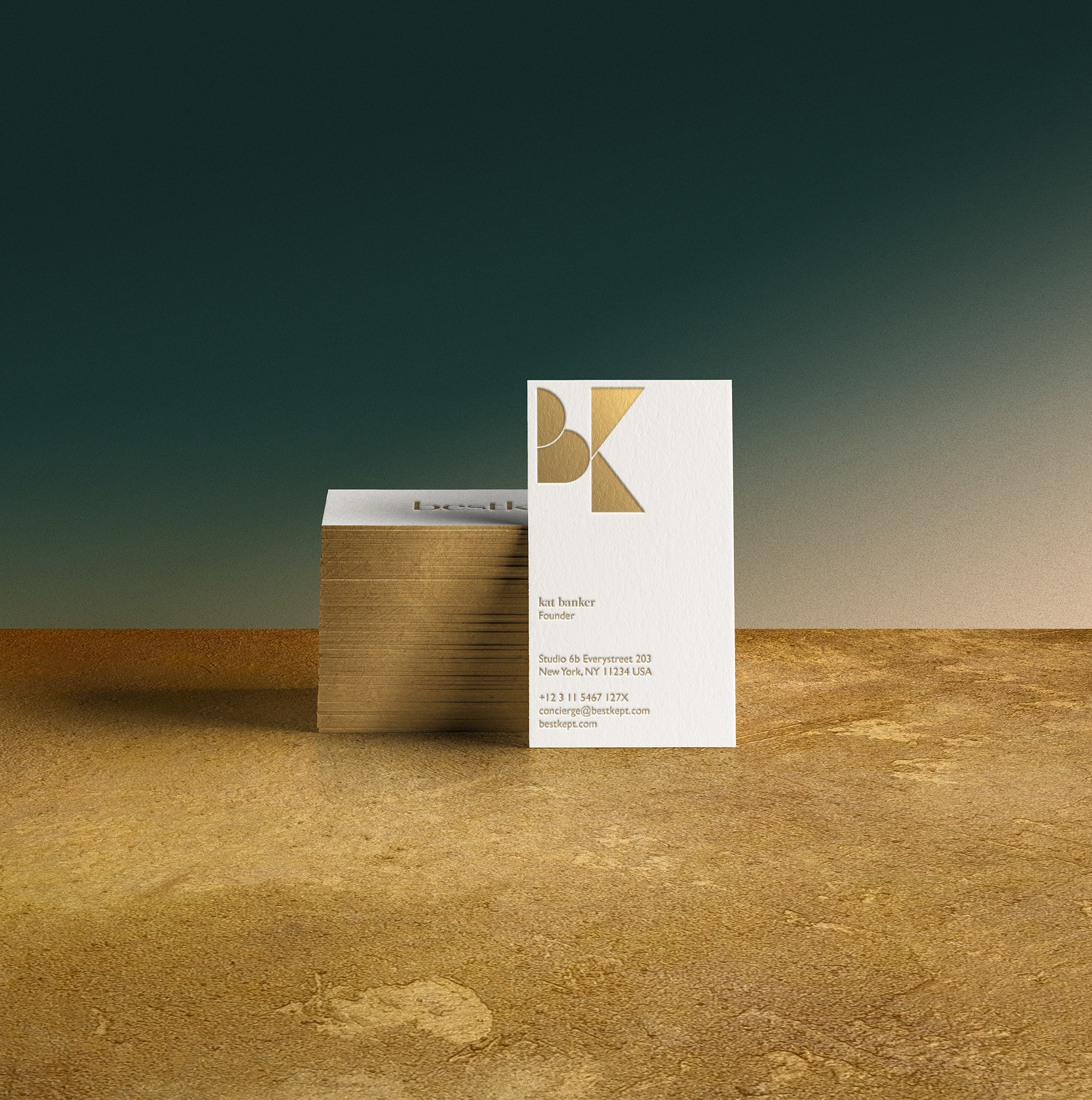
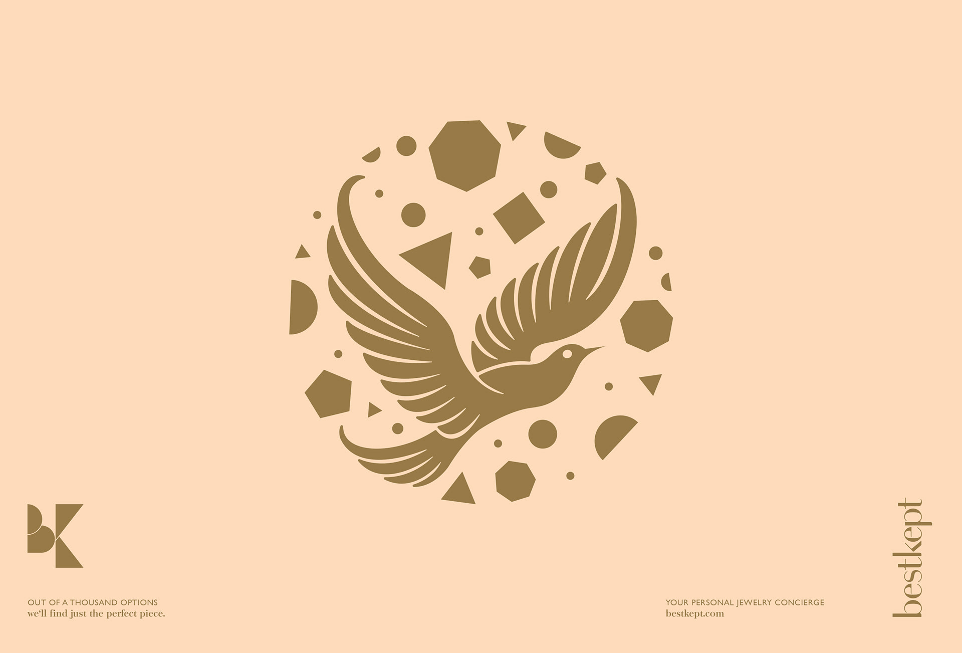
The Logo
For the Logo-System a feminine lowercase custom Word Mark is paired with a modern geometric,
jewelry-inspired Logo to achieve a contemporary, yet classic look. Both parts work individually
and as center aligned Unit.
The Logo Element strikes a more progressive and modern Tone as a counter Weight to the Word Mark.
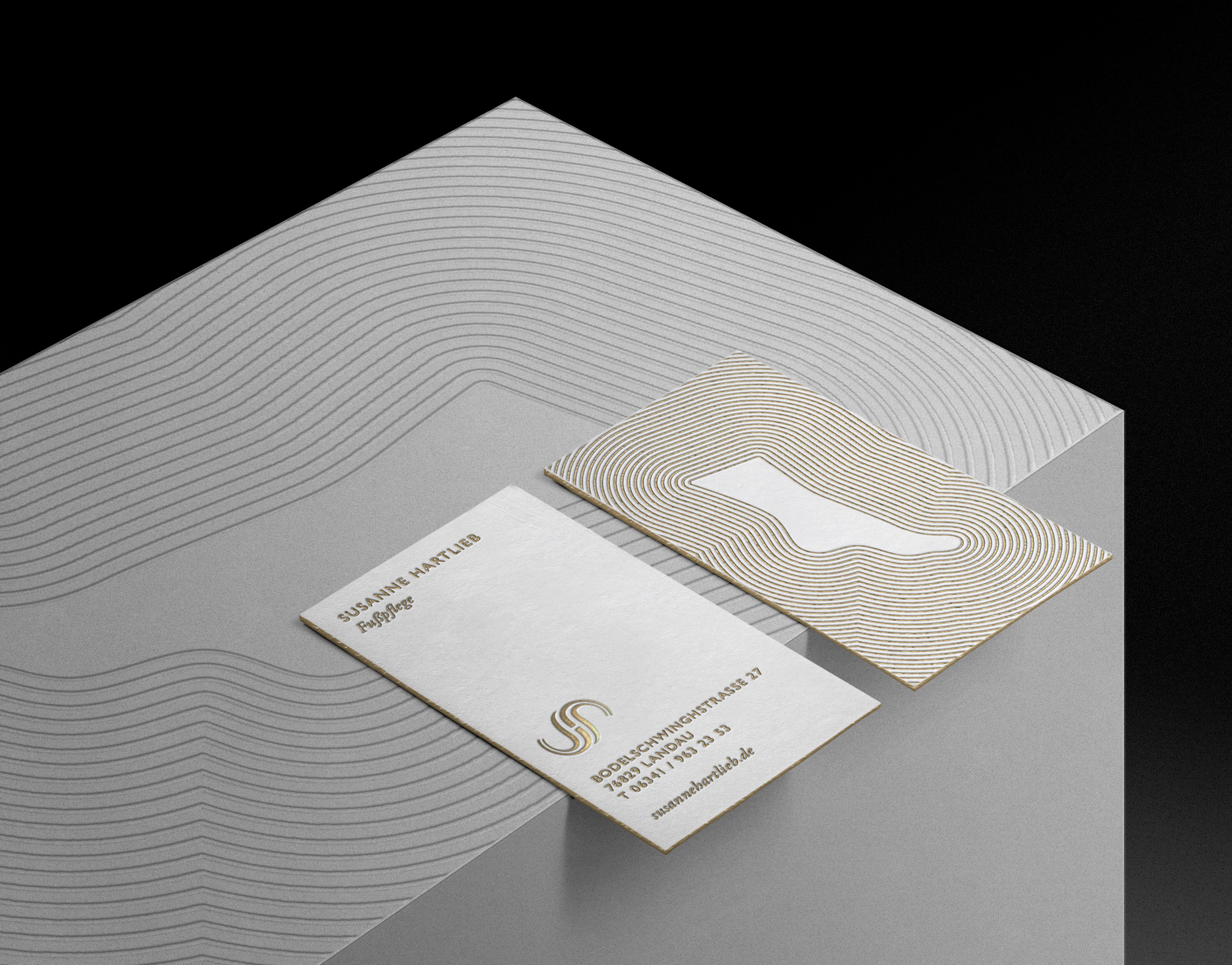
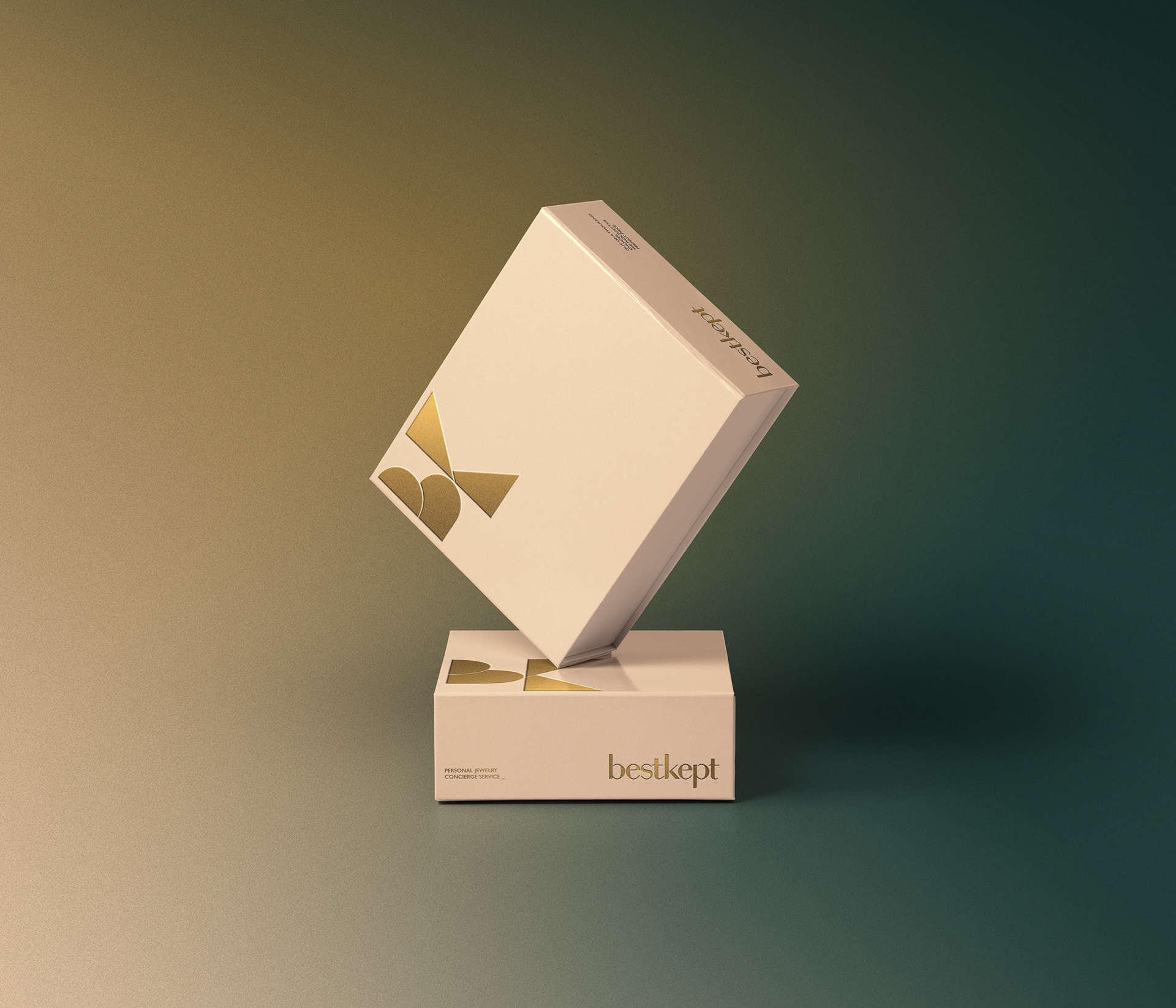
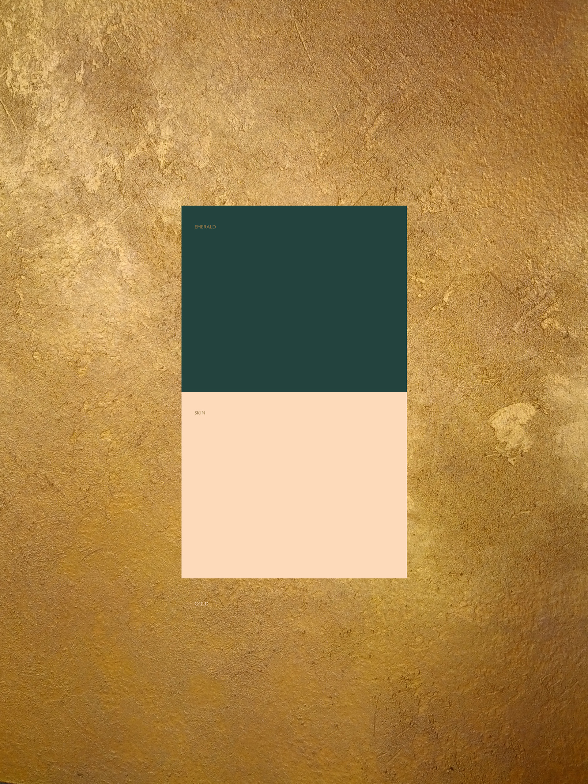
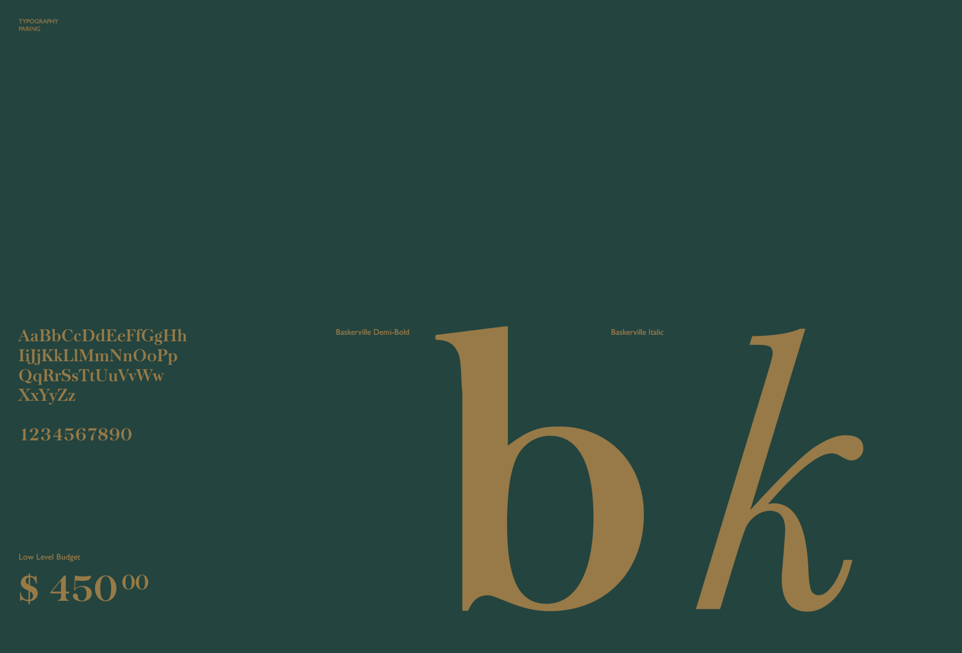
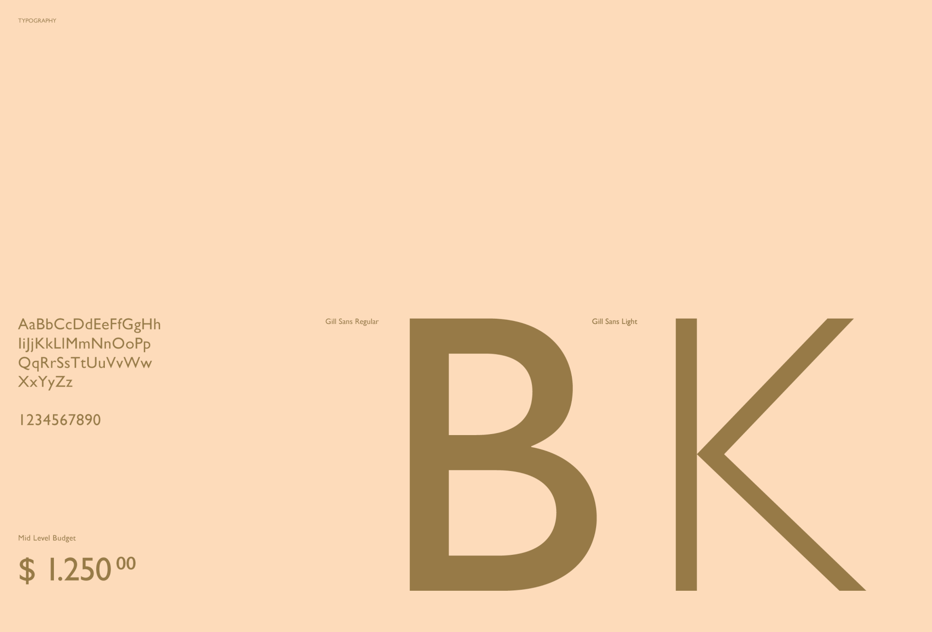
Colors / Typography:
A tried and tested combination of a warm gold and a deep emerald green is brightened and modernized by a pastel skin tone.
Use of Typography is understated and subtle. Gill Sans is paired with moderate use of Baskerville to re-emphasize the modern/classic balance.


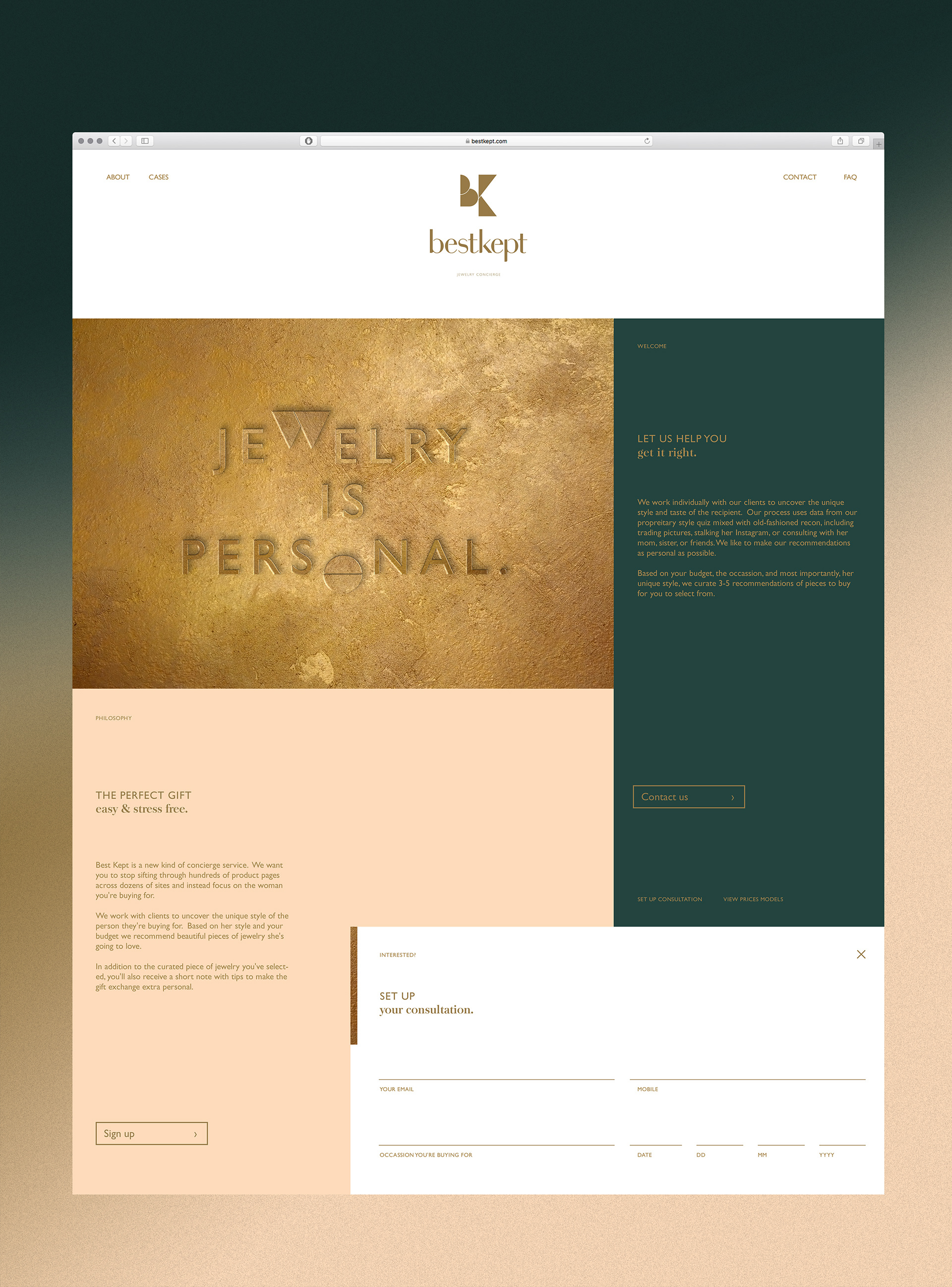
Branding:
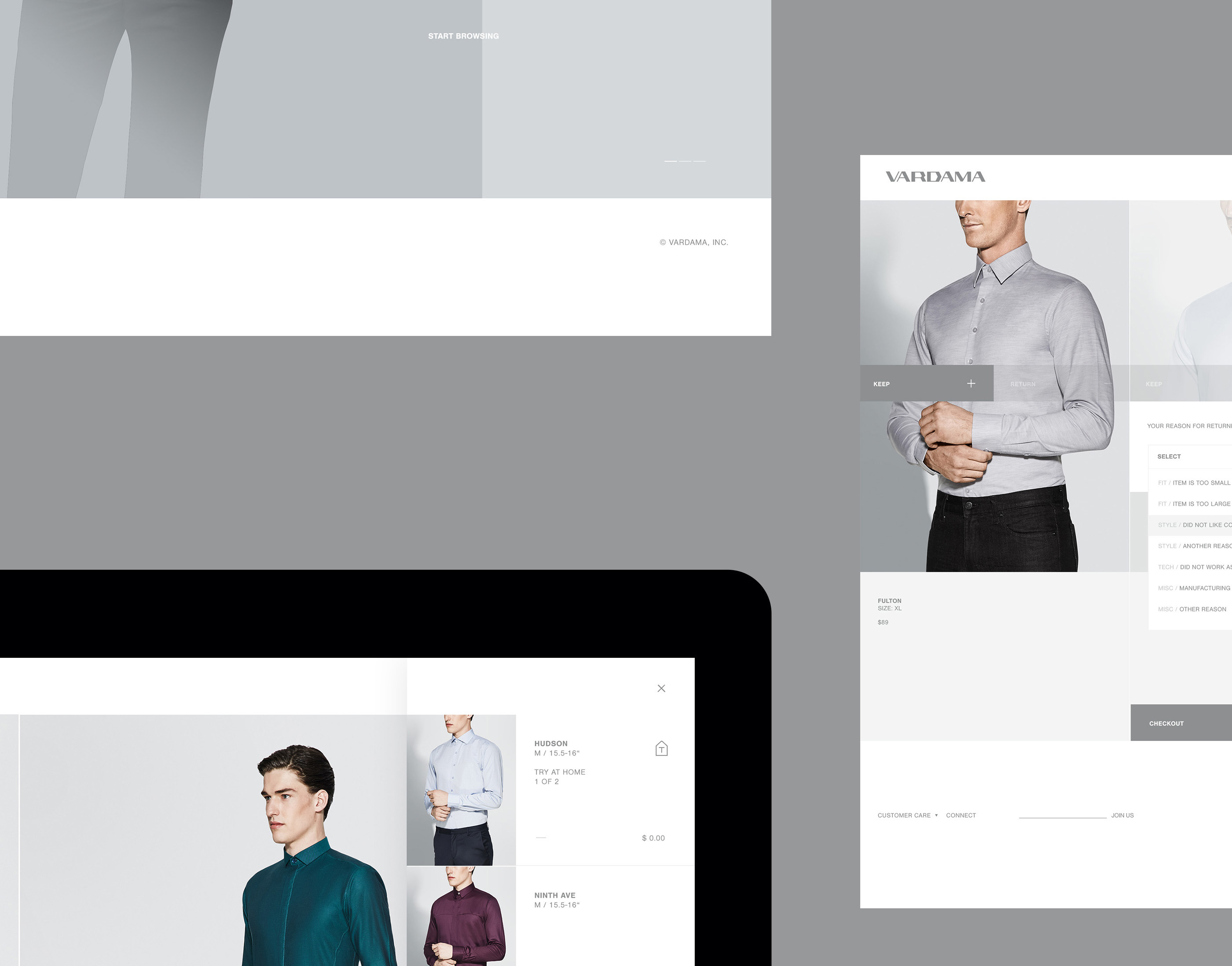
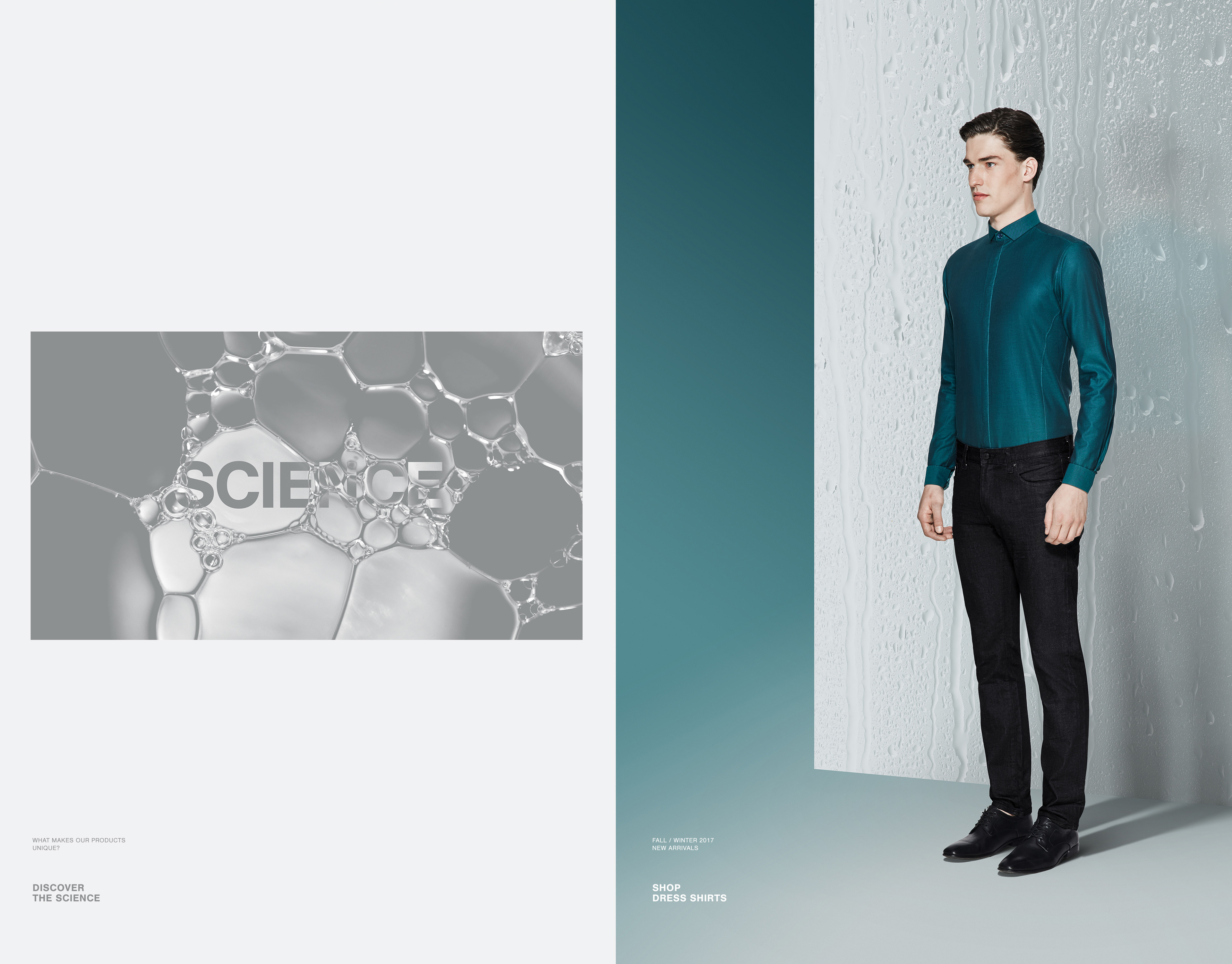
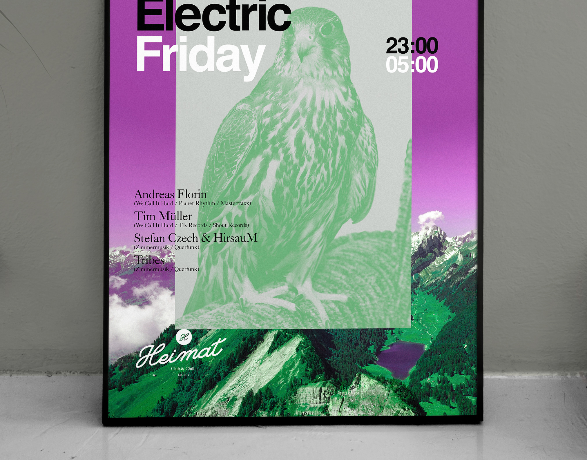
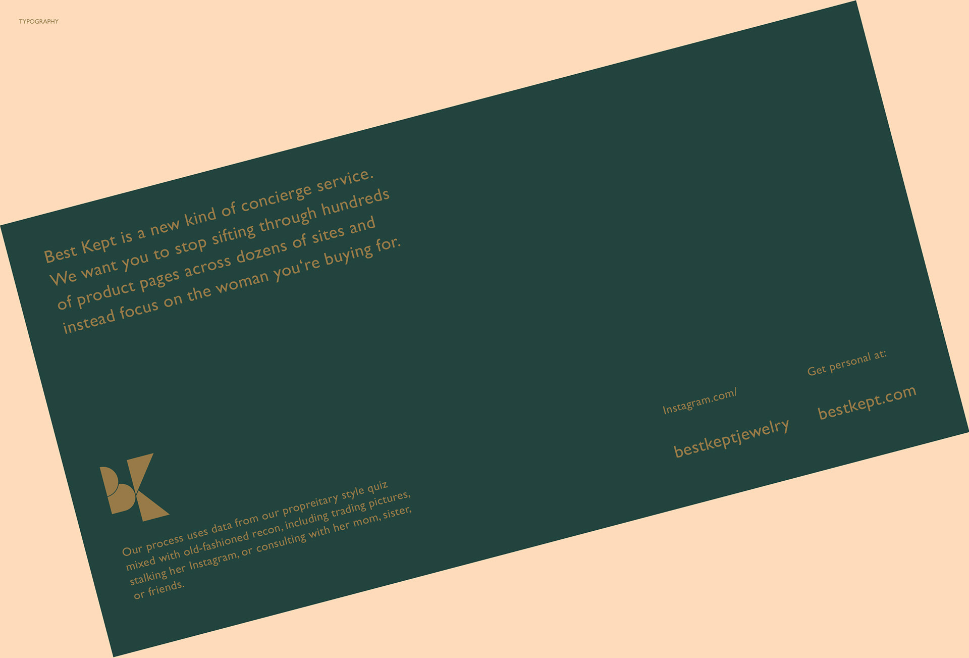
Print & Online
Visualizations of the Brands presence on and off the screen. Minimalist approaches to layout, attention to spacing, weight and composition define the look.
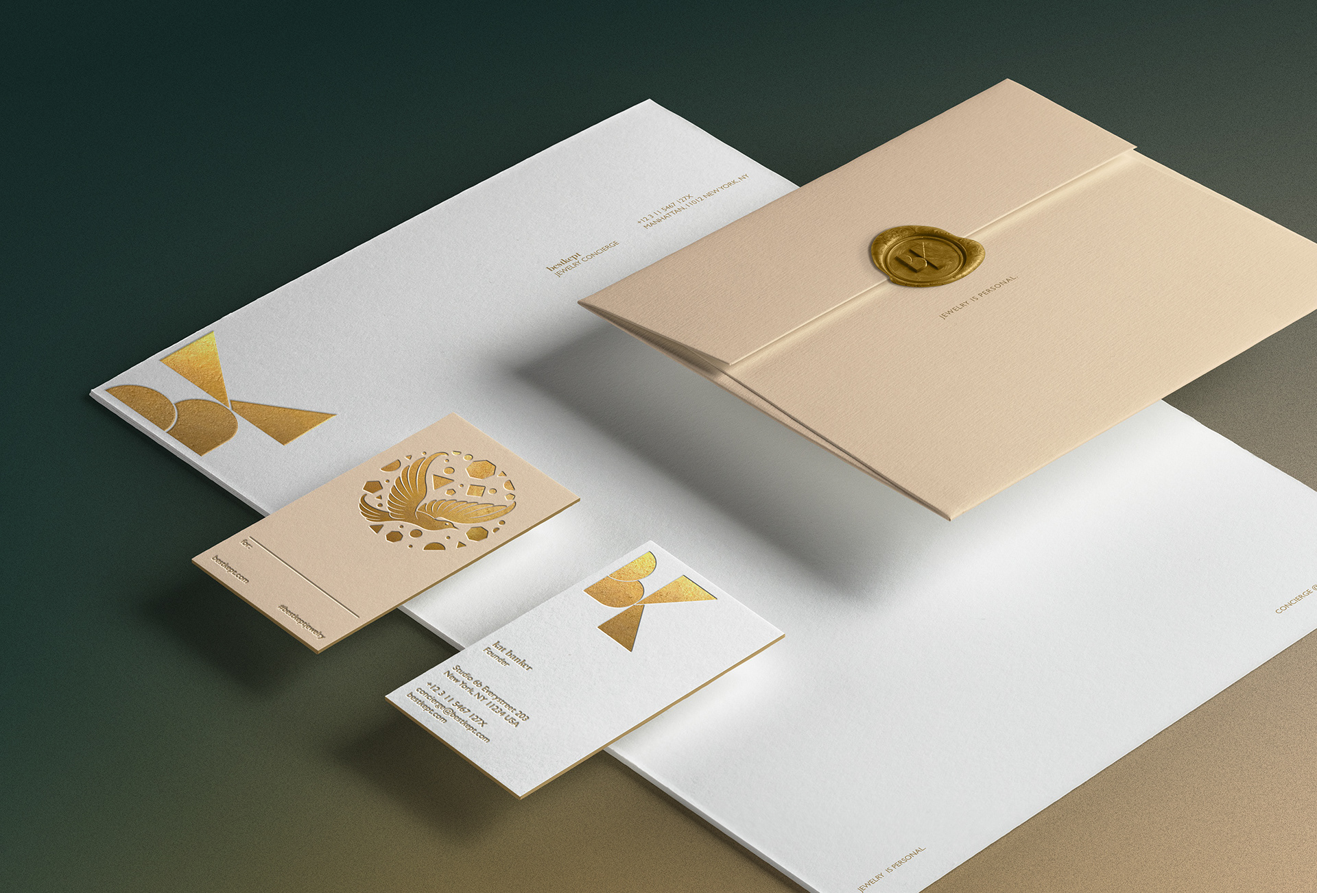
Stationary Elements & Gift Tag
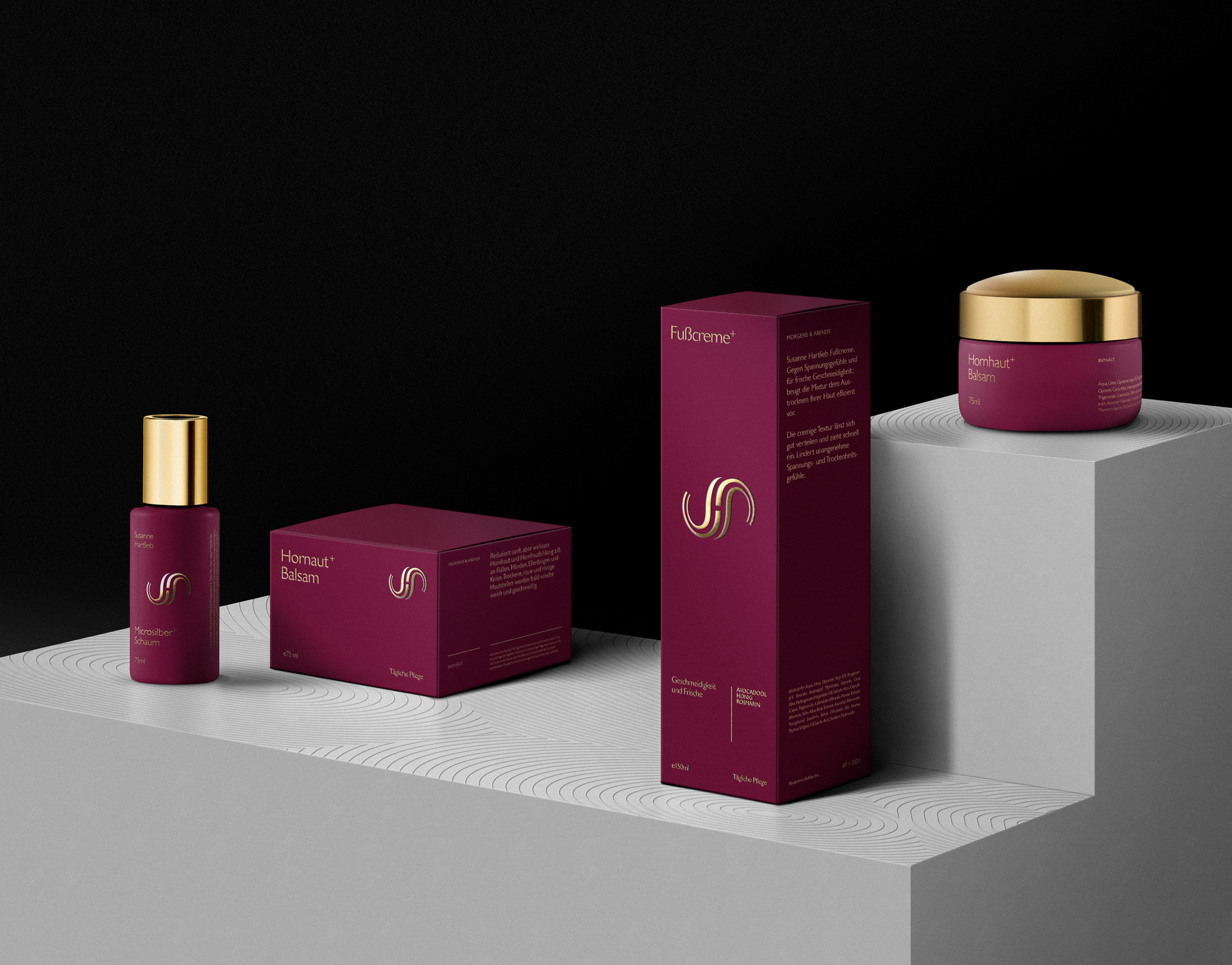
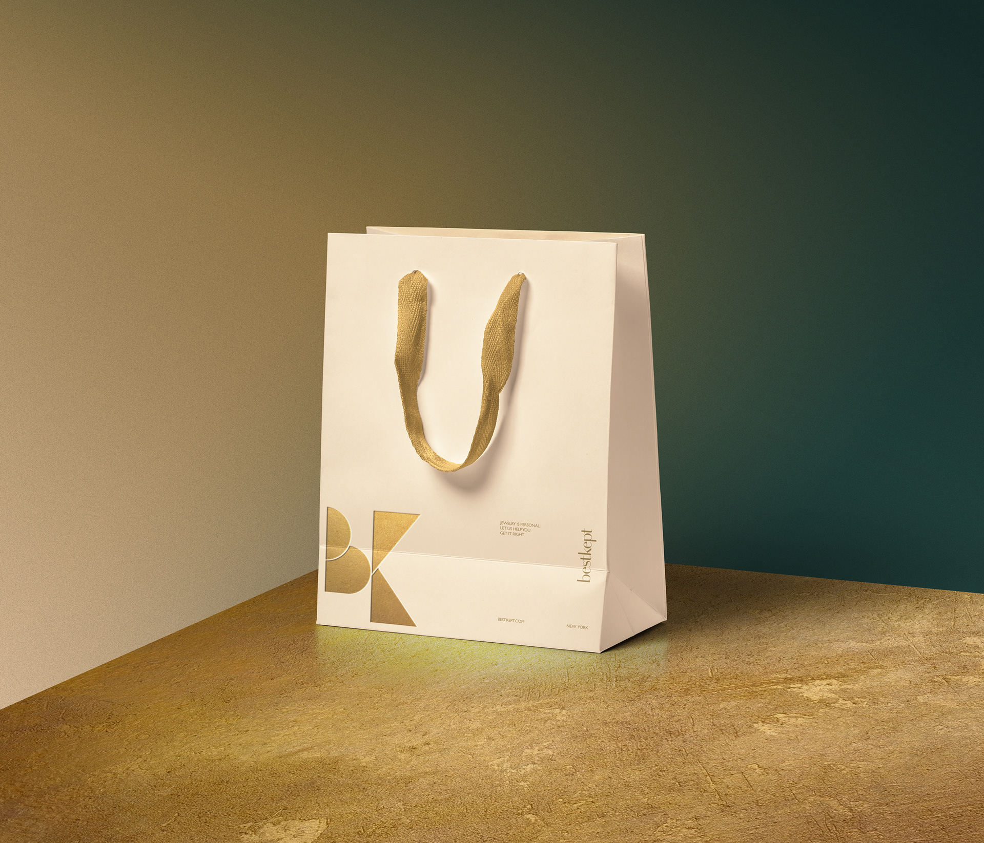
Packaging Concepts

Basic Online Presence
Art Direction & Design: C.Ruprecht
Mock-ups: Courtesy of Pixeden.com