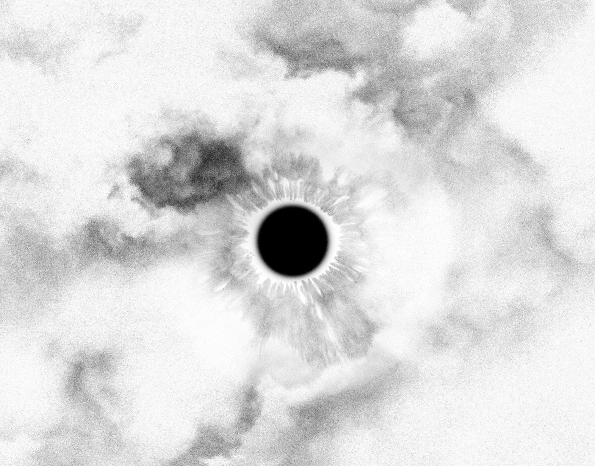
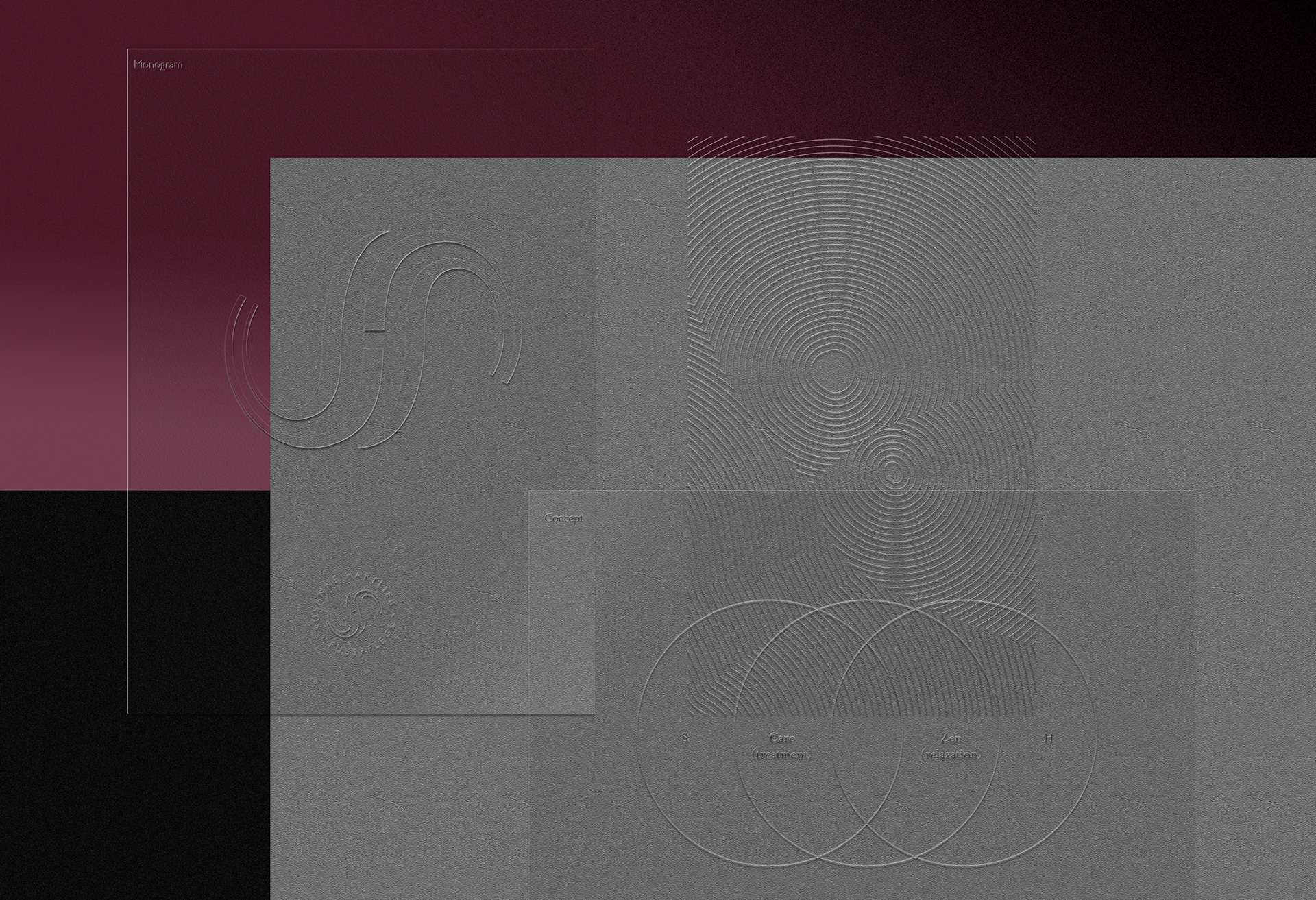
I was inspired by the calm and care found in a typical zen garden and derived both a logo and a visual concept from the delicate raking of sand; Translating the attention to detail and goal of establishing harmony for the client and health of their feet, the visual concept also radiates softness and elegance. The graphic simplicity lends itself well to the application of various finishes, such as foil stamping, em- or debossing and more. It also enabled the branding to work without the touchy subject of having relatable foot photography as part of the formula.
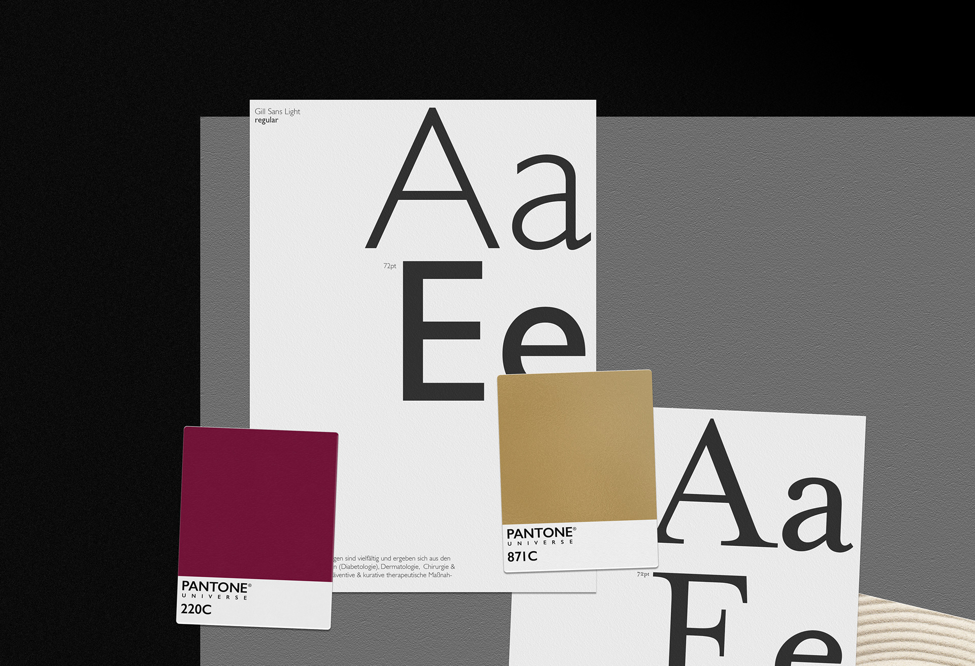
The color scheme followed a very traditionalist luxury palette, consisting of white, hues of gray and silver, gold, both as a 4 color simulation, spot color and foil applications to cover the medical aspect of the institute, as well as a deep ruby red which adds the beauty aspect to the branding.
Typography choices are:
Gill Sans:  Regular _ Light _ italic : representing the clean medical aspect of the institute, as well as making sure the cosmetic nature still appeals to female and male clientele
Mrs. Eaves:  Roman _ bold _italc : to bring in a touch of traditionalism and accents of classic luxury
The Logo
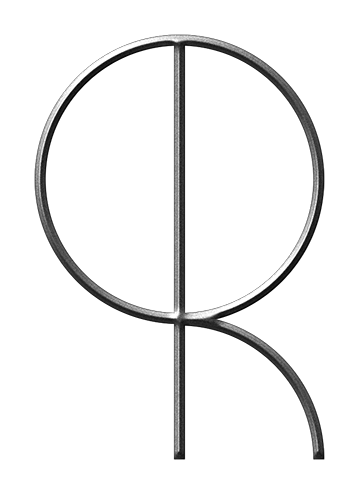
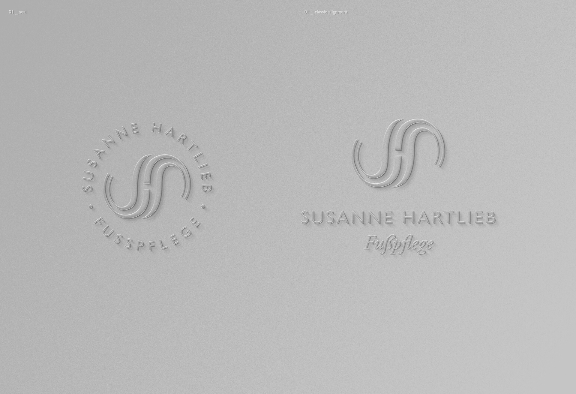
The bespoke S&H monogram was inspired by soft flowing lines, representing the caring aspect of the institute, the attention of a zen-gardener with subtle aspects of yin and yang, as well as stylized feet in the negative space around the element. Used in a multitude of ways, it mostly stands on its' own, due to its pictorial nature.
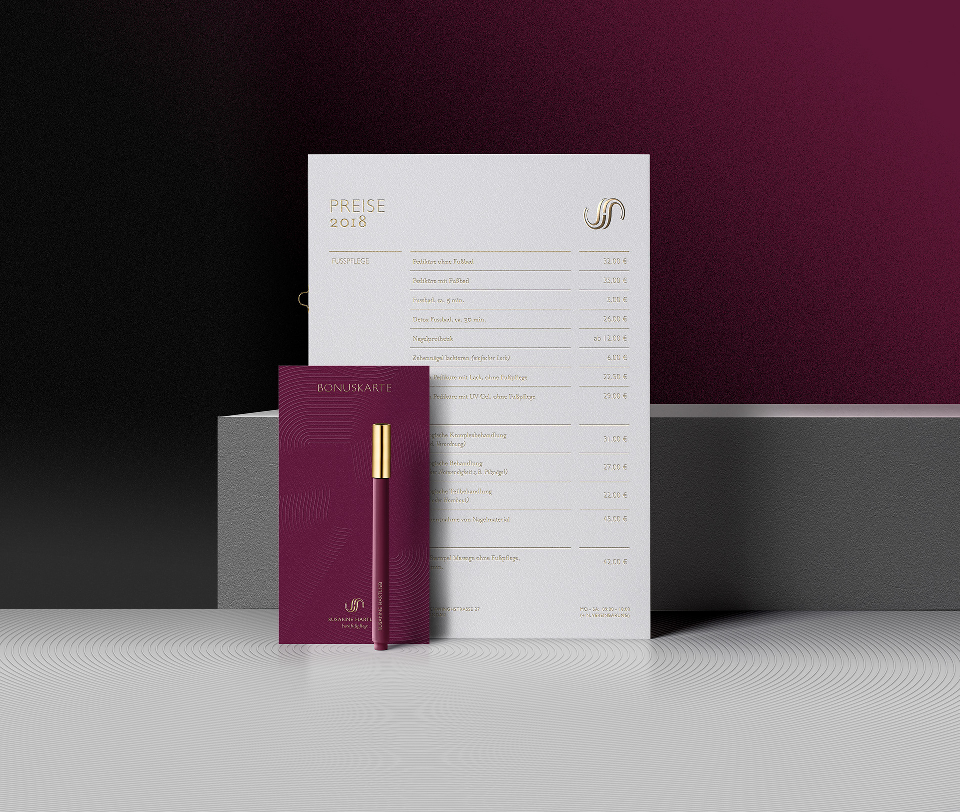
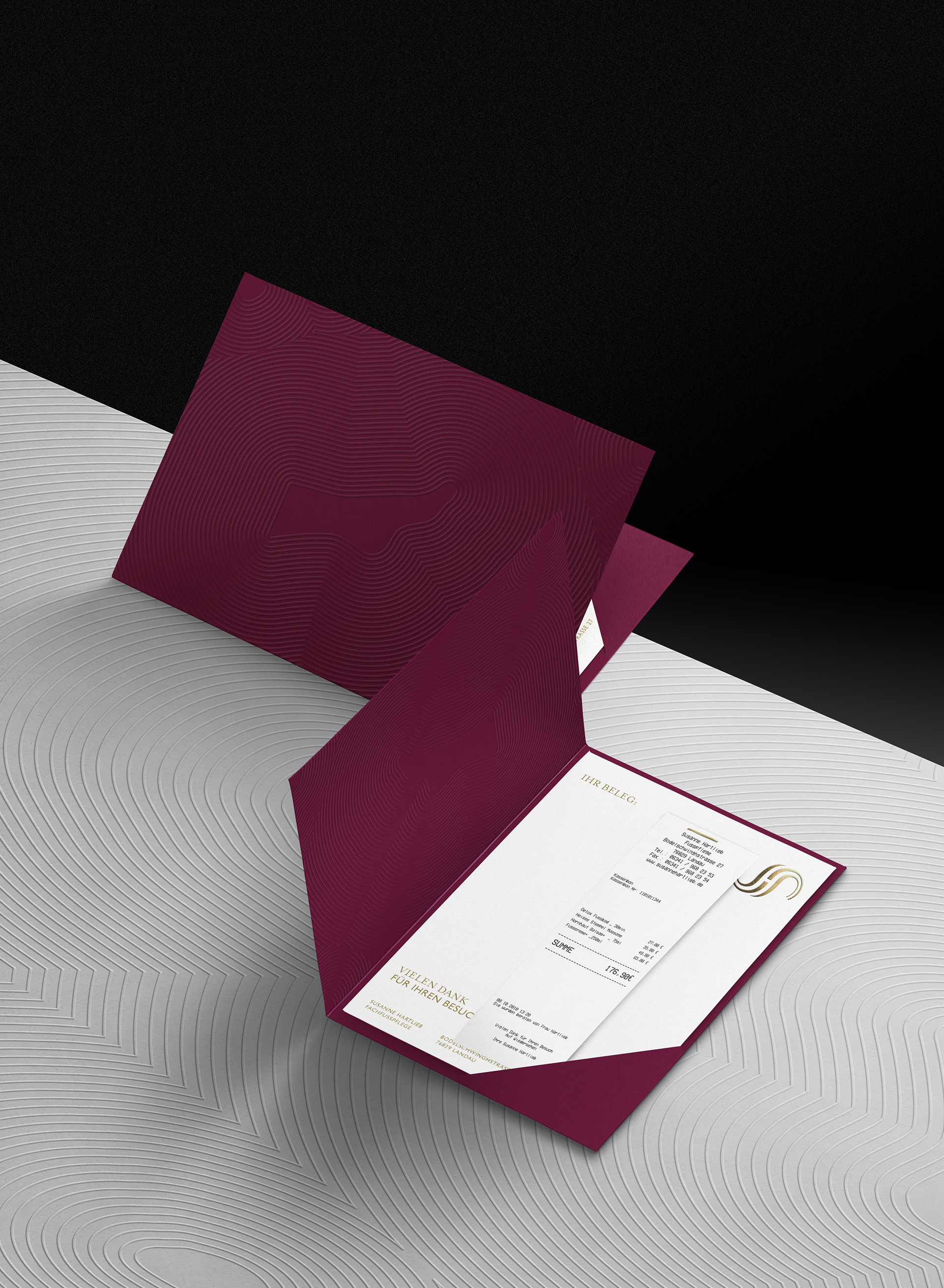
Pricing information and loyalty card 
realized with subtle blind embossing and foil stamping
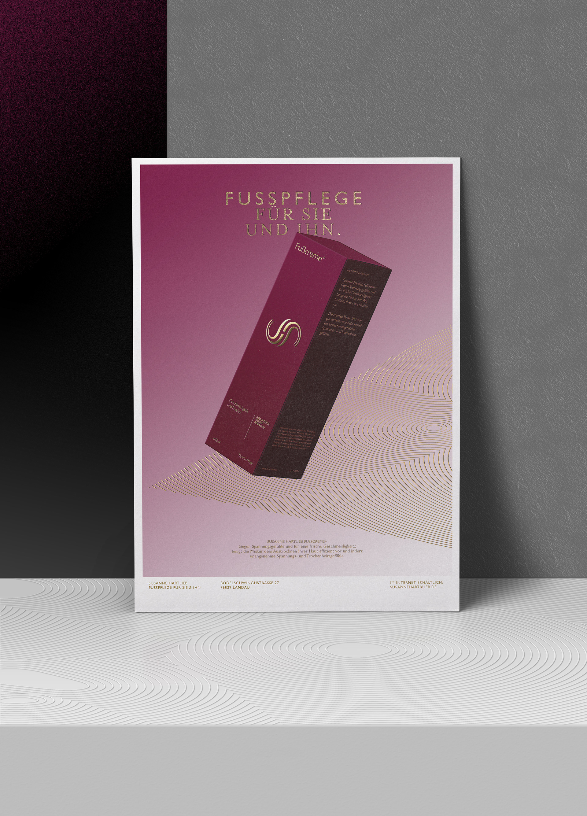
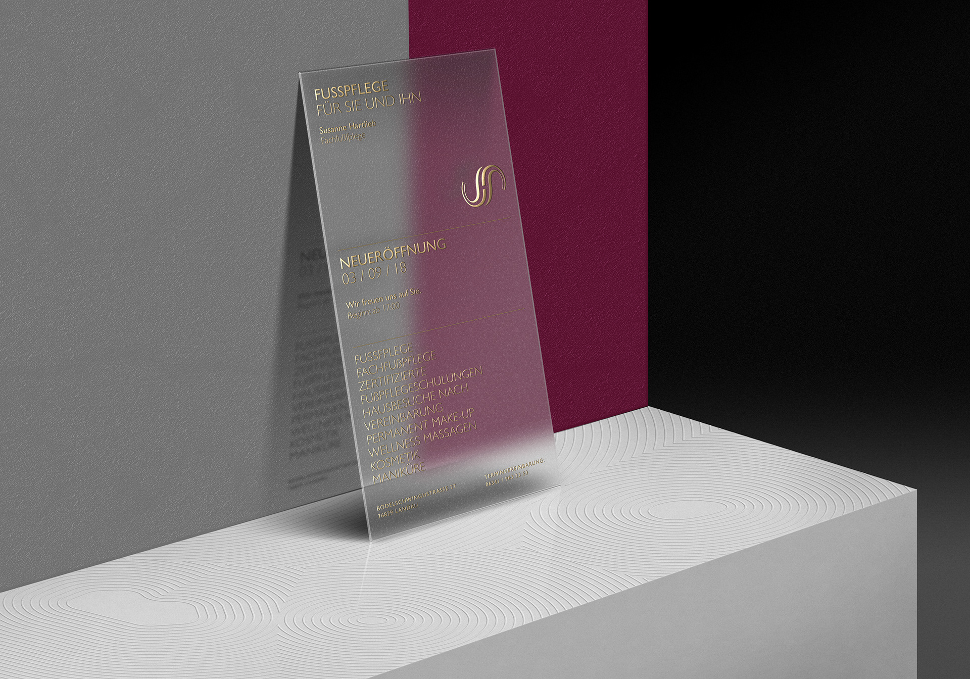
The visual concept was also applied to customize typography for in-house posters and store window banners,
bringing the individual message and logo element together coherently.
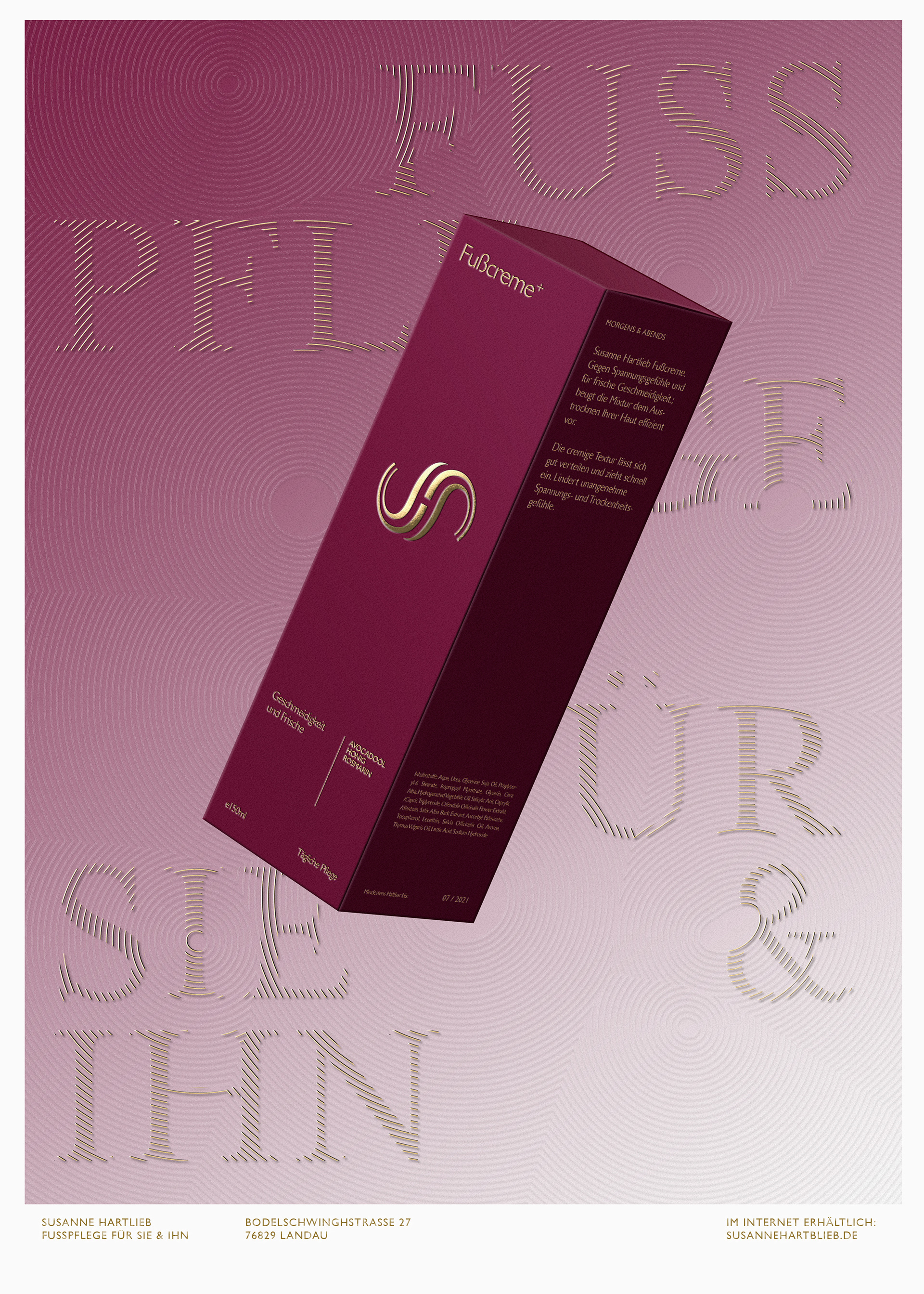
The visual concept of the delicate raking of sand in a zen garden was also used to develop illustrative elements to aid the staging of products in various in-house advertisements.
Decorative and with hints to (human) topology it also subtly borrows from an eastern sense of aesthetics, harmony and craftsmanship.
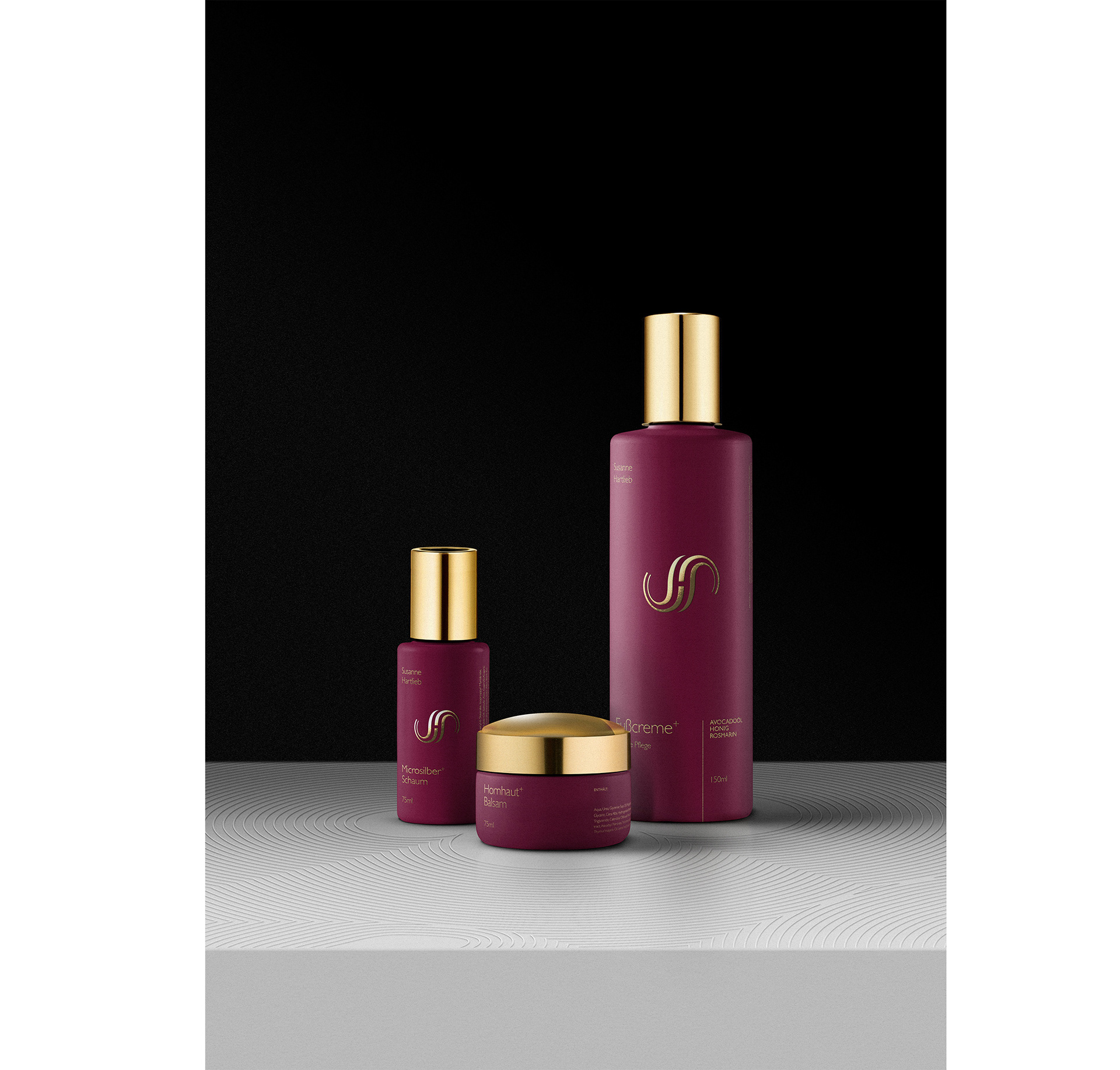
Packaging Design
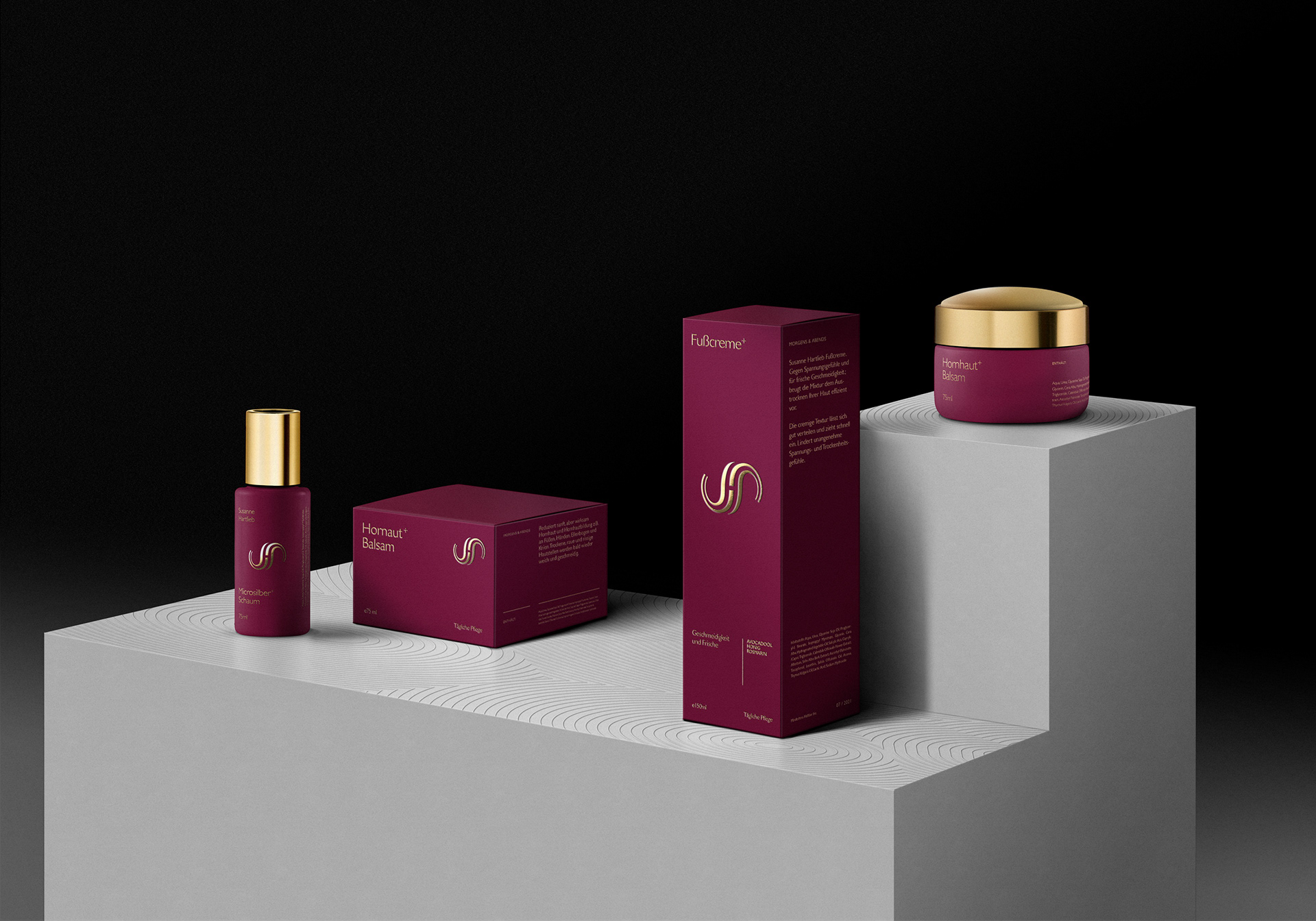
While a lot of the institute related communication is held in white and gold, the cosmetic and rich nature of the product line works with a deep ruby red paired with gold to bring in a soothing warmth and comfort.
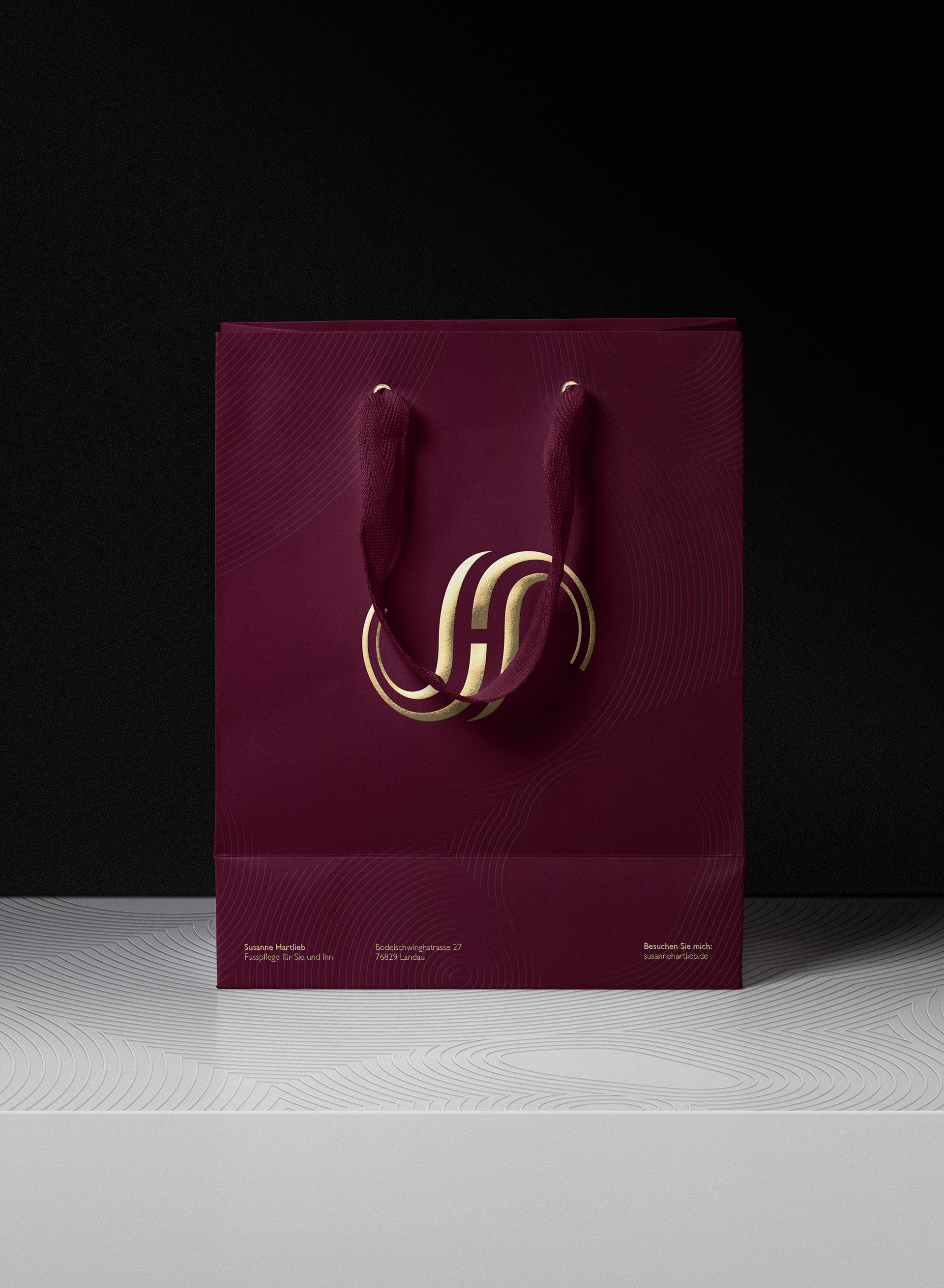
Shopping / Gift Bag and Folded Card 
for receipts, bonus card and other information
Credits:
Direction, Design, Illustration, Typography and Visualization:
Christoph Ruprecht / christophruprecht.com

Follow me on:

You may also like:

Marble Madness : Reimagined
Marble Madness, when it first came out in the 80's for the Atari® 1 System, did not only have a consequent isometric design, it also came with the first stero music ever to appear on an arcade game. Pure 8-bit pleasure.
2010
Illustration, Packaging, Fine Arts
Vardama New York
Creative Direction, Web Design and Branding for a technology / fashion / luxury start-up that uses nano technology to make dress shirts, suits and neckties spill repellent with zero downsides. Buy one of their shirts - it's the real deal.
2017
Branding, Web Design, Art Direction
Optisure, Digital Insurance
Optisure is the first of its kind, state of the art digital insurance assistance tailored to start-ups, young business and freelancers in Germany.
2018
Branding, Art Direction, Graphic Design
SchweinGehabt!
Every 2 years a creative festival is held on the grounds of an old slaughterhouse complex in Karlsruhe, Germany. The refurnished area is known to attract start-ups and creative businesses and has become increasingly popular with young entrepreneurs, artists and more.
2018
Art Direction, Branding, Illustration
Nike® Street League: Posters
Ongoing personal project of quick practice posters inspired by Nike SB's Street League, portraying the main athletes in different settings, while playing with a font combination of Generation and Garamond. Will be updating again soon.
2014
Art Direction, Illustration, Typography
Secret 7" - Max Richter
Album Art Concept and Case Study for 2016 Secret 7": The framework for the visual concept was based on Max Richters recent Record Sleeves that show a visual of the moon.
2016
Art Direction, Digital Art, Illustration
Nike Air® : Concept Boards
I wanted to create simple but surreal imagery that revolves around the topic gravity and floating, so I decided to pick out some former NBA Allstar Dunk Champions. The results are a mix of staged photography and tactile design.
2010
Art Direction, Graphic Design, Illustration
C16: Audioreactive lamp & iOS remote
C16 is a prototype concept playing with the perception of moving light-gradients inside of material. The Project was developed in cooperation with Andreas Rothaug
2013
Industrial Design, Interaction Design, Music
bestkept. Jewelry Concierge
Best Kept is a personal Jewelry Concierge Serving, coming to the Aid of the modern gentlemen, who is looking for the ideal surprise for their loved one. Based on in depth personal Dialogue the right type and style of Jewelry is determined and recommendations are given based on budget and aesthetic profiles initially based on intelligent Questionnaires.
2018
Branding, Graphic Design, Art Direction
Slate NYC
Slate is a full service creative photo agency in the heart of New York. This is a larger Case-Study, reflecting the Clients' wish to use a non-design, non-invasive approach across all communication points. 
2015
Art Direction, Web Design, Graphic Design
Back to Top