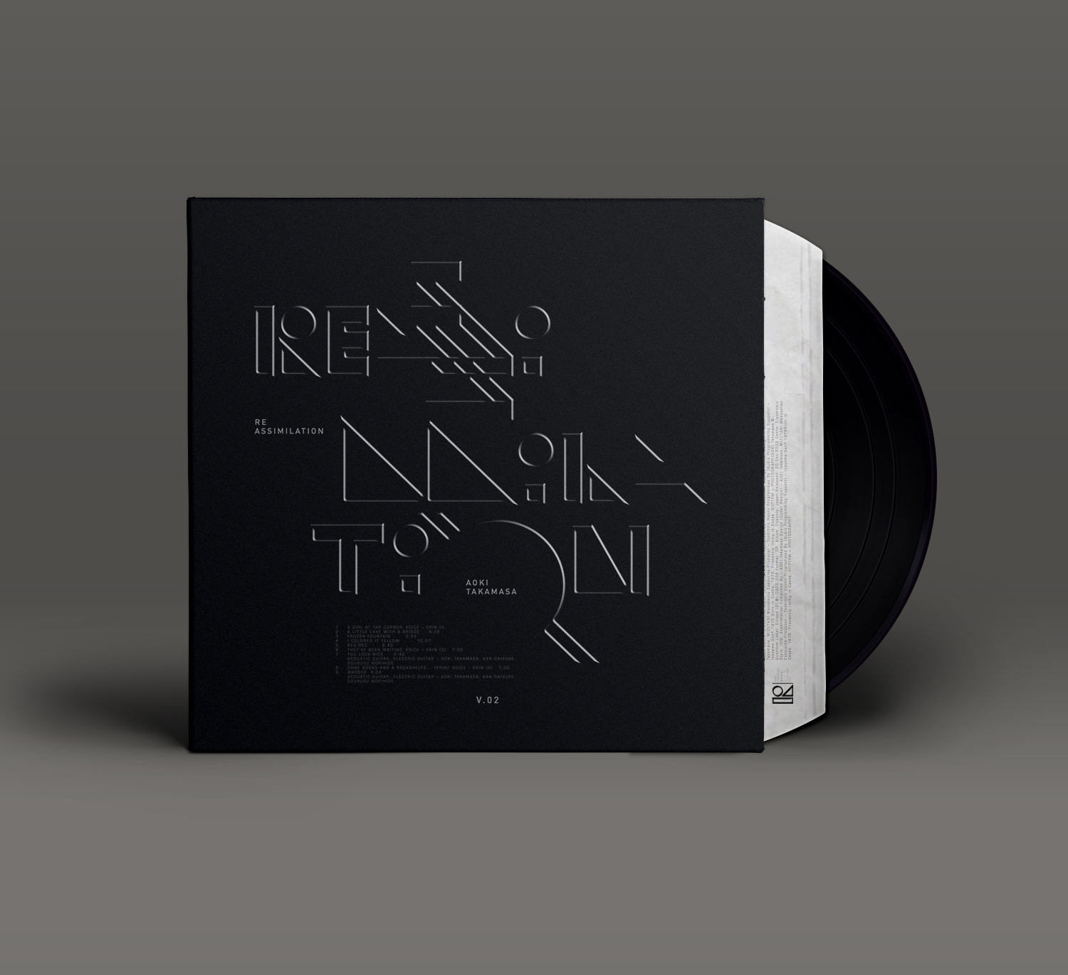
Show us your Type
City: Nantes
Year: 2018
Unpublished typographic experiments for SUYT/NANTES.
Basic Concept:
Deriving the color palette from the cites official crest.
Working with a single color for each design.
Combining minimalist vector composition with stacked PS effects.
Spending no more than 2 hours per concept.
Focussing on exploring various styles rather than looking for perfection.
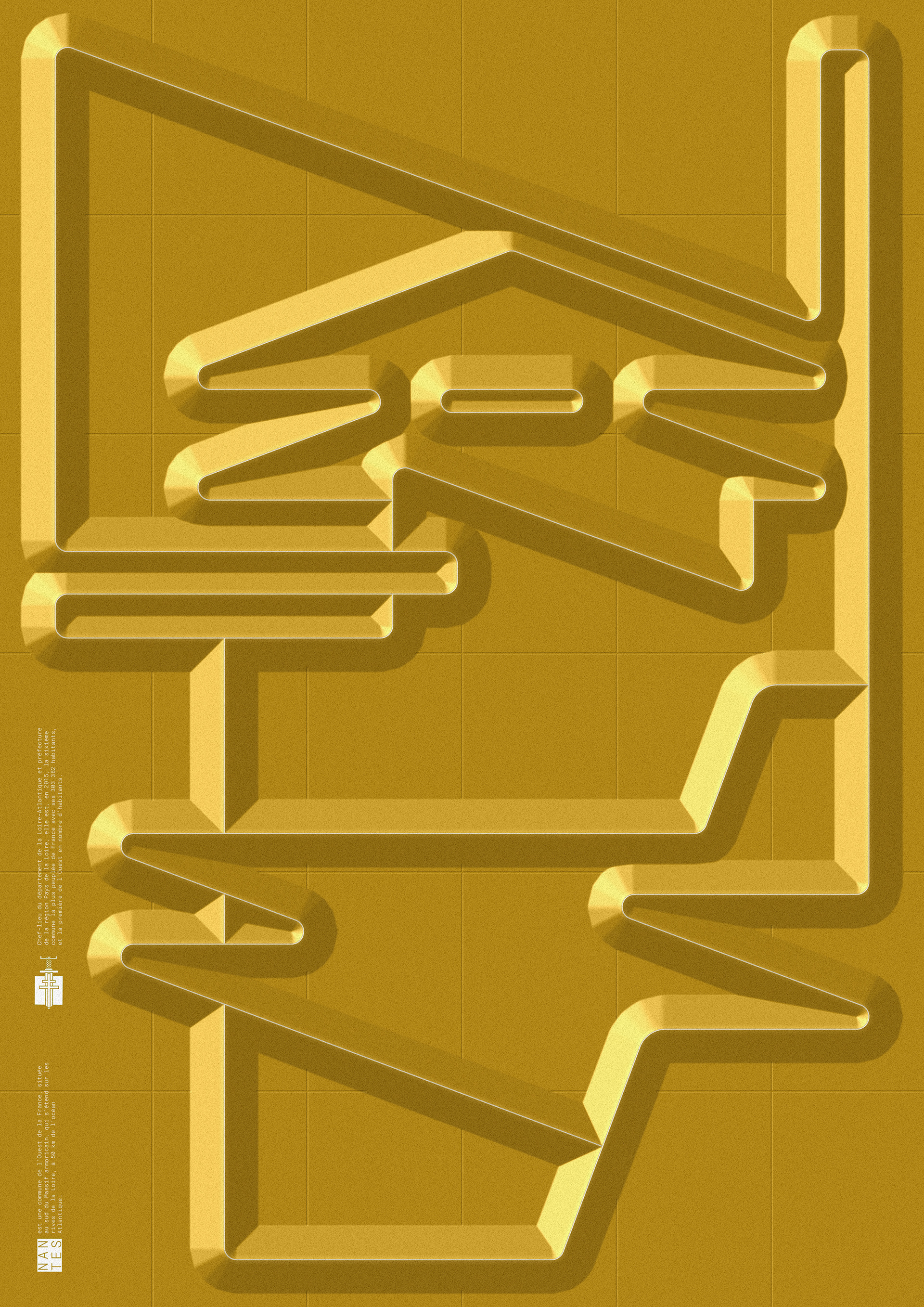
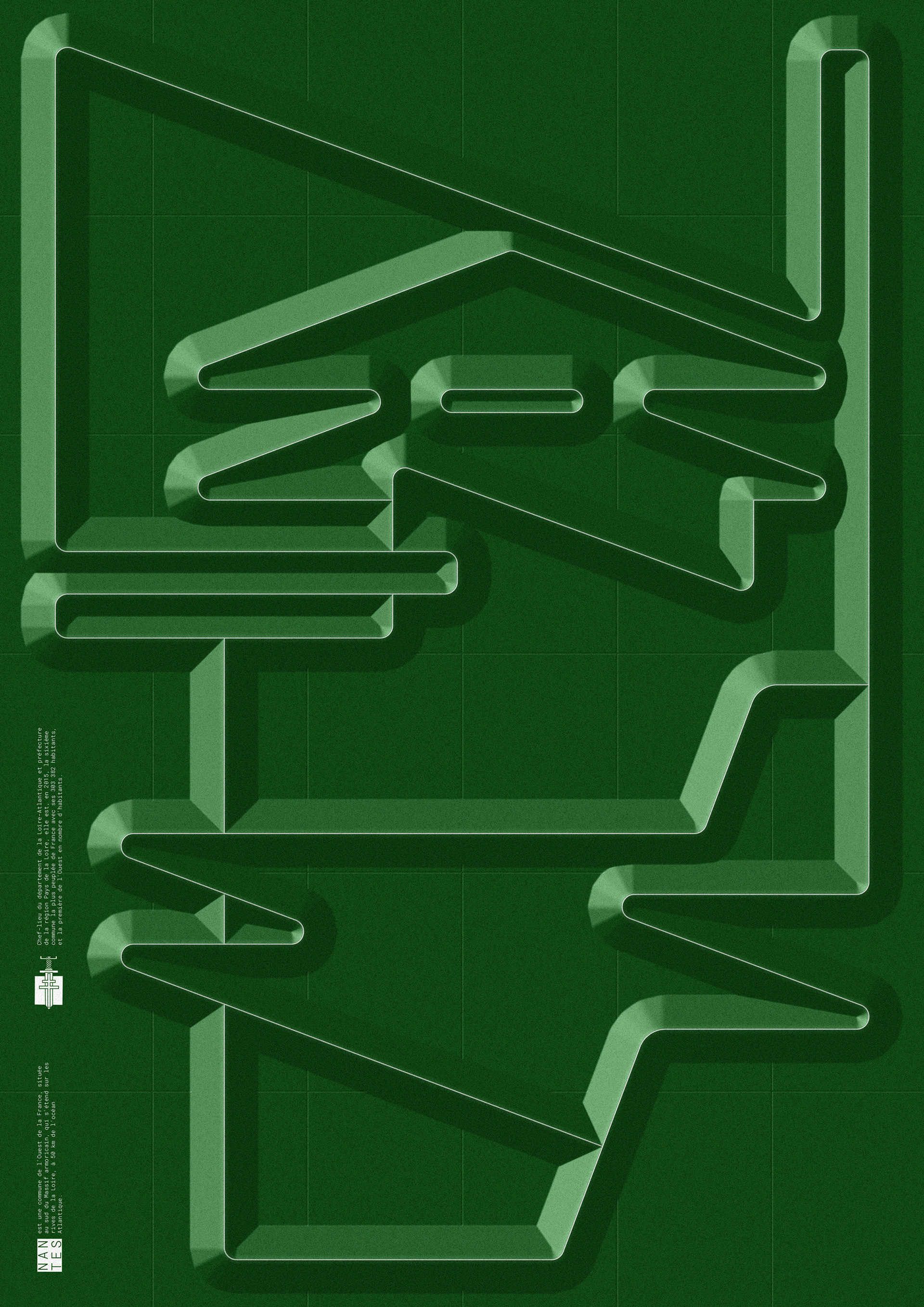
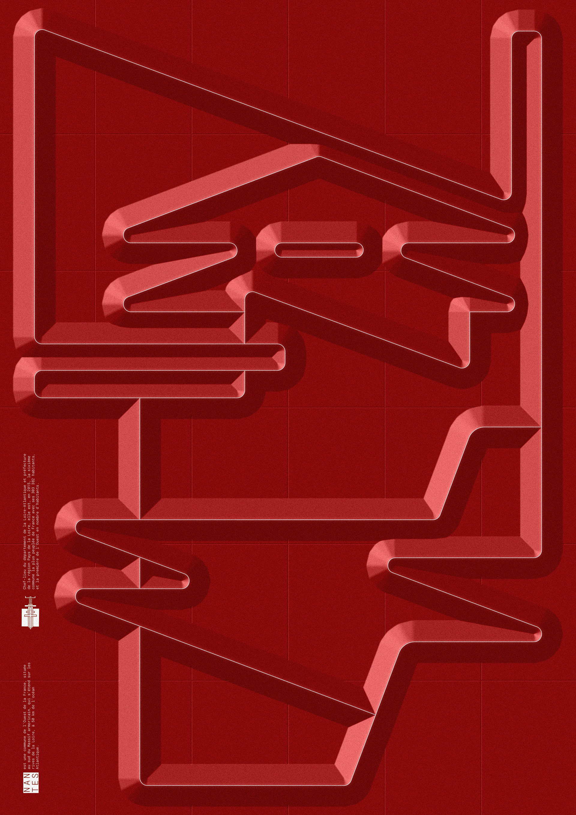
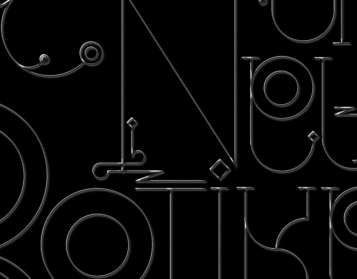
Version 1
Exploring a map-like and cryptic style,
sticking to one set of angles / diagonals,
interlocking the letters


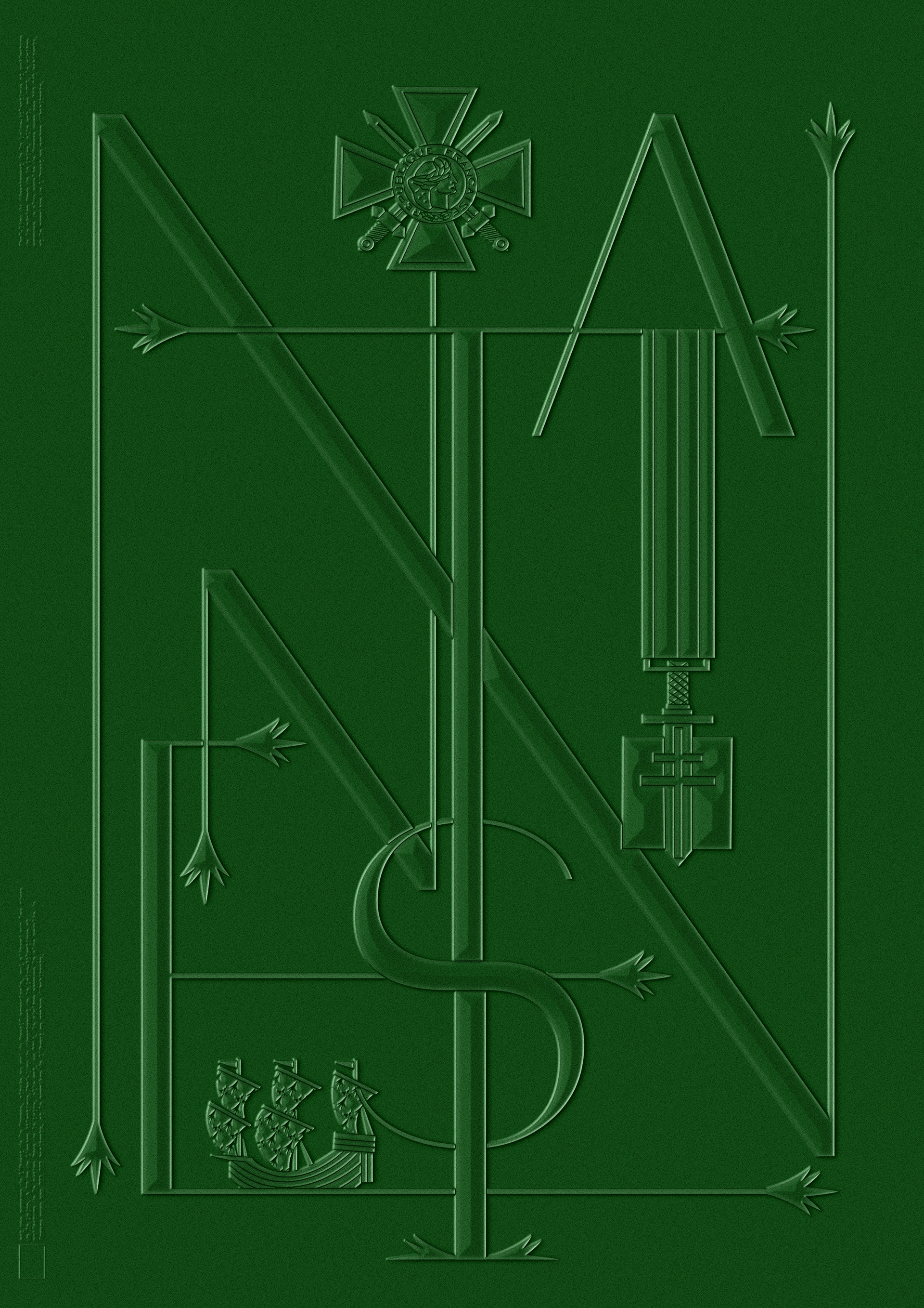

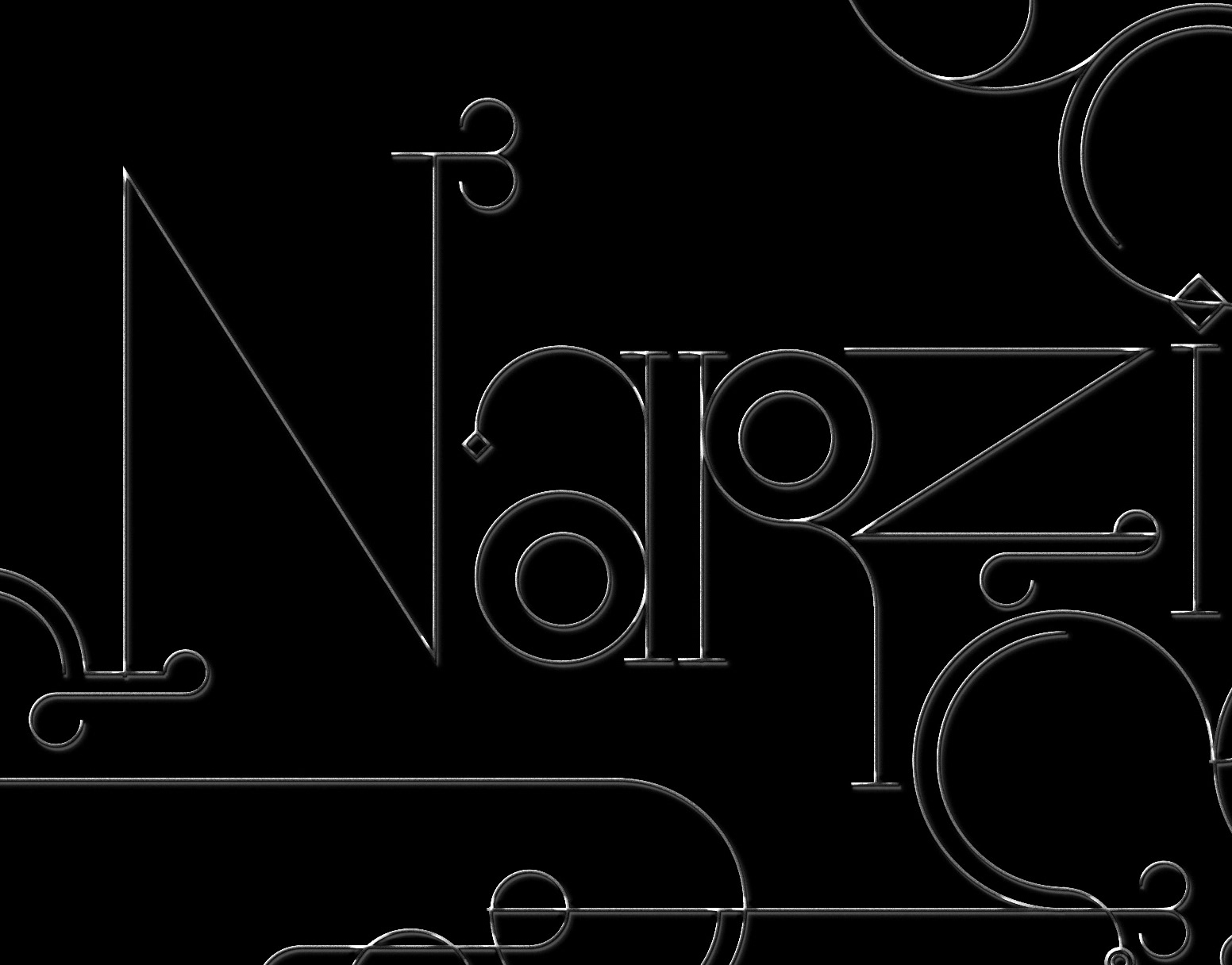
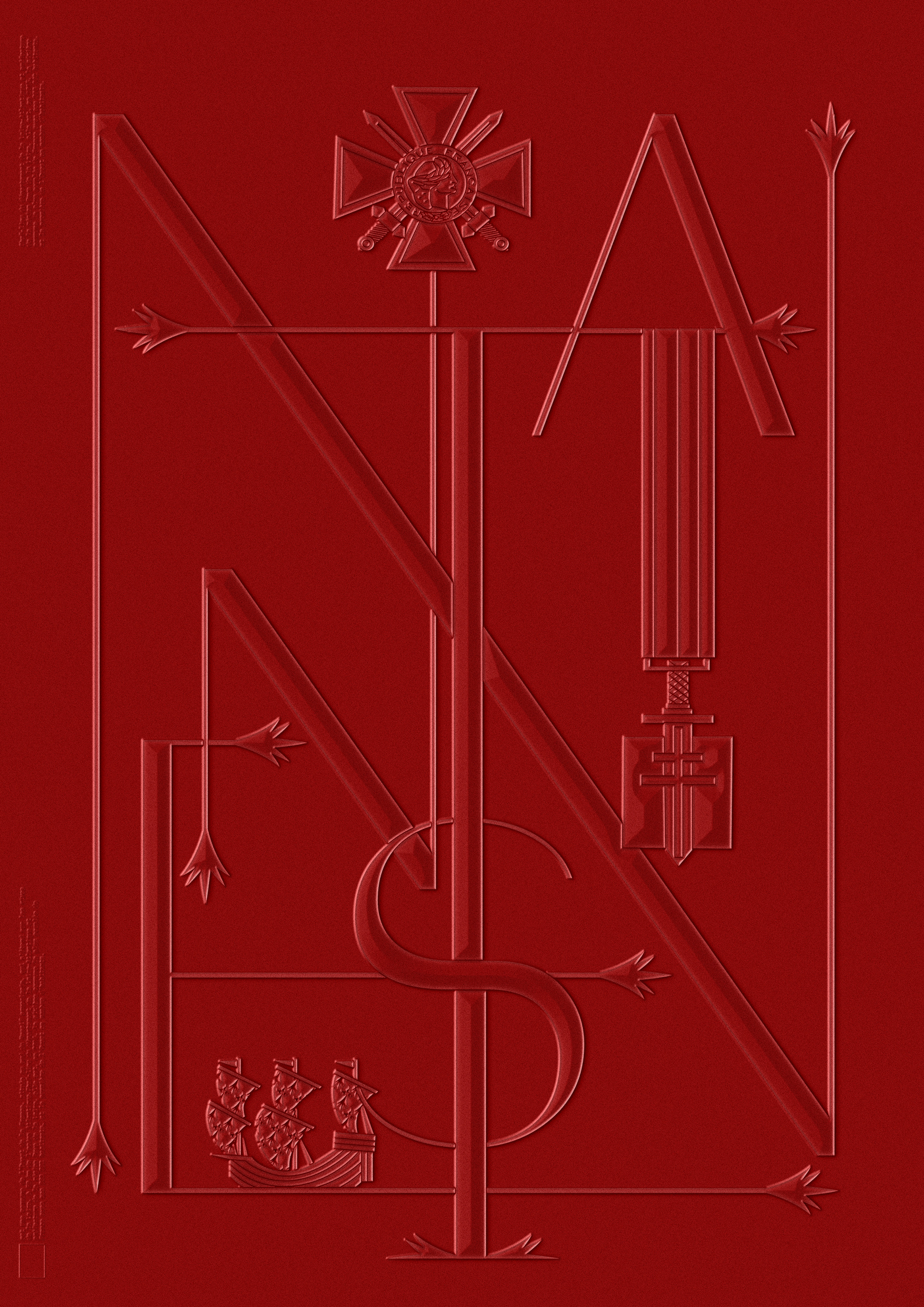
Version 2
Working with a traditional style,
borrowing decorative elements from the city crest,
and creating a custom serif look

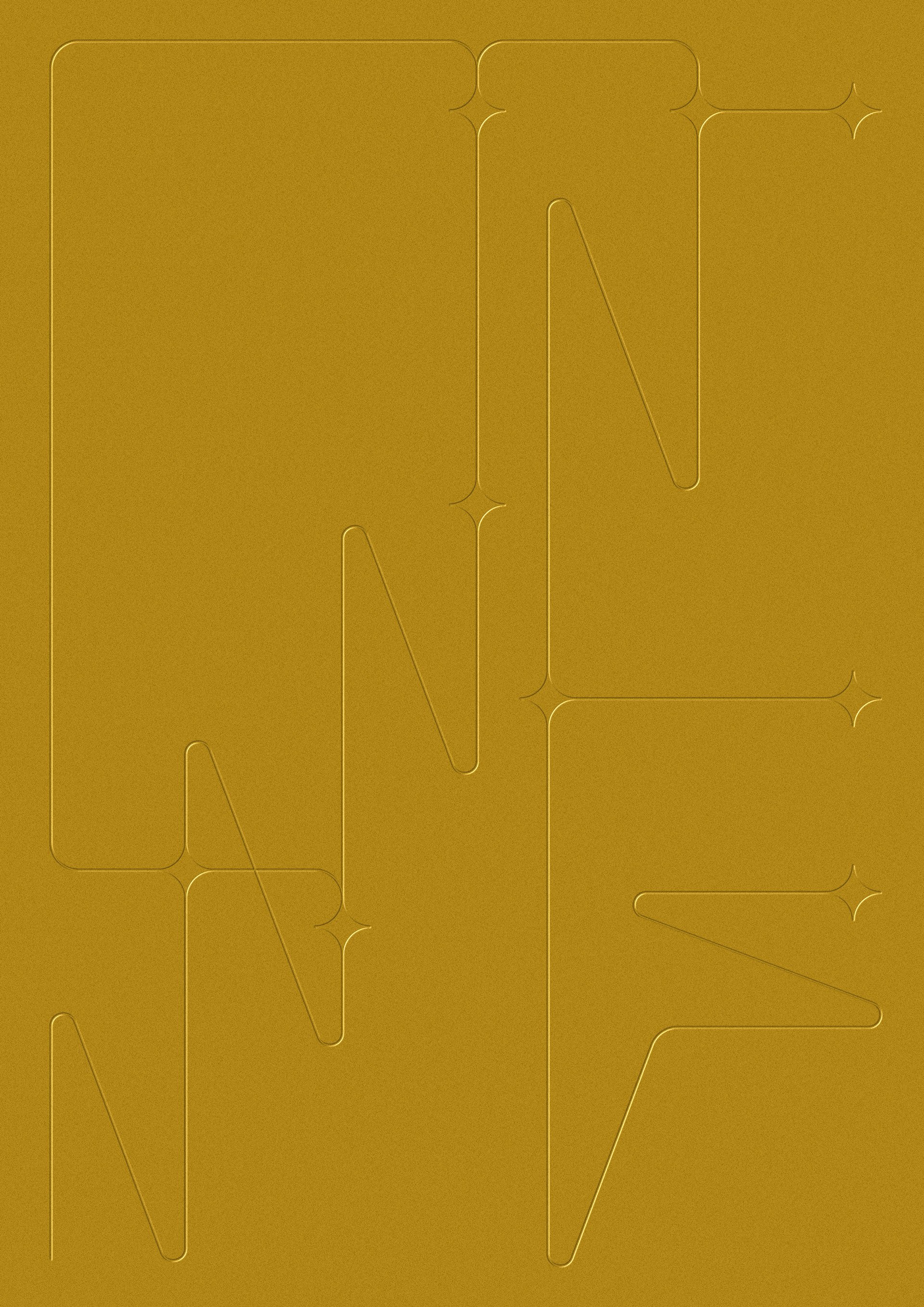
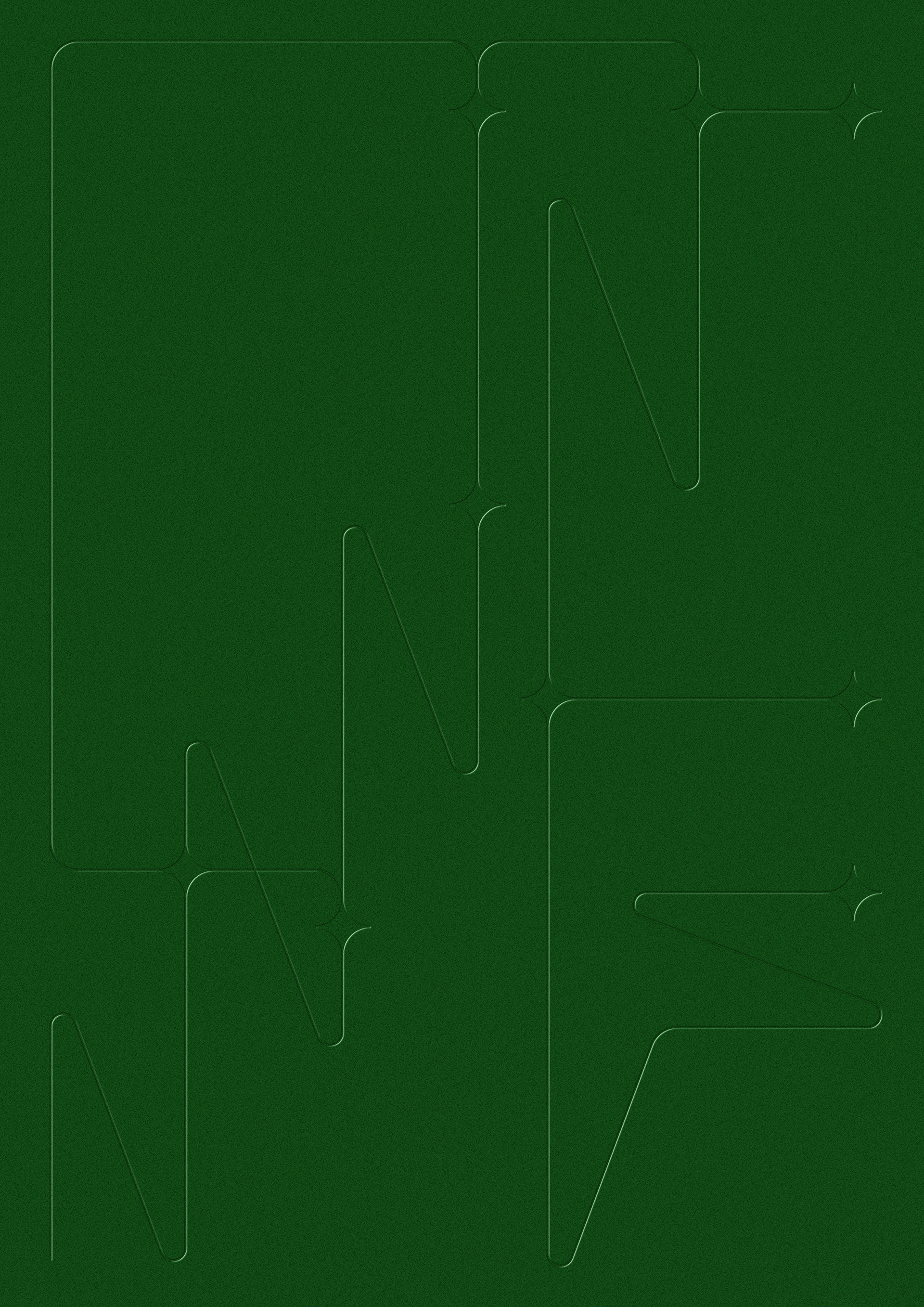
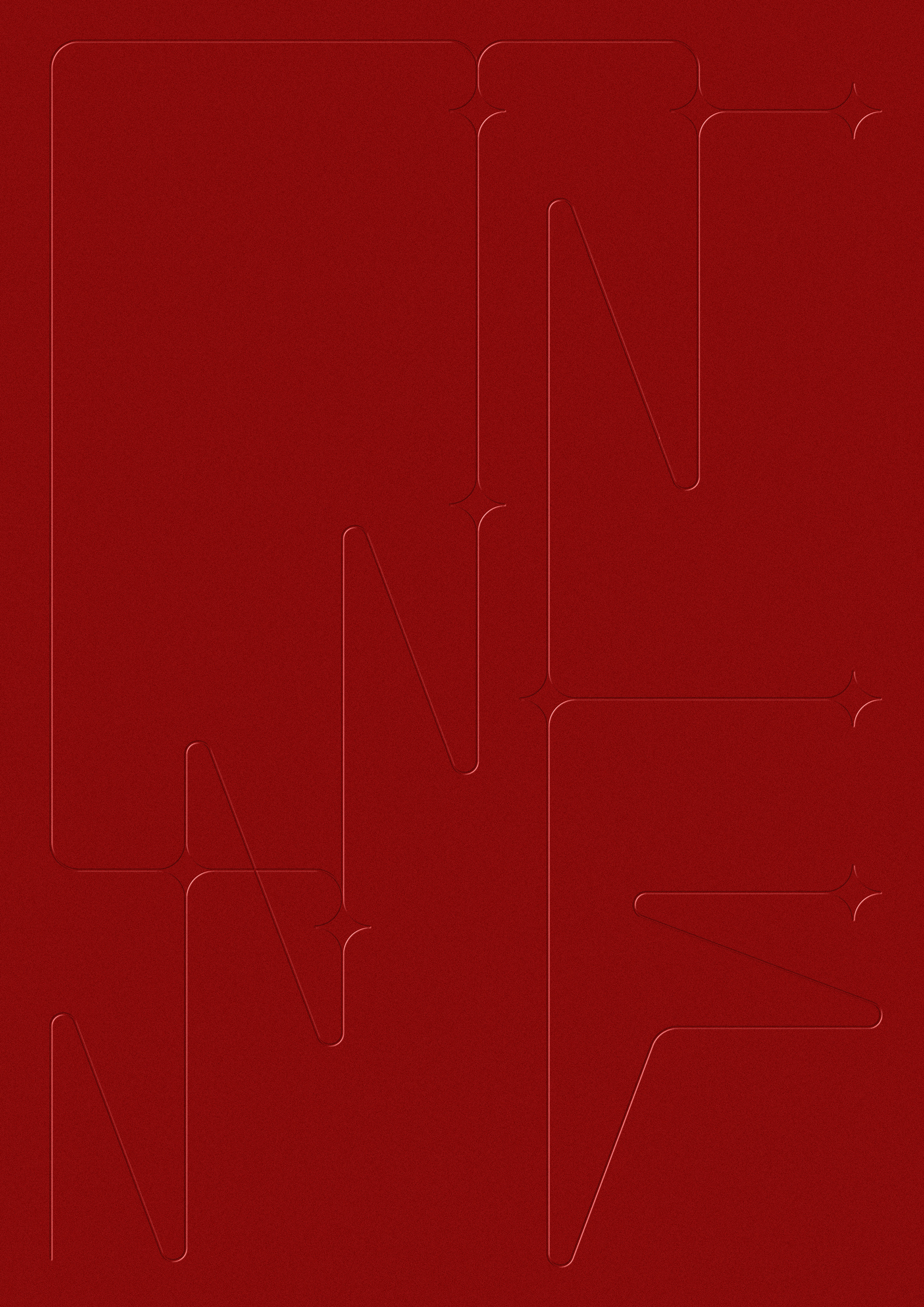
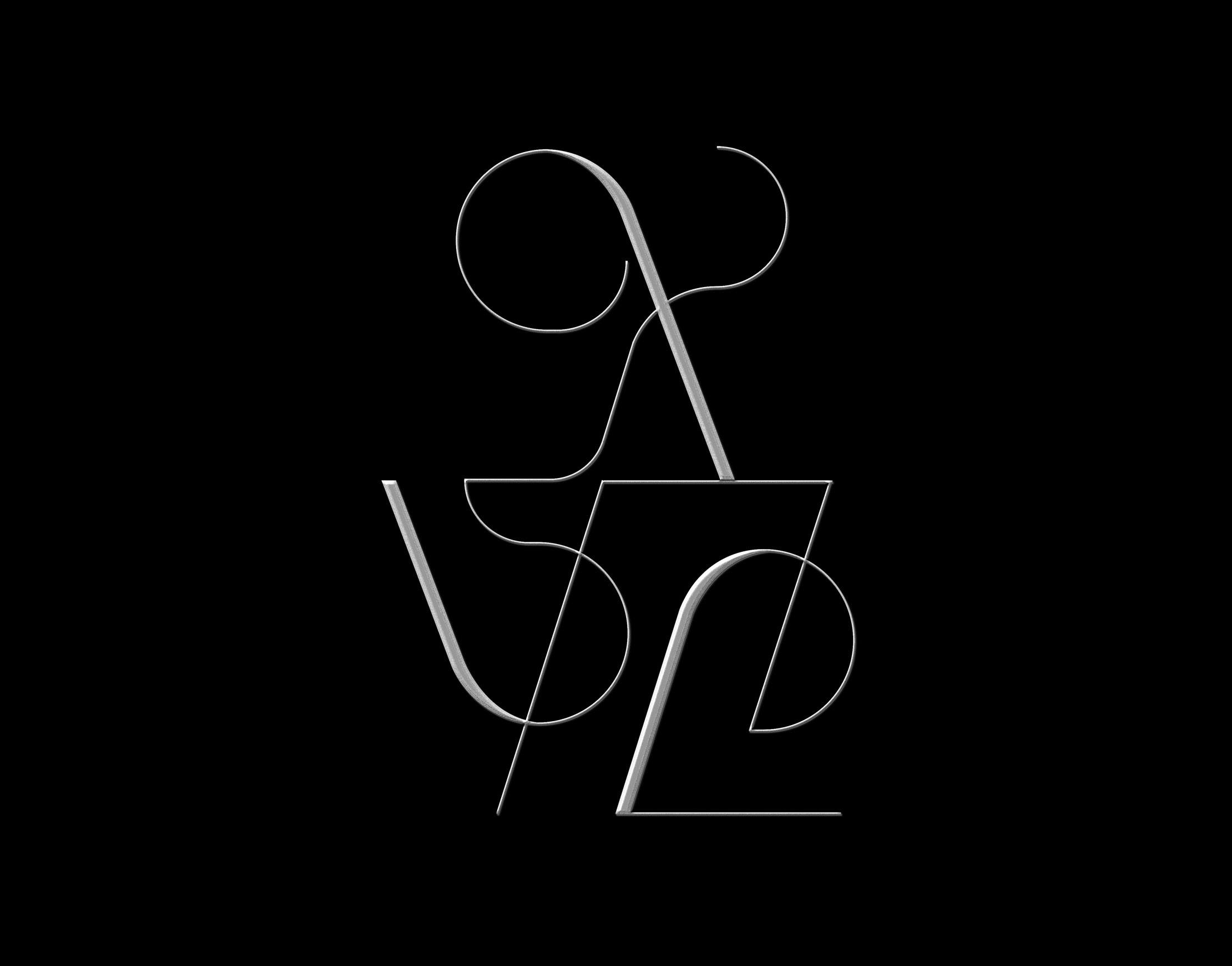
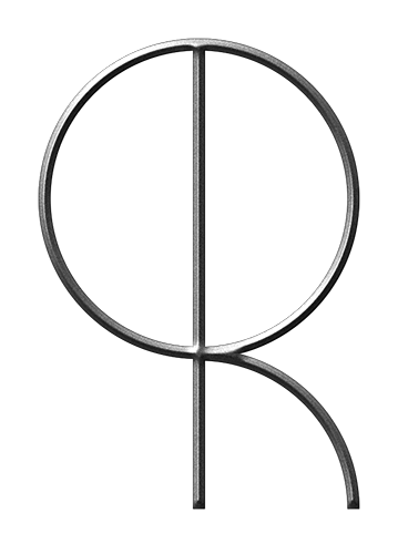
Version 3
Playing with a subtle minimalist approach,
working with lines and interconnecting elements only,
focussing on overall composition within the format,
interpreting the visual flow from the city logo (waves N)