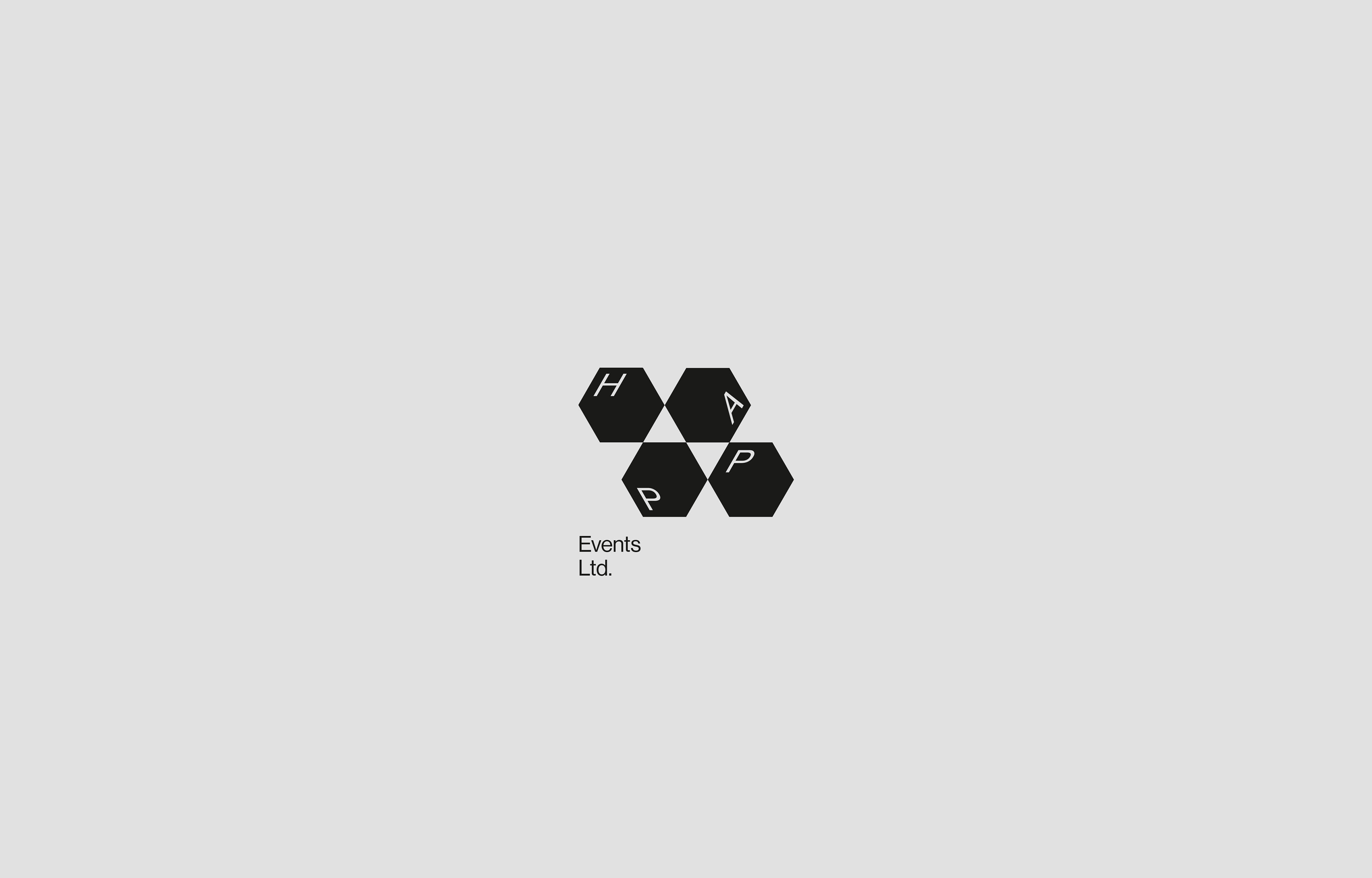
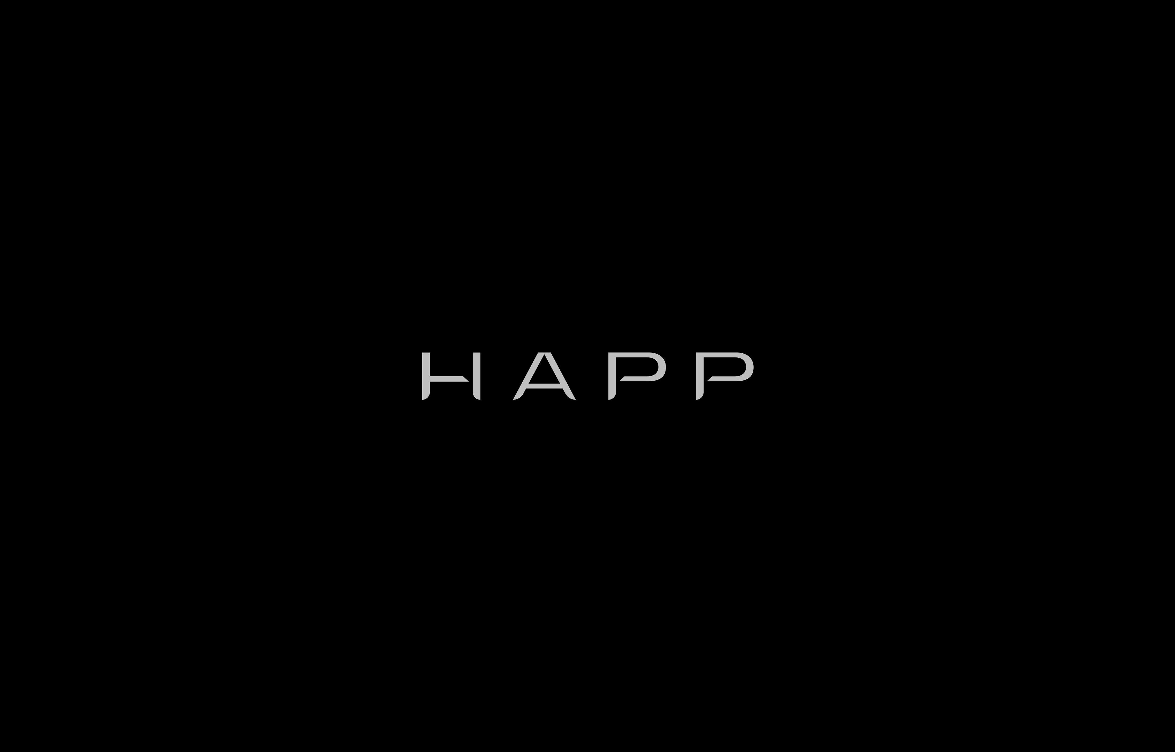
CLIENT
HAPP Events
MARKET / BUSINESS
Event Organizers in the Medical Cannabis Space
THE CONCEPT
HAPP was created from previously independent entities - now coming together to form a hub and global nexus point for events across the medical cannabis market.
I created a simple yet flexible dynamic modular system that underlines their brand mantra: "Clarity & Connection".
The isometric cubes can be rotated and arranged in a myriad of ways.
CLIENT
HAPP – Umbrella Brand
MARKET / BUSINESS
Global Hub and Service Provider in the Medical Cannabis Space
THE CONCEPT
HAPP's mission is to provide access to a global network, independent services, and creative content all supported by technology.
I've developed a bespoke logotype for the umbrella brand, that feels both premium and future-facing.

CLIENT
Toi & Moi
MARKET / BUSINESS
Premium Preservatives
THE CONCEPT
Bespoke logotype for the Haitian market leader for preservatives.
Graphically reminiscent of both pop culture and luxury/fashion.
The two circles are prominently featured on the respective packaging, where they come together
in a vesica-pisces-style, representing 2 individuals making love.
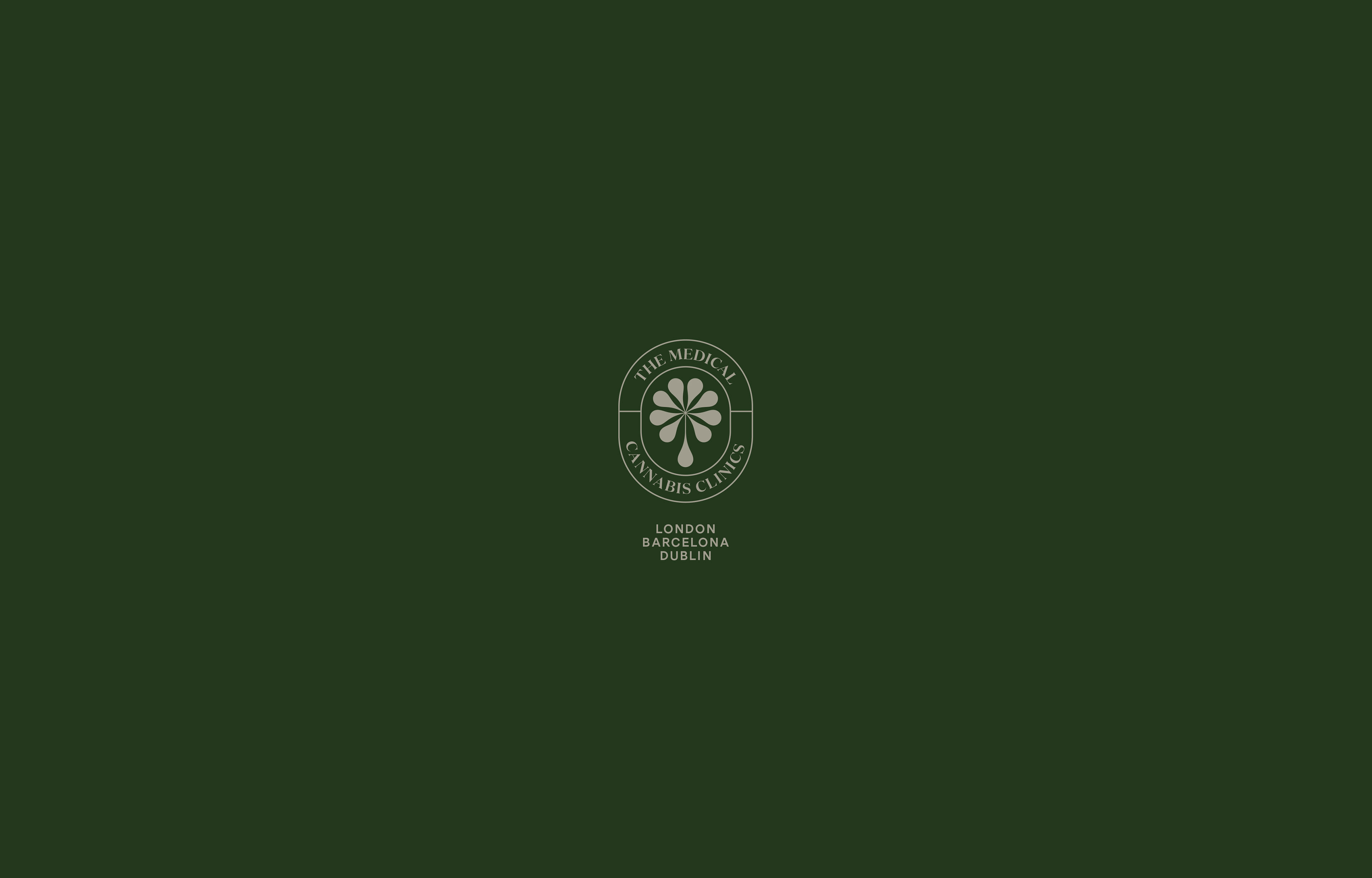
CLIENT
The Medical Cannabis Clinics
MARKET / BUSINESS
Healthcare
THE CONCEPT
Logo proposal for an international network of medical cannabis clinics, mainly focussed on the therapeutic
effects of applying CBD-Oil. The idea behind the logo was to create a simple and timeless geometric shapes,
that fits in the healthcare and wellness market, but at a second glance reveals a cannabis leaf hidden in the negative space,
from which the healing extract flows forth. The boutique-style typesetting supports the luxury characteristics
and patient centered philosophy of the clinics.

CLIENT
KörperKolleg
MARKET / BUSINESS
Physical Health
THE CONCEPT
KörperKolleg { ger. = Body / Collegium } offers consultation and therapeutic services based on the KAP-formula
(Kompetence, Attitude, Performance) – a process driven, salutogenesis focussed approach.
I created a K-K monogram from one basic geometric shape, that when rotated reveals a stylized human figure.
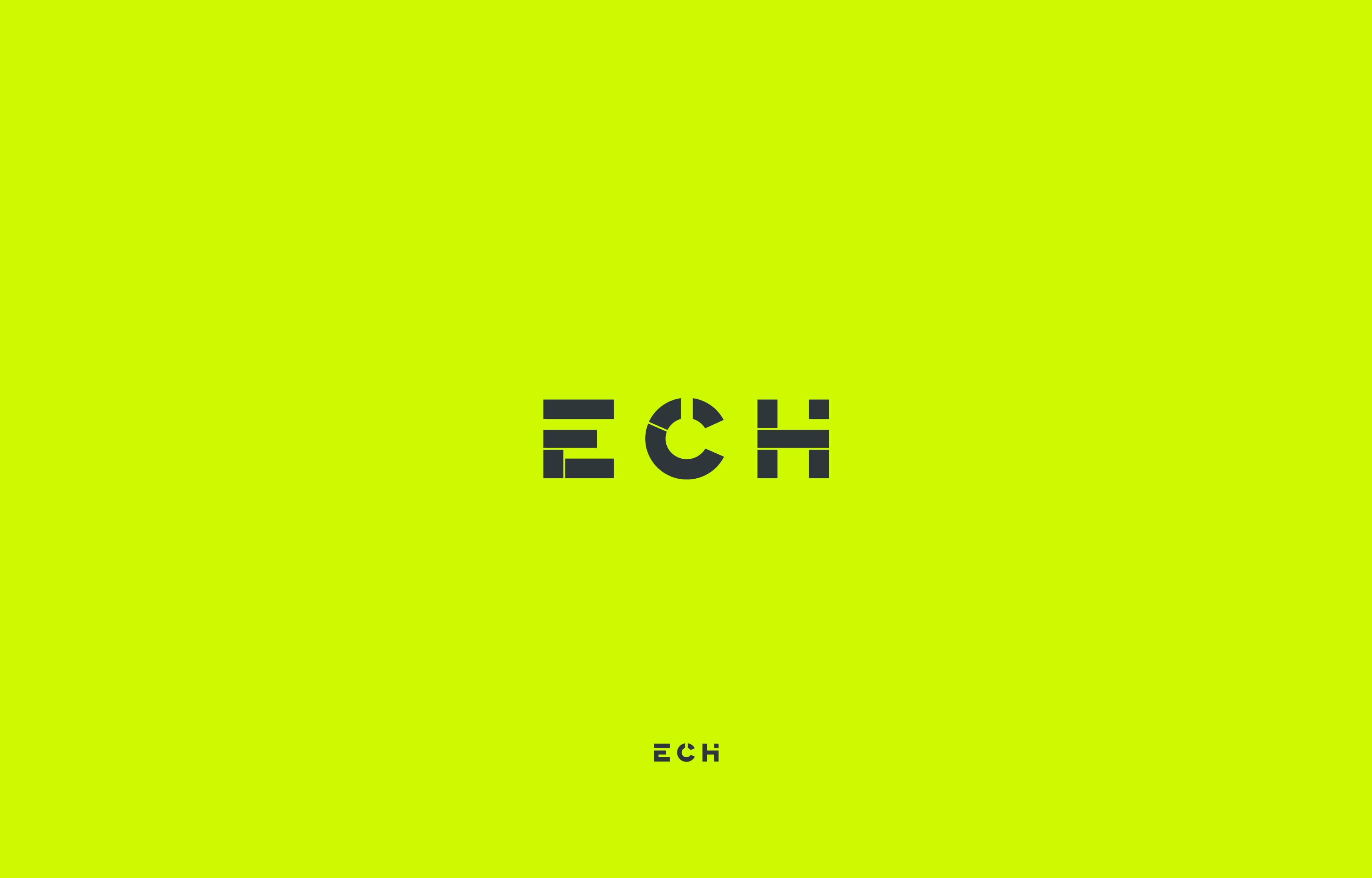
CLIENT
European Cannabis Holdings
MARKET / BUSINESS
Medical Cannabis
THE CONCEPT
ECH is on a mission to shape the future of cannabis. They are building the infrastructure that will make cannabis more readily acceptable and accessible. by providing venture capital, exceptional talent and operational excellence to a fast-growing portfolio of companies.Inspired by their tag line "Shaping the Future of Cannabis" I've developed a set of logo strategies to visualize their progressive approach and scope of services, all with a modern and financial undertone. At the end of the process they chose the graph and diagram inspired bespoke logotype.
ECH is on a mission to shape the future of cannabis. They are building the infrastructure that will make cannabis more readily acceptable and accessible. by providing venture capital, exceptional talent and operational excellence to a fast-growing portfolio of companies.Inspired by their tag line "Shaping the Future of Cannabis" I've developed a set of logo strategies to visualize their progressive approach and scope of services, all with a modern and financial undertone. At the end of the process they chose the graph and diagram inspired bespoke logotype.
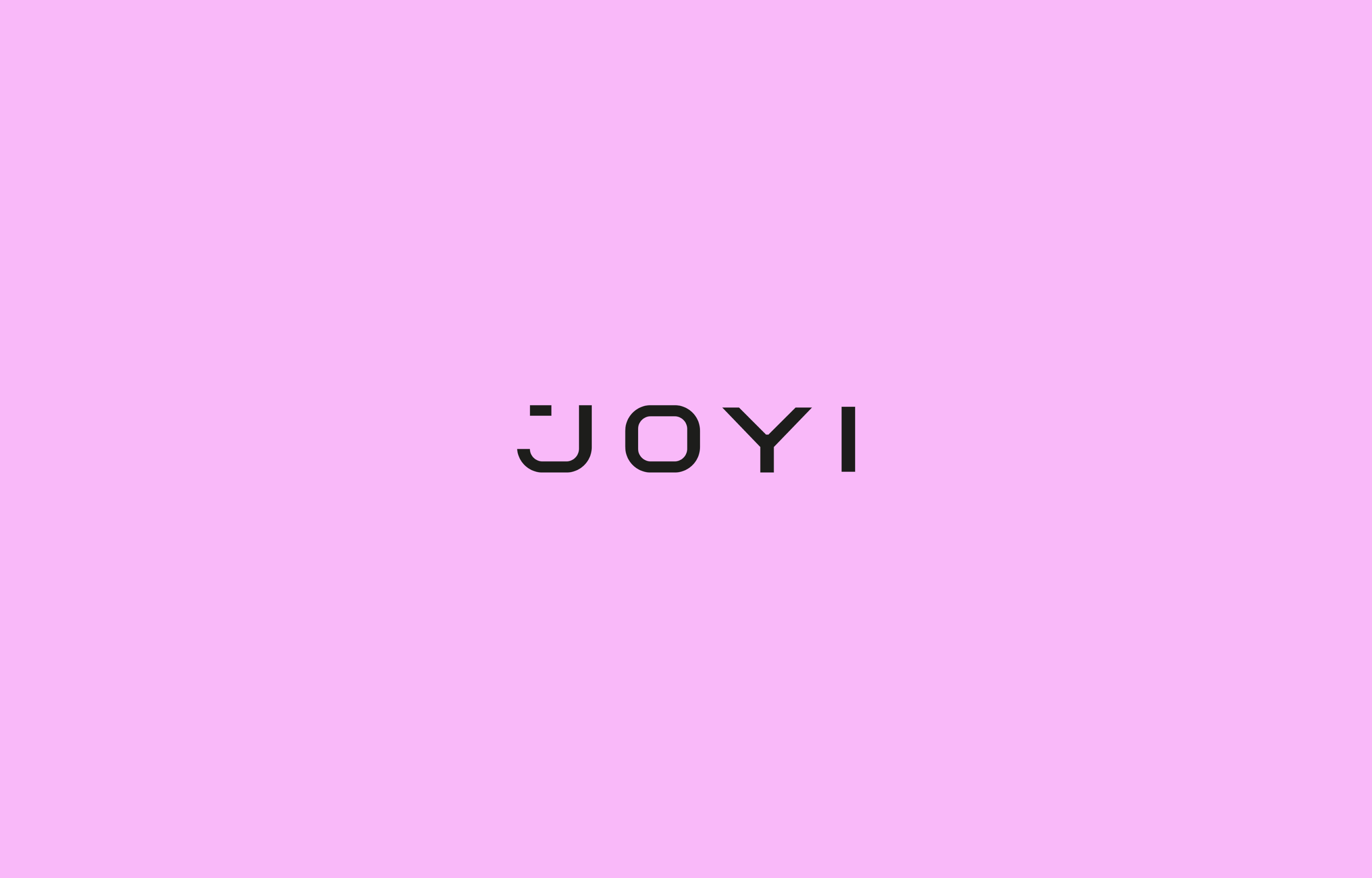
CLIENT
J O Y I
MARKET / BUSINESS
Premium Preservatives
THE CONCEPT
Bespoke logotype for the Haitian market leader for preservatives.
The clean logotype is dressed in various textures to communicate the product features
across a broader range..
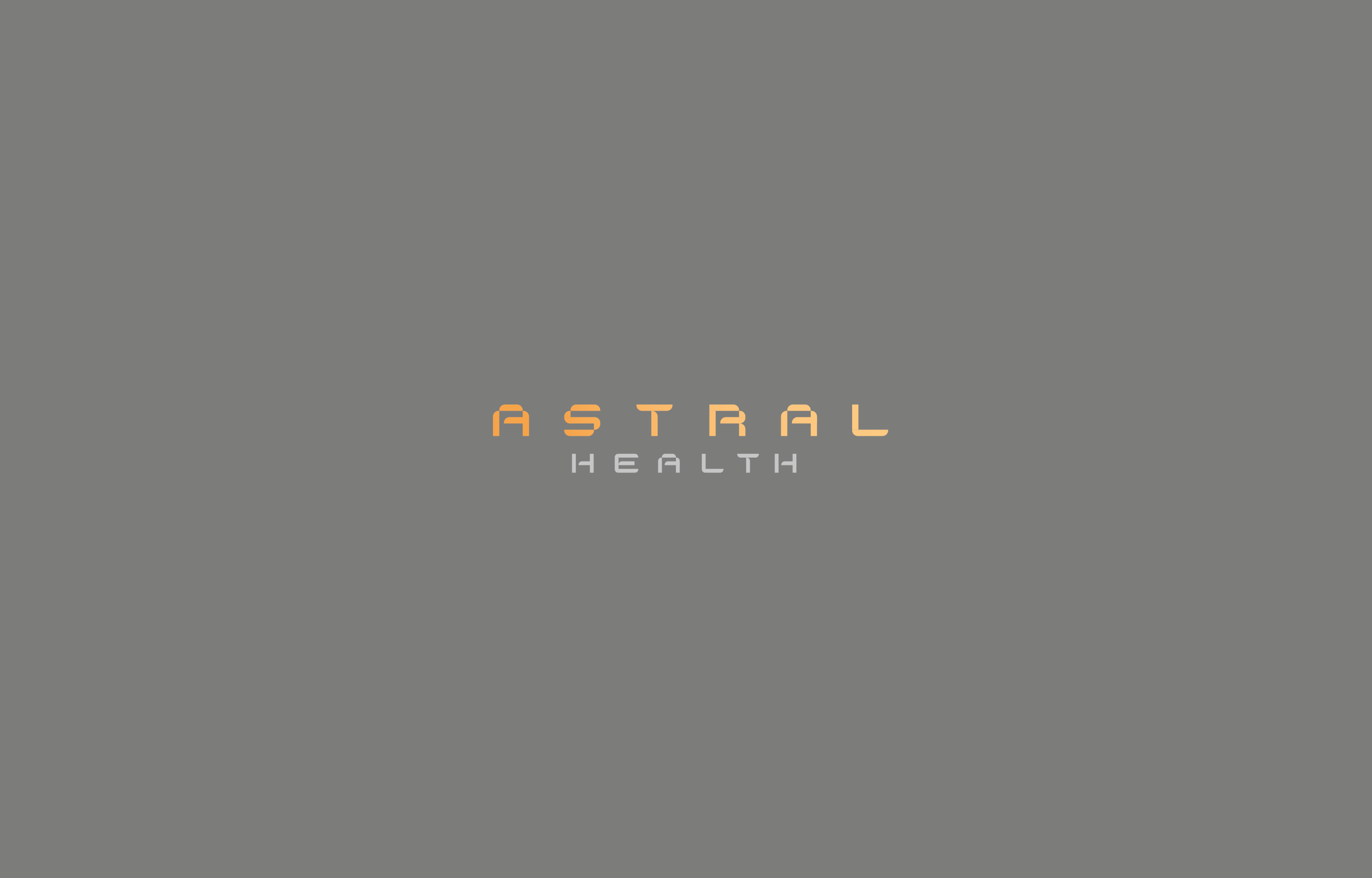
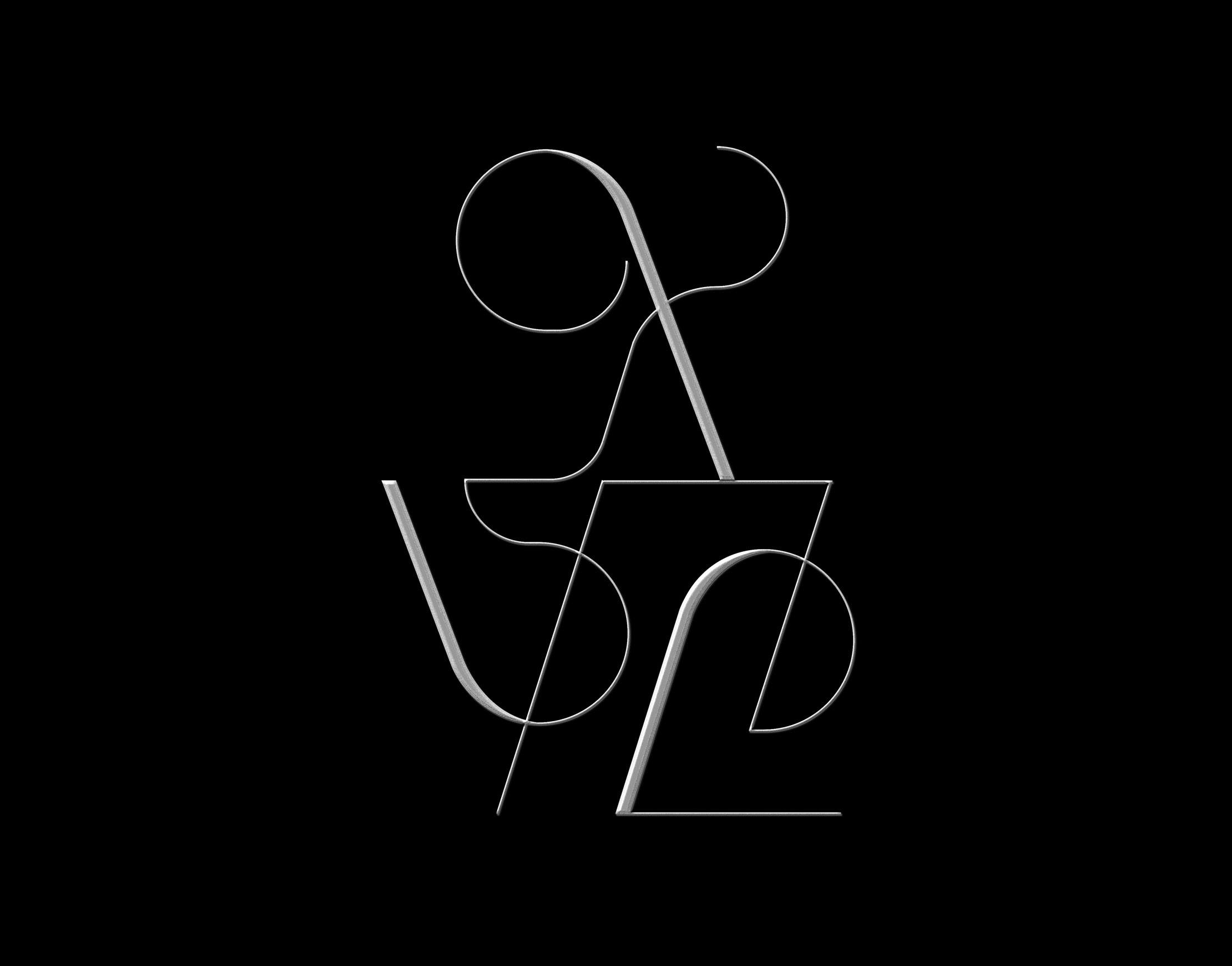
CLIENT
Astral Health
MARKET / BUSINESS
Medical Cannabis Import
THE CONCEPT
Astral Health facilitates the licensed import of approved medical cannabis products on an ongoing contractual basis – supported by range of commercialization services. I've developed a fully bespoke logotype for them, alongside an avatar element for use on social media. Their space-inspired naming lead me to an unapologetically futurist approach to the brand aesthetic, reflected in both elements.
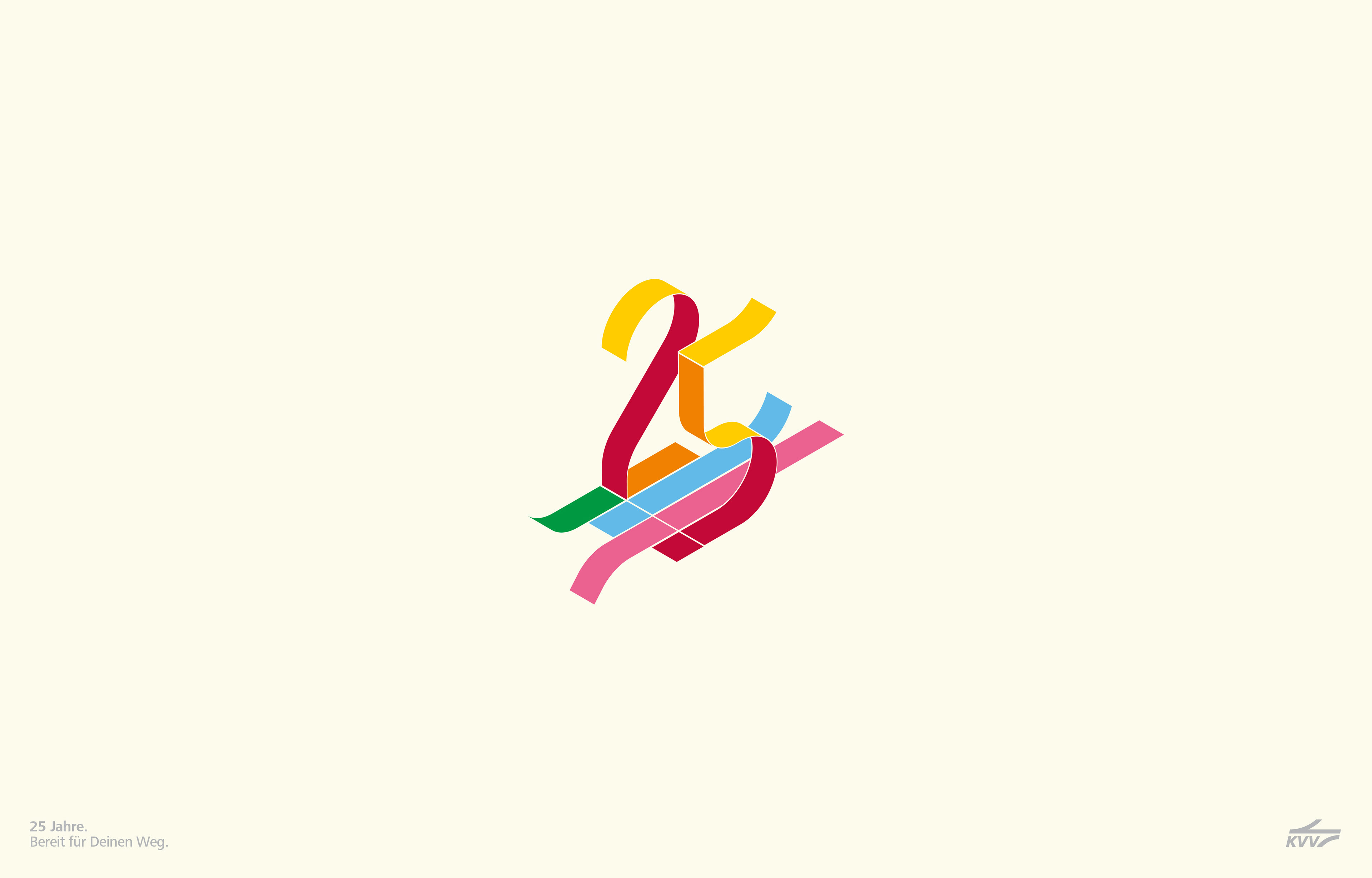
CLIENT
KVV
MARKET / BUSINESS
Public Transportation
THE CONCEPT
The Karlsruhe-based public transport service provider KVV celebrates their 25 year jubilee in 2019.
Together with the agency ixtacy I've developed various approaches for the logo design to be used across various campaigns.
The solution on display above is inspired by the typical plans found in subways, or on bus stations - visualizing the various routes and connections
via color. The agency I cooperated with developed the accompanying slogan which translates to "25 Years - Ready for your Journey."
A populist approach inspired by logos usually found in the realms of international sport events, such as the olympics.

CLIENT
Lake Health
MARKET / BUSINESS
Narcotics Import and Distribution
THE CONCEPT
Lake Health's services consist of importing a range of regulated narcotics into Ireland and distributing these to a range of scientific
and medical companies across the country, from apothecaries, to laboratories or larger factories. I aimed to create a clean, conservative and medical B2B look.
The resulting logo conveys the following aspects: 1. L & H Monogram 2. Medical Cross 3. Import (Letter L) and 4. Distribution (outward facing arrows)
all while staying within the confines of contemporary minimalism.

CLIENT
Phantom
MARKET / BUSINESS
Premium Preservatives
THE CONCEPT
"Forget it's there – Make it unforgettable."
A modern minimalist bespoke logotype - playing with the idea of disspearing and making use of only the most essential elements in typography.
Developed for the market leader in premium ultra-thin preservatives in Haiti.

CLIENT
Dispensary Green
MARKET / BUSINESS
Medical Cannabis Dispensary
THE CONCEPT
Visual mark for an up and coming dispensary in the United Kingdom.
A reductionist and modular mechanic is utilized, to create a medical cross from stylized leaves.
CLIENT
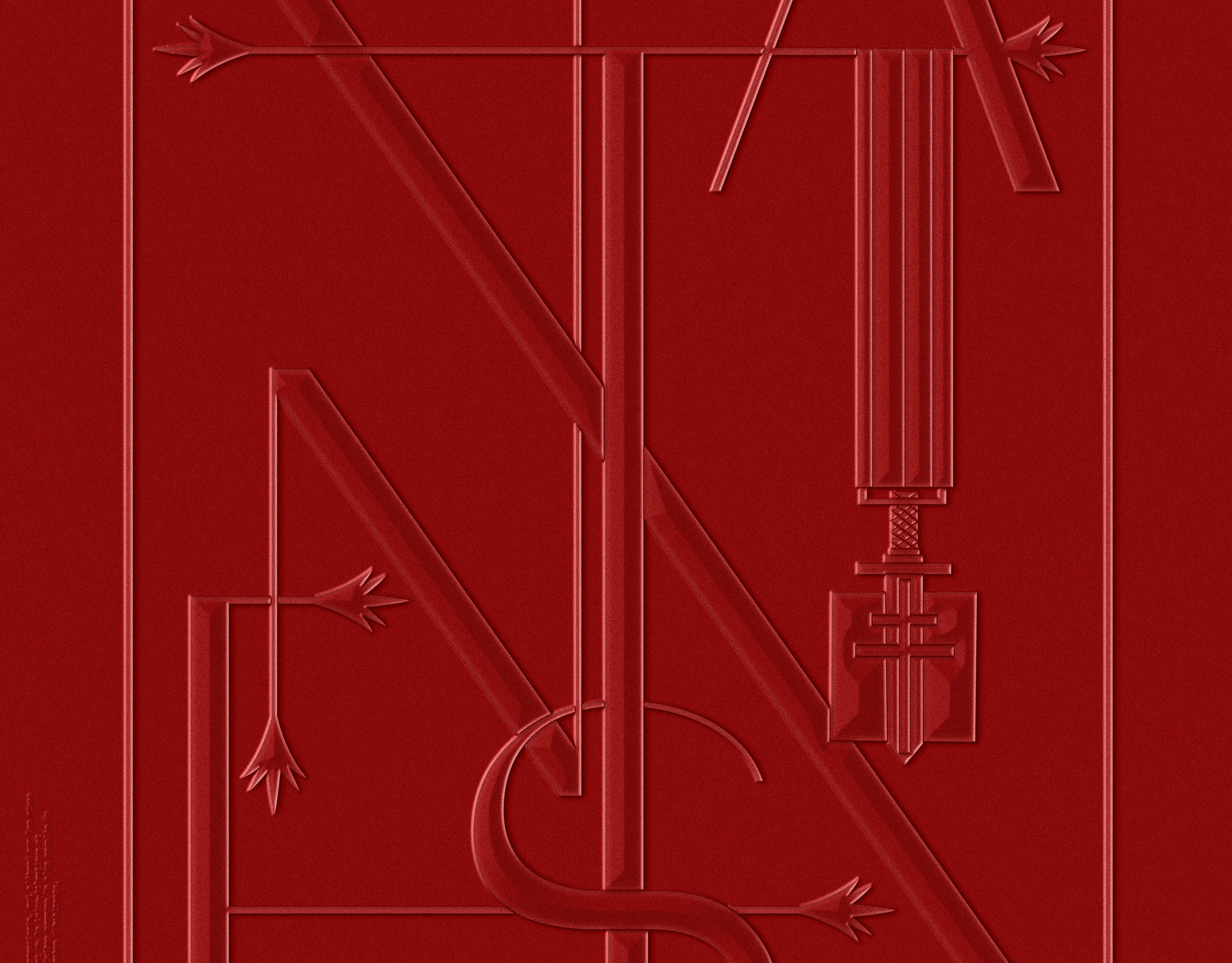
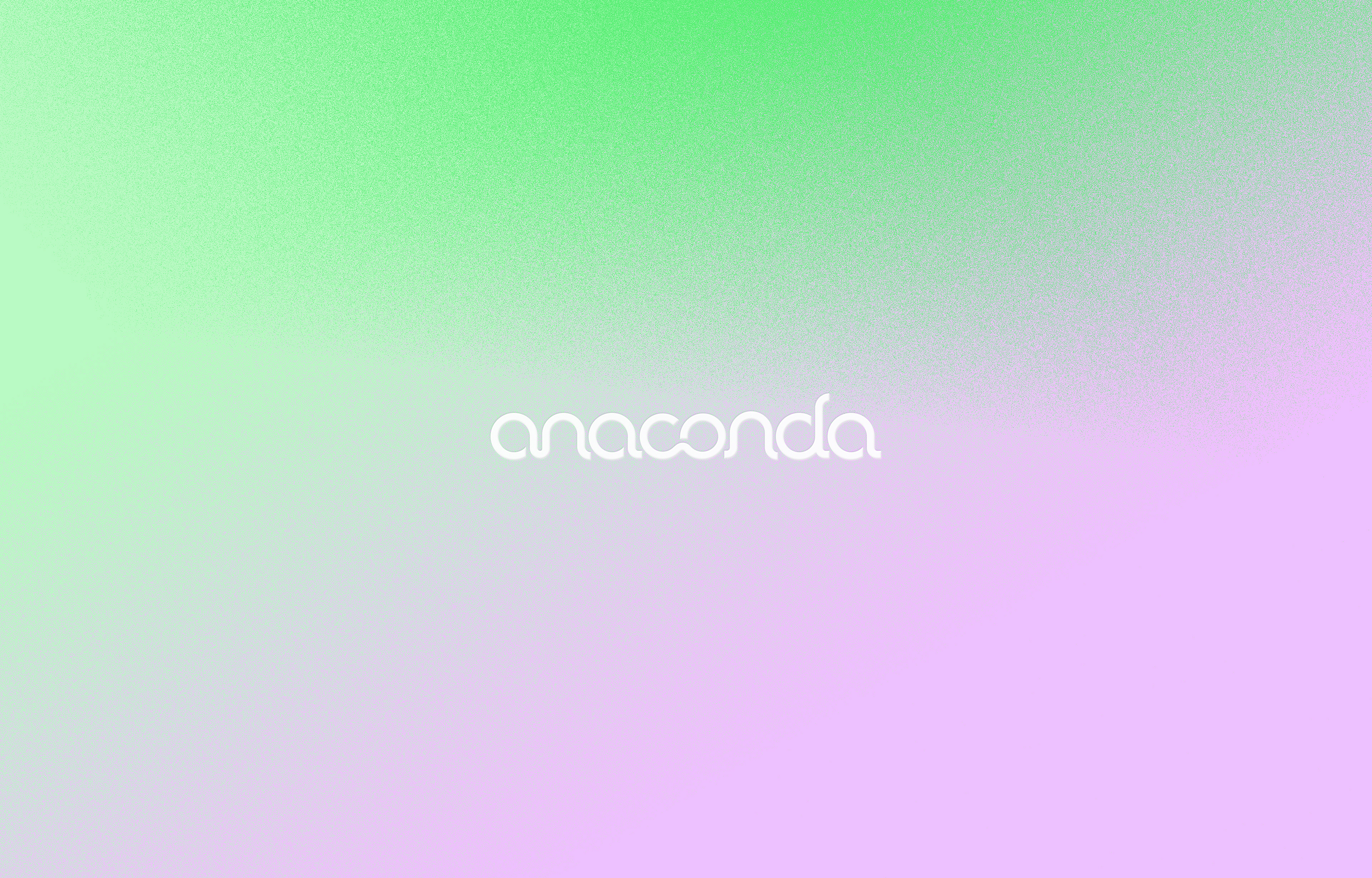
Anaconda
MARKET / BUSINESS
Premium Preservatives
THE CONCEPT
Bespoke logotype for the Haitian market leader for preservatives.
Inspired by the brand name, the lowercase typographic solution has subtle snake-like features.
The brand is offering XL-sized products.
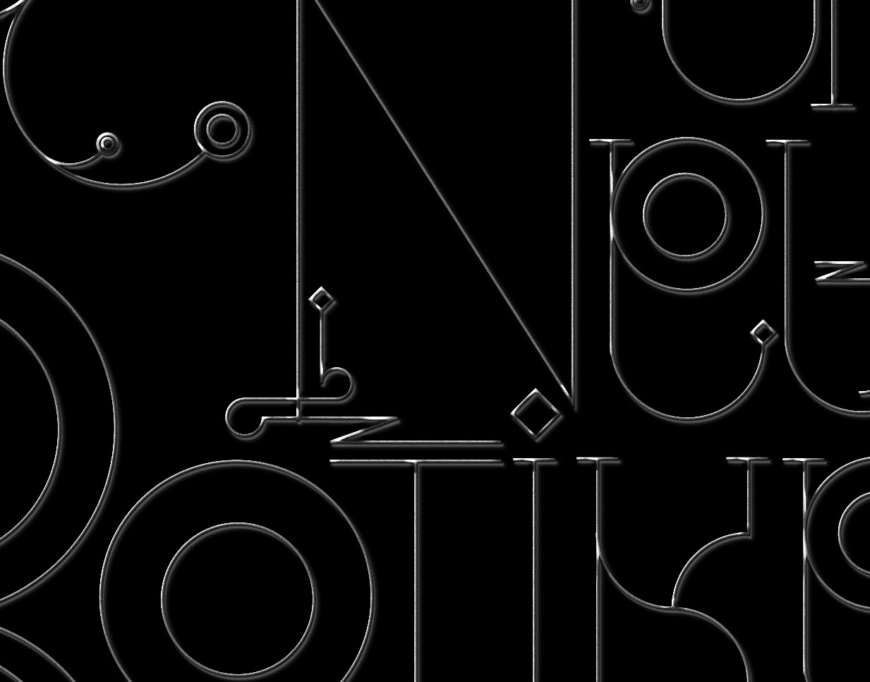
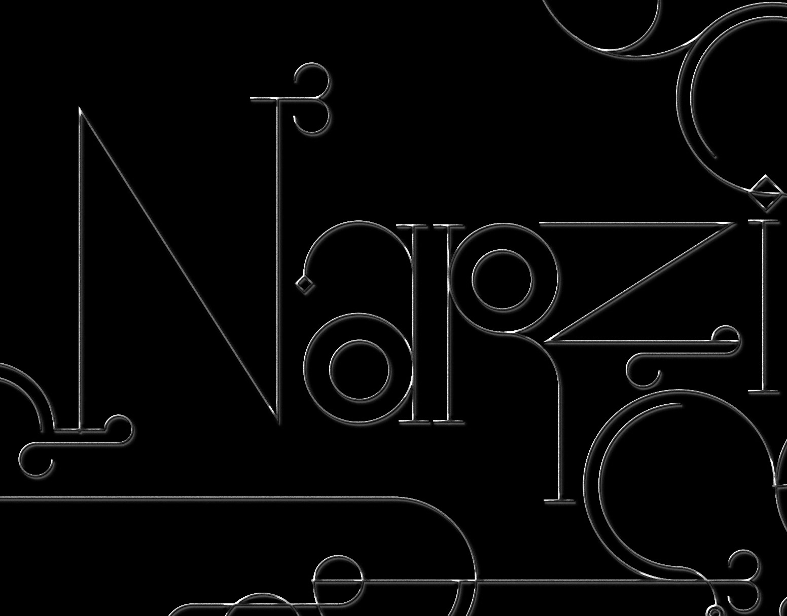
Thank you for scrolling.