About:
Vardama™ is a fashion / technology start-up, with a proprietary textile formula, making any kind of fabric (such as cotton, silk, tinsel or linen) repellent to all water-based liquids, such as red wine, cranberry juice or sports drinks.
At the same time the fabrics maintain all vital elements of modern day fabrics, such as their feel and breathability all while adding additional moist-wicking features. I had the opportunity to lead the brand from their intermediate start-up look and feel to a mature corporate design.
The Challenge:
Create a modern Classic
Versus a Start-Up Look
Versus a Start-Up Look
The objective: Not drowning the company in the oversaturated landscape of fashion start-ups and emphasizing the technology and functionality aspect in a way that doesn't read sport or active wear but instead maintains a luxury brand profile. Creating an online shopping platform that goes beyond a templated feel, but is easy to maintain and grow.
All at a small budget and using existing image material, while trying to compete with established and classical brands in places like Nordstroms or Bloominddale's.
The Approach:
Skipping a contemporary start-up feel and instead building a modern yet time-less brand with character and confidence and a meticulous attention to detail. Making the most out of existing image material by adding new layers of retouching and image enhancements. Delivering an online shopping experience that feels technically and visually sophisticated, yet being ground in minimalism. For a long term vision of the brand, think Apple meets Saint Laurent.
Branding Elements:
Logo & Avatar:
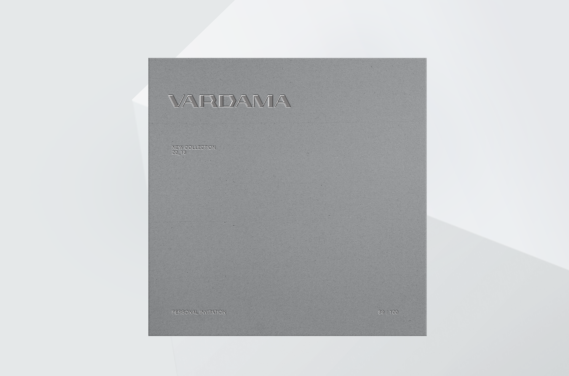
100% custom lettered and meticulously spaced, the brands' new logotype is technical, futuristic, unapologetic and luxurious. The idea to create a durable modern classic that feels at home with the likes of Versace, Prada or Burberry and doesn't have millennial start-up written all over it, also marked the inception point for the overall design philosophy of the brand.
Material Design
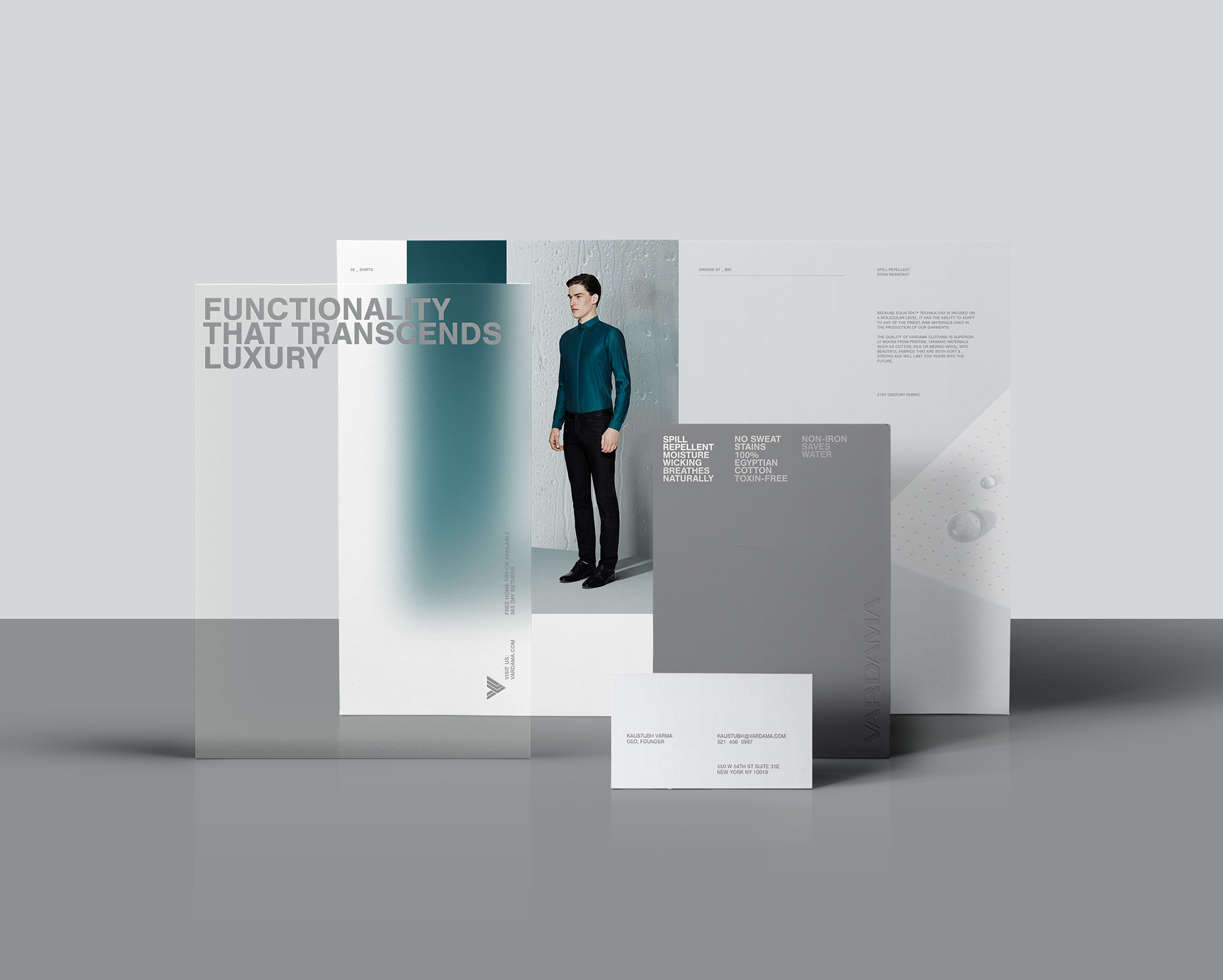
Black as the Fashion-Classic is replaced with a set of silver-blue hues, emphasizing the Tech Aspect of the Brand, while making the Brand lighter, futurist and still allowing for a whole Range of seasonal and Campaign dependent Splashes of Color, throughout the minimalist Make-up.
A color spectrum and effect-rich, yet minimalist design approach inspired by water in its various states. Transparent, reflective, glossy and obscuring printing materials and finishes are used to provide higher resolution and depth to the silver-only approach, while providing the necessary technical overtones. Some materials are later digitally emulated in the brands' on-screen media.
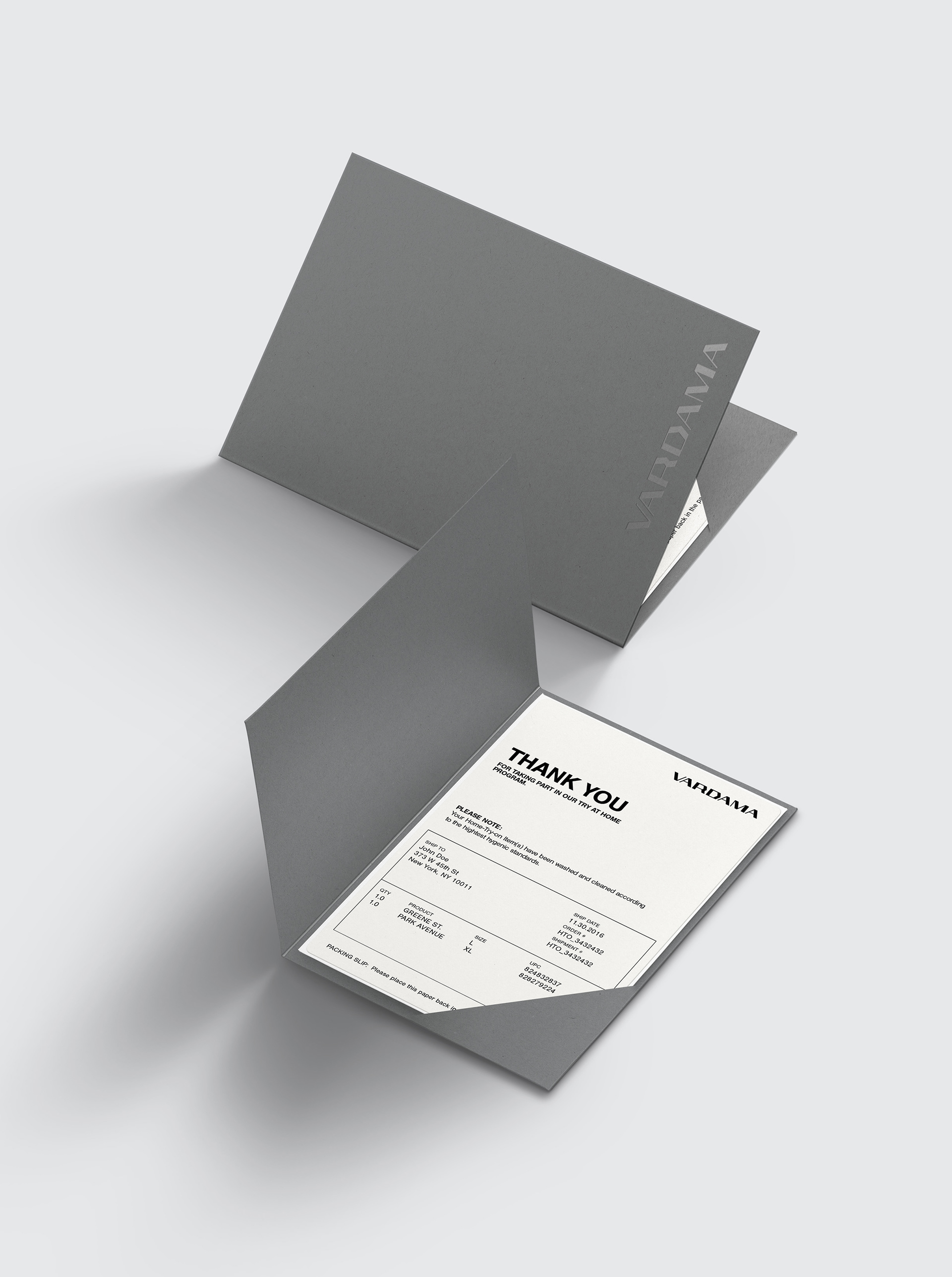
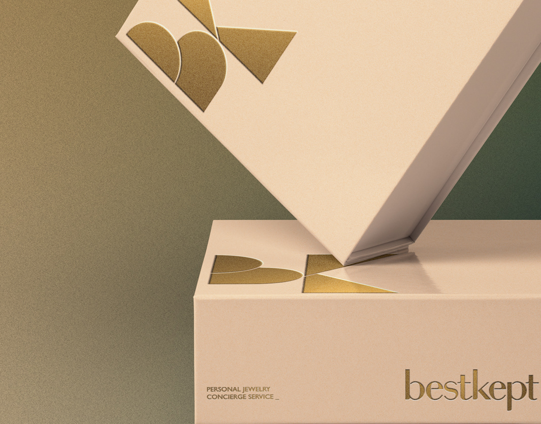
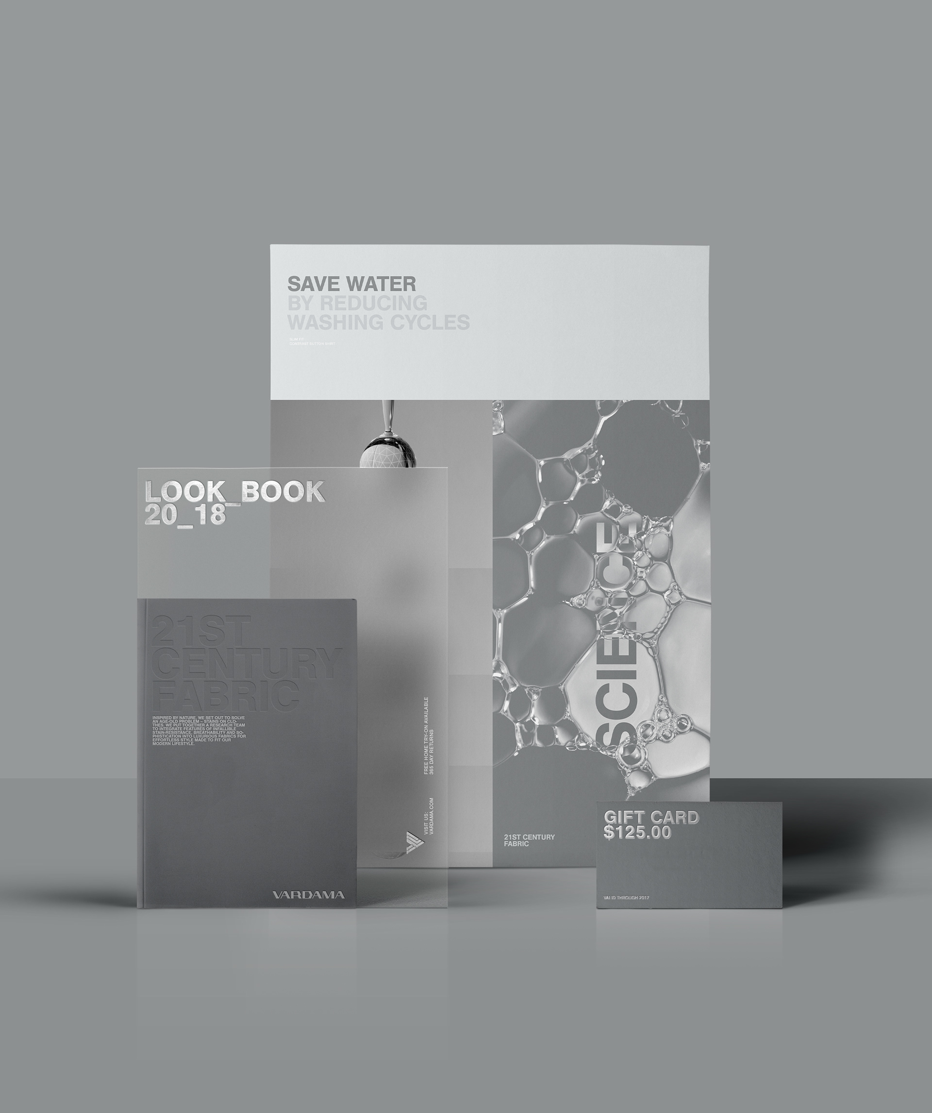
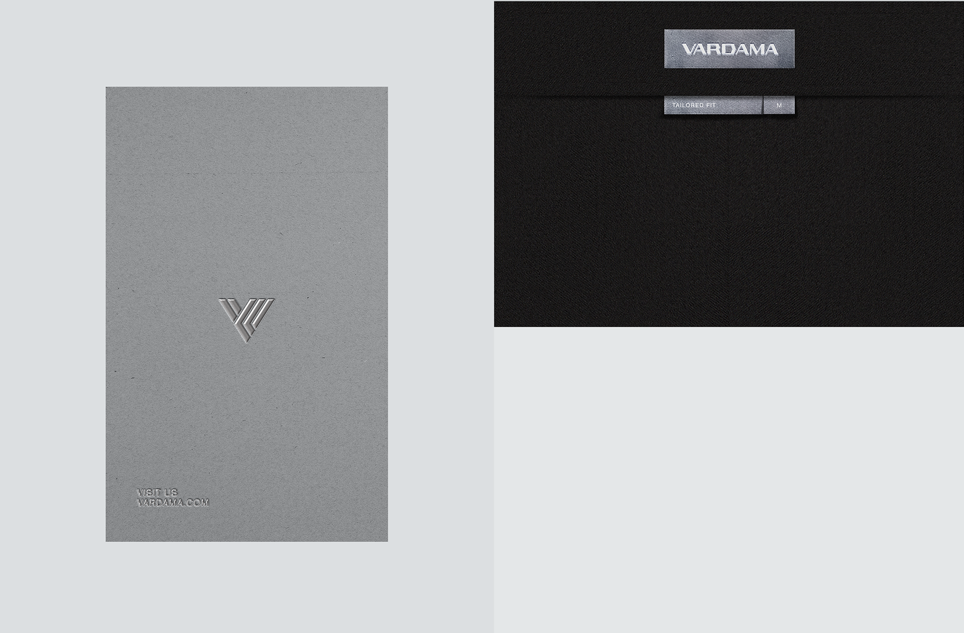
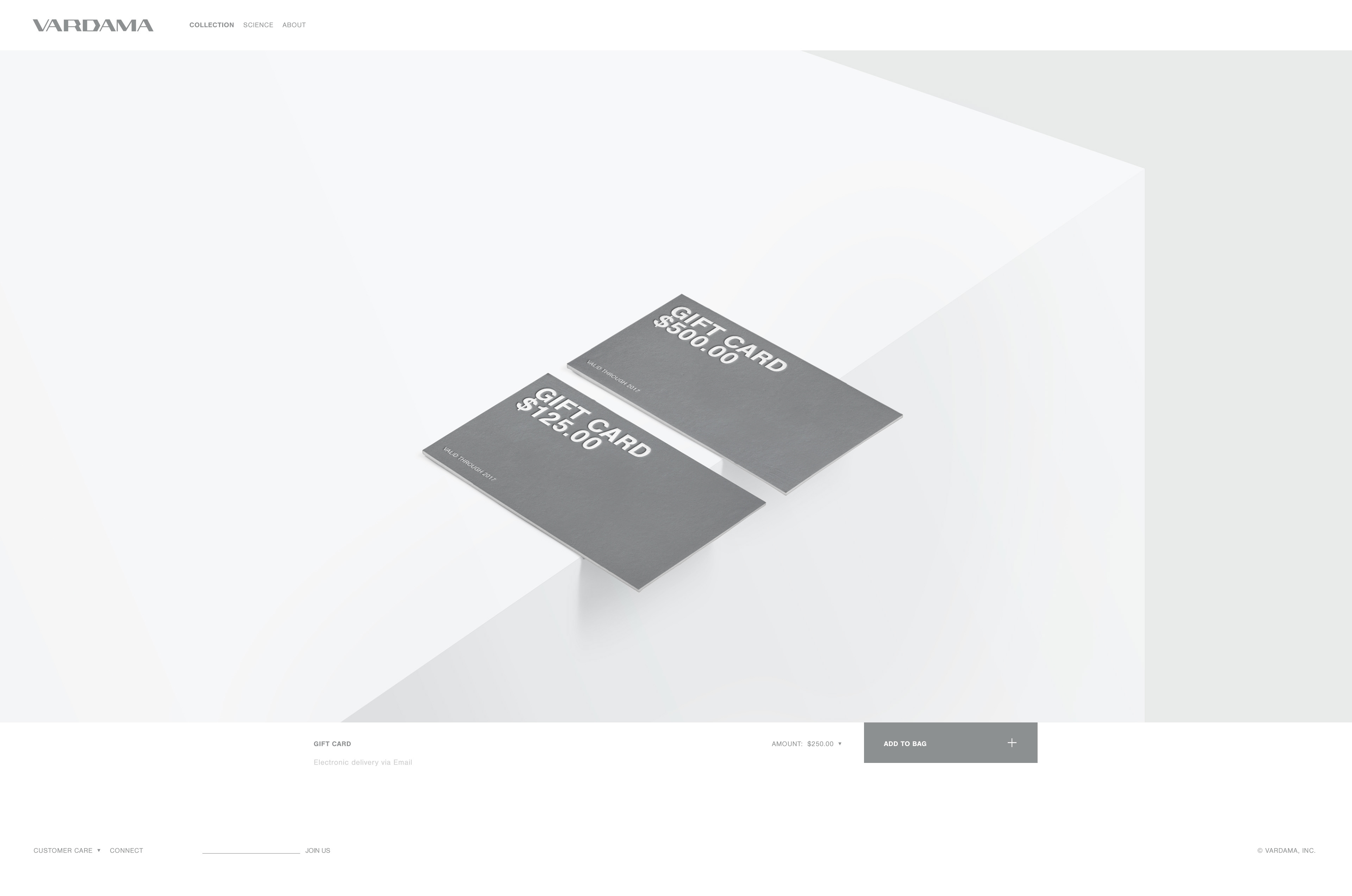
Packaging, Card & Hangtag for the actual Shirts
Understated, technical, use of UV Spot
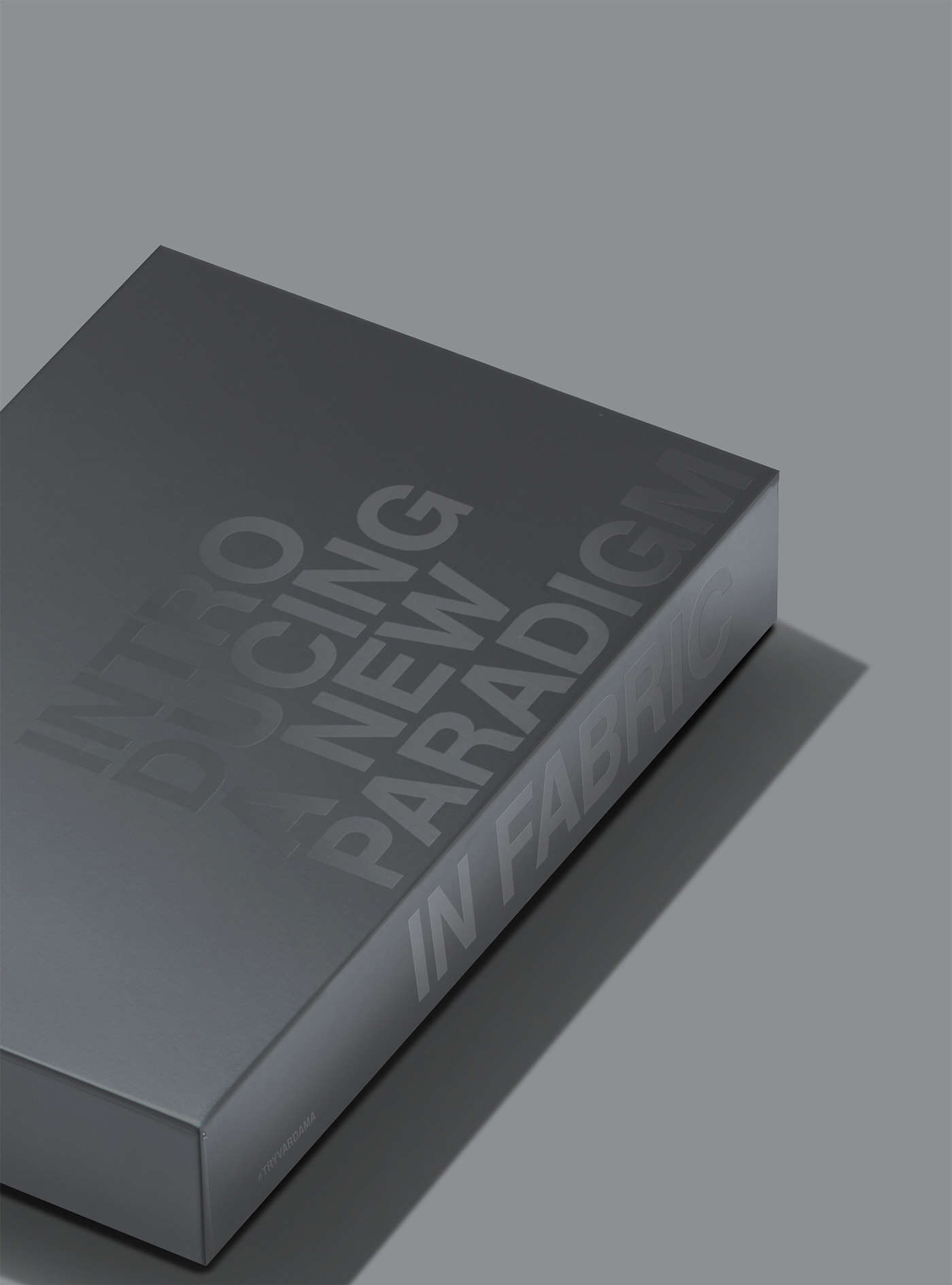
(Above: Try at Home Packaging)
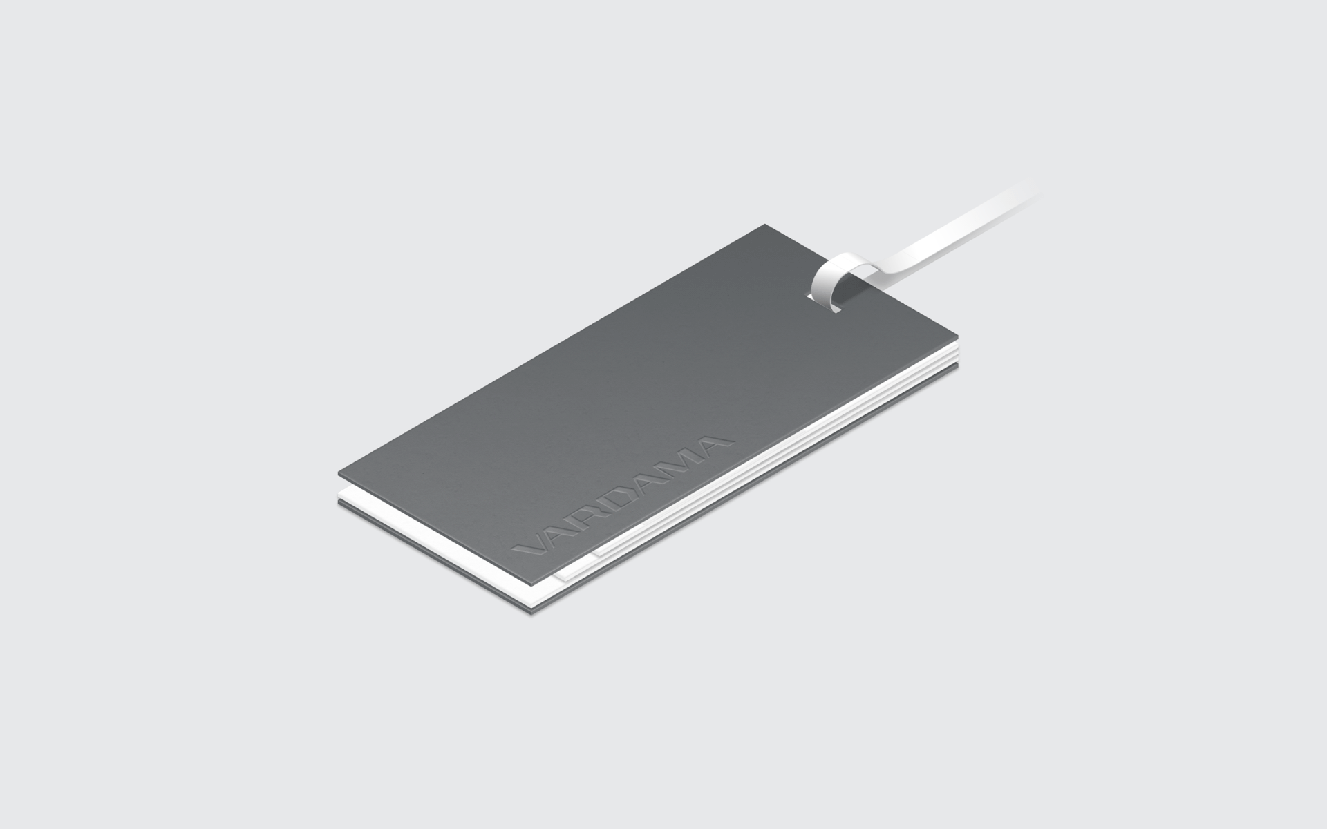
The Hangtag
Luxurious & Informative
A special Solution needed to be found for the Hangtags, informing potential buyers about the technology and benefits. This resulted in a 4 piece design on heavy paper, utilizing Spot UV Gloss to highlight the various features, showing them both - all at a quick glance, and providing the option to read about each of the 3 main features in detail.
The back of the Hangtags also carried custom Vardama Collar Stays in a semi-transparent Paper Bag.
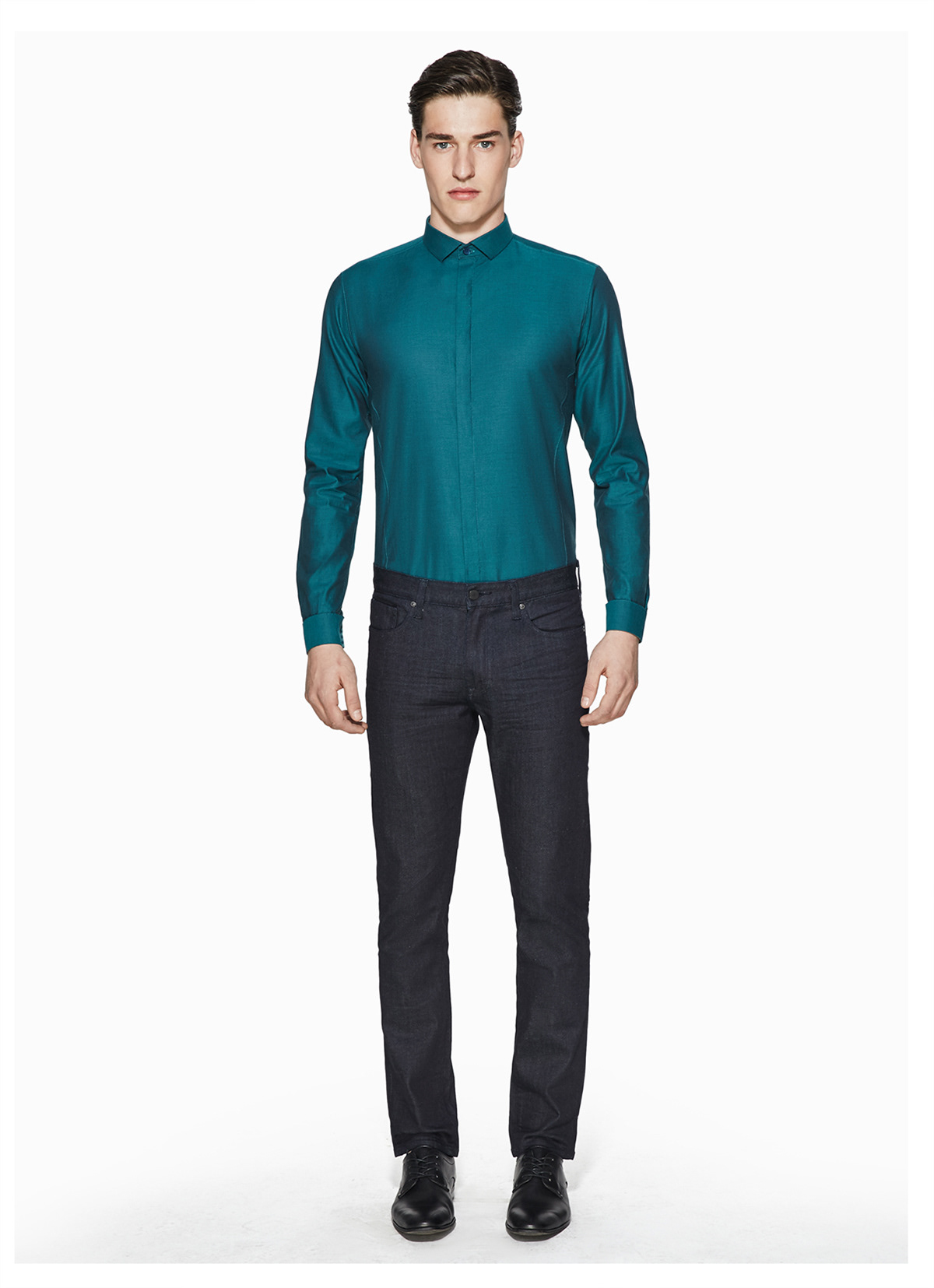
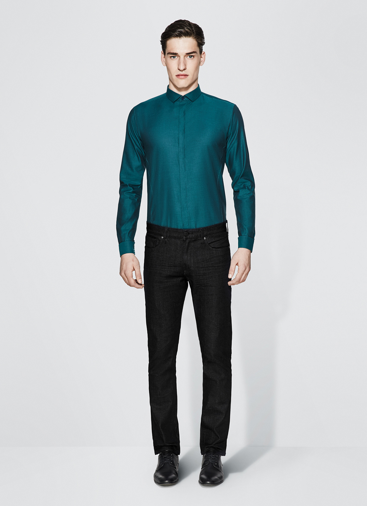
Photography:
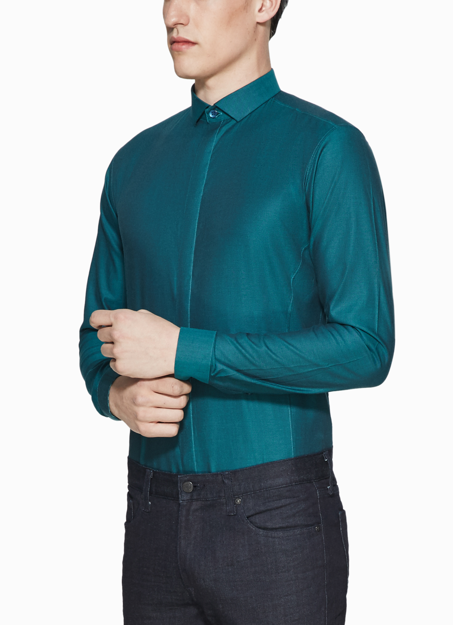
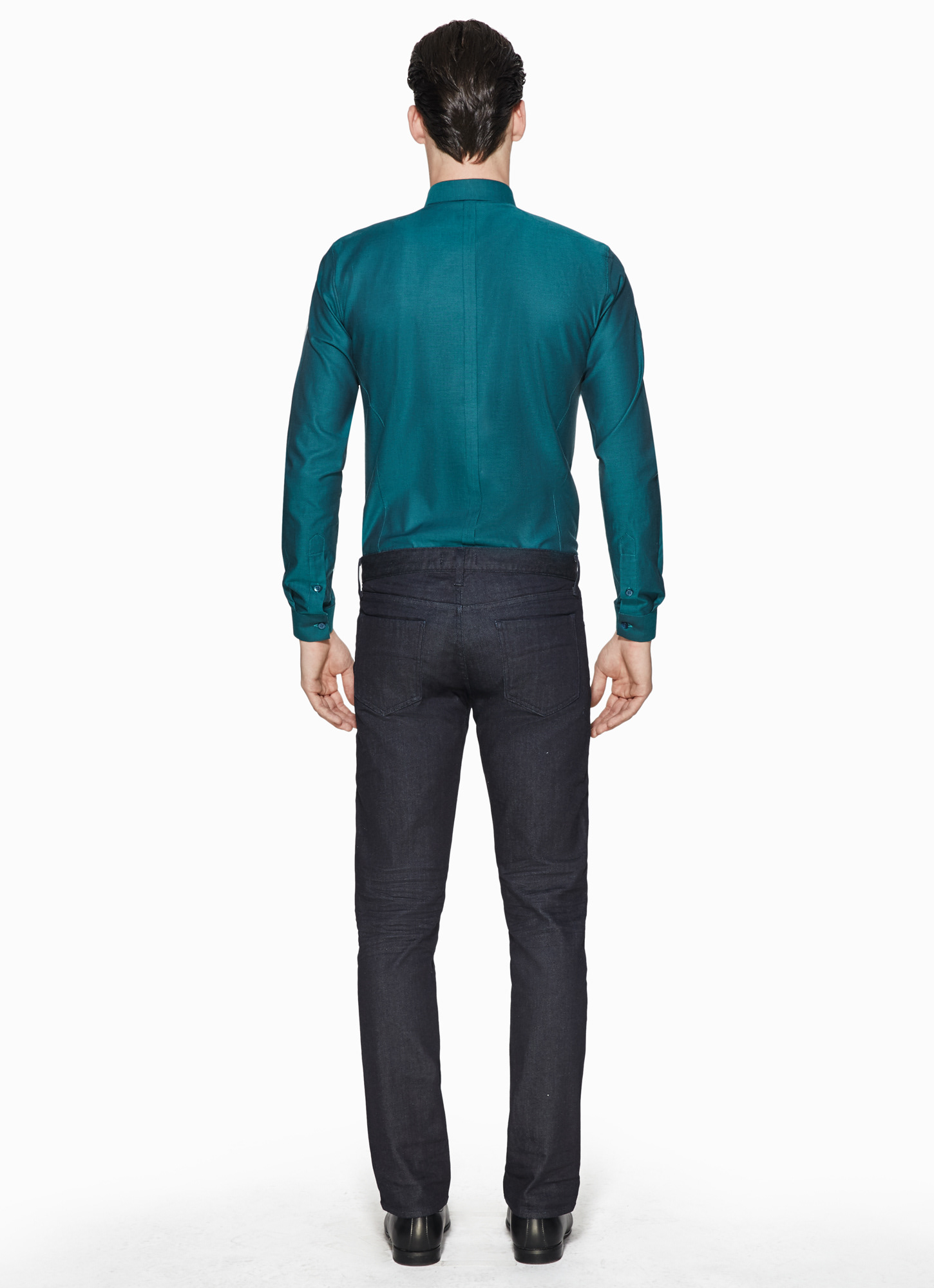
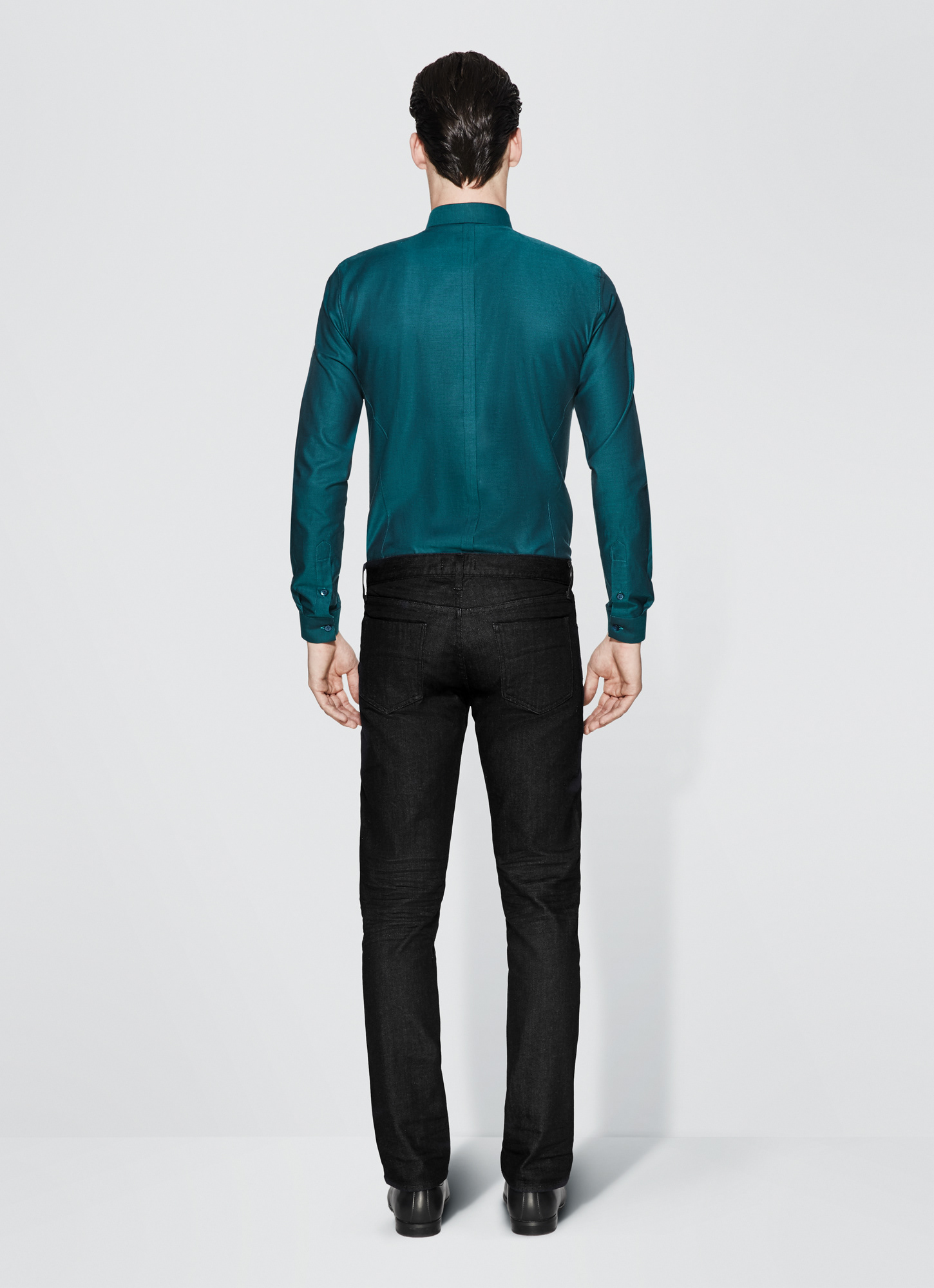
Making the most
Out of existing Images.
Out of existing Images.
Due to severe budget restraints existing image material needed to be upgraded to match a luxury profile. I developed a concept that brought a high-end touch and a technical clarity to the images and worked with a team of retouchers to deliver coherent results across the entire collection. Subtle changes in cropping, color values, skin adjustments and an added background all came together to make the needed difference.
You can see the before & after results below.

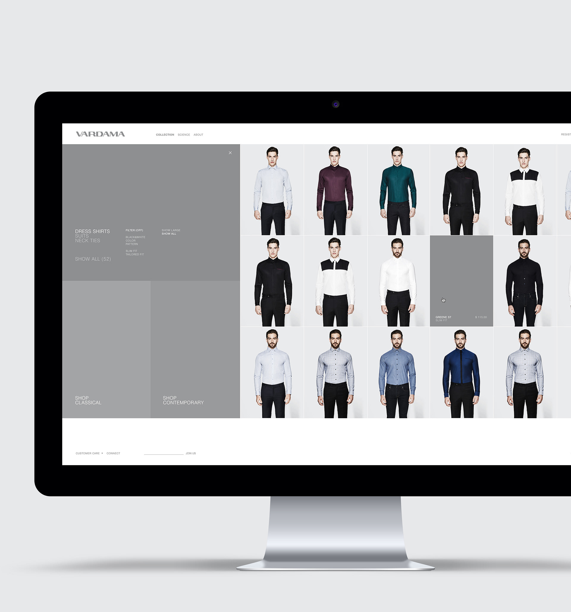
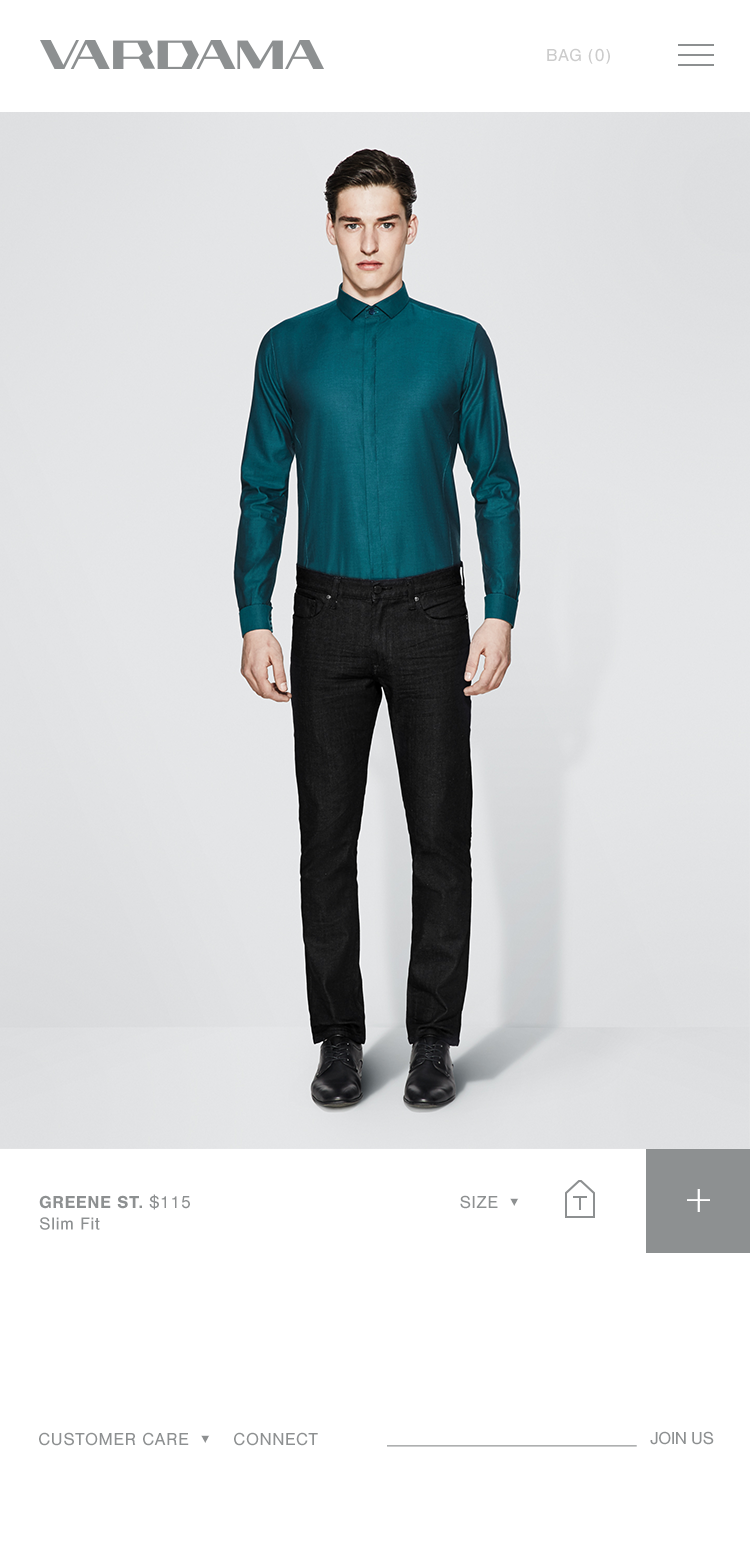
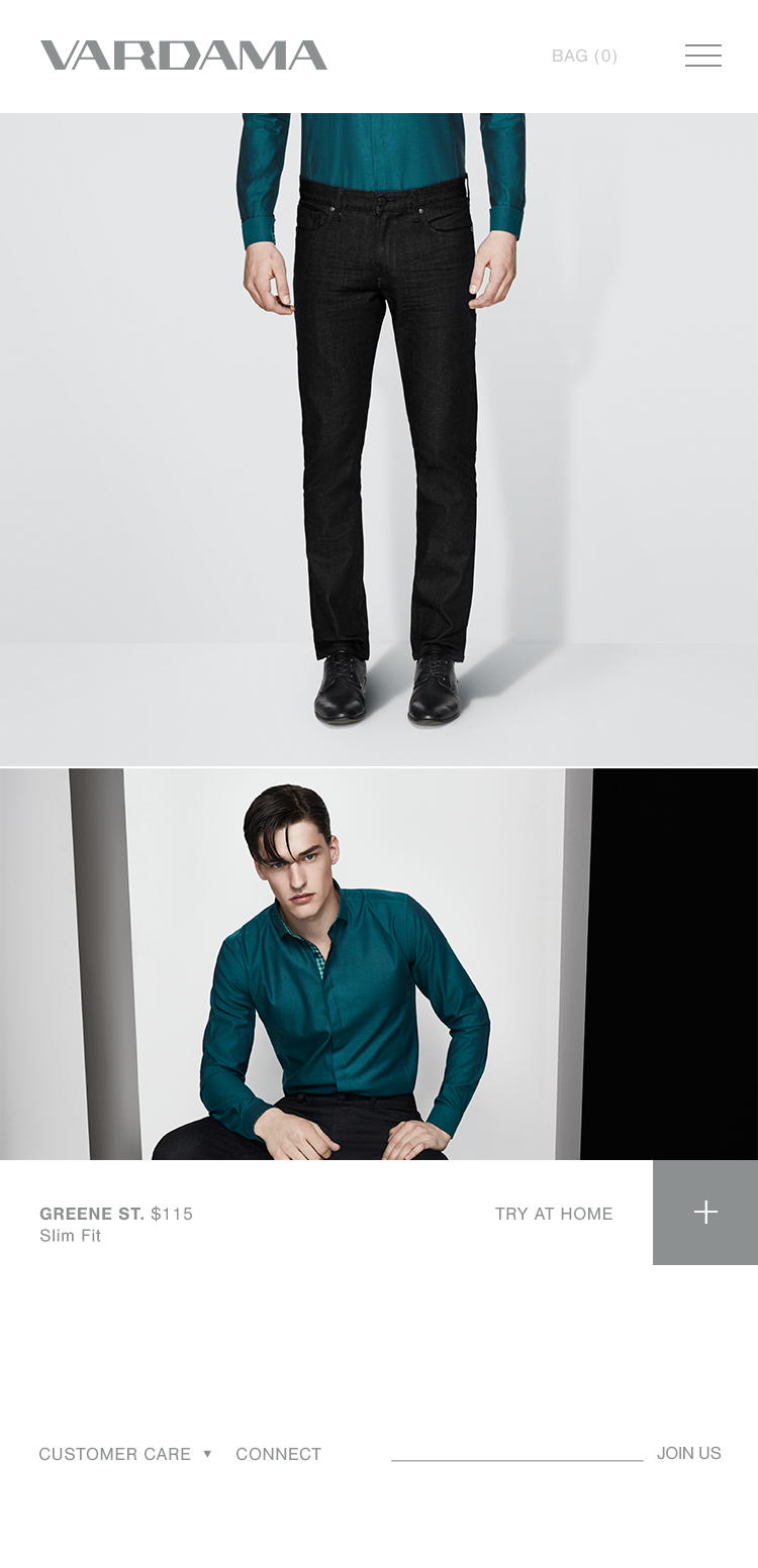
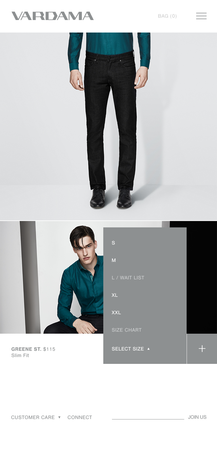
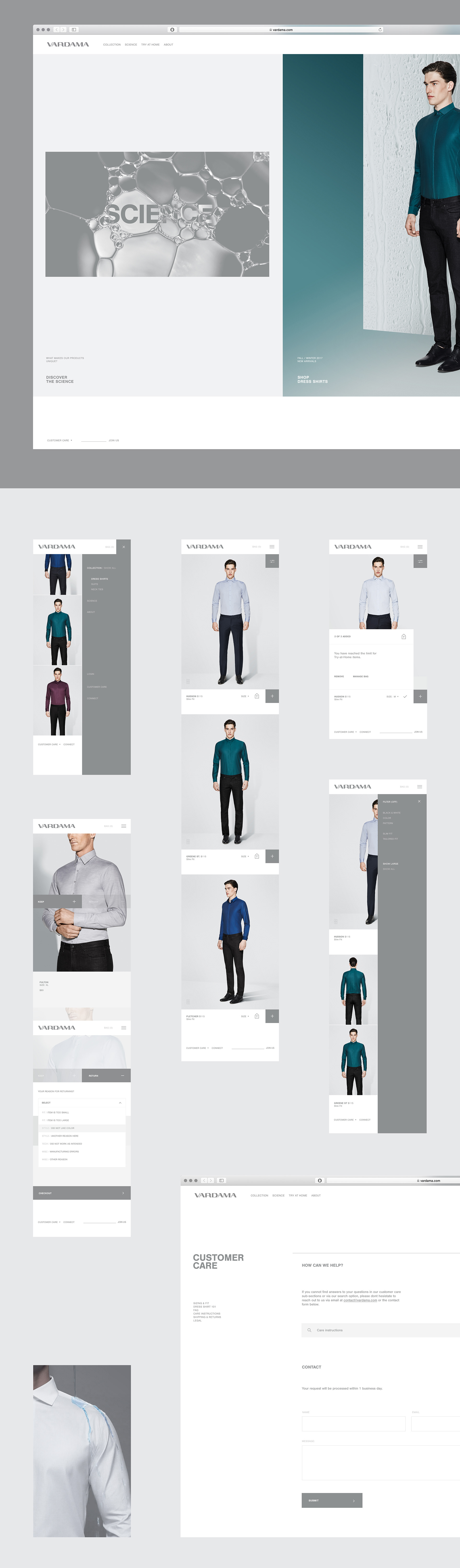
The Website:
A clean architecture brings simplicity and ease into the design - understated typography and a simple modular grid provide the brand with room to grow and change due to putting the biggest emphasis on the creation of visual content.
Usage of screen area is maximized wherever possible. Filter options and intelligent quick-shopping tools tailor the experience to both the hasty shopper and the indulgent explorer. A horizontal navigation breaks with the habits, yet feels fluent and intuitive, both with the mouse and via gestures.
The curating Team at Siteinspire.com recognized the unusual yet effective solution and featured the website in December 2017.

2 styles of browsing products are available. Either via the use of generous imagery or via a smaller grid, providing a view of most of the collection at a glance. Additional filters can be used to browse categorically, or across the entire offering of products. The filter menu opens and collapses automatically, bringing a smooth feeling into the navigational aspect.
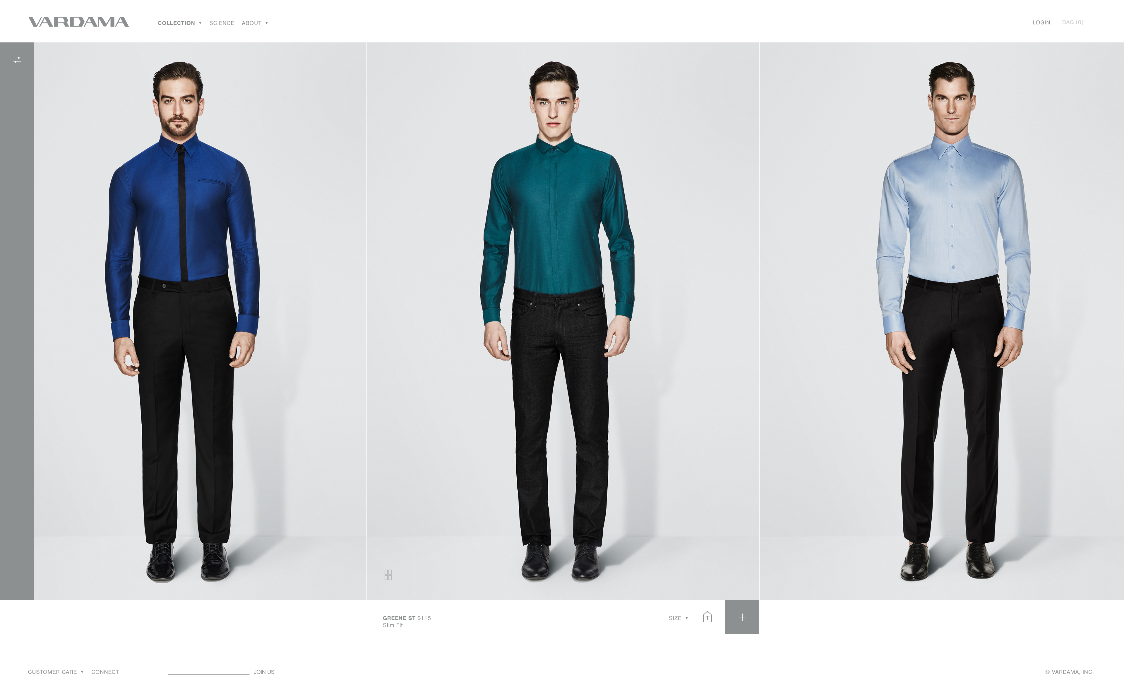
Product Information shows up on hover, as well as various images of the same product if desired. Shopping can take place in the main gallery with more details being available on the product page itself.
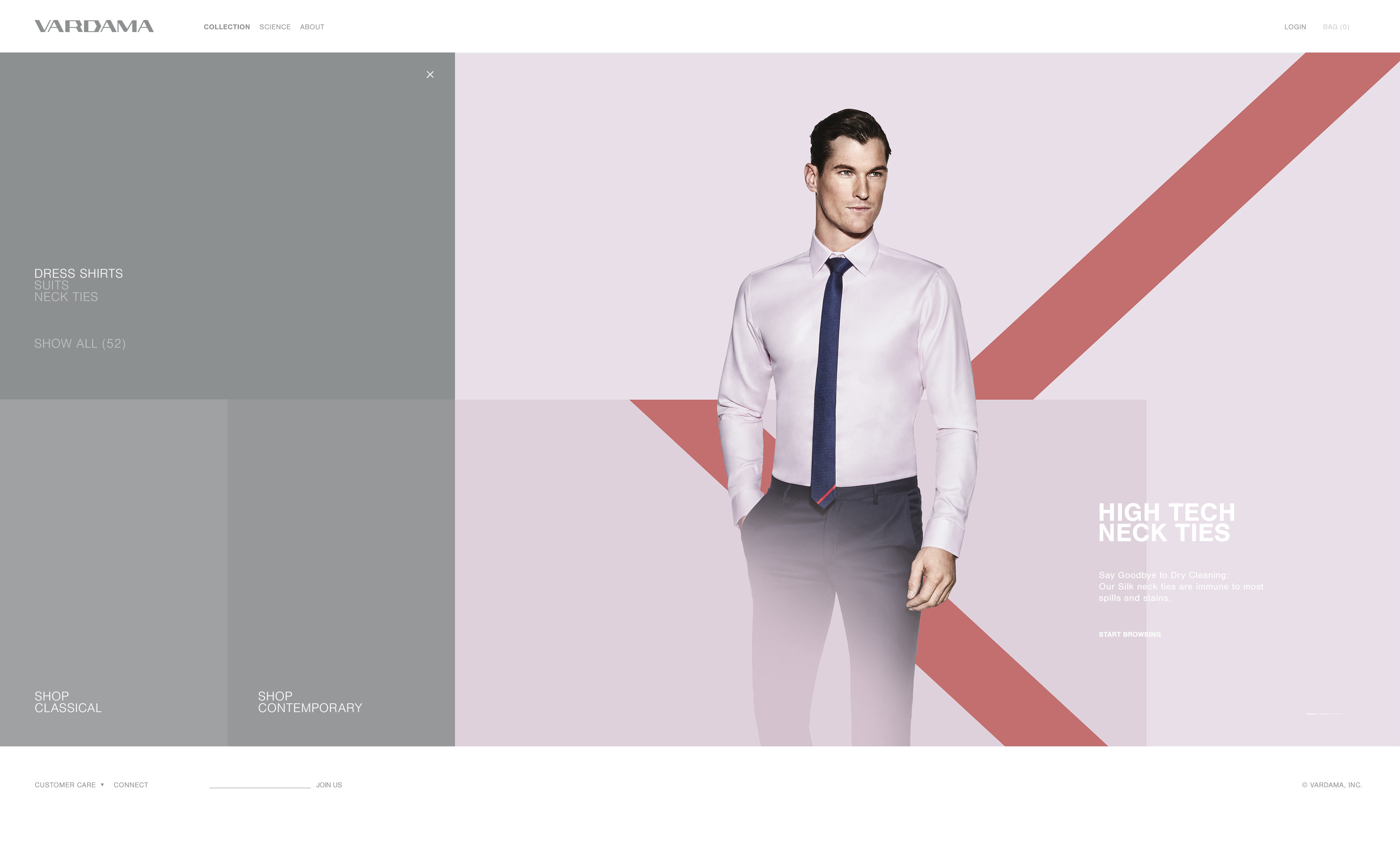
Minimalistic visuals focus on enhancing the products via use of color and geometry.
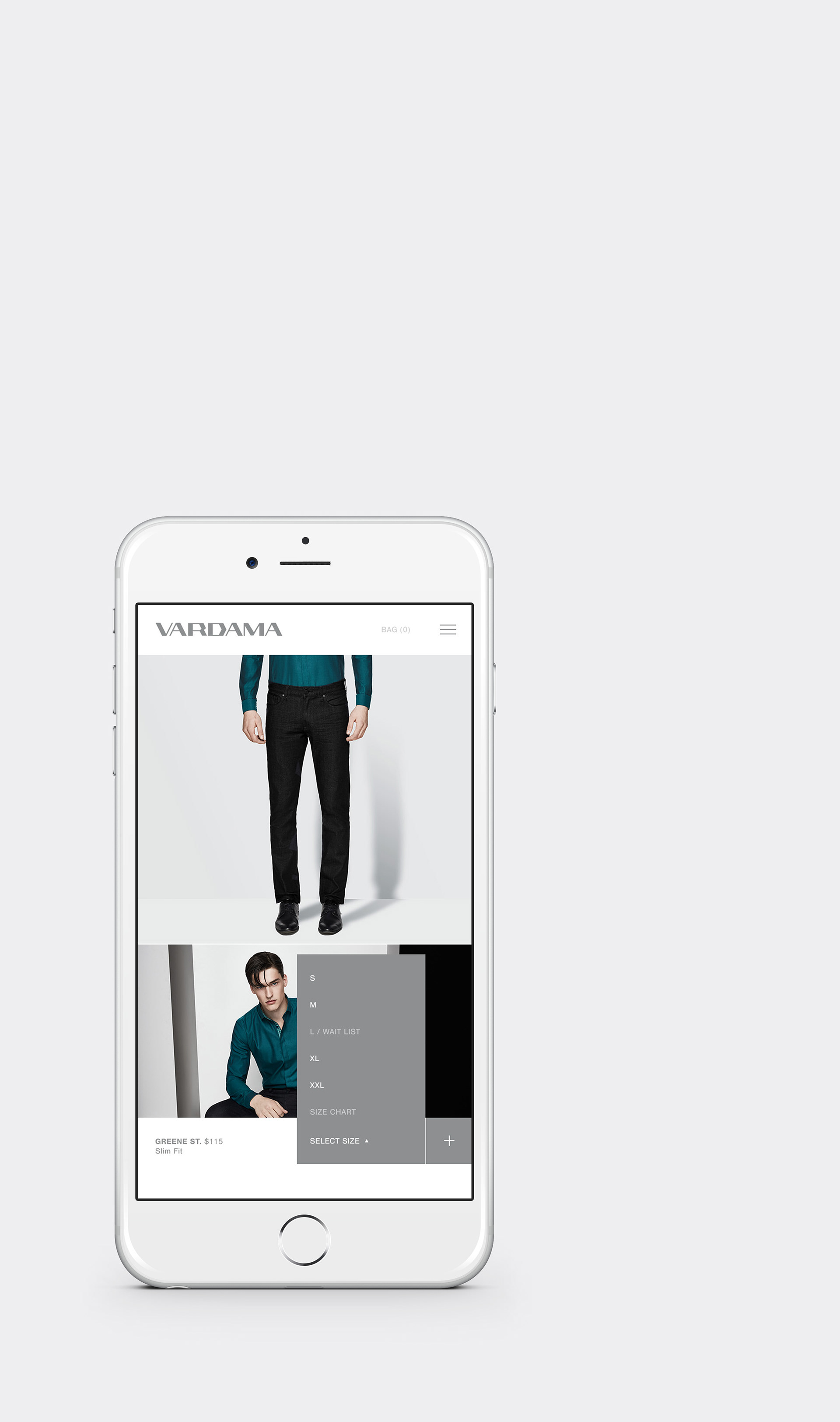
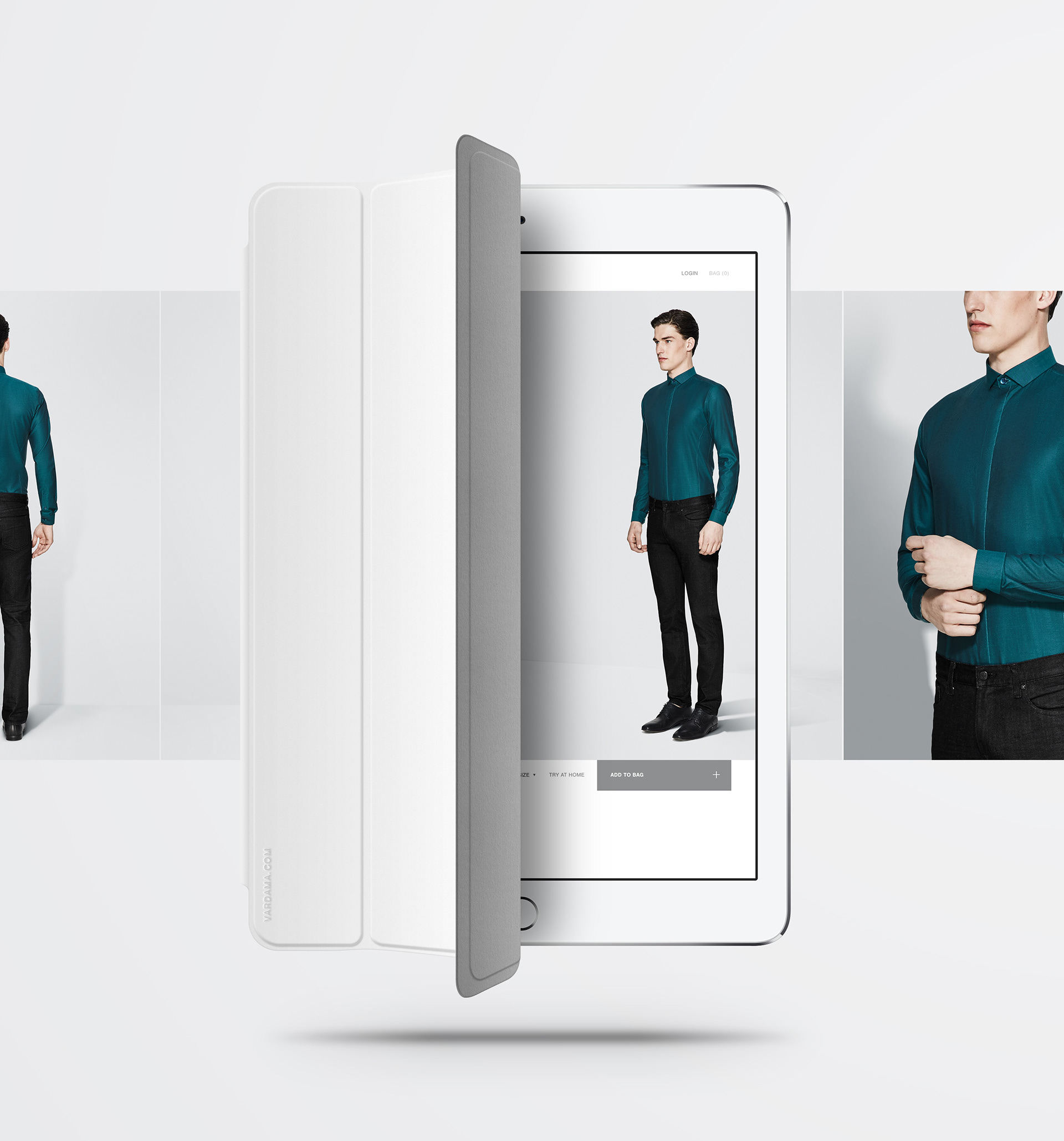
The Mobile Concept:
More than just responsive:
In the collection and online shopping area, an app-like appearance is created from simple and consistent UI elements, that feels generously tailored to your screen – and with your browser UI collapsed, almost lets you forget you're on the web.
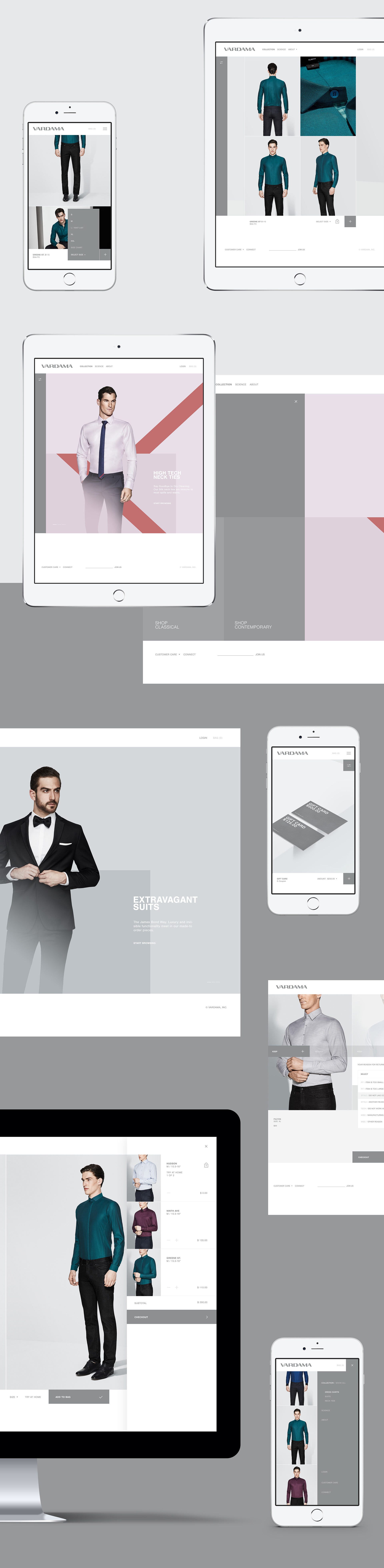
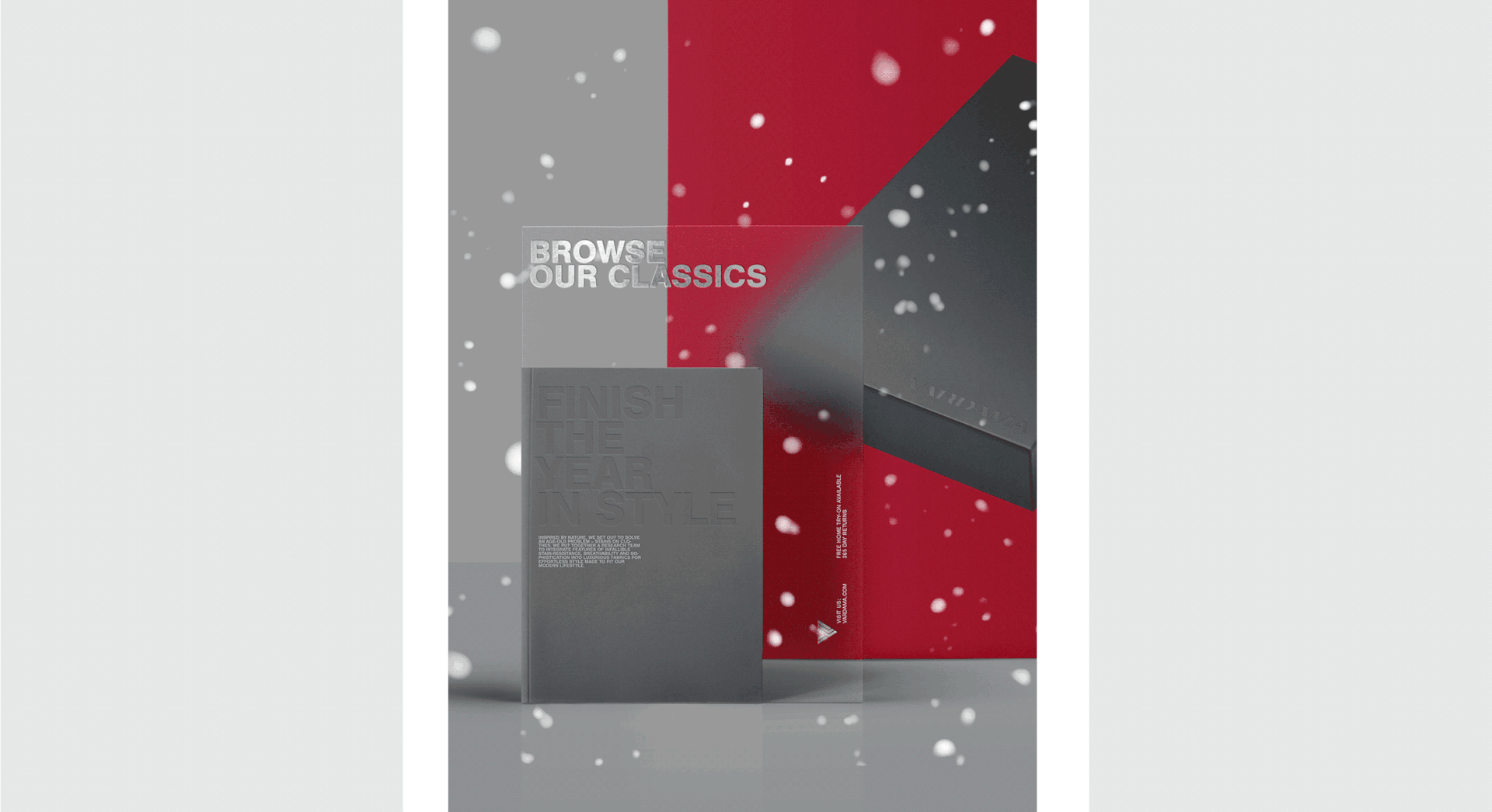
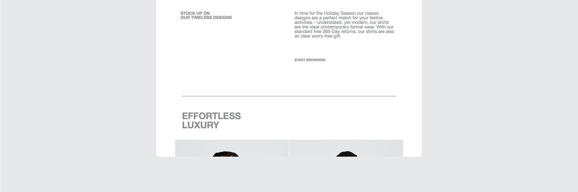
Digital Marketing
Email Campaigns
And Social Media Channels
And Social Media Channels
I've helped the brand with Instagram® concepts and digital marketing via specific email campaigns, follow up emails, leading through their Try-At-Home program and more.

recently featured on _ siteinspire.com
visit _ vardama.com
Creative & Art Direction _ Christoph Ruprecht
Photographic Direction _ Christoph Ruprecht
Corporate Branding _ Christoph Ruprecht
Web Design / UI UX _ Christoph Ruprecht
Programmer _ Julian Wright
Photography _ Slate Studios, Cameron Krone
Retouching _ Bermudez Studio