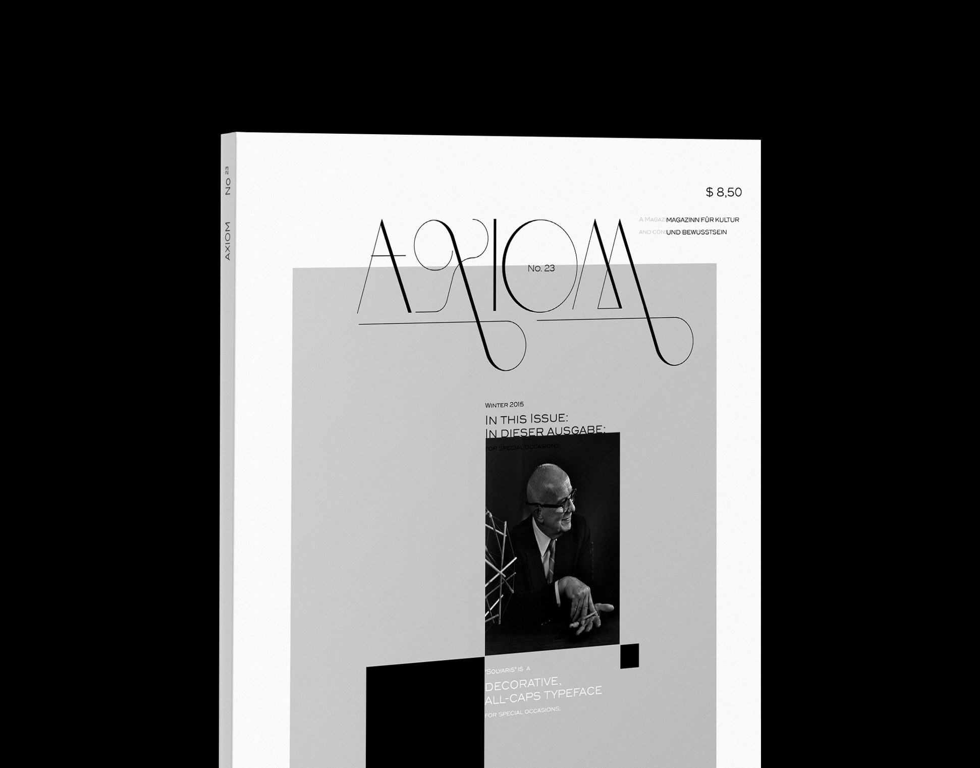
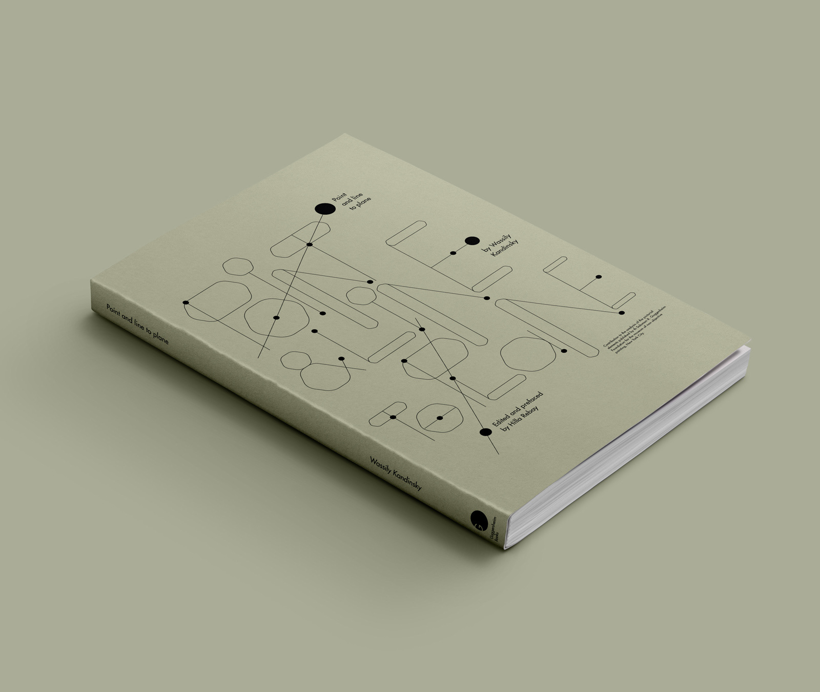
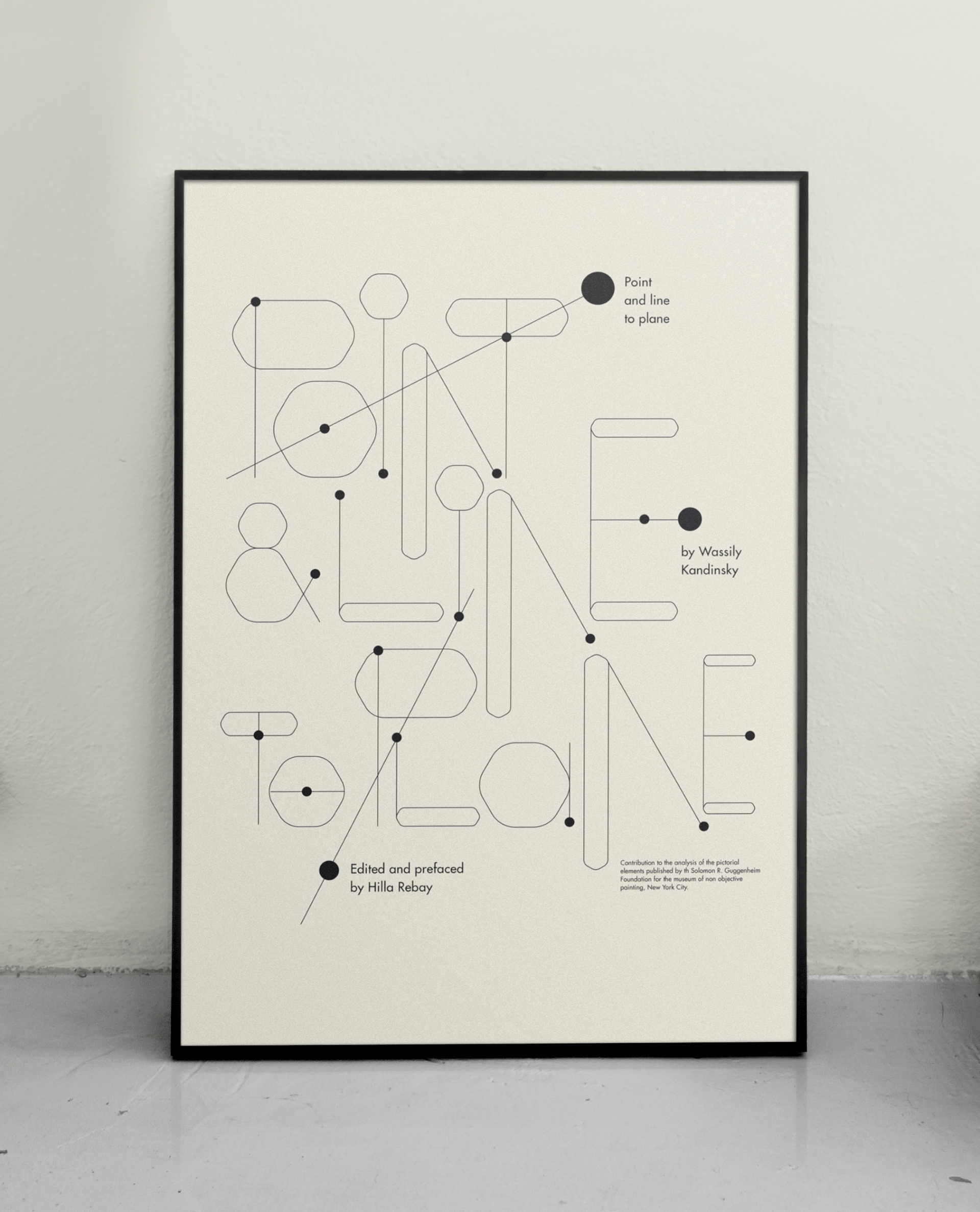
The Concept:


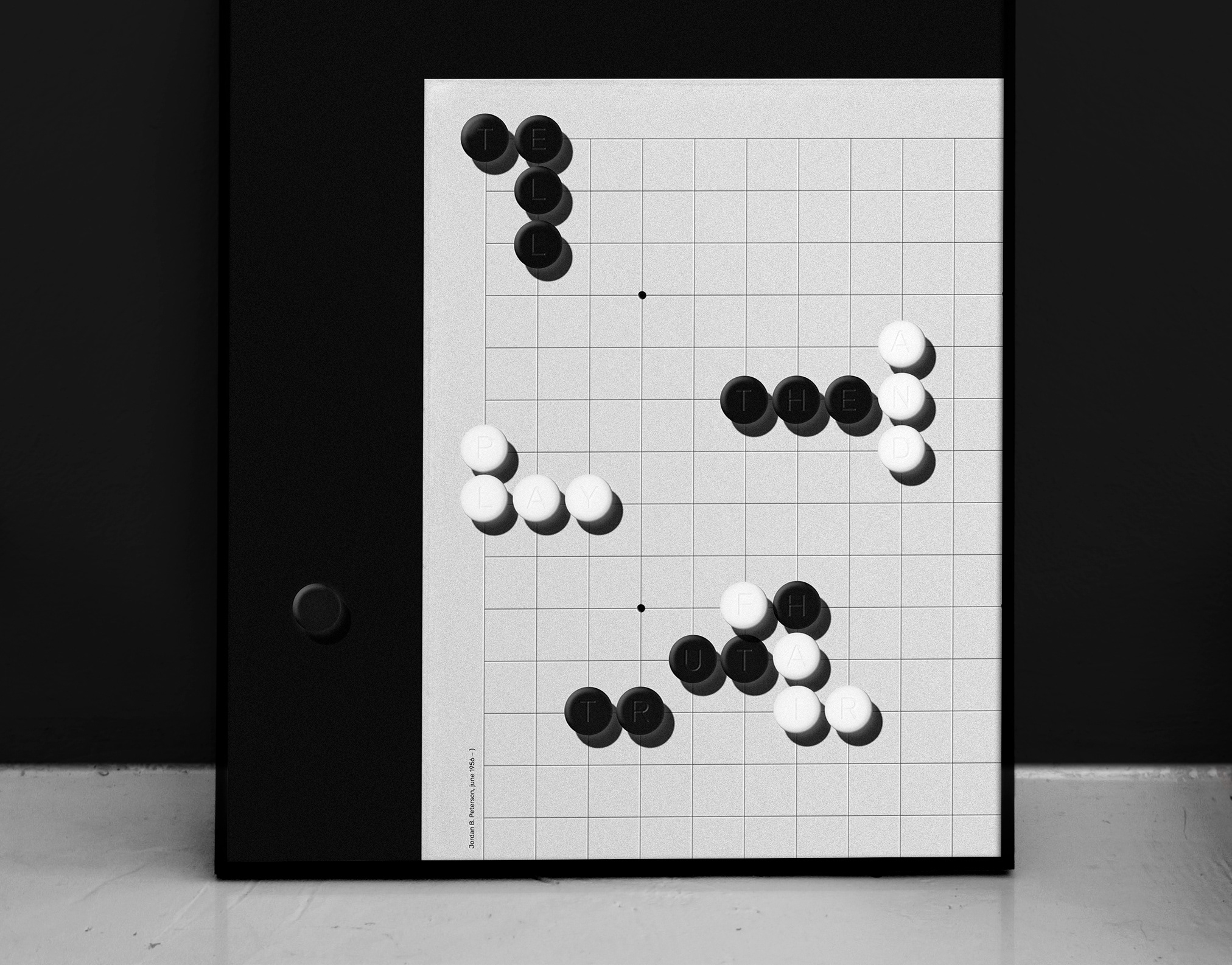
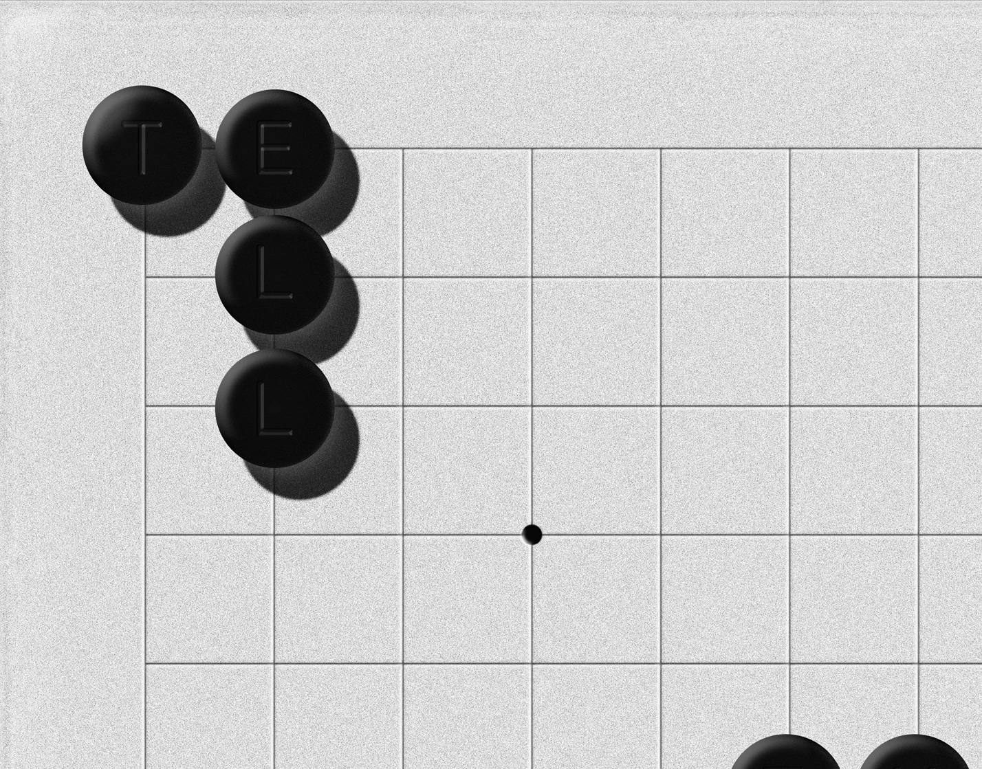
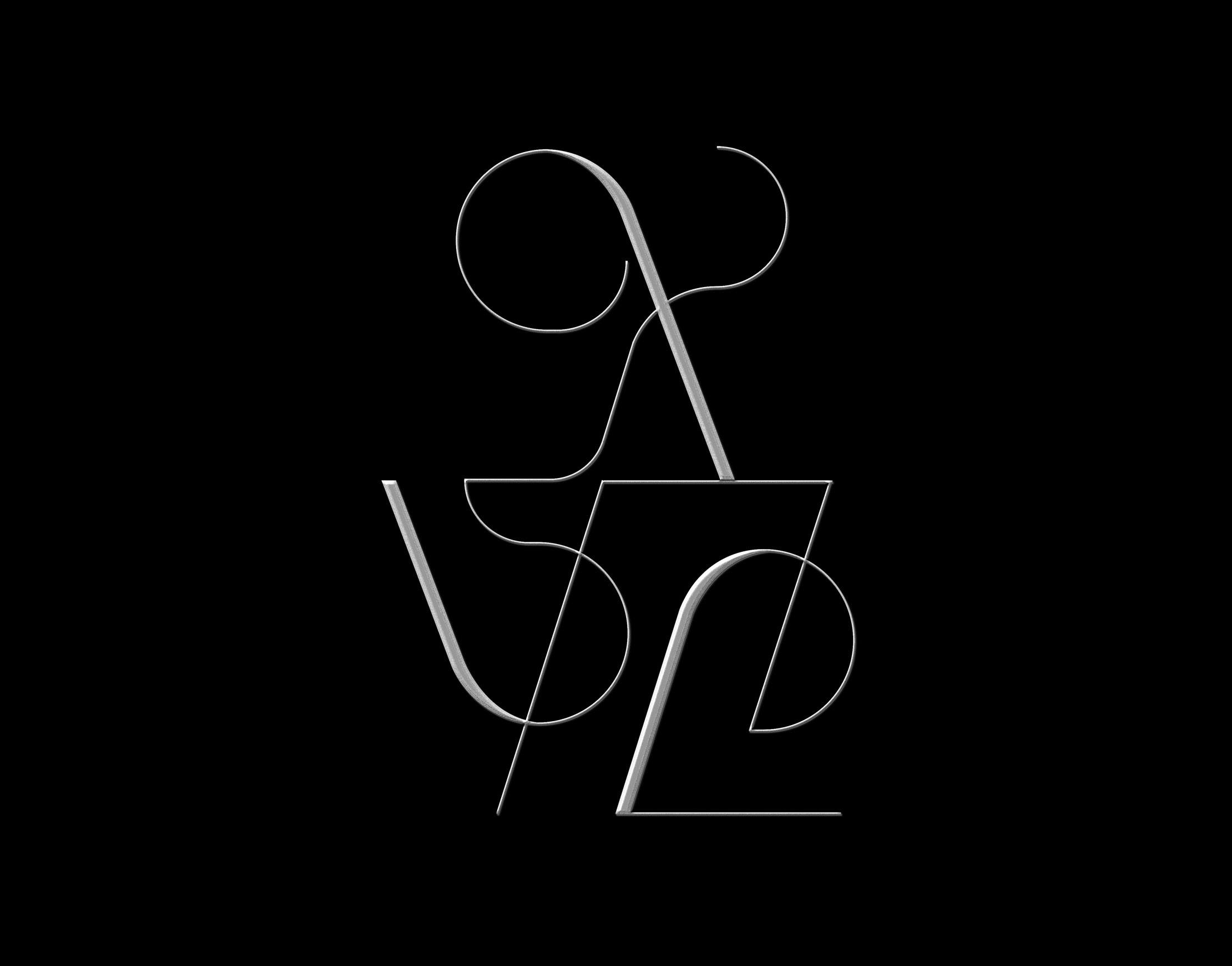
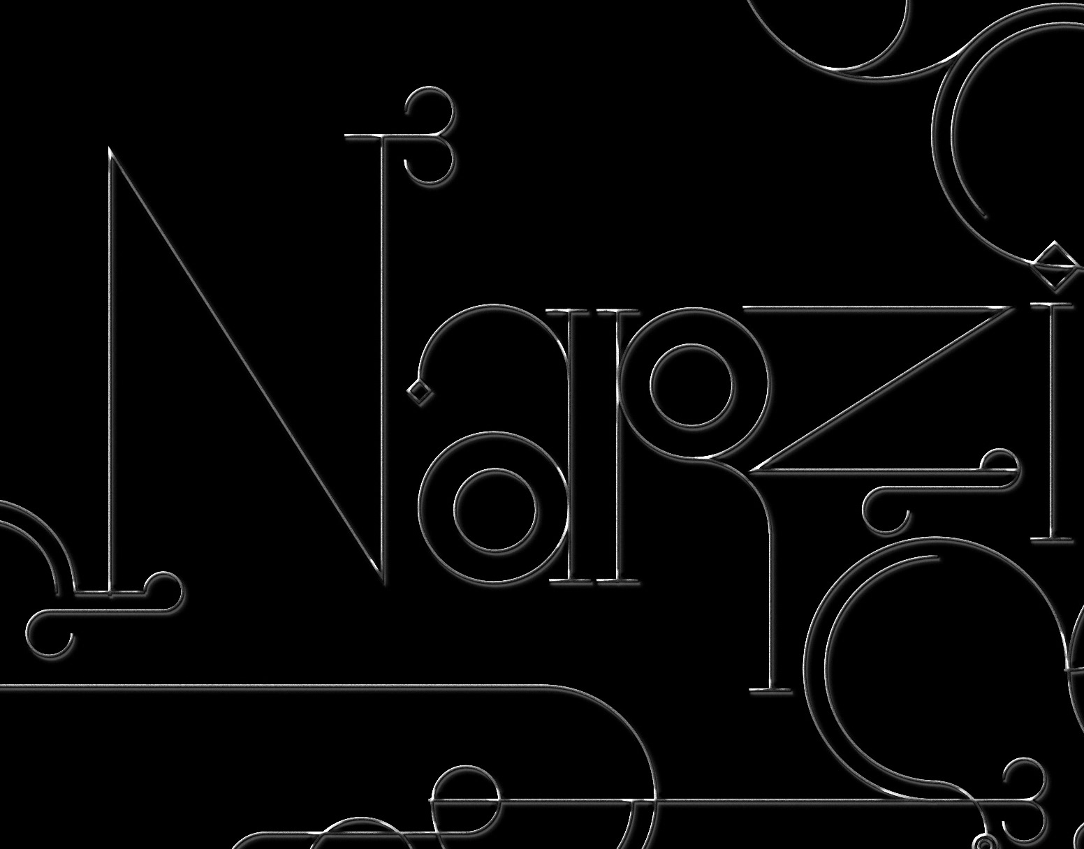
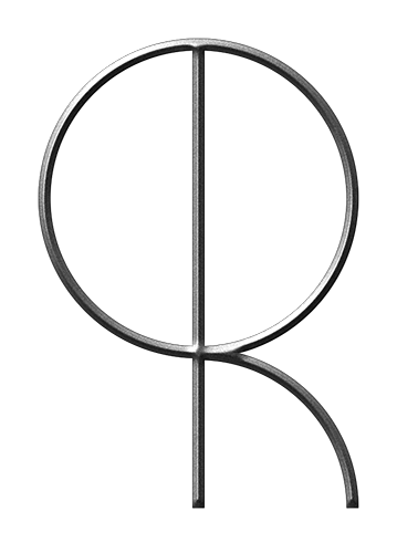
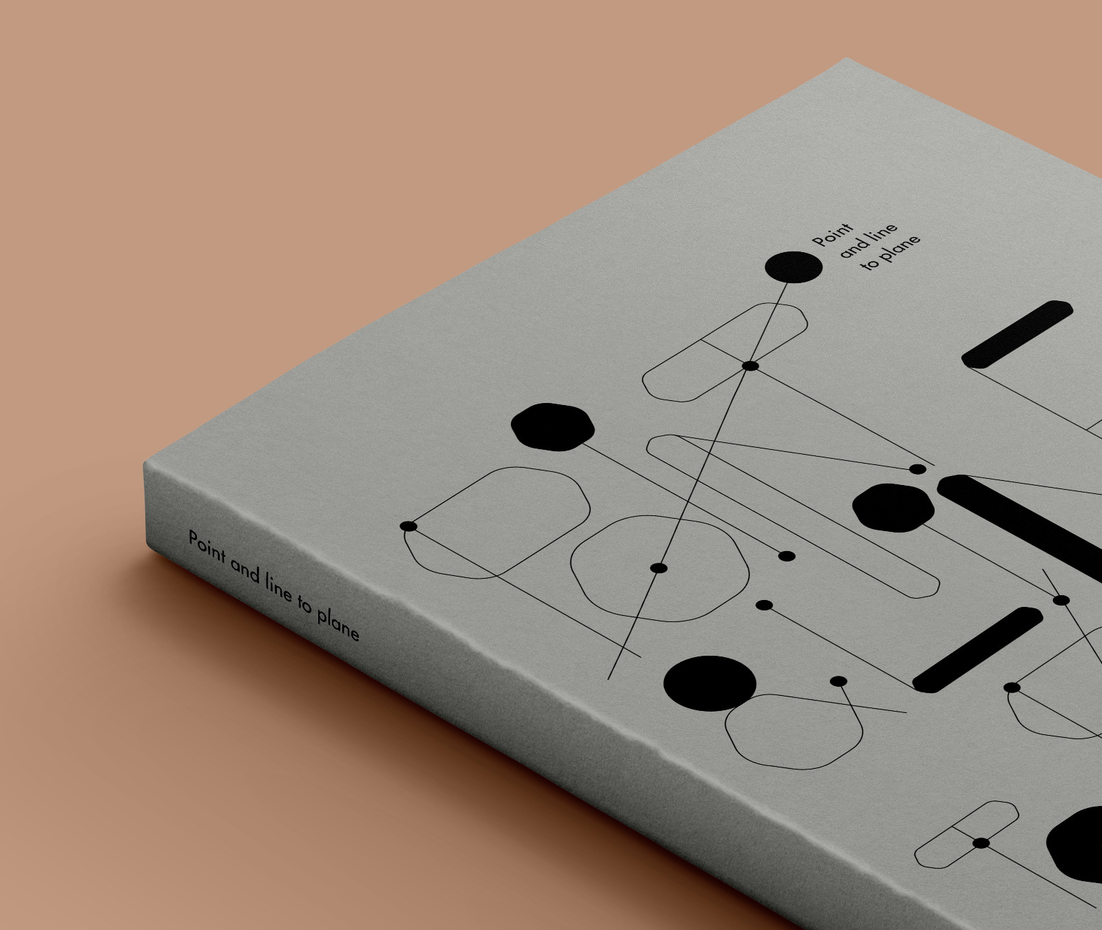
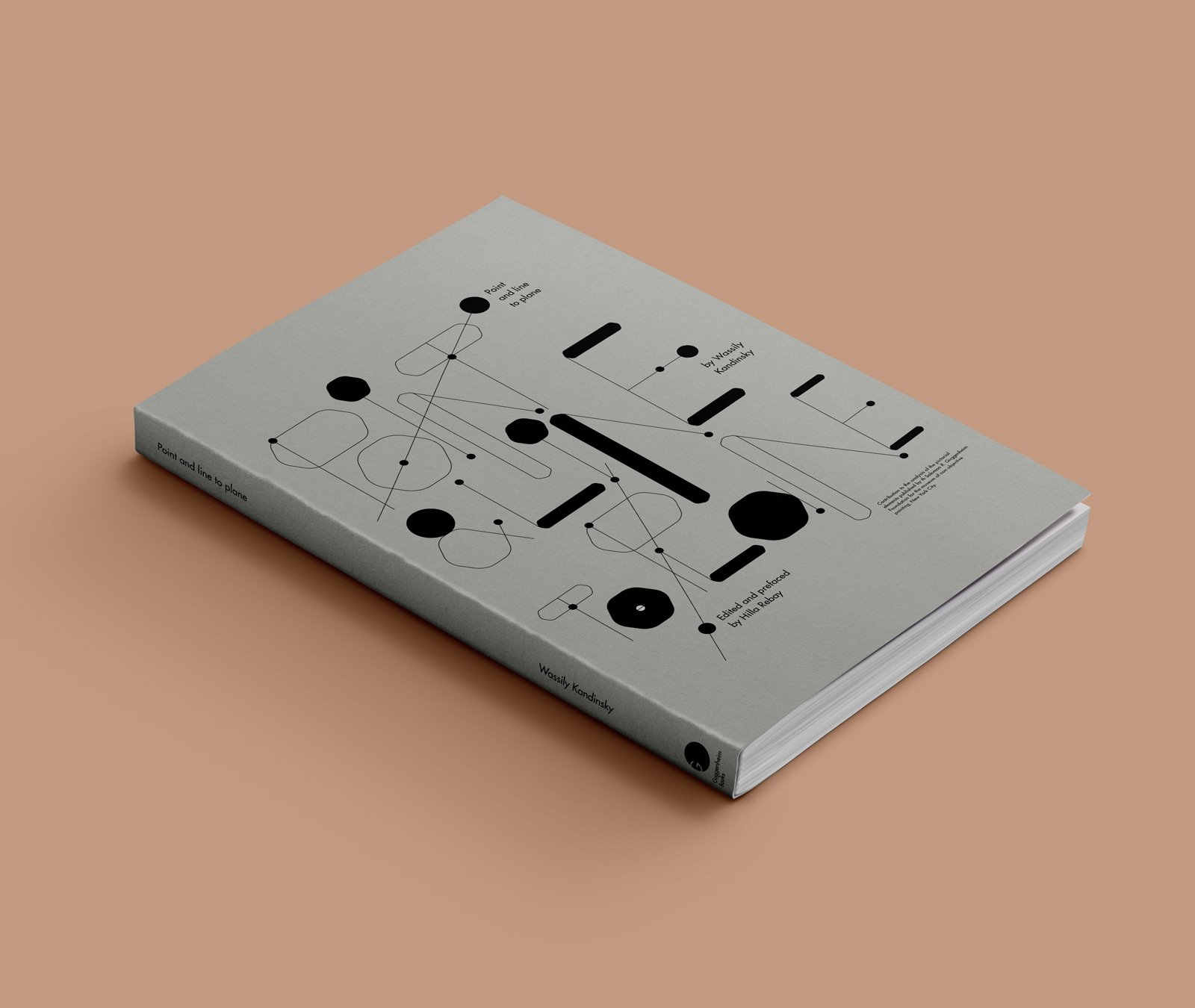
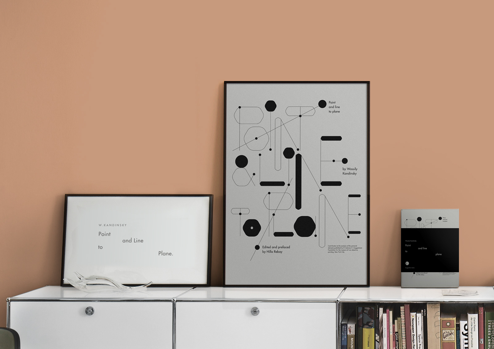
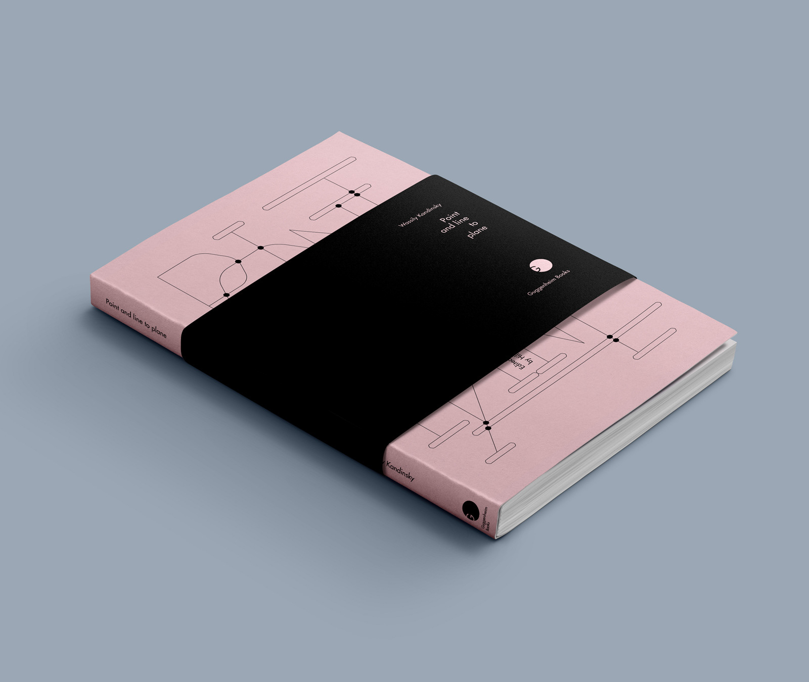
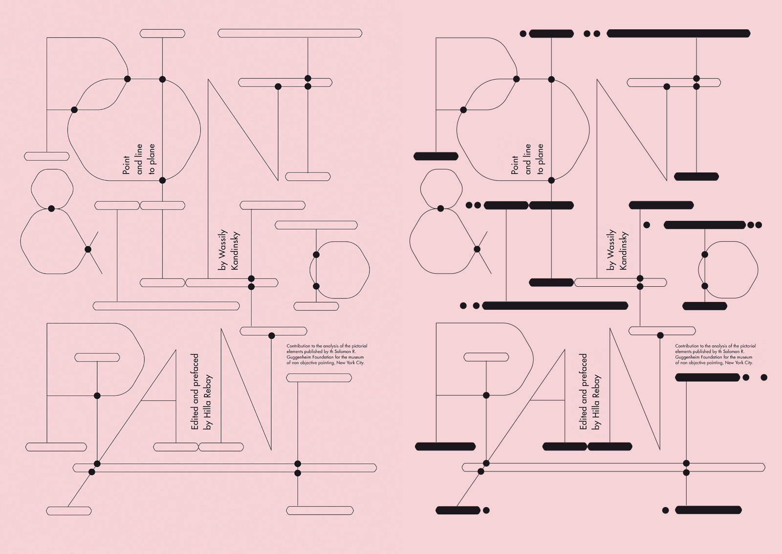
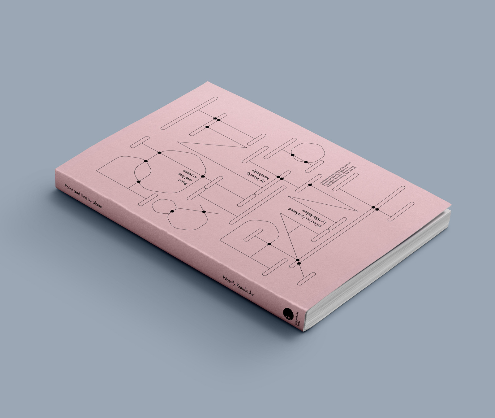
In opposition to Kandinsky's theory, the words aren't interpreted into the design through an artistic / expressionistic approach, but rather literally, creating each letter from a point a line and a plane and coming up with a modular typographic system.
-


-

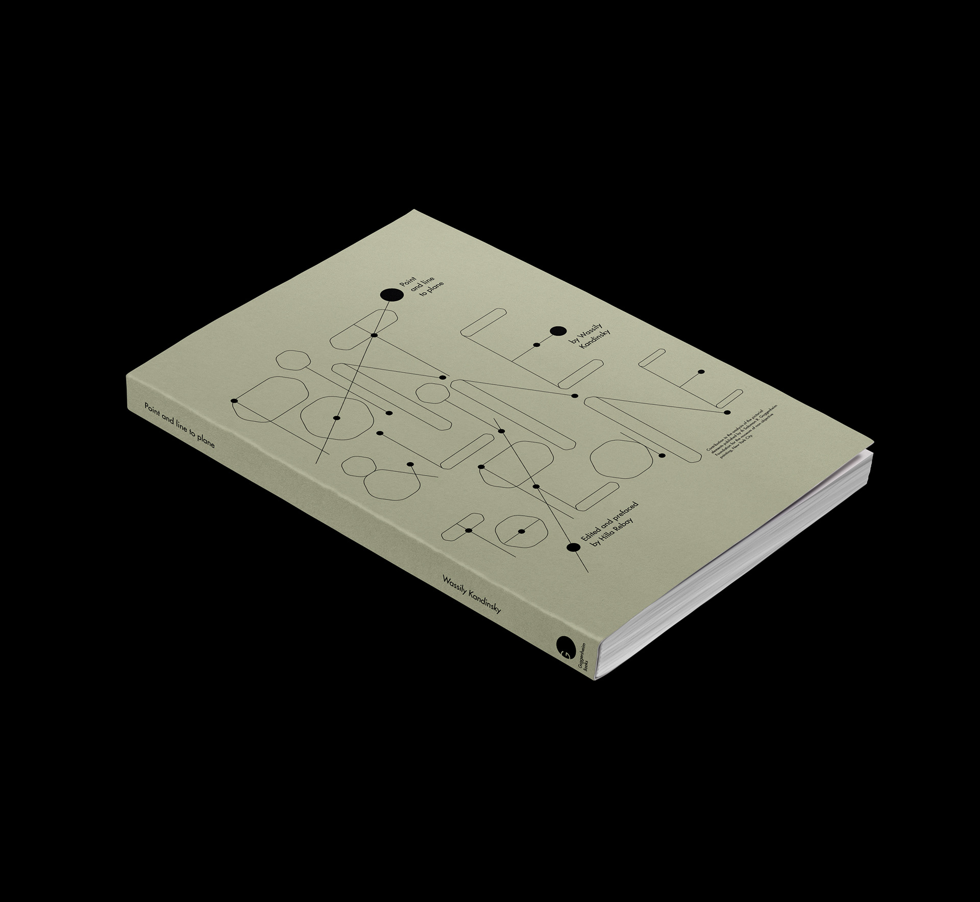
alternate black & white version

-


-
-


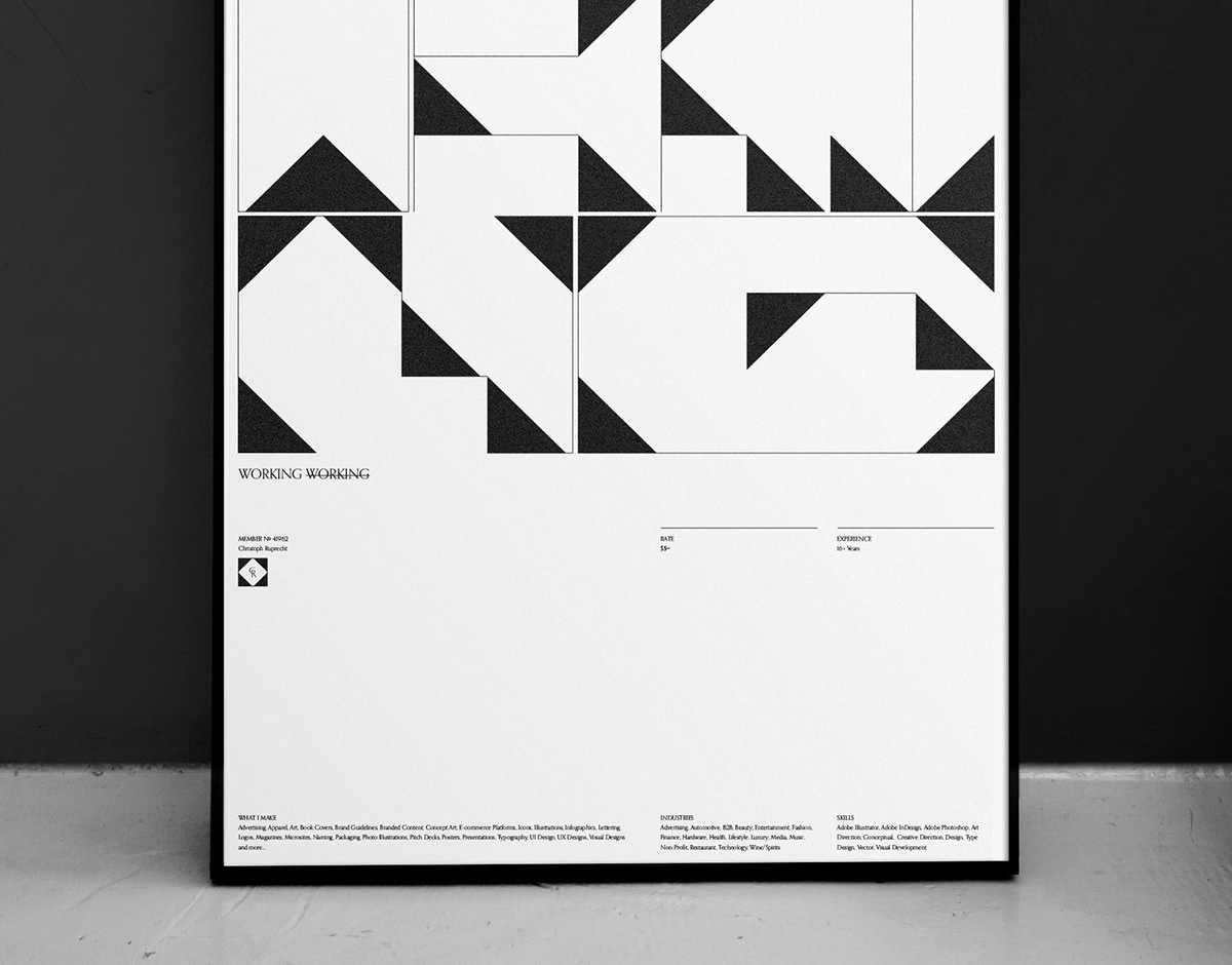
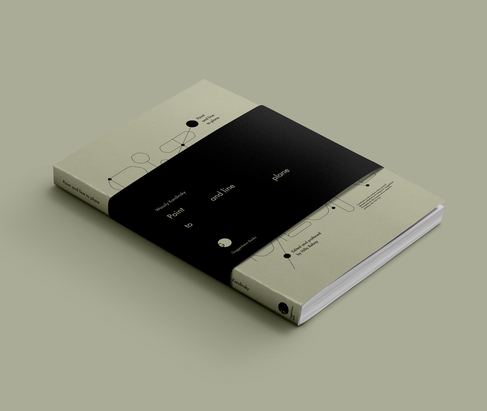
Alternative Approach
Version 2


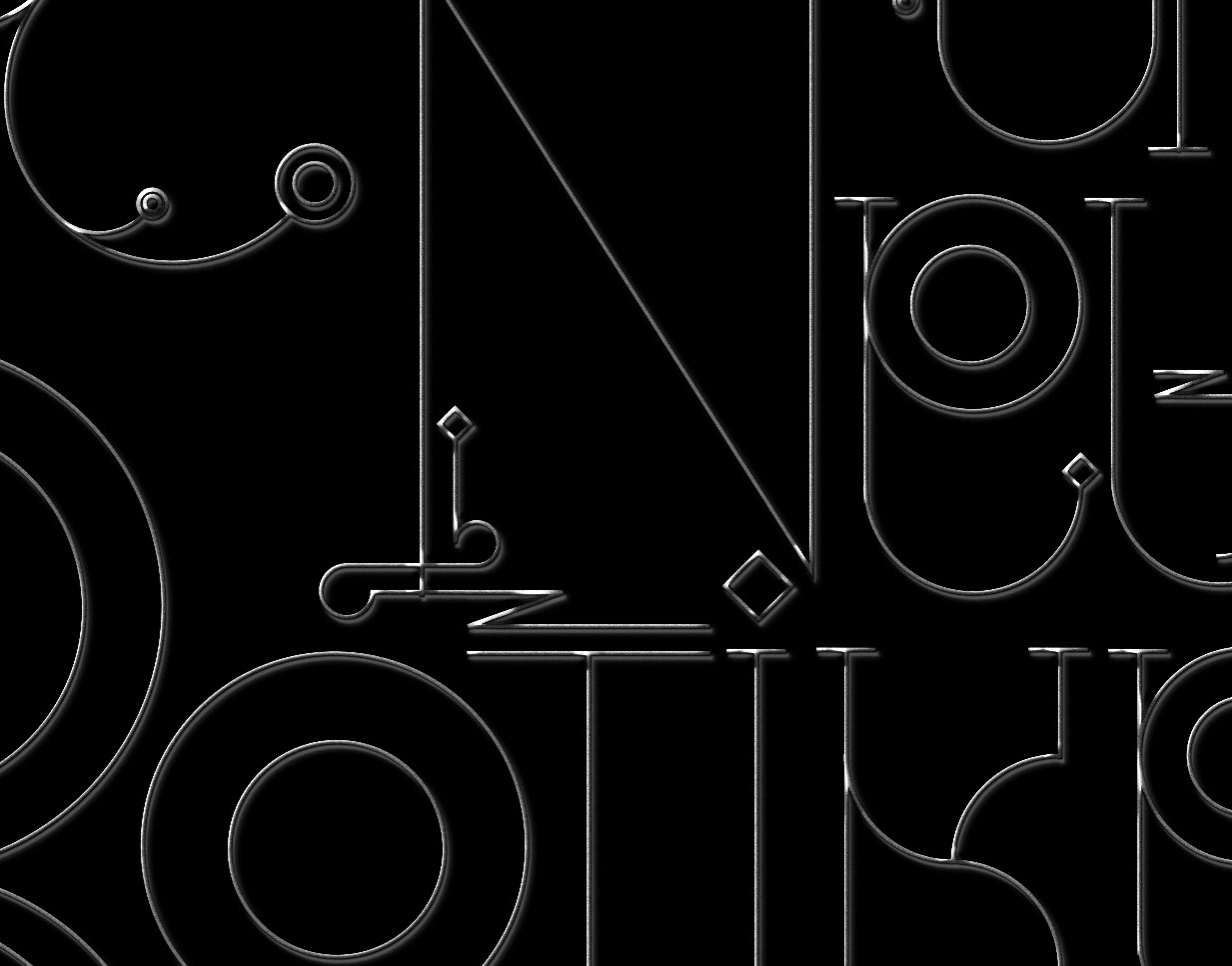
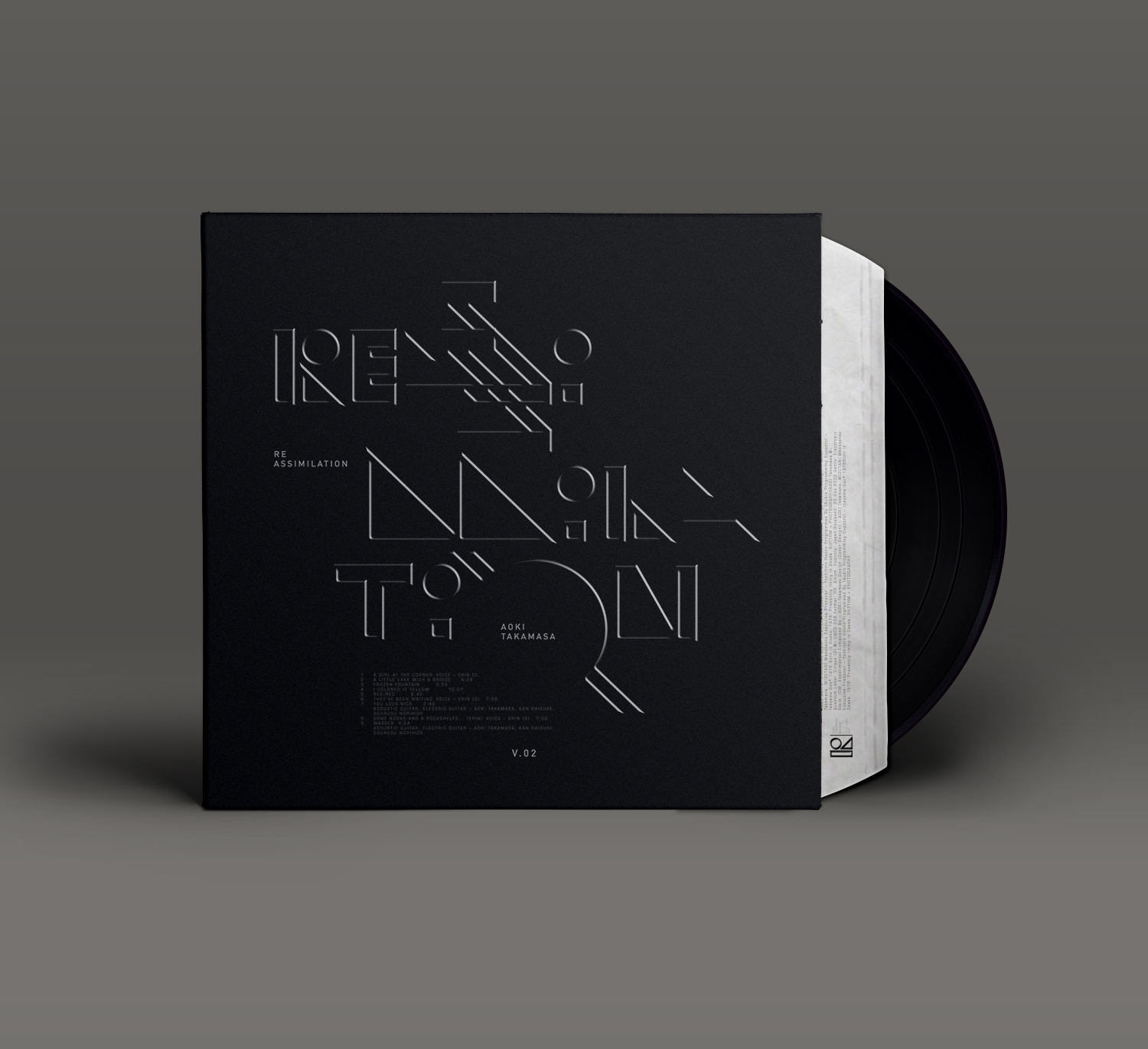
Referencing musical notes / playing sheets in the composition to lead back to his Kandinsky's theory that draws a connection between arranging sound and graphic form in space.


© MMXV Christoph Ruprecht
Guggenheim Books is a fictional Company

You may also like:

type/philosophy
Ongoing explorations of different styles of experimental typography, put into a philosophical context
2015
Graphic Design, Typography
#adobelive / bauhaus
I was recently invited by Adobe to join them for a three part live stream in Munich, Germany. The objective was to work on 3x 2 hour live sessions and create 3 individual projects incorporating the latest typekit fonts, resulting from a historic collaboration between the Bauhaus Dessau and Adobe. #adobehiddentreasures #adobelive
2018
Illustration, Graphic Design, Typography
Logos & Logotype Collection
Selected Logos & Logotypes for different clients and industries, ranging from 2010 – 2017. Large percentage is hand lettered and custom built.
2018
Branding, Graphic Design, Art Direction
Logotypes & Lettering
Collection of various unused logos and logotypes aswell as a couple of custom typography exercises
2013
Graphic Design, Typography
Logos & Marks 2020
A selection of different styles of identity marks I have been working on over the course of the past year. In 2019 / 2020 I was fortunate to, among others, work with a wide array of up and coming brands in field of luxury, beauty, technology, sport and consulting.  This year's set continues to reflect my passion for handcrafted typography solution in both custom word marks, as well as monograms and visual marks as well.
2020
Art Direction, Typography, Branding
Solyaris : Decorative Typeface
"Solyaris" is decorative, all-caps typeface with various alternates and gimmicks for special occasions.
2013
Graphic Design, Typography
Logos & Marks 2018
An selection of different styles of identity marks I have been working on over the course of the past year. The work ranges from experimental and decorative to traditionalist luxury, always with a focus on visual clarity.
2018
Art Direction, Typography, Branding
Narzissten & Neurotiker
The written text inspired the narcissistic looking letters and their obvious neurosis to hide behind an almost unecessary amount of decorative elements.
2010
Illustration, Typography
WorkingNotWorking
Experimental Typography created to mark my start on workingnotworking.com.  Playing with simple geometry and M.C. Escher inspired concave/convex perspectives. Positive space reveals the cryptic letters, negative space a set of simple geometric objects and arrows.
2018
Typography, Art Direction, Digital Art
Aoki Takamasa : Reassimilation
Was listening to Aoki Takamasa the other day and created a fictional record cover and a typographic concept based on angles and lightning that I felt visualizes his style of music, which is very rhythmic and pattern based.
2014
Art Direction, Graphic Design, Typography
Back to Top