The Concept:
An understated "french chic" Framework, based on using subtle typography as the main architectural Element,
provides the Client with the necessary Leverage to attract Brands with a strong Desire for and Emphasis on classic Beauty and present the Studio as an established, matured creative Hub, as opposed to an up and coming Start-up.
provides the Client with the necessary Leverage to attract Brands with a strong Desire for and Emphasis on classic Beauty and present the Studio as an established, matured creative Hub, as opposed to an up and coming Start-up.
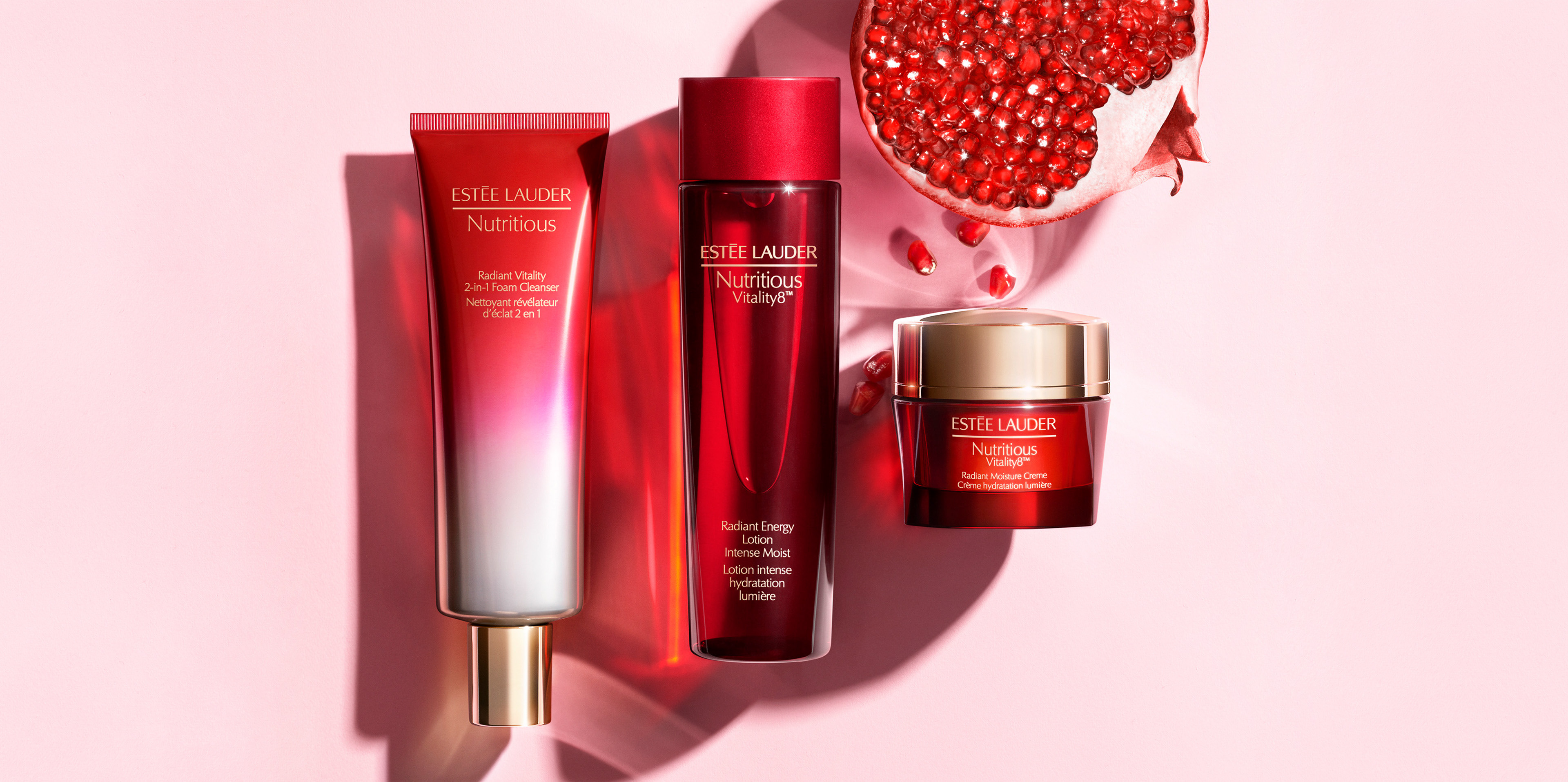
During my years as their freelance Art Director the Studio was able to expand both their Studio Space and List of Clientele, including landing a Global Player like Estée Lauder as a frequent Client. After taking a sabbatical in 2017 the Studio has recently moved on to a more modern Approach.
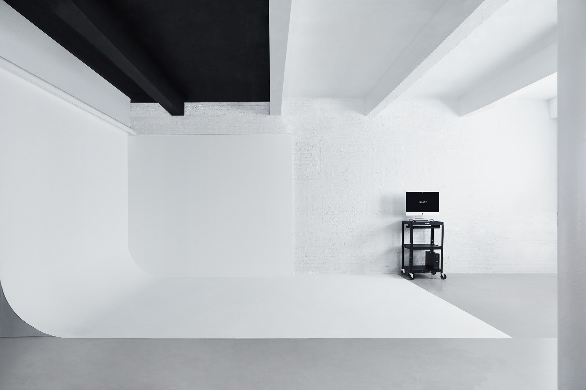
© Christoph Rupreht | Work samples from 2014-2016
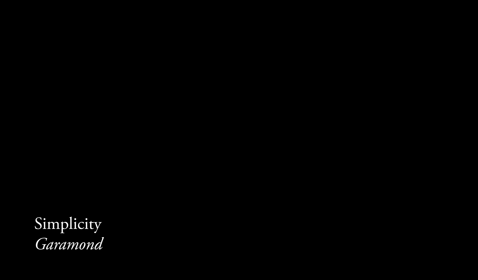
The Solution: A simplistic, well balanced white space approach based on 2 provided elements, Logotype and Garamond as the typographic basis. Design and Art Direction are meant to resonate with both traditional and modern luxury Brands, to never overpower use of imagery and give collaborators & clients a timeless impression over a short lived feel.
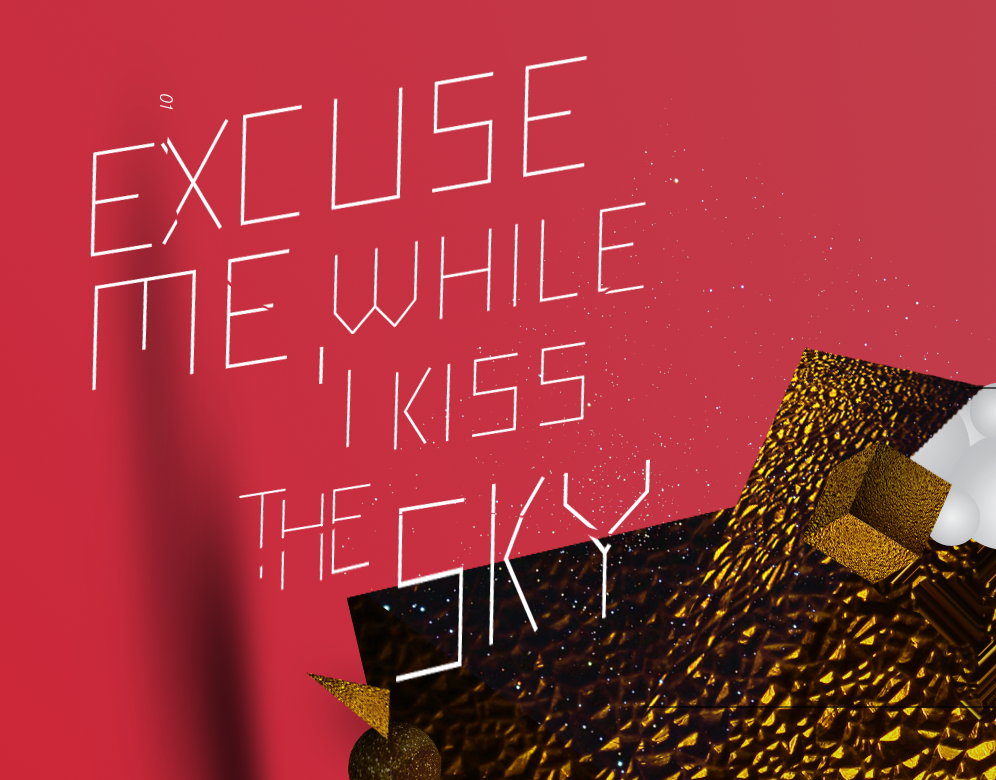
01
The Basics
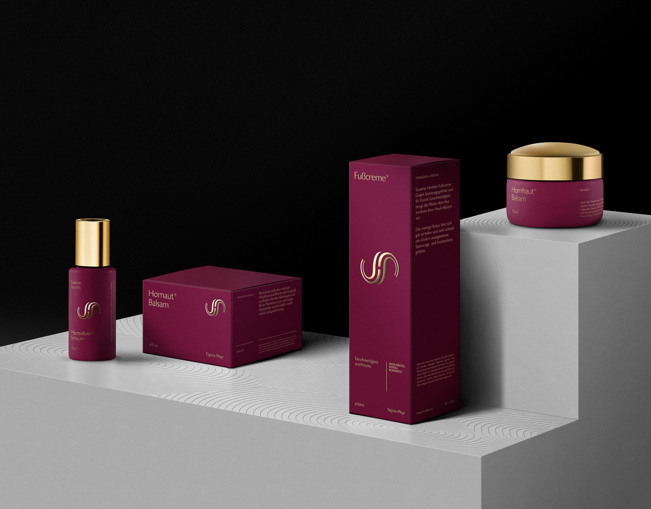
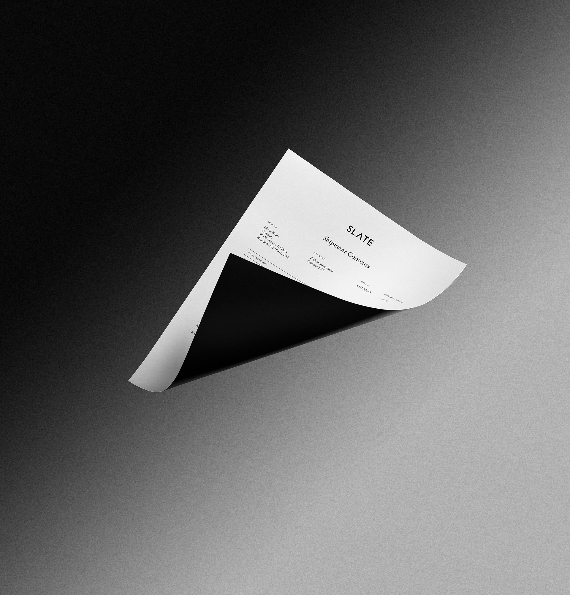
Corporate Materials
Corporate Materials
Correspondence Stock, Call Sheets
Rate Cards, Business Cards, etc.
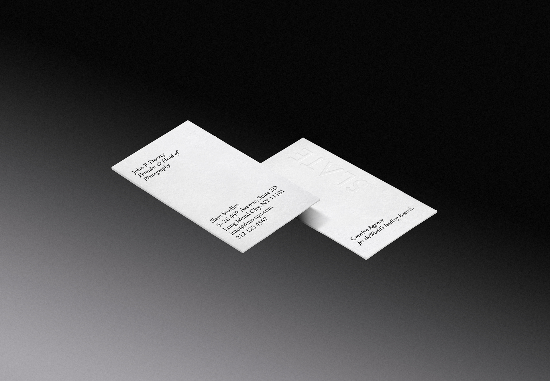
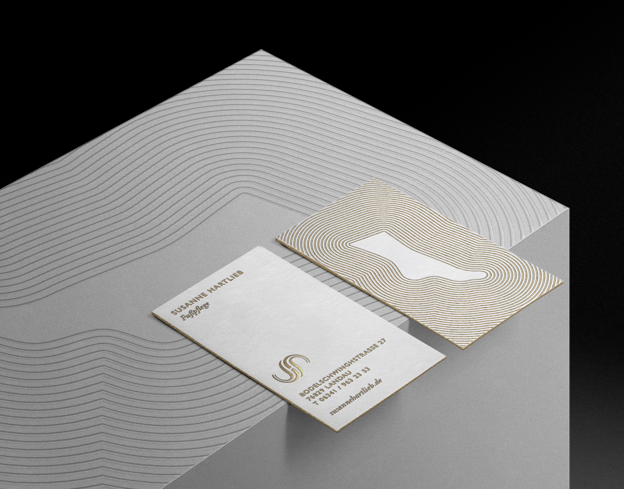
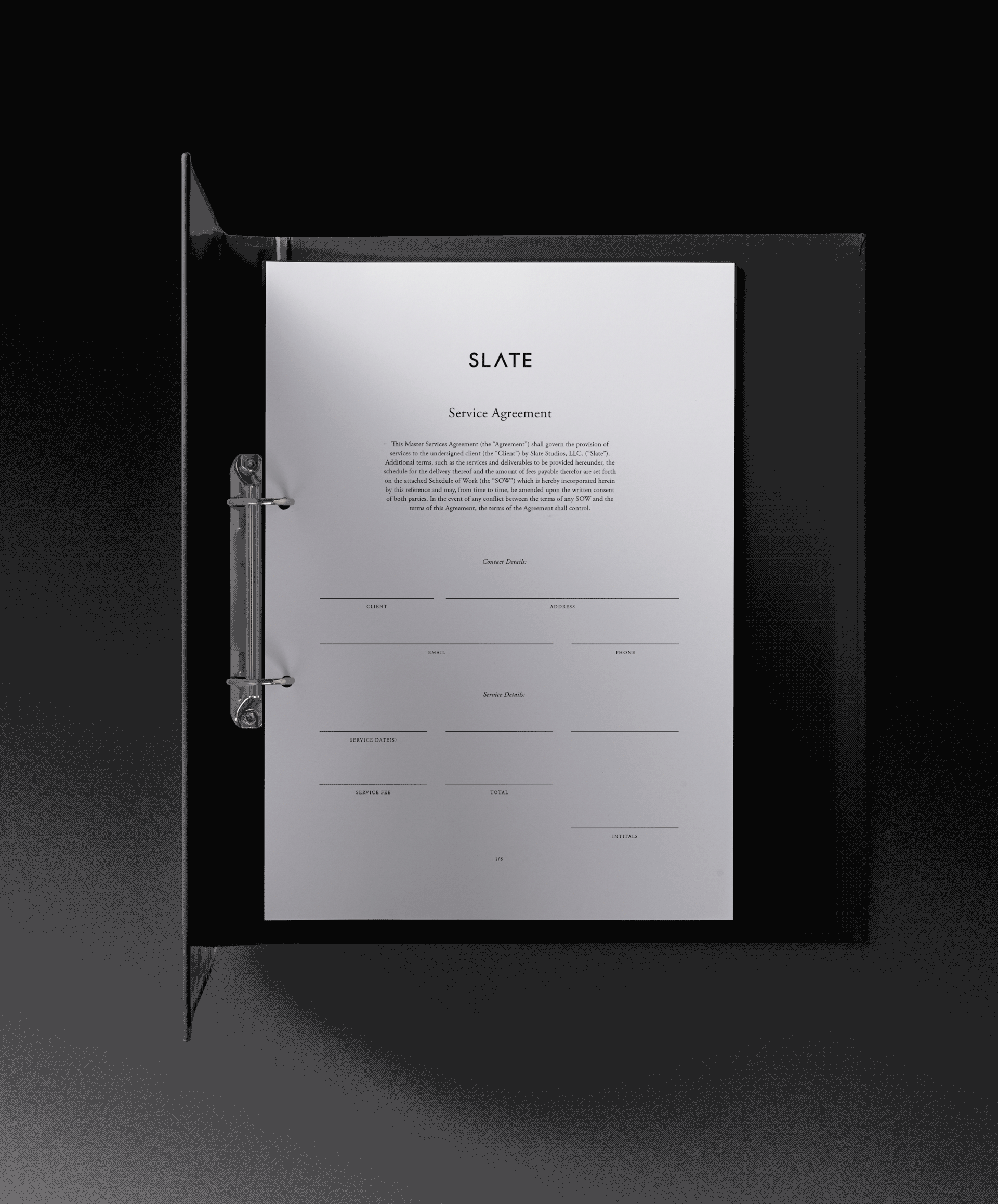
Business Cards, Heavy Weight 2-Ply, letter-pressed

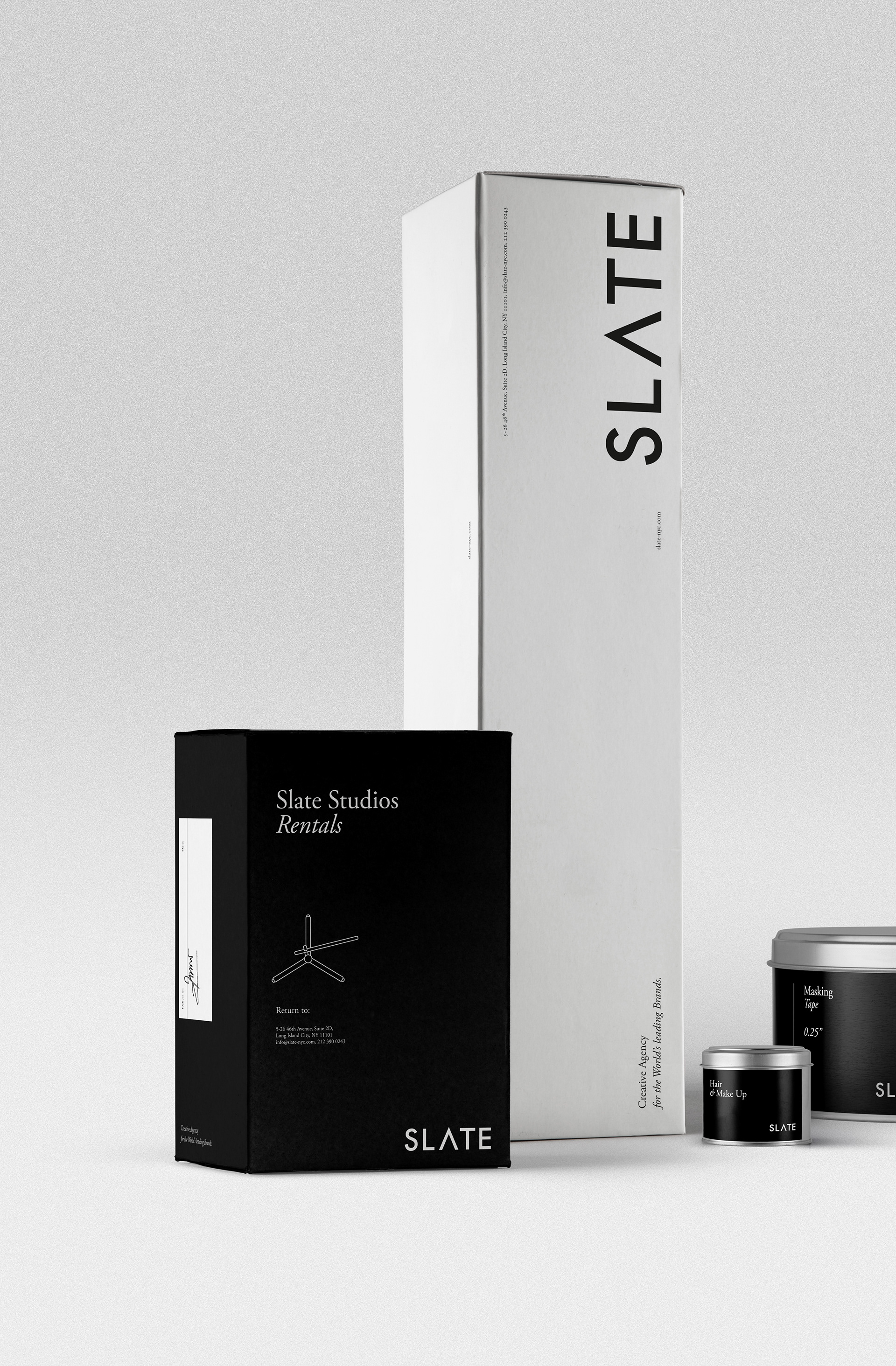
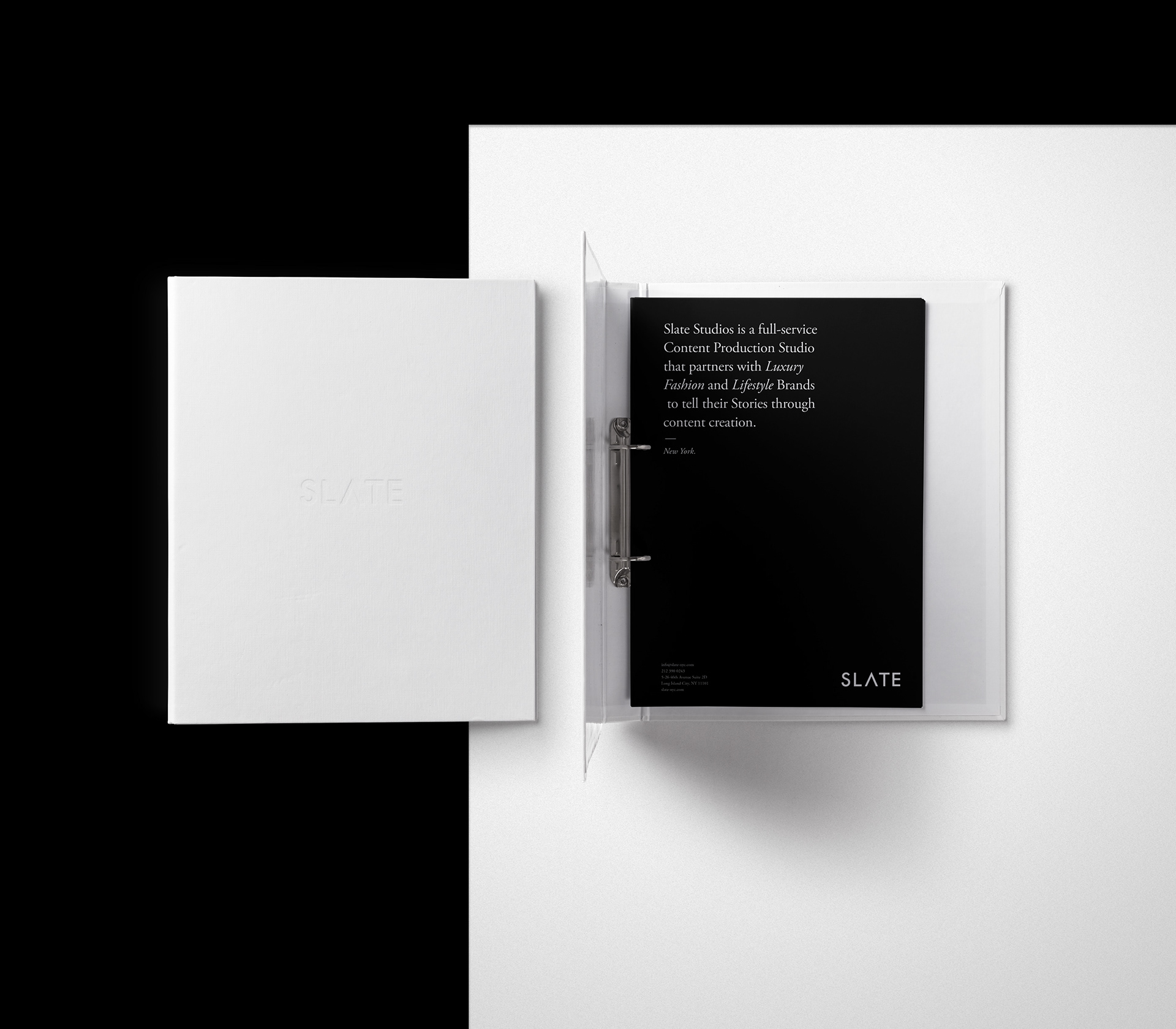
Folders, Boxes and Contracts (below) are designed with subtlety and longevity in mind.
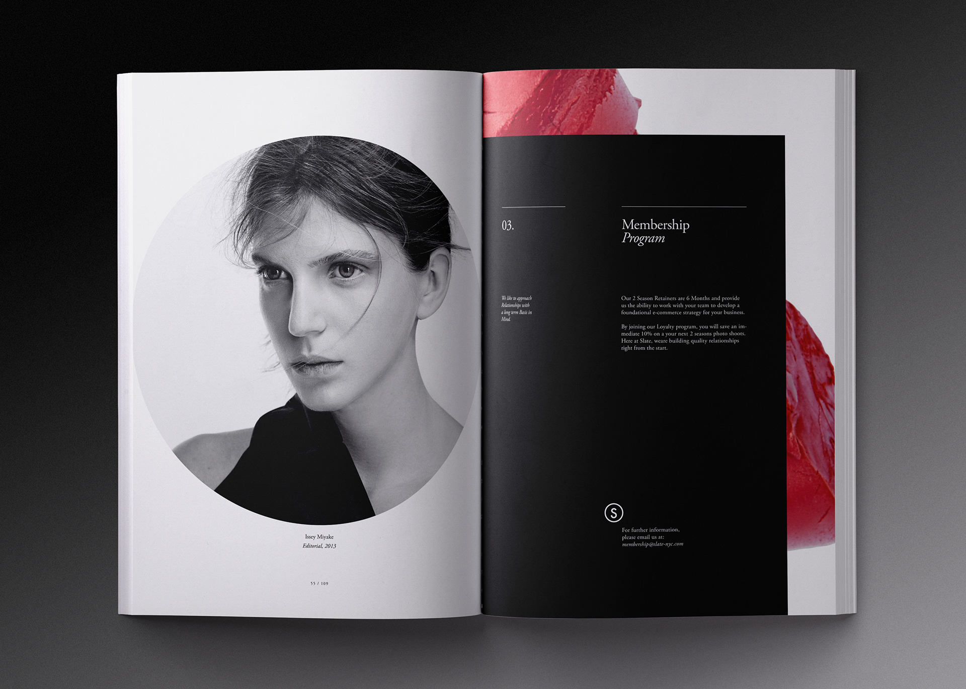
Portfolio:
The Studio Presentation
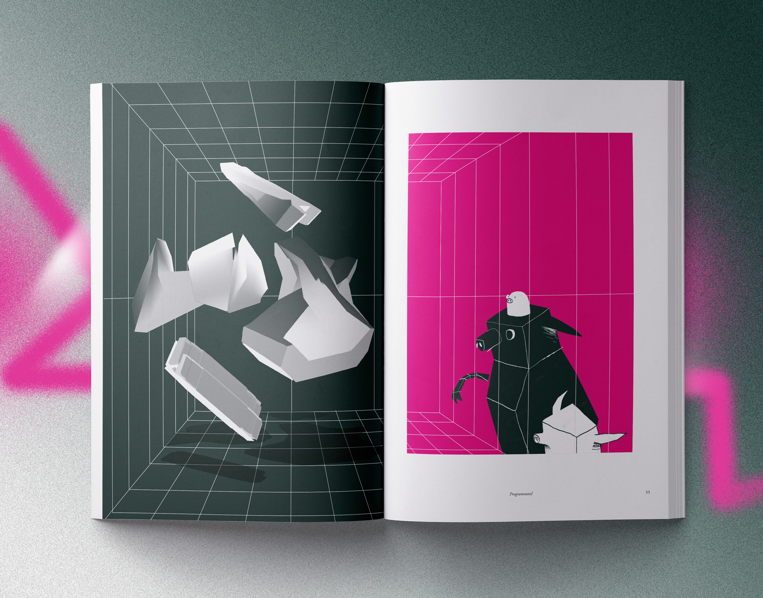
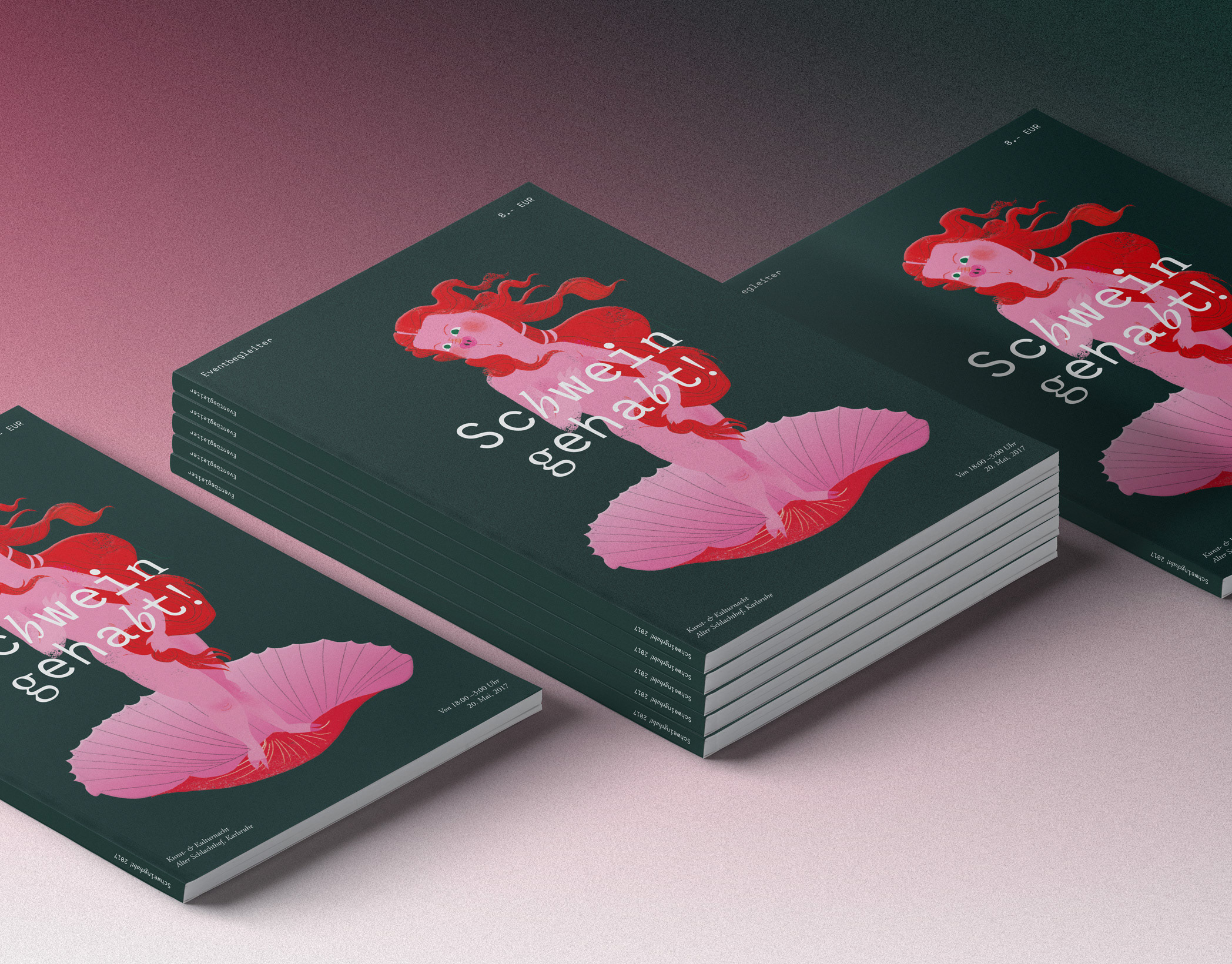
Brochure & Booklets
Brochure & Booklets
Div. Booklets
Several Sizes, Categorized Portfolio
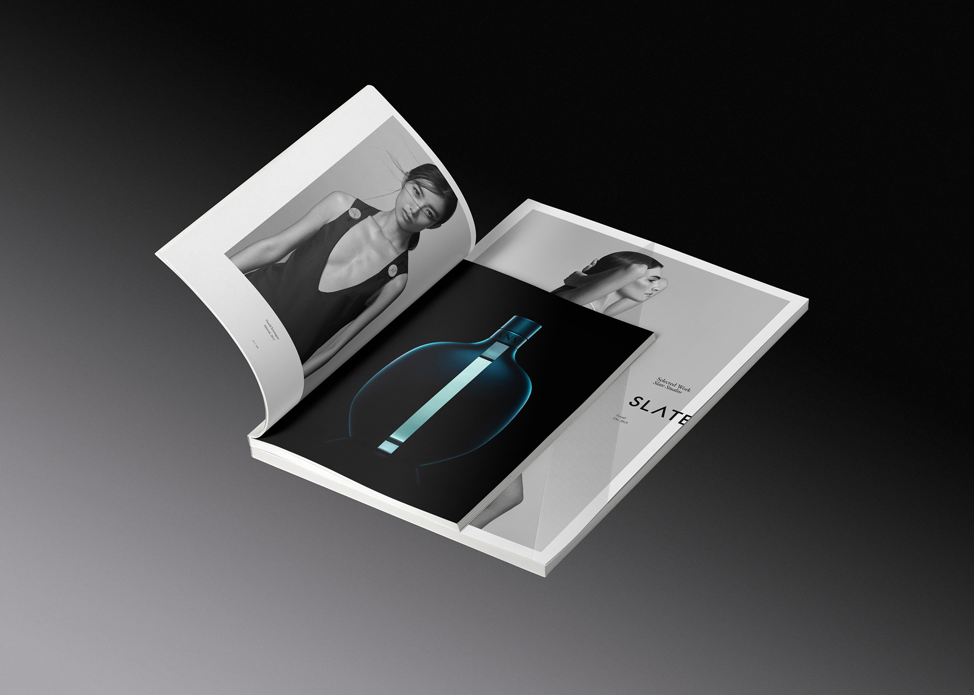
2 Sizes of Brochures are utliized, smaller for a categorized portfolio, larger for the studio presentation including a generous presentation of Selected work.
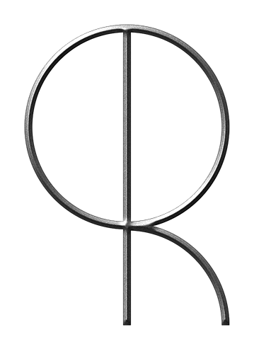
A simple numeric system is utilized for the cover design of the categorized portfolios
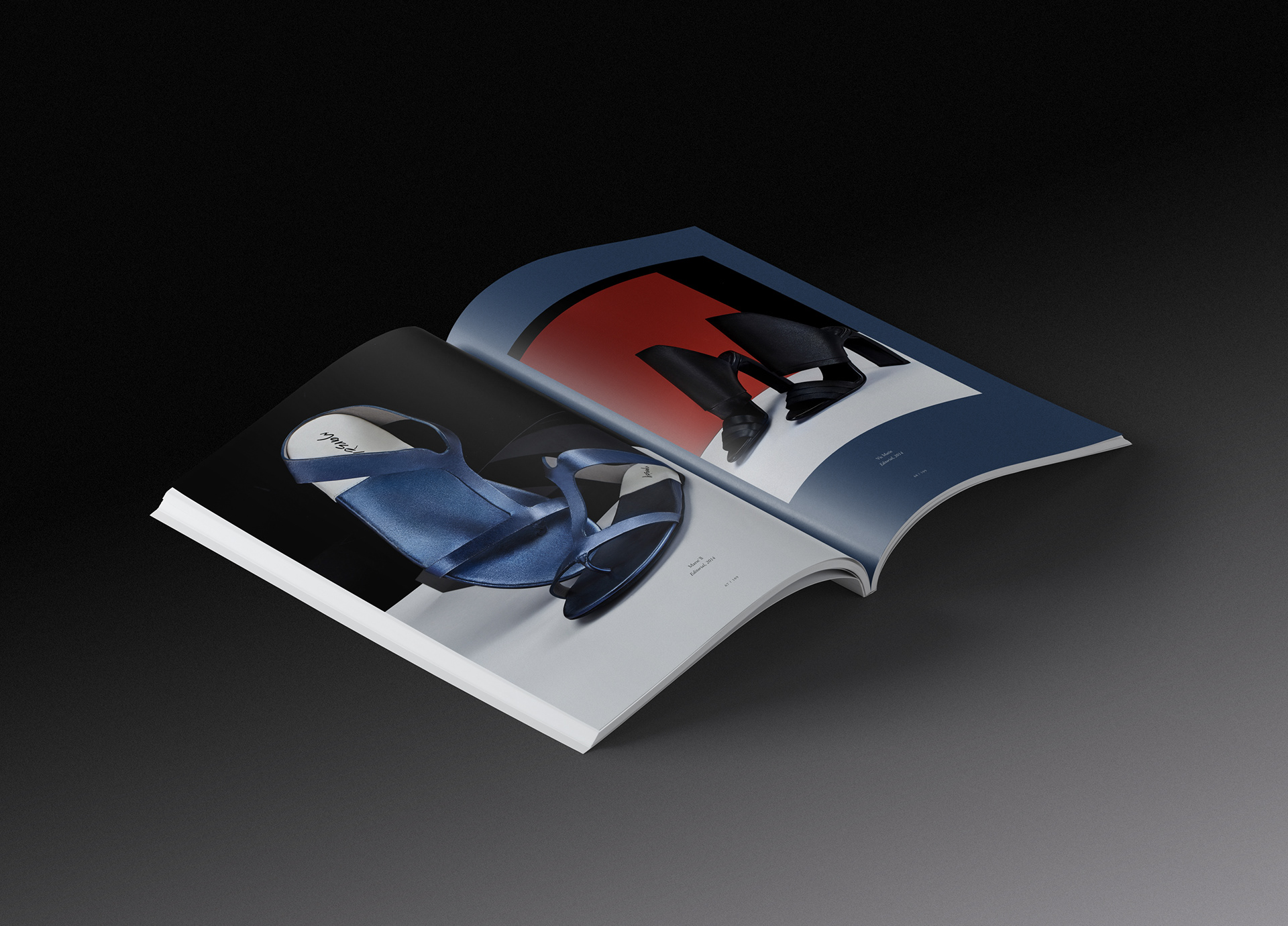
Understated layout and typography makes space for the presentation of the work, while still adding some creative undertones via use of color, crop and composition.


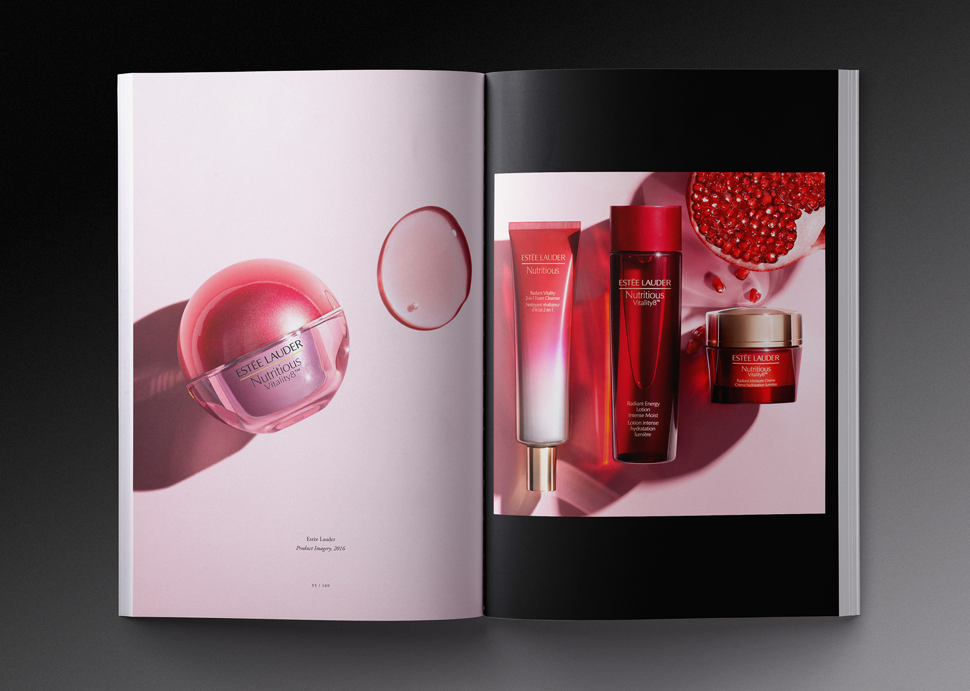
Two Spreads from the Studio's Beauty Portfolio
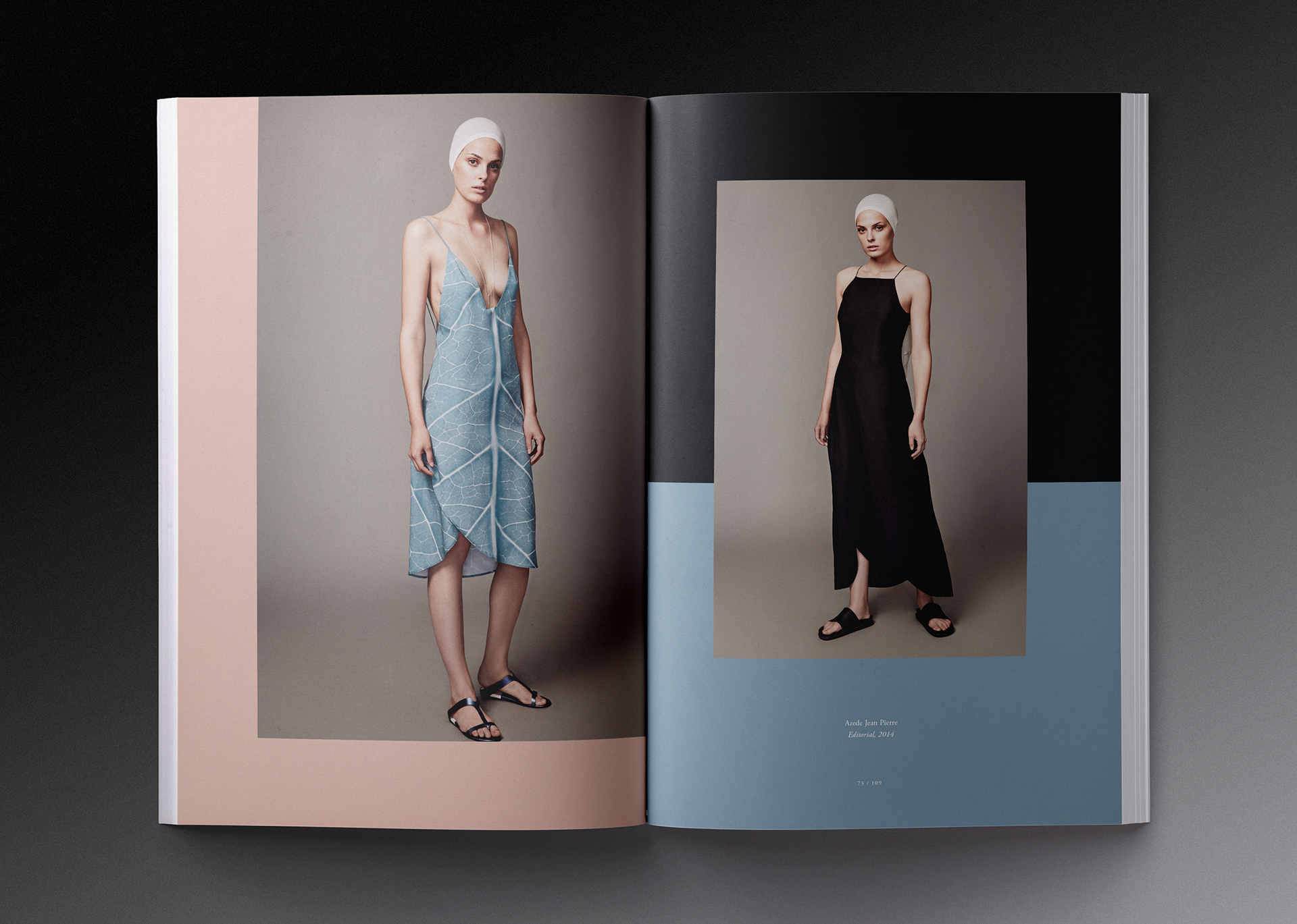
Playful layouts break up the other wise classical pages to showcase the Studio's different styles and understanding of the millenial market and contemporary trends.
04
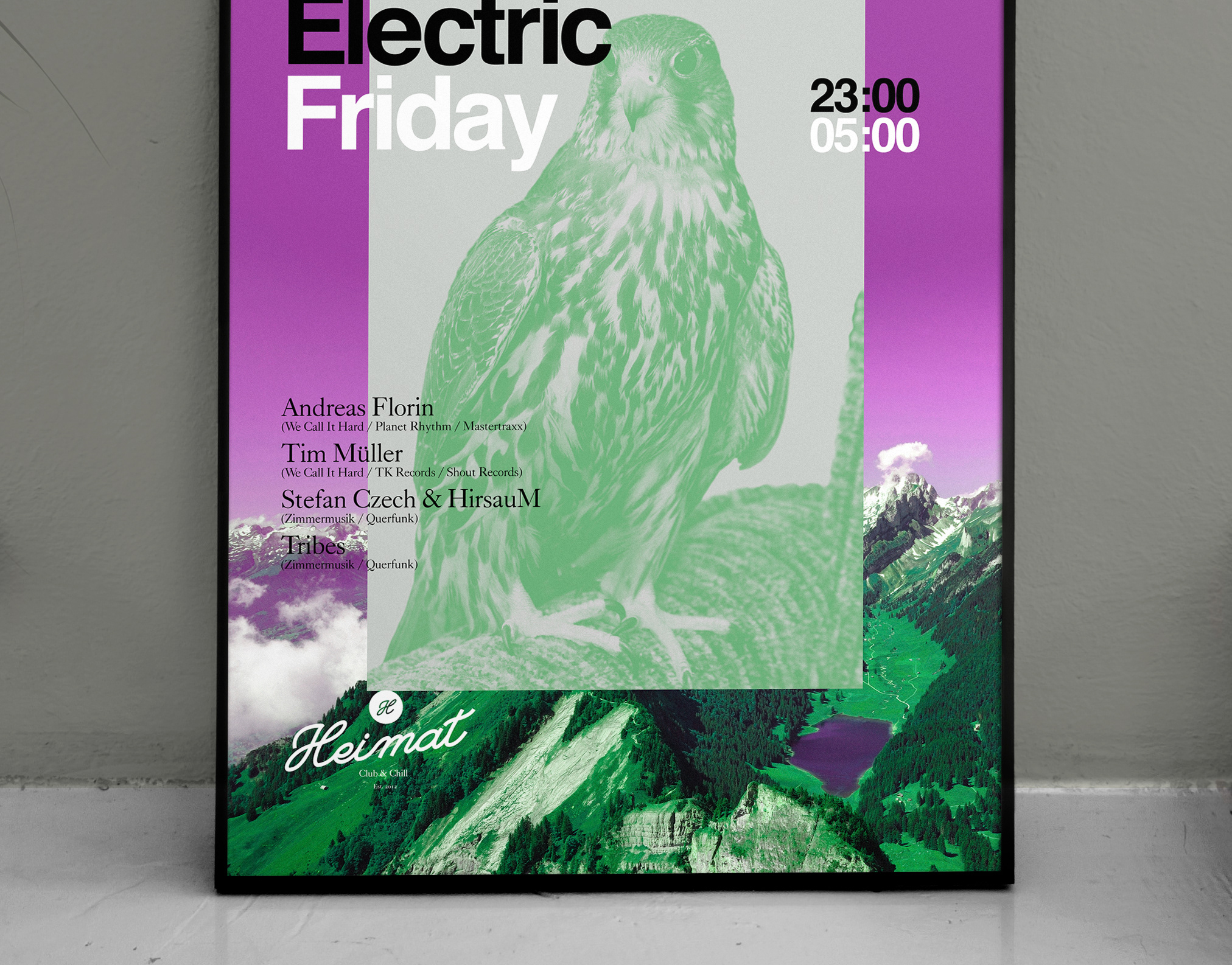
Advertisements
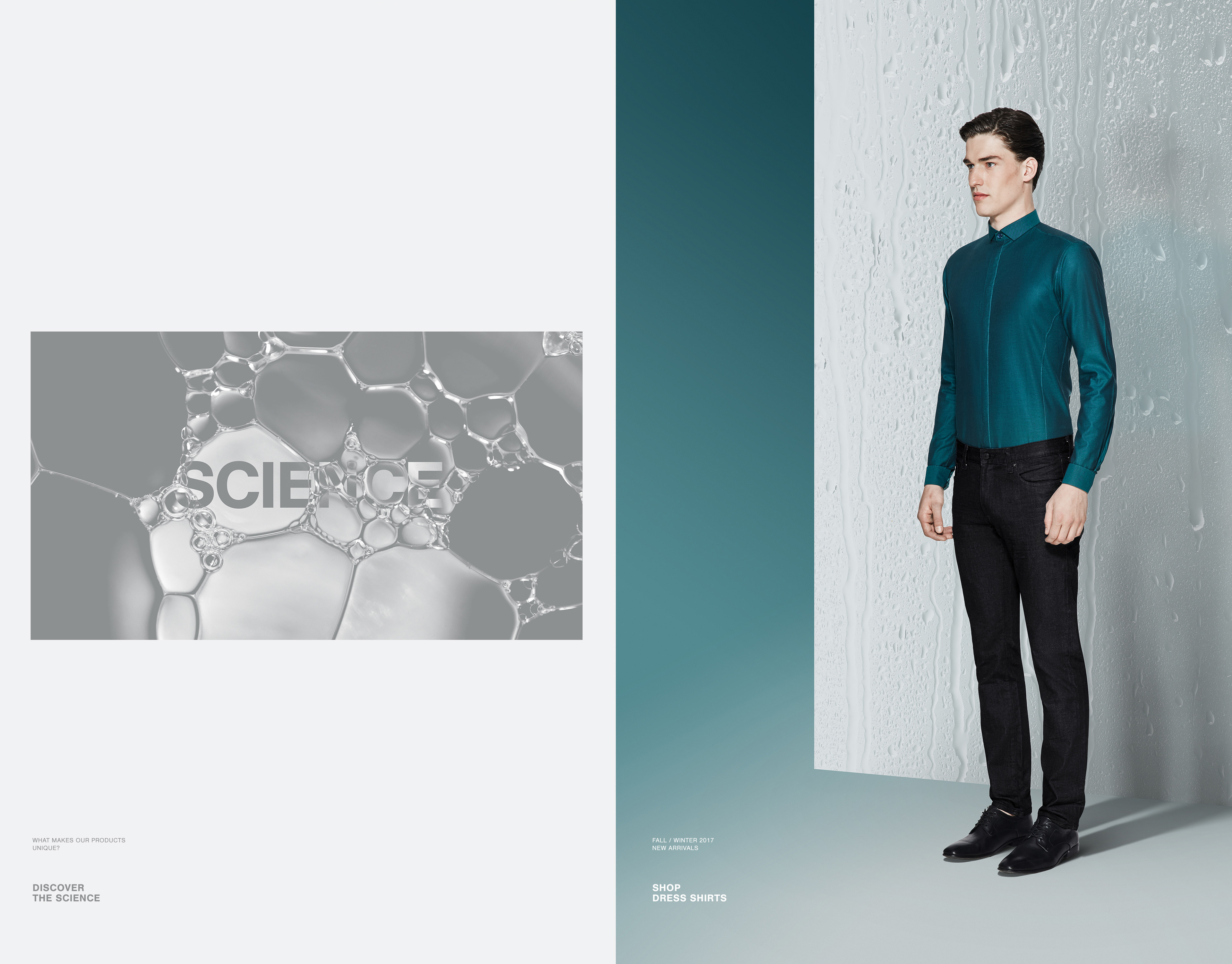
in Print & Magazines
in Print & Magazines
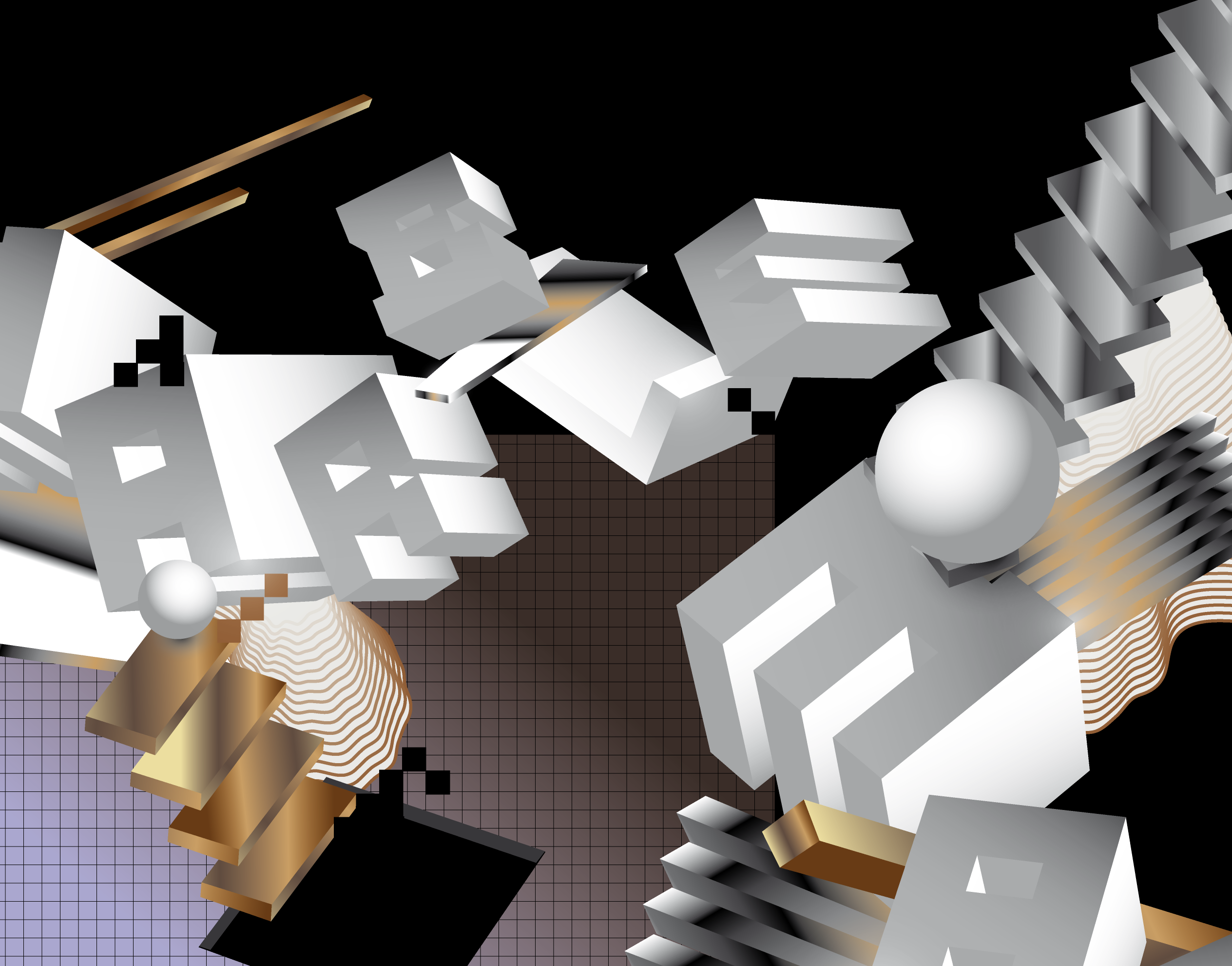
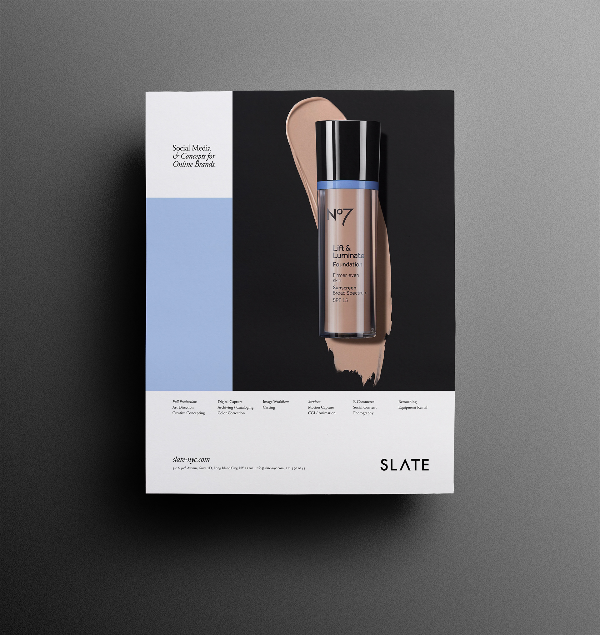
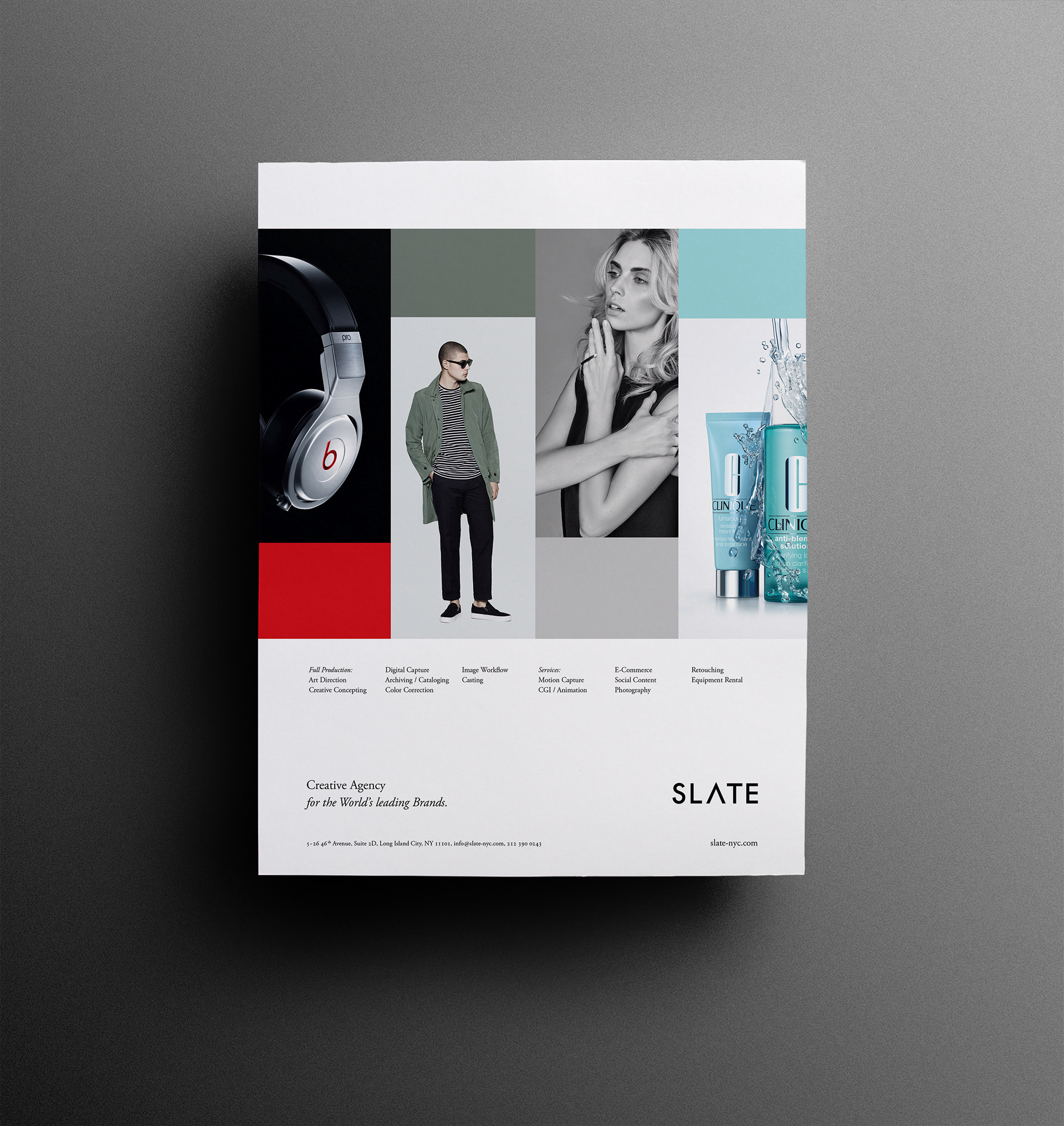
Advertising Architecture
Basic Grid / Typography & Image Use
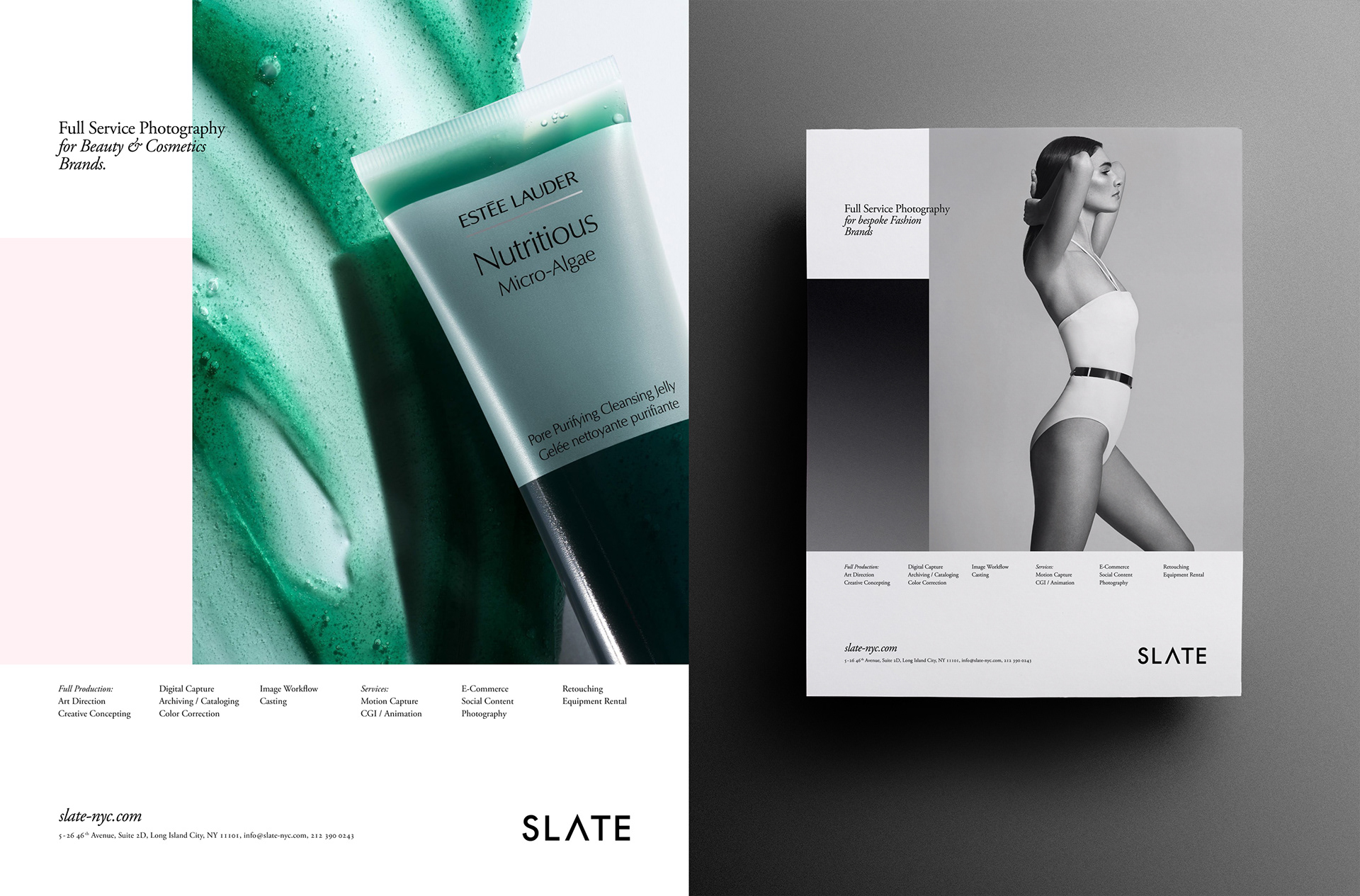
A simple framework to hero a specific services, markets or the studios full service approach as a flexible solution that provides the necessary space for the quality of the work to take the front seat.
Collaterals:
Digital Documents
And internal .PDF Files
And internal .PDF Files
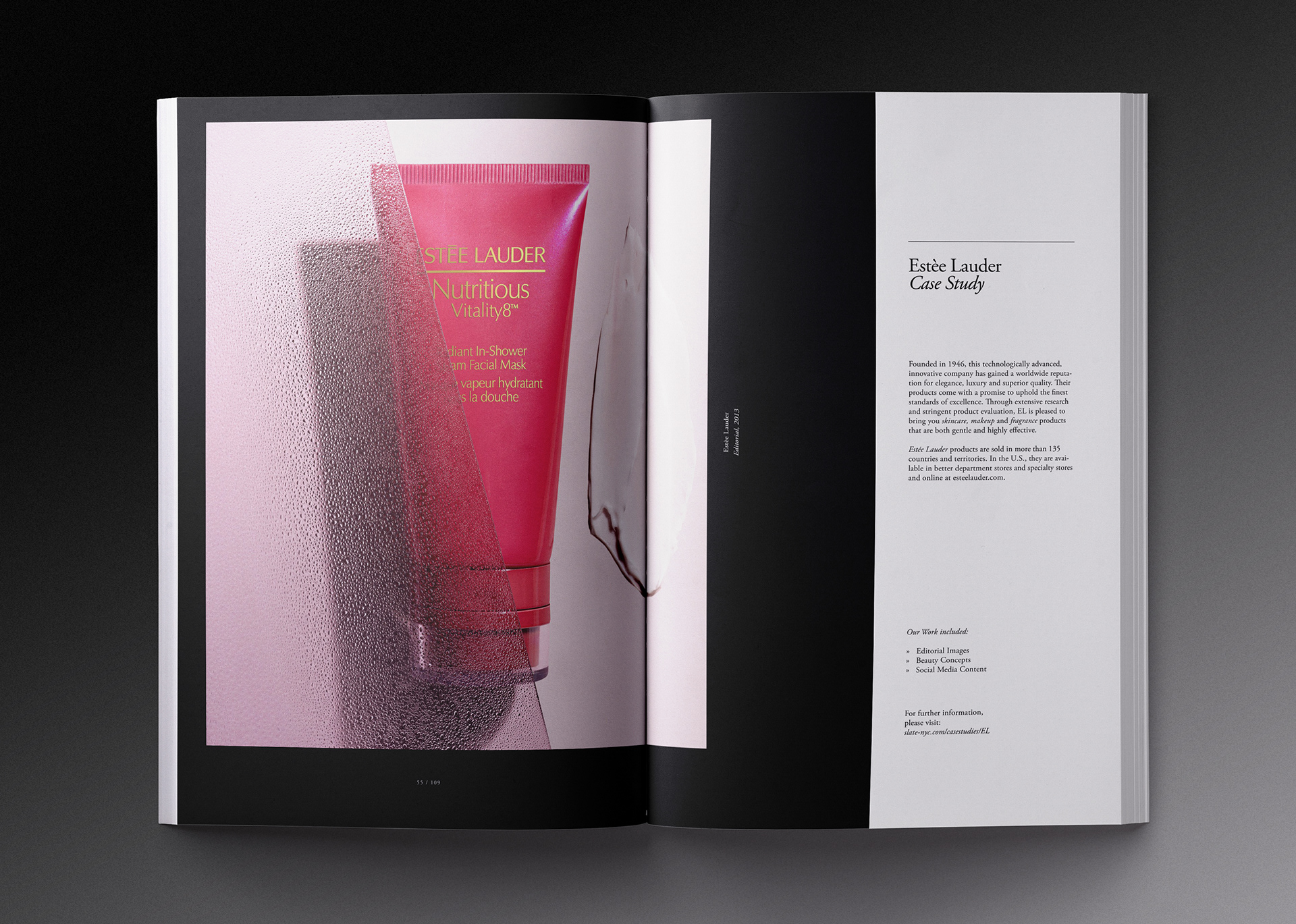
Case Studies, Proposals,
Price Lists, Tracking Sheets
and more…


Online Presence
Website
And Social Media
And Social Media
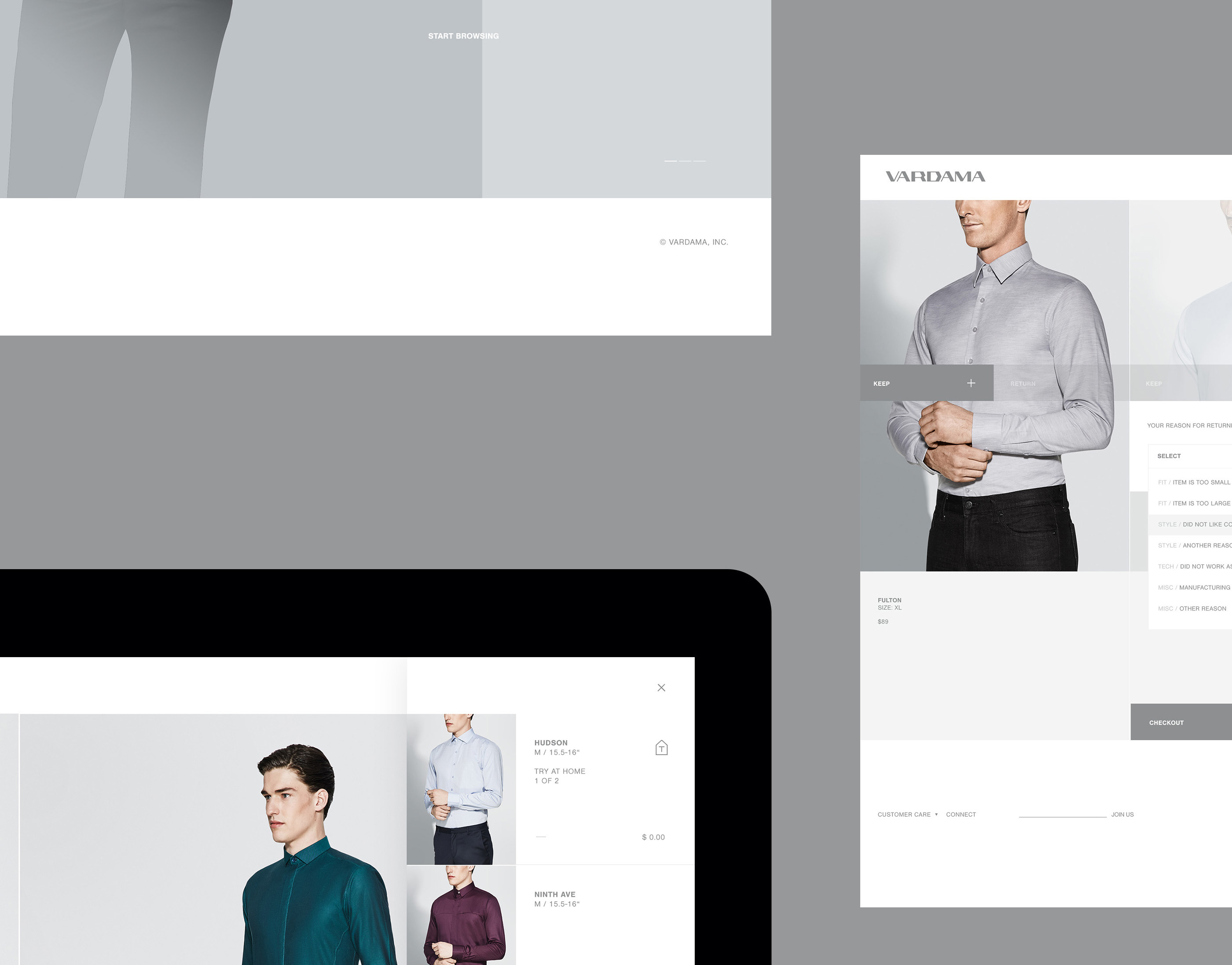
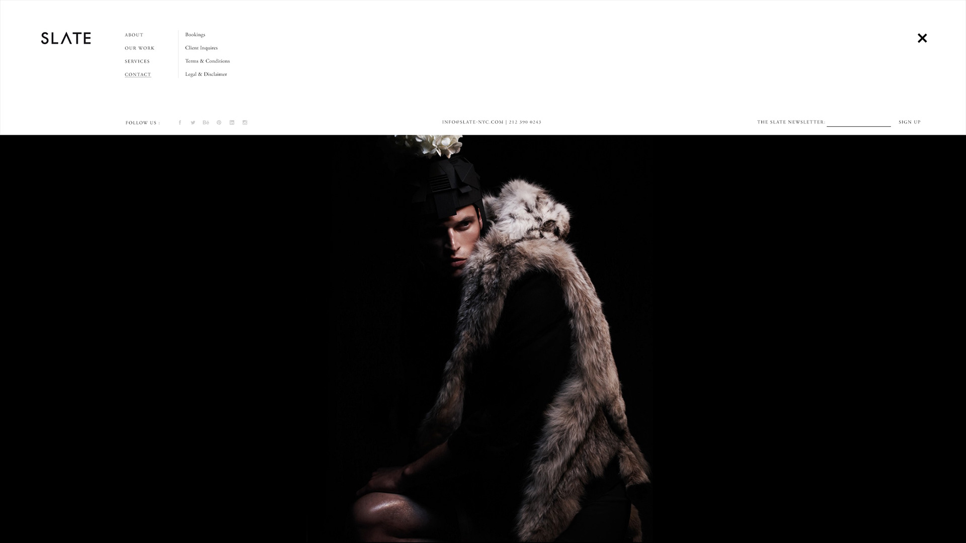
Studio Website & Email Campaigns
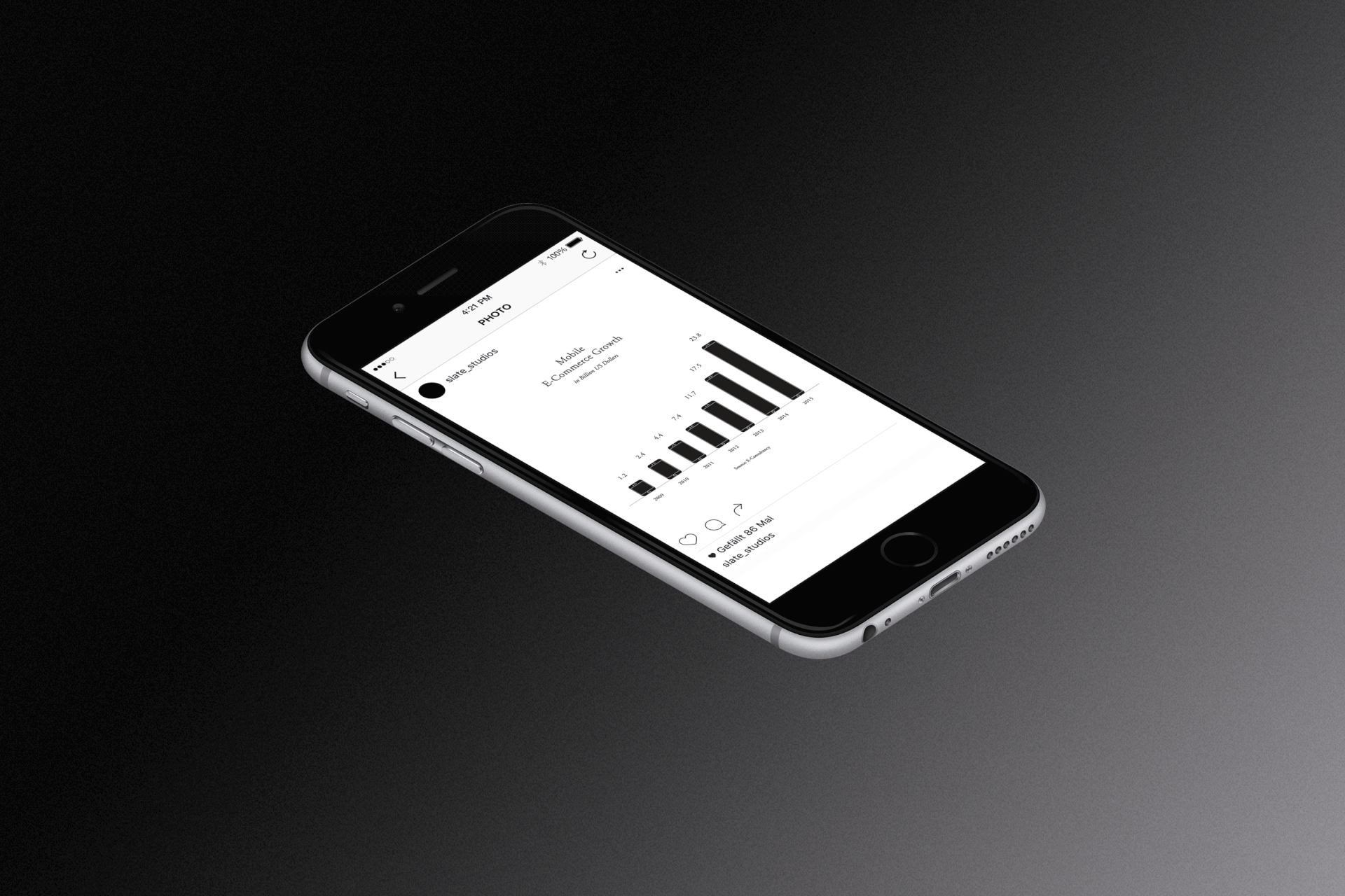
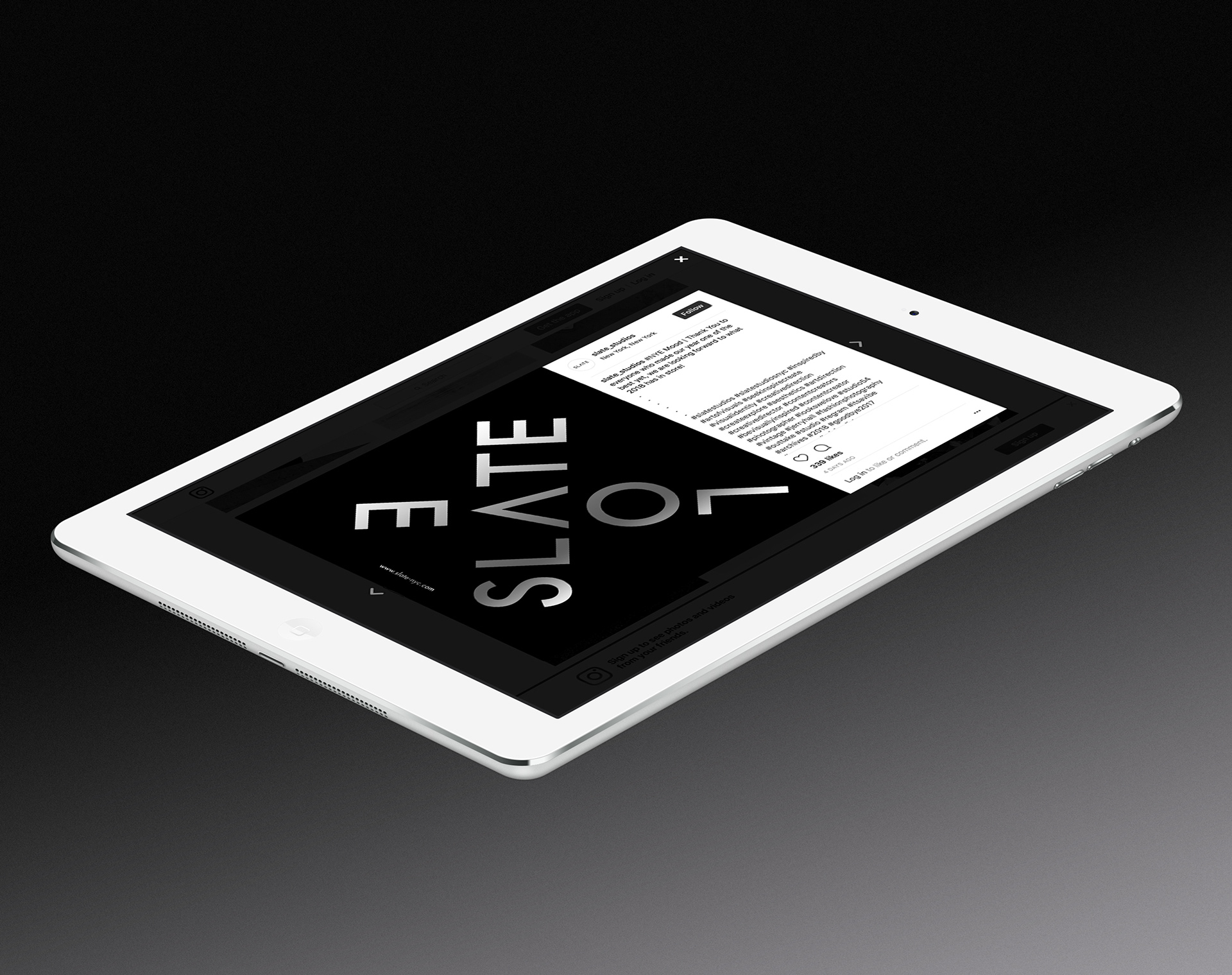
Social Media Channel
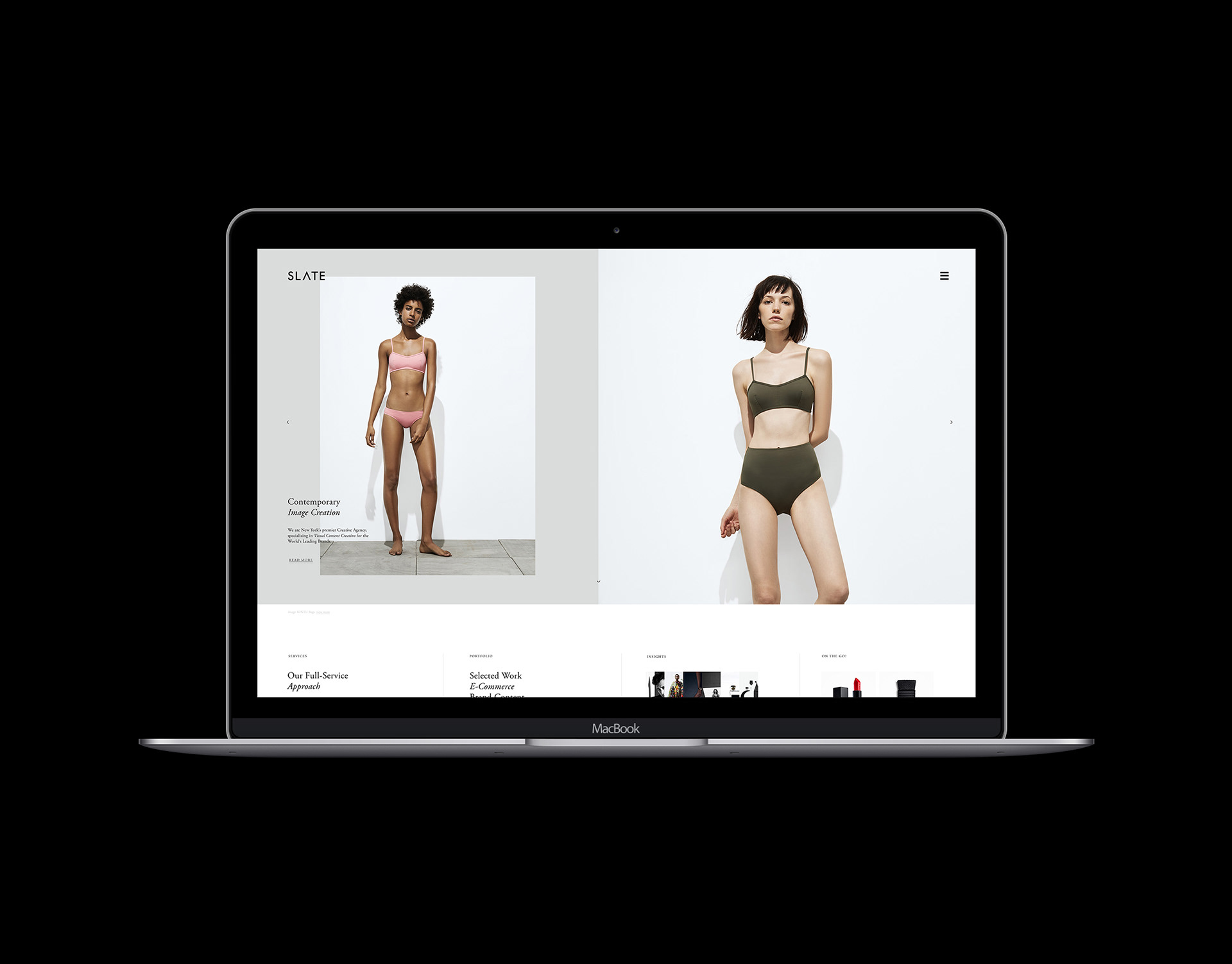
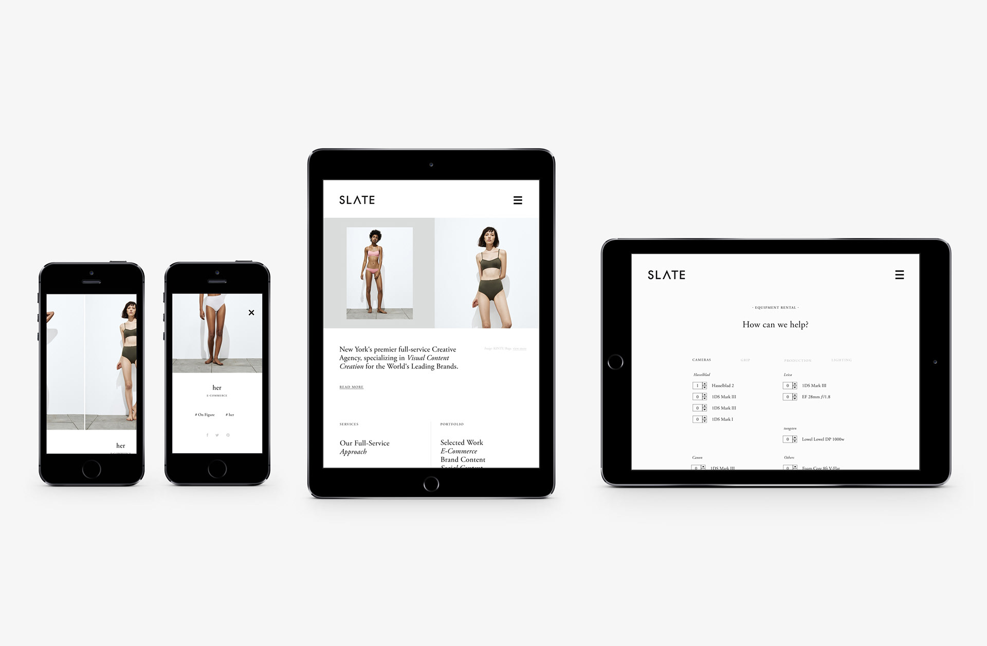
Generous Hover-Images for the first and second navigational items in the hierarchy.
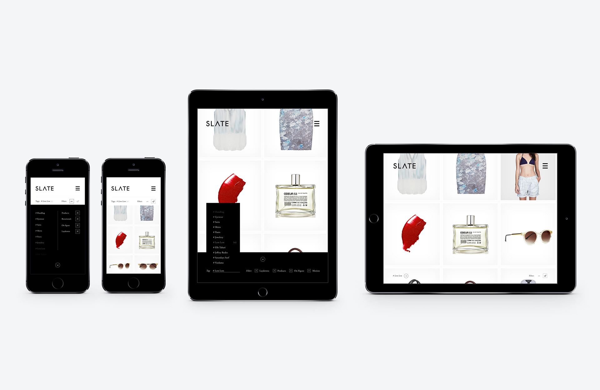
A dynamic gallery view with multiple filter options
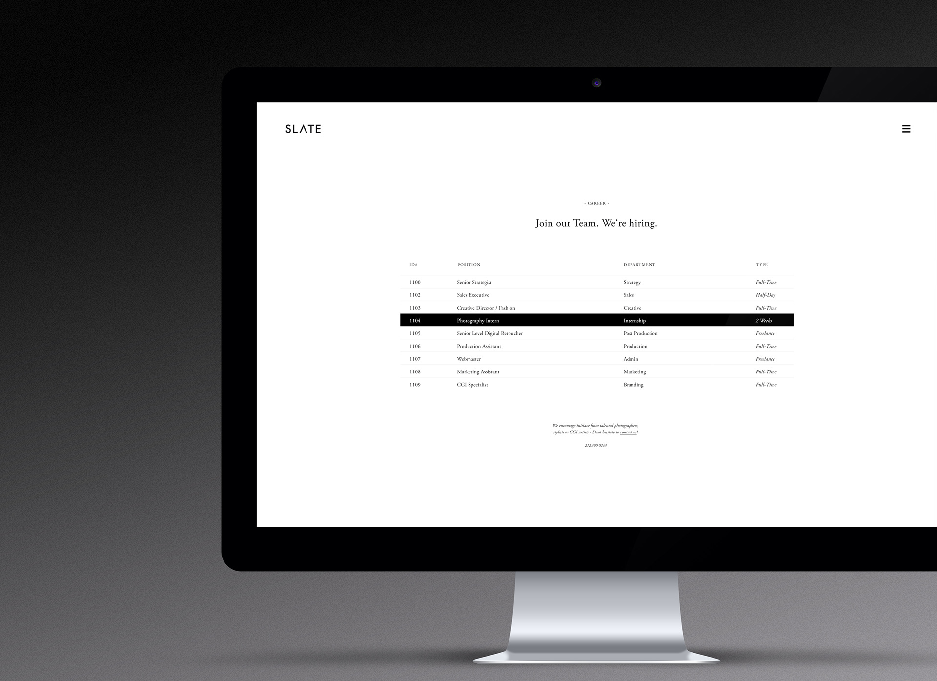
Informative Pages are understated and minimal
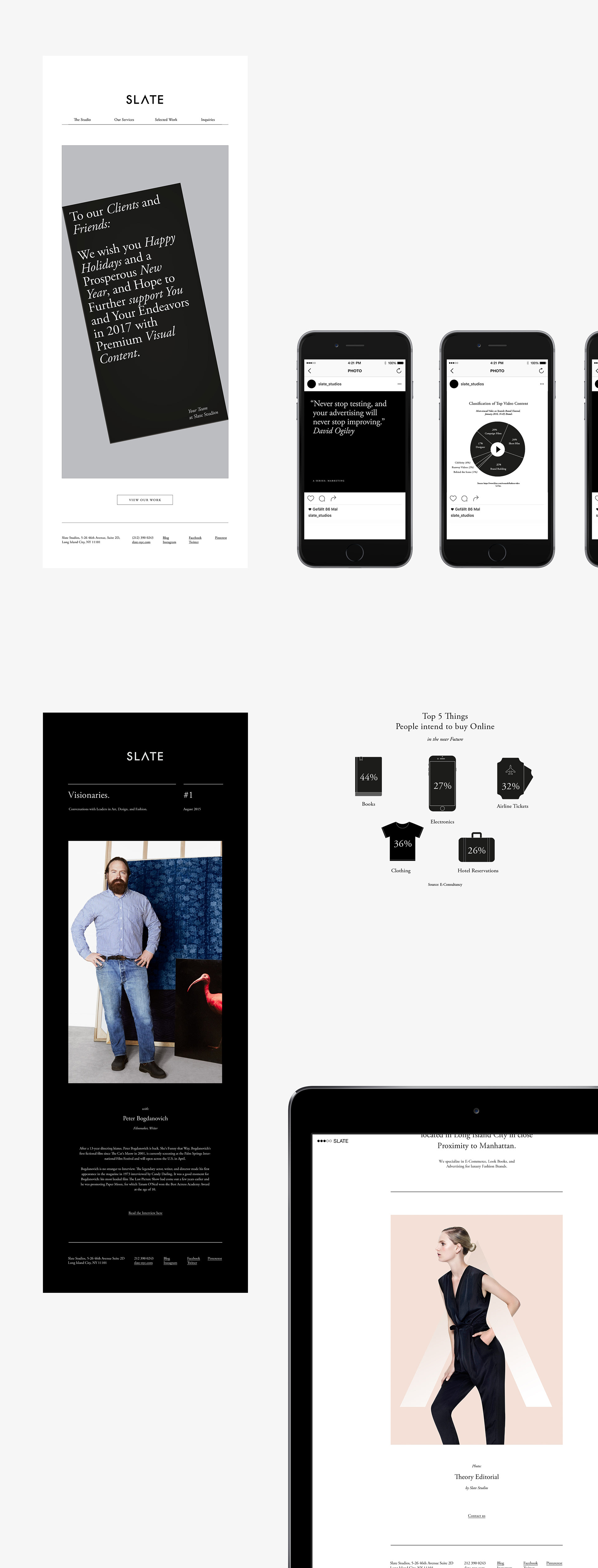
Email Campaign Templates & Concepts
Social Media Content Creation & Use of additional Graphic Design Elements
Credits:
Art Direction: Christoph Ruprecht
Graphic Design: Christoph Ruprecht
Photography: Slate NYC
© 2014 – 2016