
It was both fun and challenging, interacting with the community and working with a severe time restraint.
About the Typefaces: After almost 100 years, original typography sketches and unpublished letter fragments from the legendary Bauhaus school of design were rediscovered and are now ready to inspire a new generation of designers. Five beautiful alphabets have been meticulously completed and digitized by an international team of students guided by renowned type designer Erik Spiekermann. Now for the first time, we’re making two fonts available exclusively to Creative Cloud members, with more to come.
You can learn more about the Adobe/Bauhaus cooperation here:
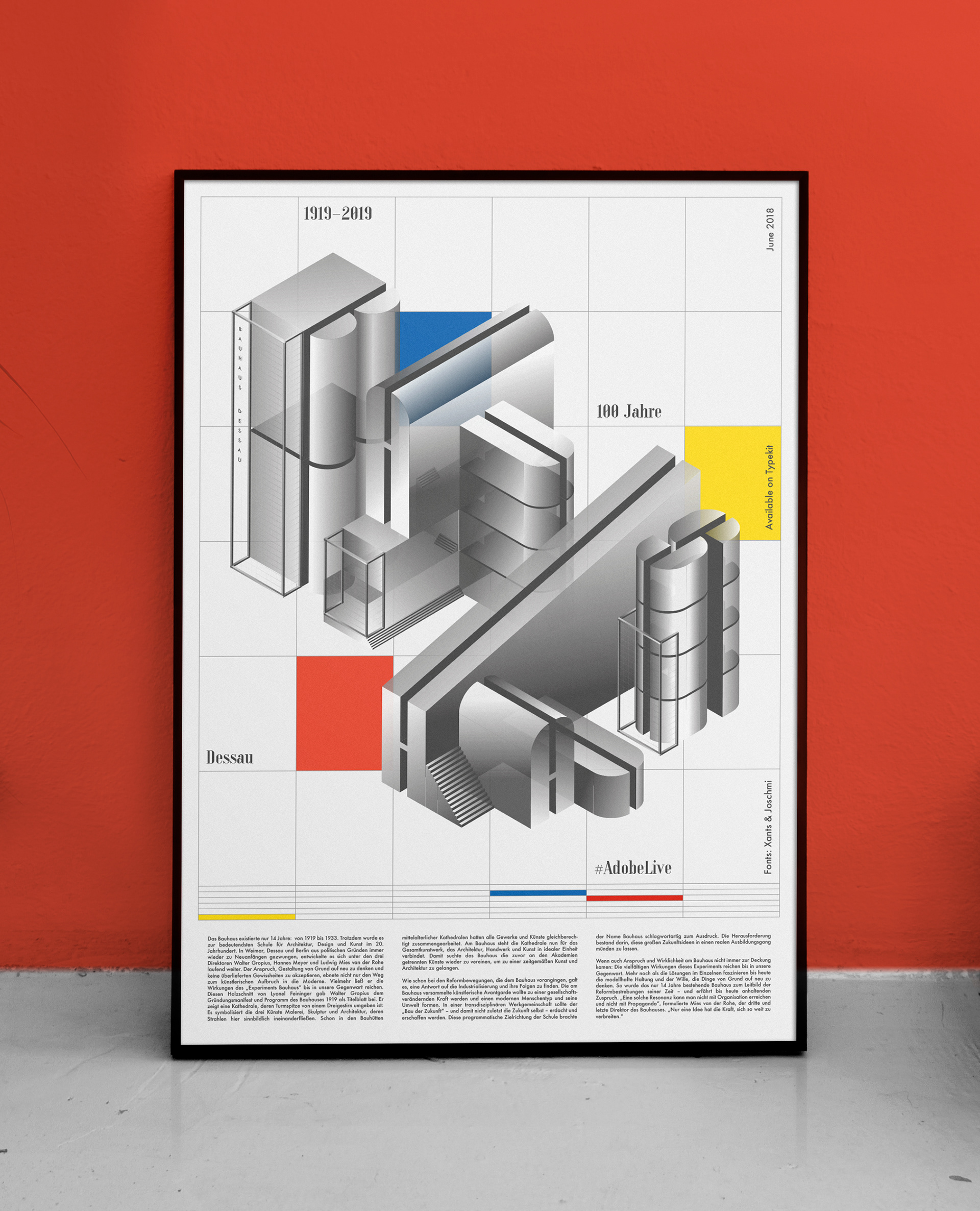
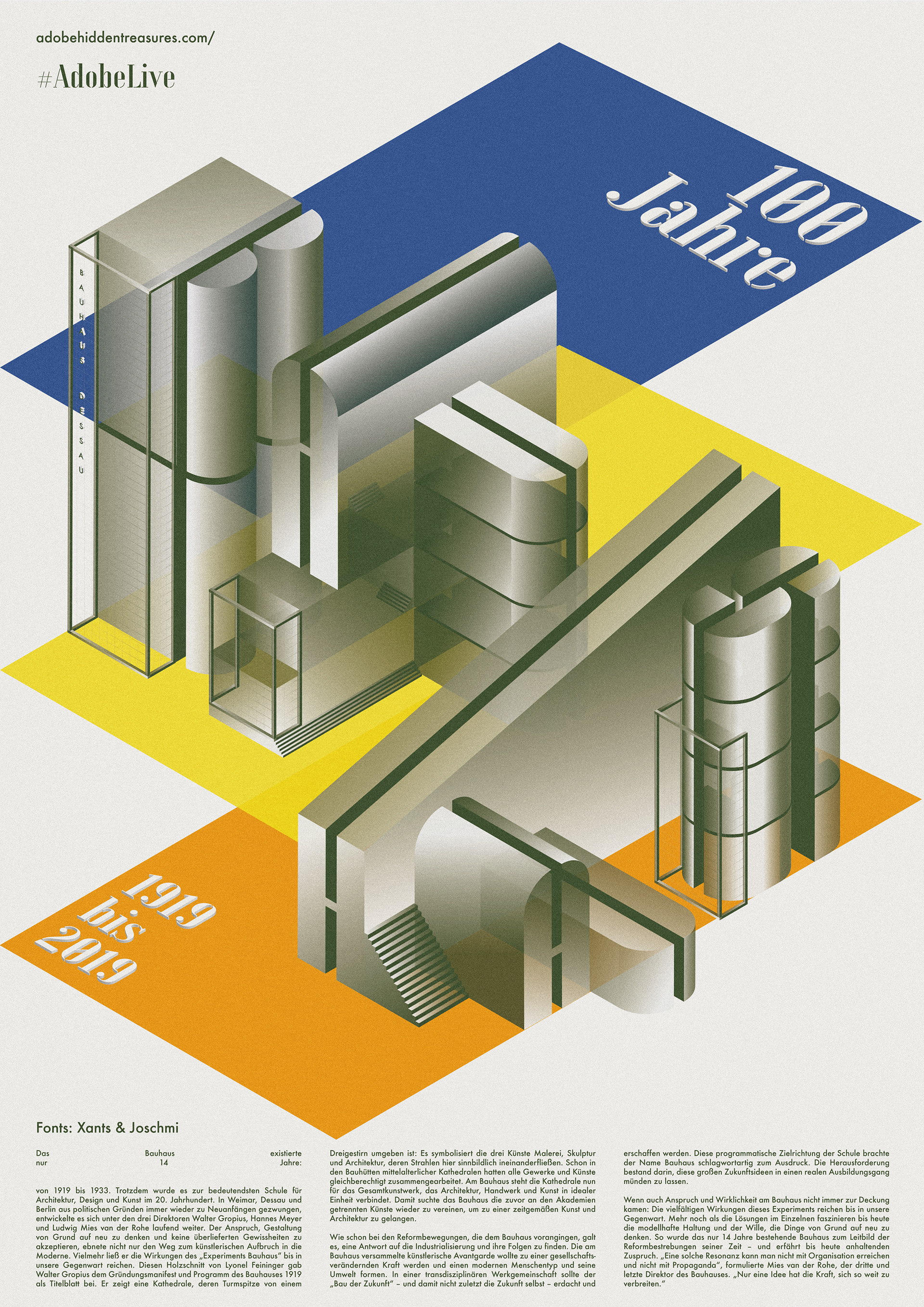
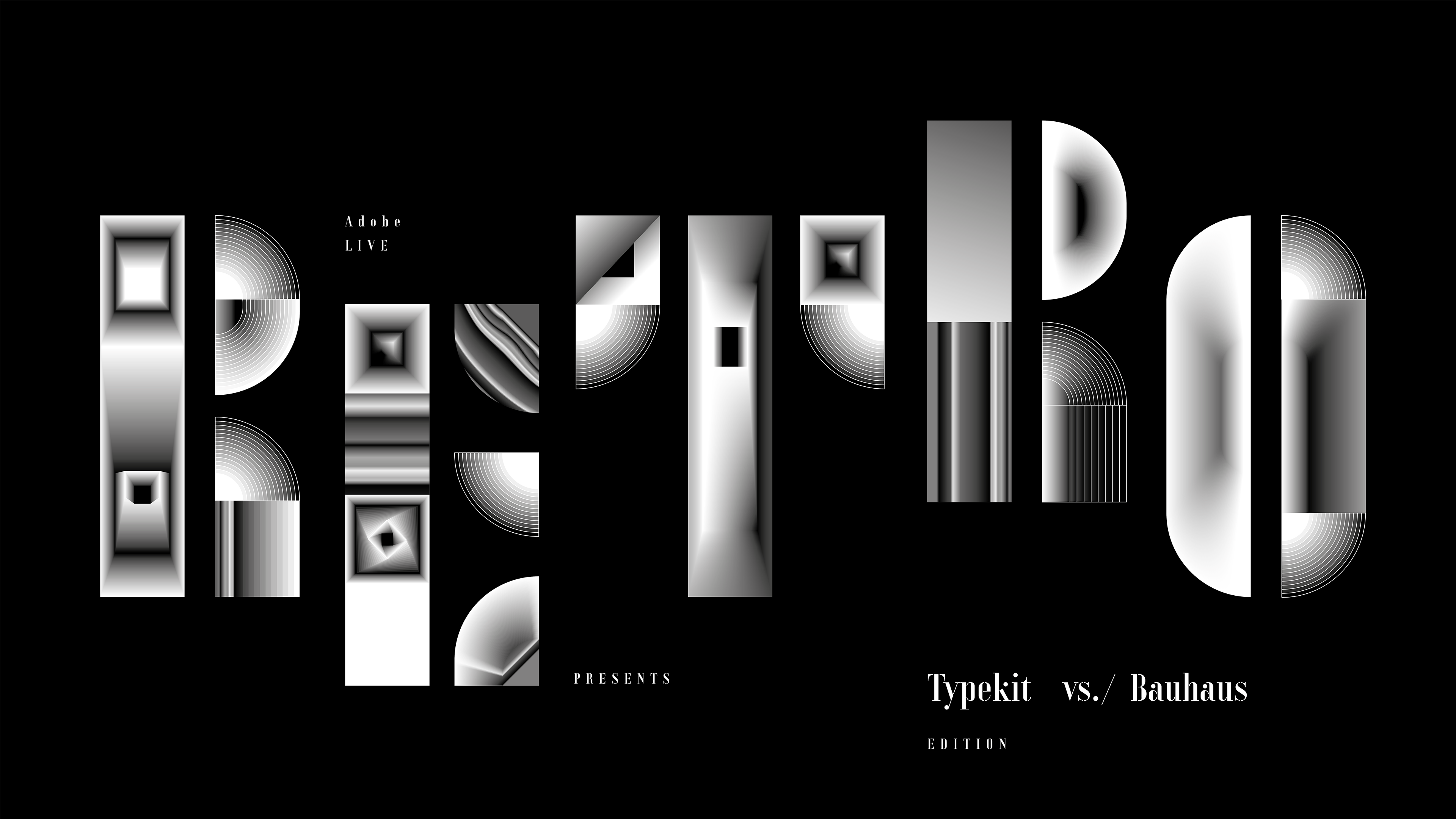
Day 1 – Poster
Poster Design, using the "joschmi" typeface as the main building blocks, deriving an illustrative typography piece, inspired by the radical isometric perspective used for architecture and technical drawings at the bauhaus a hundred years ago. Created with adobe illustrator, using the 3D extrude effects, isometric perspective, global colors and gradients with various transparency settings. You can view the 2 hr video of the session below (german only, sorry).

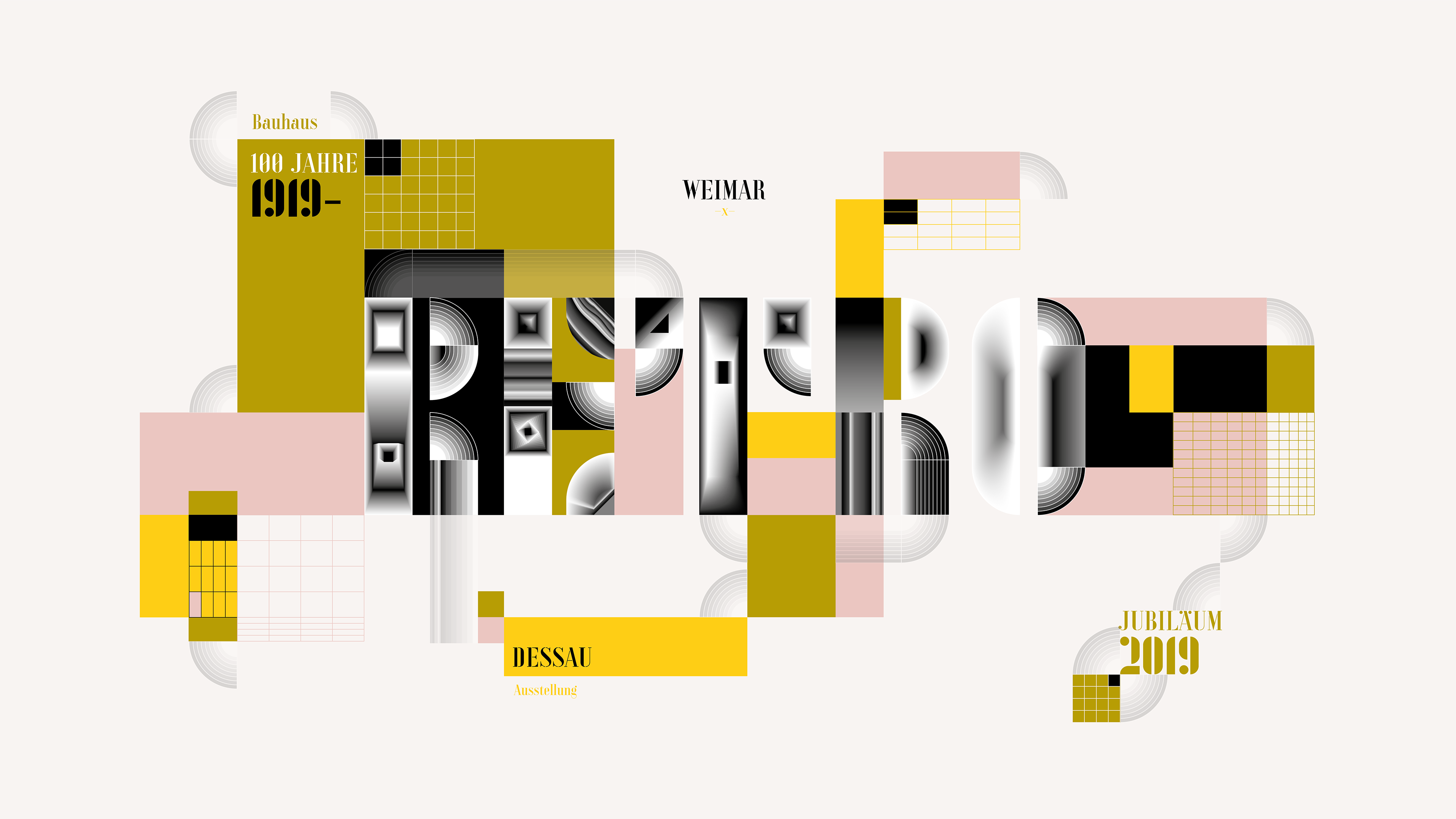
Day 2 - Desktop BG
A quick desktop background to celebrate the upcoming 100 year anniversary of the bauhaus. I wanted to deconstruct the "joschmi" typeface, to emphasize its modular character and to have some simple fun with the blend tool by filling the individual letters of a word suggested by the live community during the stream. The blend tool comes with a lot of experimentation and trial and error, but can deliver unexpected results and due to its generative nature, create lots of complexity in a short amount of time.
The result doesn't feel as complete as on day one, in the end it was more about the process and giving some creative impulses for illustrative typography.
You can view the 2 hr video of the session below (german only, sorry).
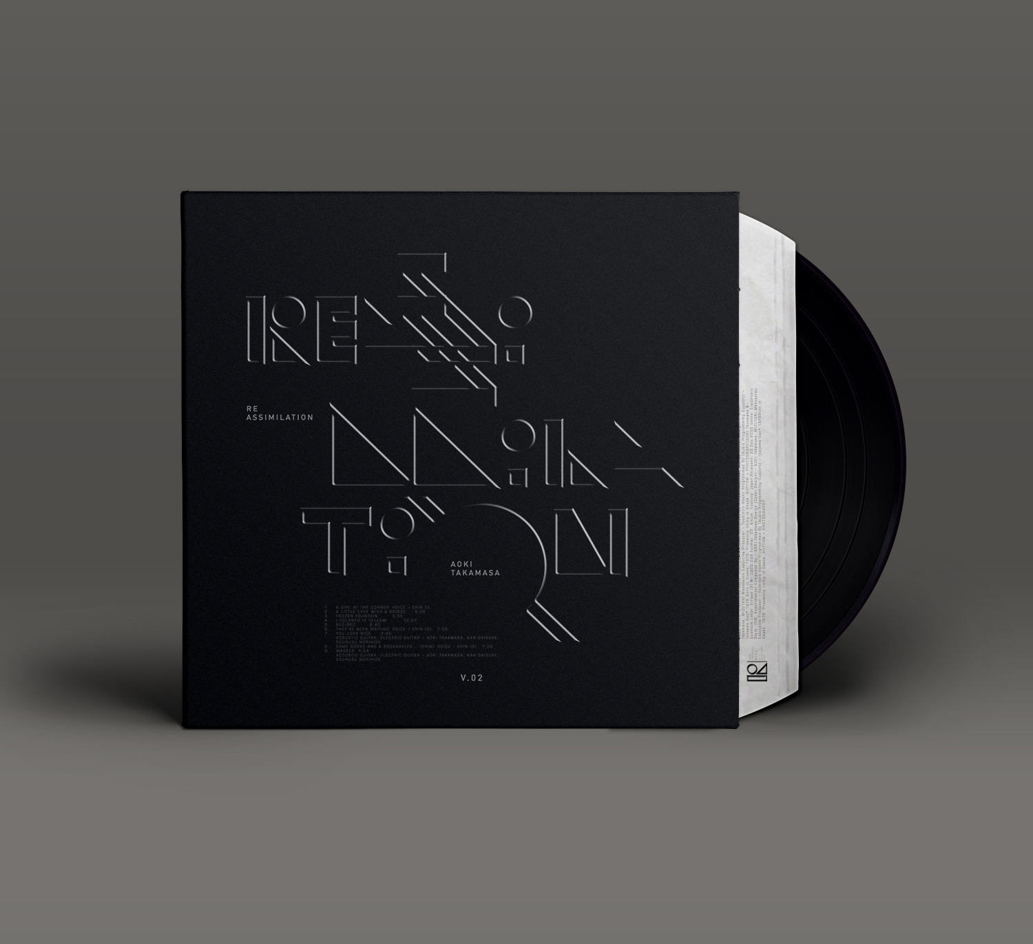
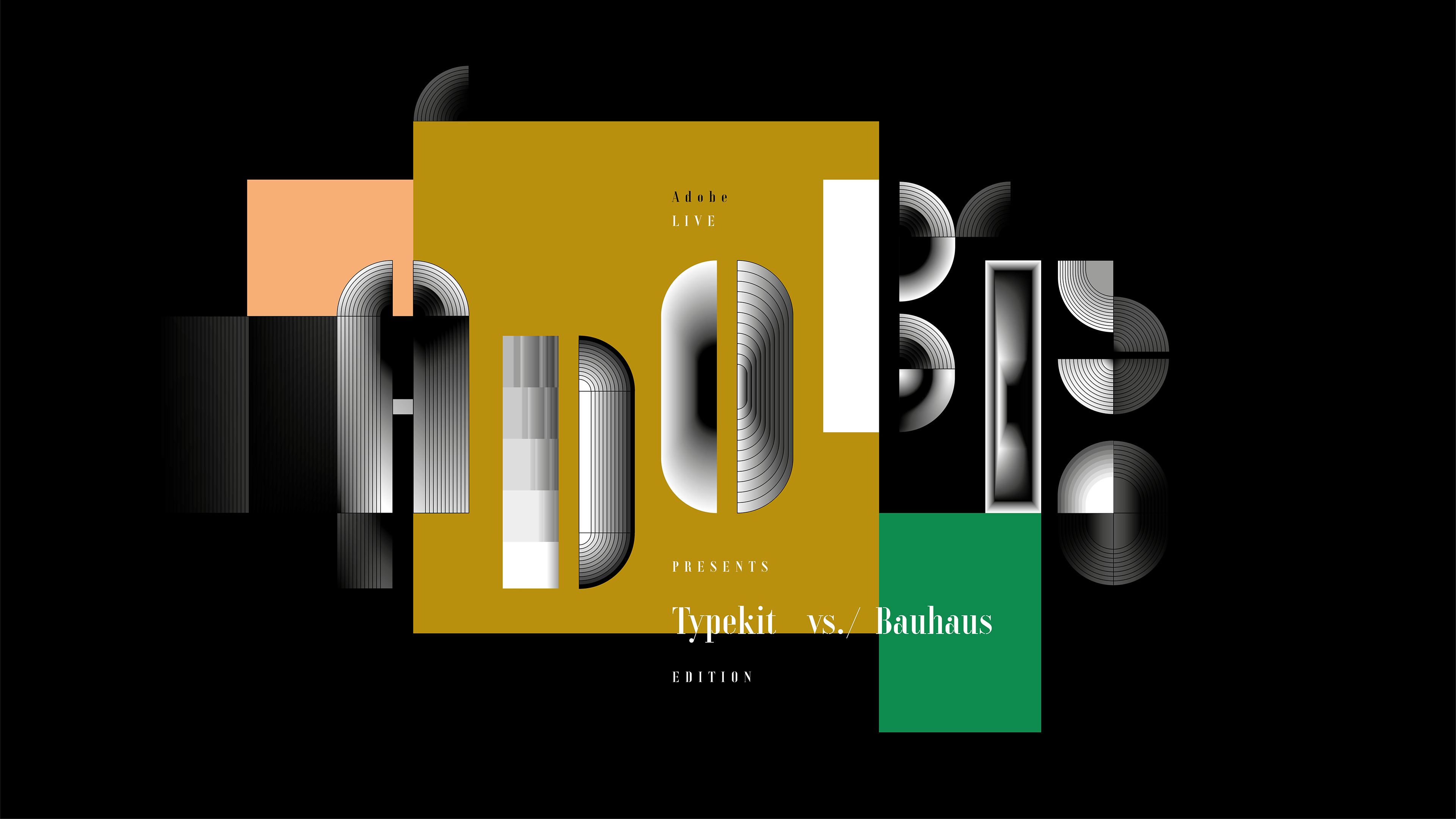
"RETRO"
Blend Tool meets "joschmi"
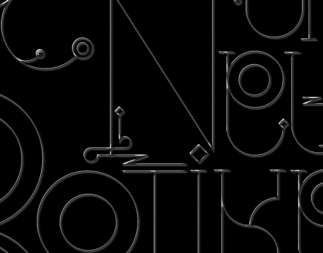
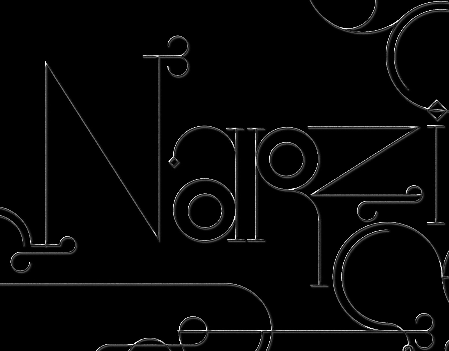
Day 3 - Logo Design
We divided 1,5 hours into 3 segments, working with both, "xants" and "joschmi" to create a couple of quick logos. In approach 1 I utilized some serif elements from the "xants" typeface to create a mark to go with the logo type, as well as a custom letter solution, which I created after the live stream (first image below). In approach 2 the lowercase version of "xants" was utilized to create a fictional logo for a watch manufacturer. In approach 3 I tried to create a logo by combining elements from both typefaces, resulting in an interesting and unexpected hybrid look. All words used for the logos came from the live community. Later at the end of the session we took some time to look at some viewers contributions and choose a winner of a free year of Adobe's creative cloud. You can view the 2 hr video of the session below (german only, sorry).
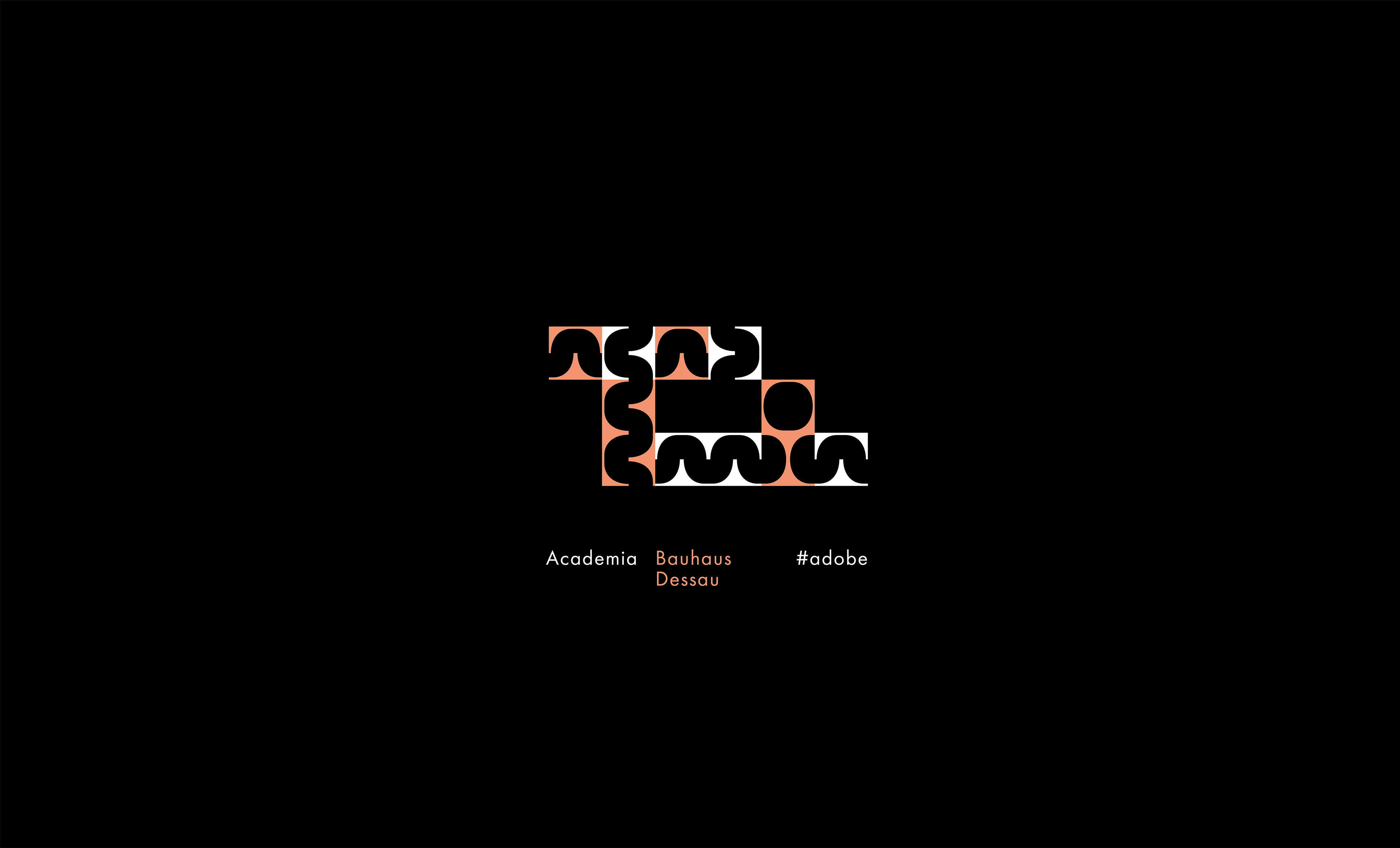
"academia" (above)
Using serif alternates from "xants" to create a modular negative space typography
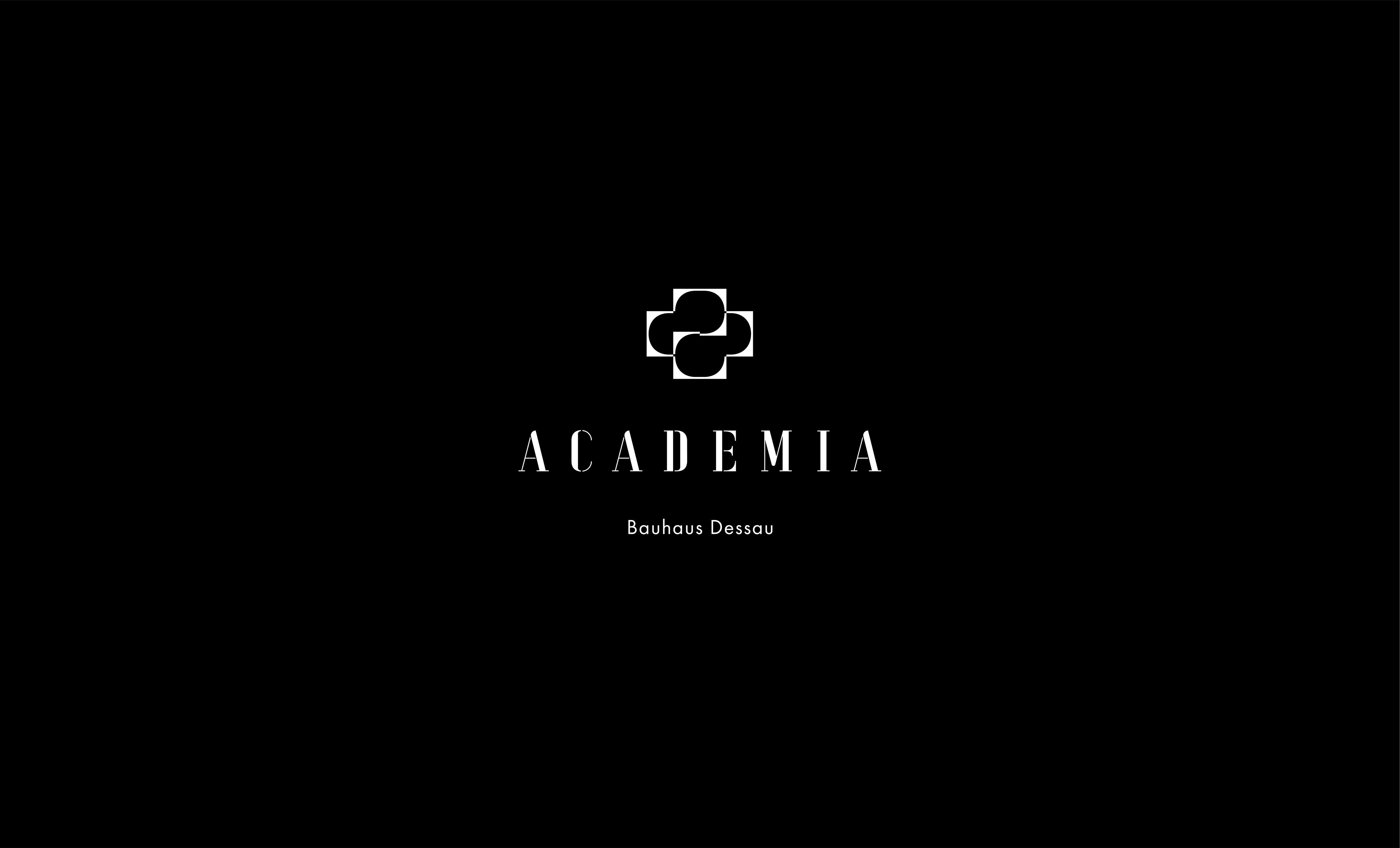
"ACADEMIA"
Using uppercase letters from "xants" with a modular mark derived from serif elements of the letter "E"
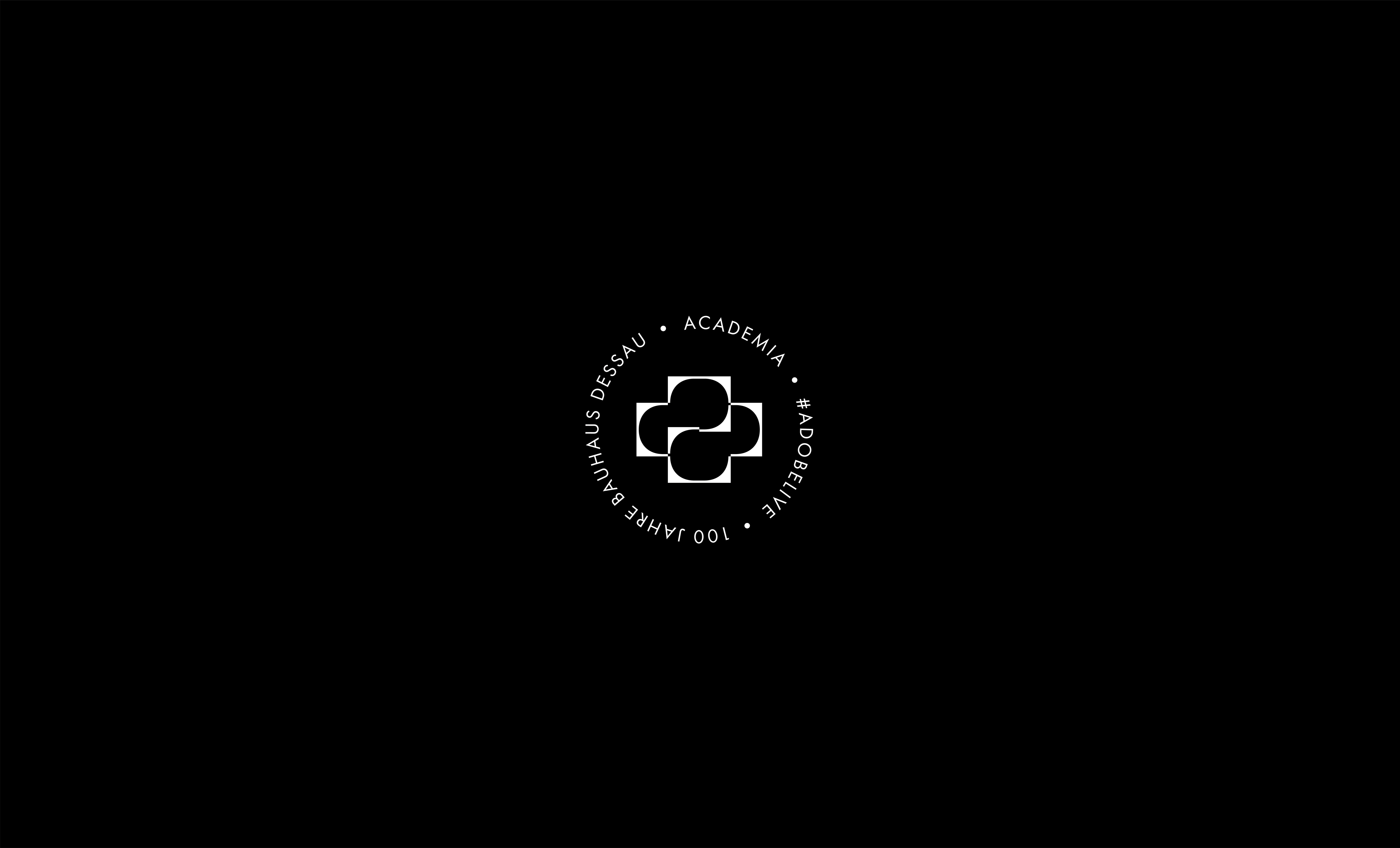
"Creative Cloud X Bauhaus"
Using a single element from "xants", I created a quick visual mark

"zei+los" (timeless)
Using "xants" lowercase letters, closing some of the gaps and working with different heights of the individual letters
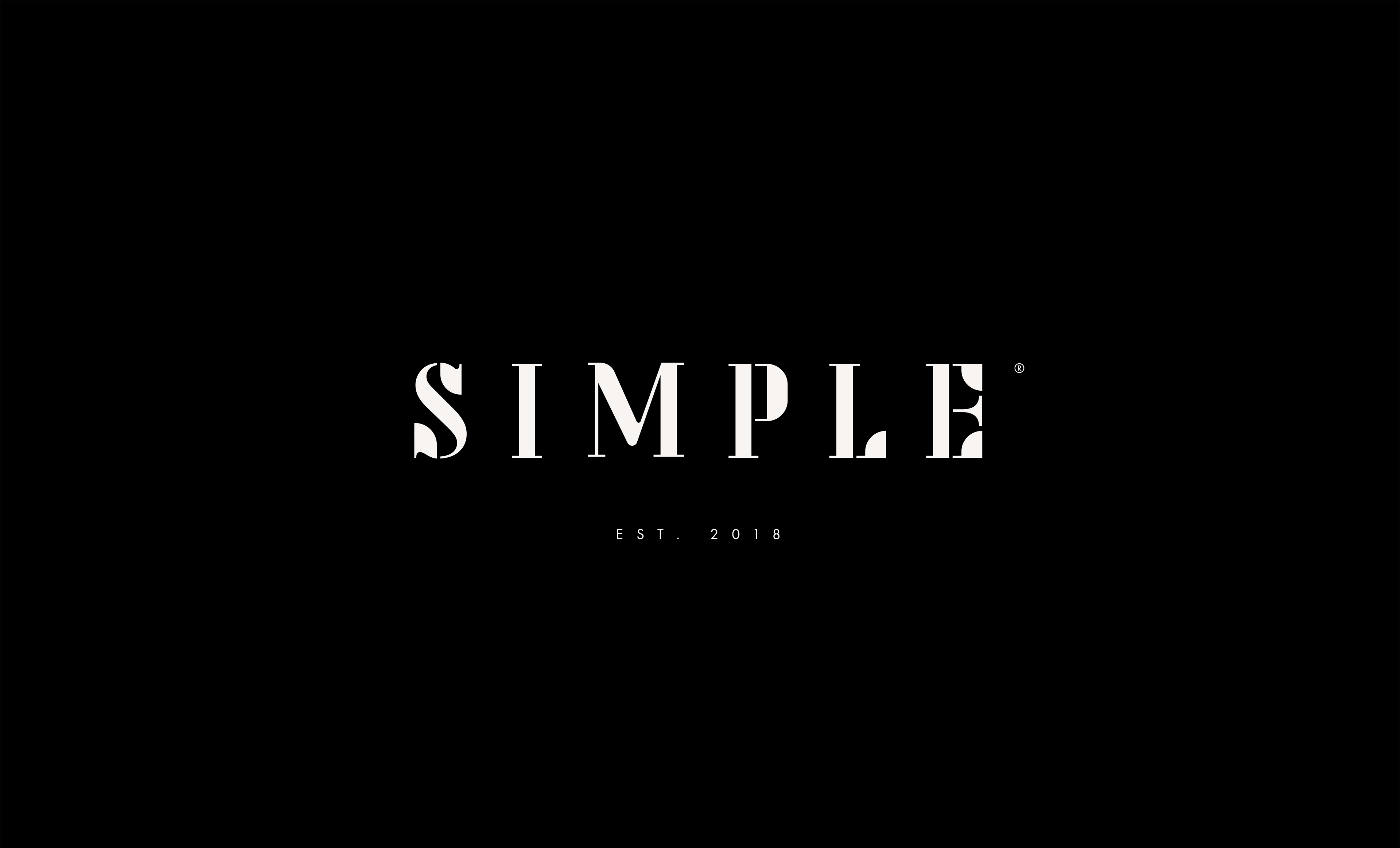
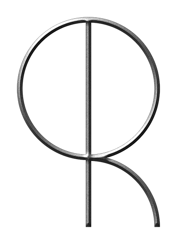
Simple®
Creating hybrid letters from mixing "xants" with "joschmi"
Thanks & Credits:
Special thanks to Rufus Deuchler & Can Doener from Adobe
Fonts: Developed under supervision of Erik Spiekermann
Joschmi: Joost Schmidt + Flavia Zimbardi
Xants: Xanti Schawinsky + Luca Pellegrini
Additional font used: Futura (typekit version)
If you're on creative cloud, you can download the fonts for free here
Or take part in one of multiple design challenges here
More information on the #adobelive bauhaus sessions here
#adobehiddentreasures