please press play for the intended synergetic effect
of the .gif below


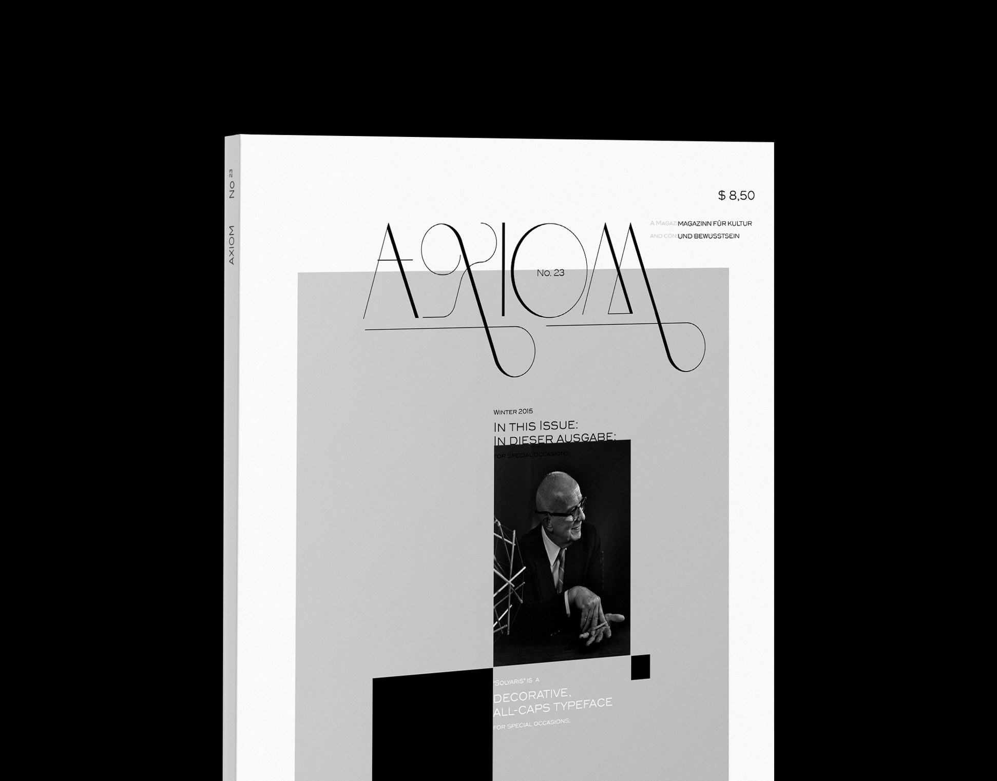
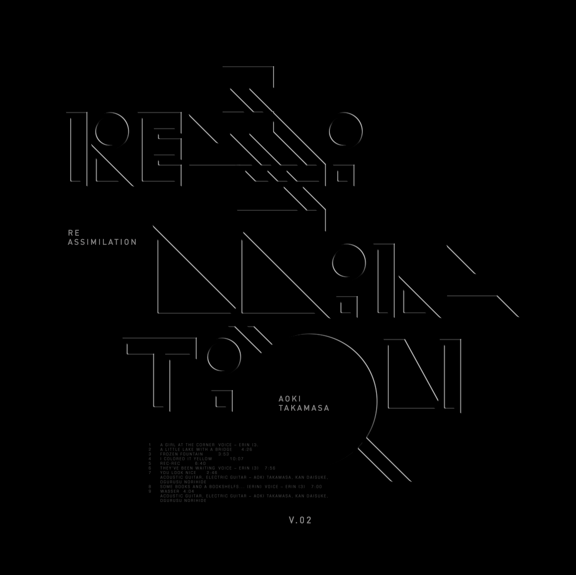
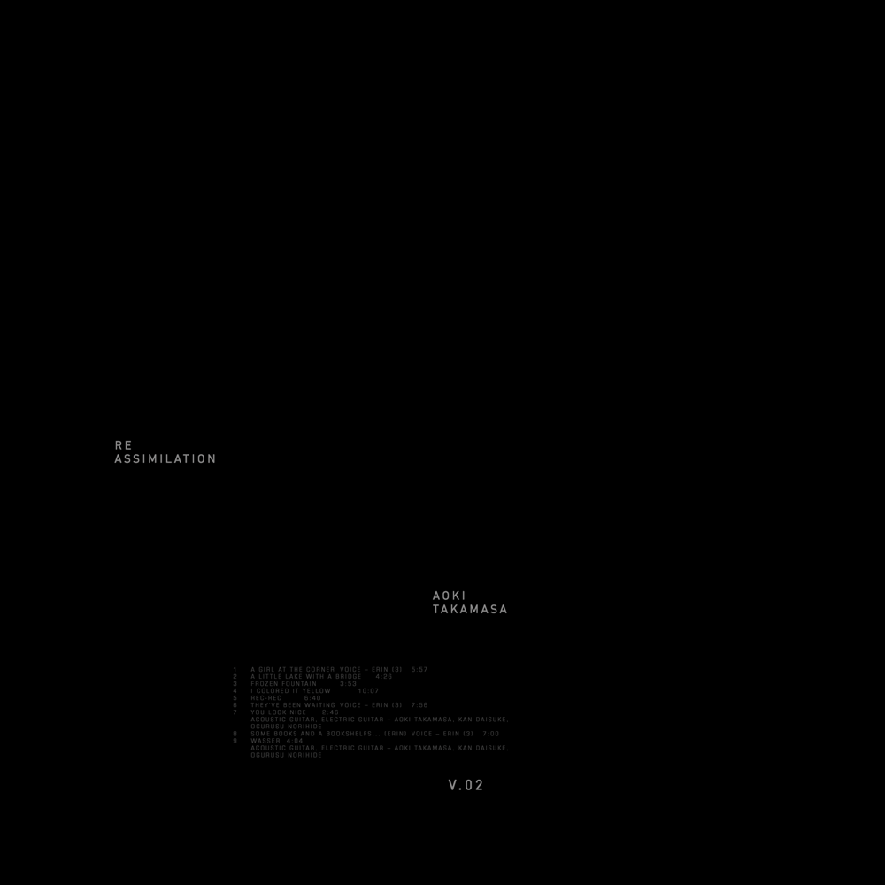
"Simply Funk" by Aoki Takamasa
​​​​​​​
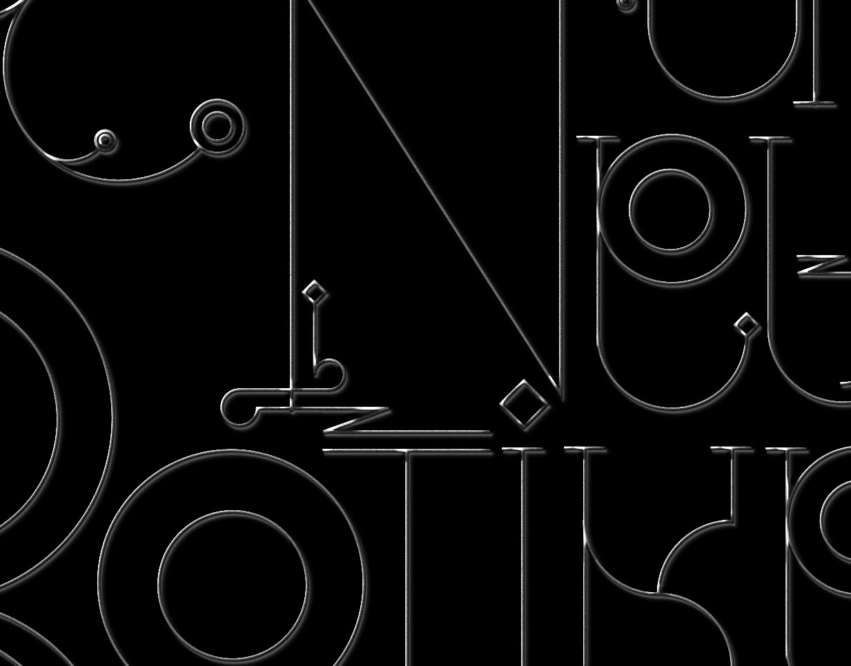
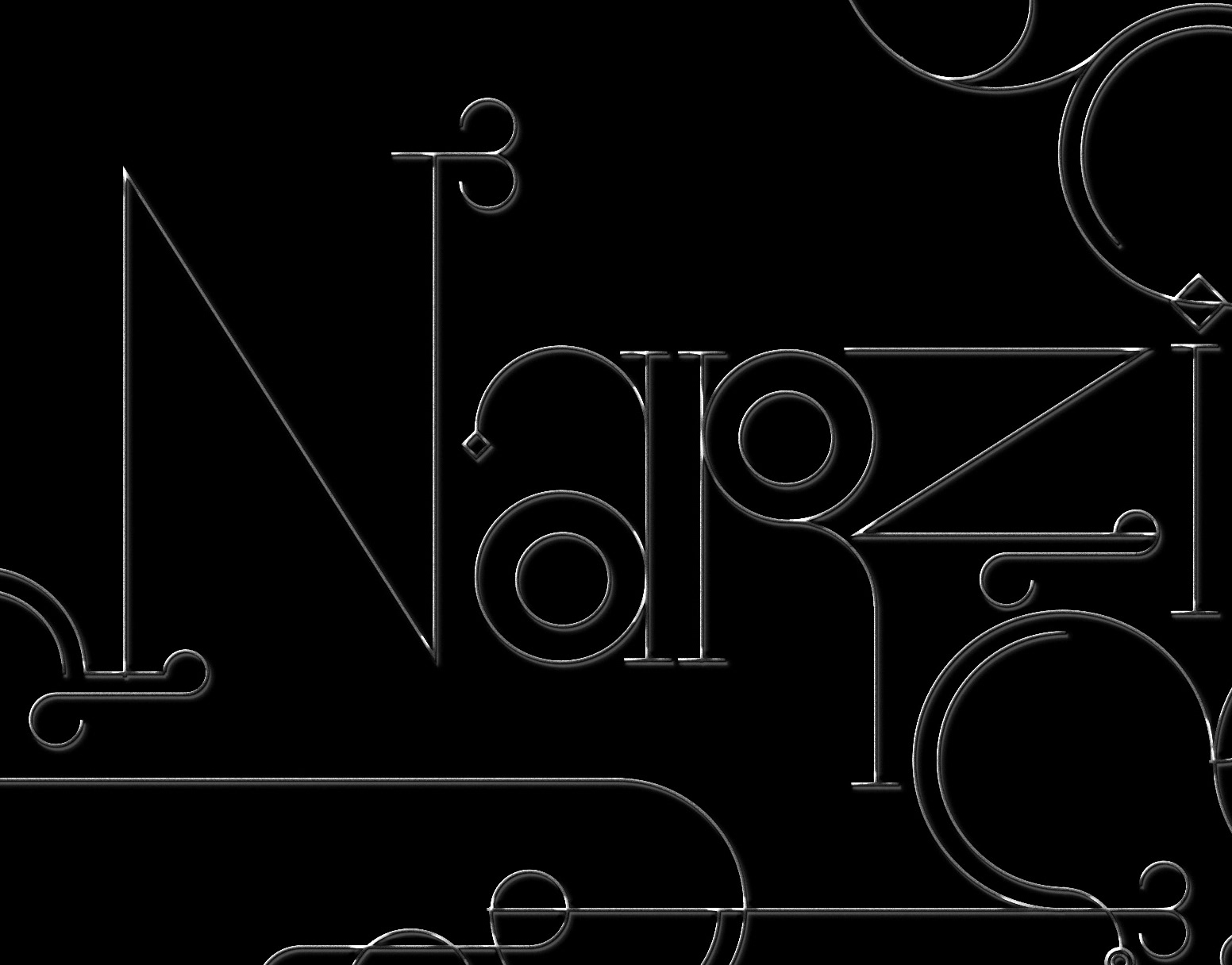
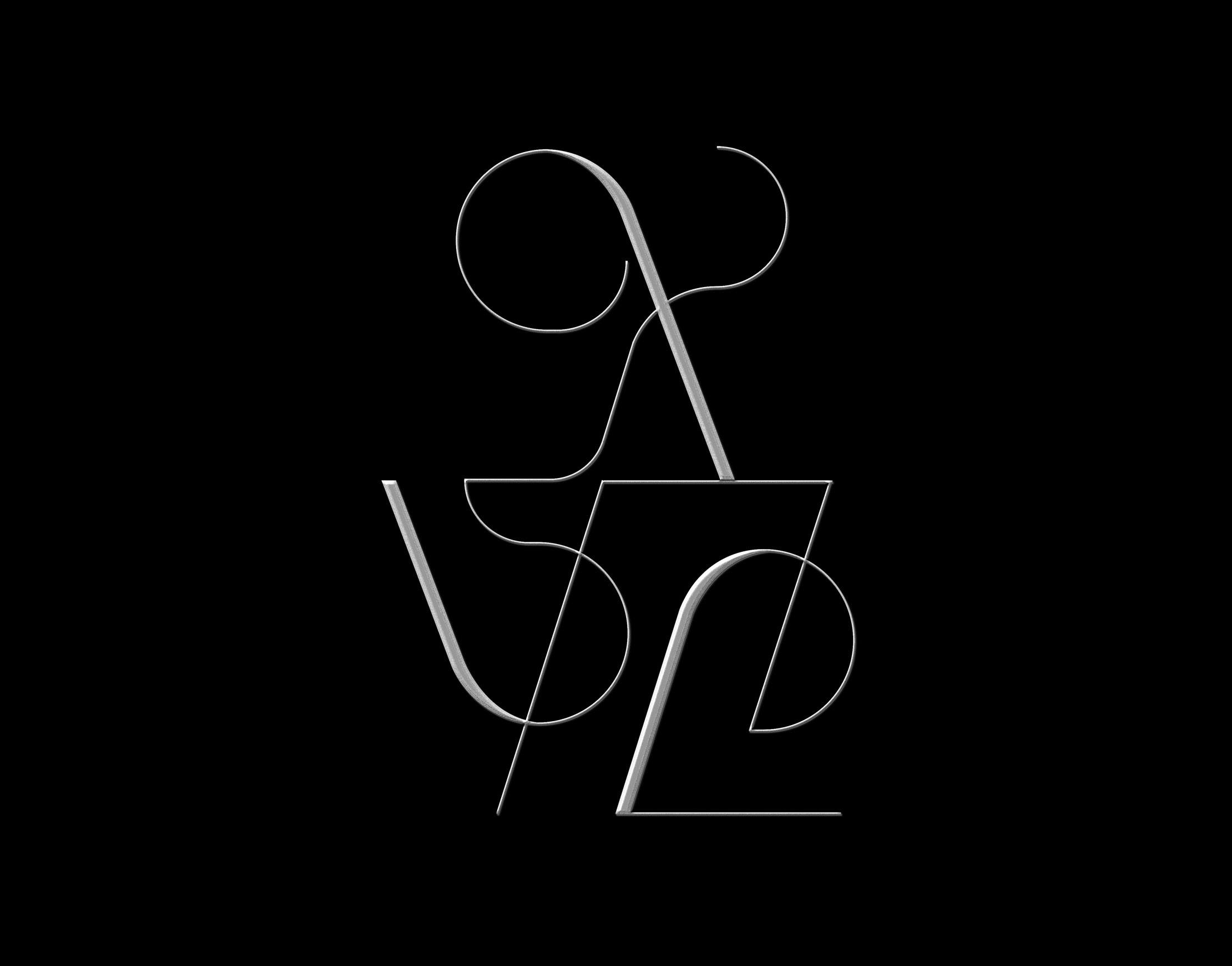
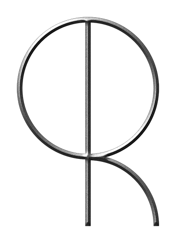
The Change of Angles due to virtual Lighting shifts and reassembles the Typography constantly.

The different geometric shapes utilized react in their own way to the changes and create different rhythmic patterns. A simple toolkit, resulting in a myriad of outcomes, reflecting on the structure of Takamasa's music.
© MMXIV Christoph Ruprecht

You may also like:

Logos & Marks 2019
A selection of different styles of identity marks I have been working on over the course of the past year. In 2019 I was fortunate to, among others, work with a wide array of up and coming brands in the medical cannabis industries, an evolving market spanning health, finance and technology. Overall this set represents an exercise in contemporary minimalism and bespoke typography.
2019
Branding, Typography, Art Direction
type/philosophy
Ongoing explorations of different styles of experimental typography, put into a philosophical context
2015
Graphic Design, Typography
Logos & Marks 2020
A selection of different styles of identity marks I have been working on over the course of the past year. In 2019 / 2020 I was fortunate to, among others, work with a wide array of up and coming brands in field of luxury, beauty, technology, sport and consulting.  This year's set continues to reflect my passion for handcrafted typography solution in both custom word marks, as well as monograms and visual marks as well.
2020
Art Direction, Typography, Branding
Narzissten & Neurotiker
The written text inspired the narcissistic looking letters and their obvious neurosis to hide behind an almost unecessary amount of decorative elements.
2010
Illustration, Typography
Logos & Marks 2018
An selection of different styles of identity marks I have been working on over the course of the past year. The work ranges from experimental and decorative to traditionalist luxury, always with a focus on visual clarity.
2018
Art Direction, Typography, Branding
Point and Line to Plane : Book
Being a big fan of the written/philosphical works of Wassily Kandinsky I did this little graphic reinterpretation of one of his most popular works.
2015
Art Direction, Typography
#adobelive / bauhaus
I was recently invited by Adobe to join them for a three part live stream in Munich, Germany. The objective was to work on 3x 2 hour live sessions and create 3 individual projects incorporating the latest typekit fonts, resulting from a historic collaboration between the Bauhaus Dessau and Adobe. #adobehiddentreasures #adobelive
2018
Illustration, Graphic Design, Typography
Logos & Logotype Collection
Selected Logos & Logotypes for different clients and industries, ranging from 2010 – 2017. Large percentage is hand lettered and custom built.
2018
Branding, Graphic Design, Art Direction
Show us your Type / Nantes
Different experimental approaches for SHOW US YOUR TYPE / NANTES EDITION. Creating various monotone posters with playful typography, exploring different styles and re-interperting elements from the cities' official logo and crest. Applying the same minimalist formula of simple vectors enhanced by stacked photoshop effects.
2018
Typography, Graphic Design, Art Direction
Solyaris : Decorative Typeface
"Solyaris" is decorative, all-caps typeface with various alternates and gimmicks for special occasions.
2013
Graphic Design, Typography
Back to Top