
The motto of the festival is "Schwein Gehabt" an older german saying - which loosely translates to "having a stroke of luck" but references a pig (Ger: Schwein).
The Festival is meant to expose the business ventures, galleries and culinary places to a wider range of the public. I partnered with Atelier Remise, an illustration collective, to create the 2017 branding for the festival. 3 Illustrators from Atelier Remise delivered pig-inspired Illustrations and elements, reflecting the environment, landmarks and people - I created the collages, compositions and overall Branding.
The Goal with the branding was to provide a solid yet playful basis in layout and typography to balance out the wilder and more humorous aspects of the illustration work so the festival would appear to those looking for a "higher culture" as well as the younger generations and kids.
© Christoph Ruprecht, Atelier Remise, 2017
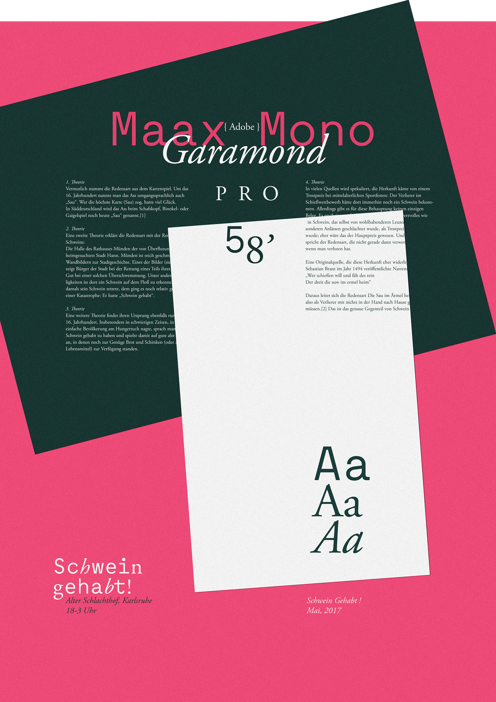
Typography Setup:
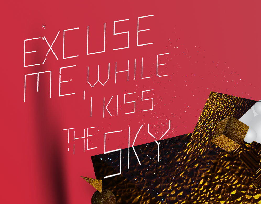
Architectural and Modern meets Classical in a playful combination
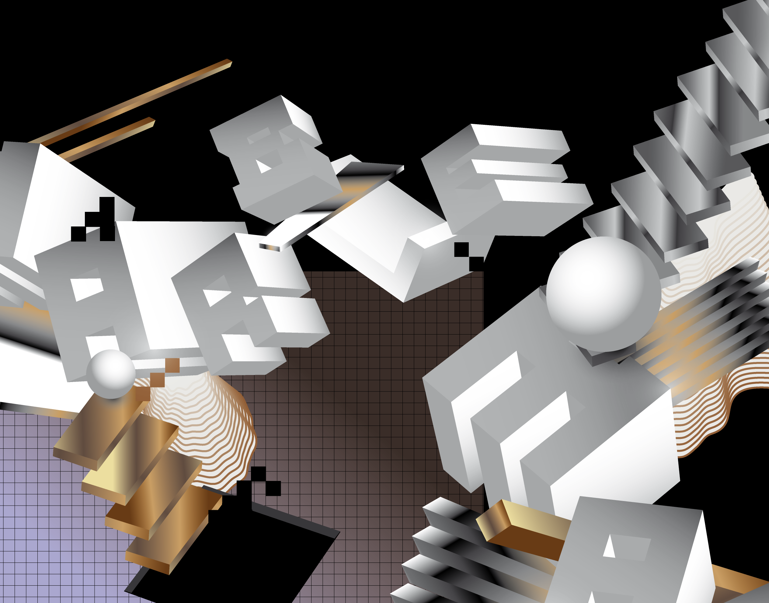
The Posters
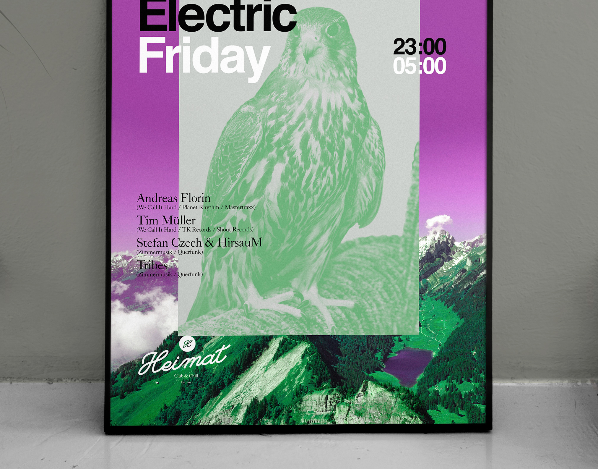
Multiple Posters were designed for the Event – below are 2 of my favorites. The Posters bring together the work and style of 3 different Illustrators, arranged by myself in 2 different approaches, loose and dense. The Illustrations re-interpret the environment and the creatives working there, reflecting the different facets of the area.
Poster V1 - Main Directive: Spread good vibes and make people curios...
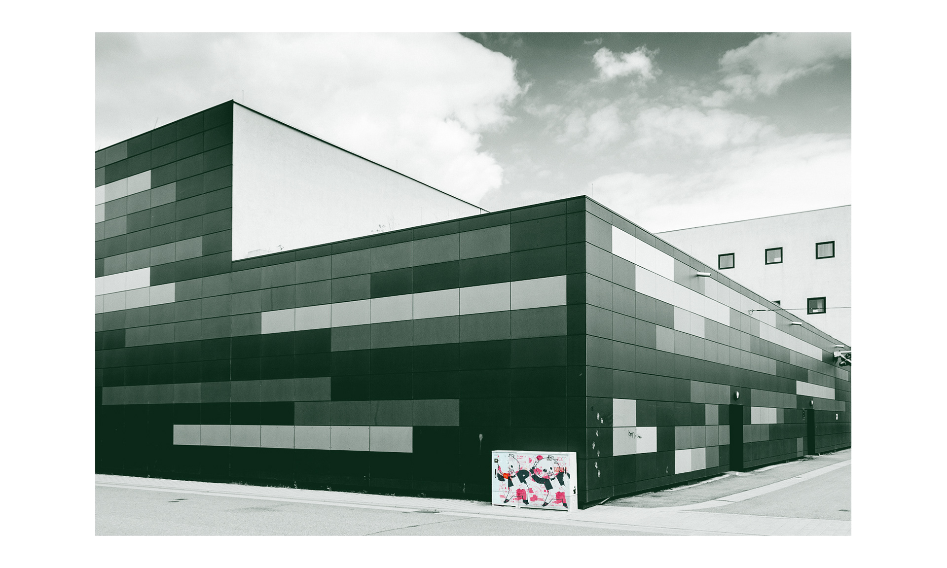
Substage - One of the Event Locations
(Photography by: chilibean.de)
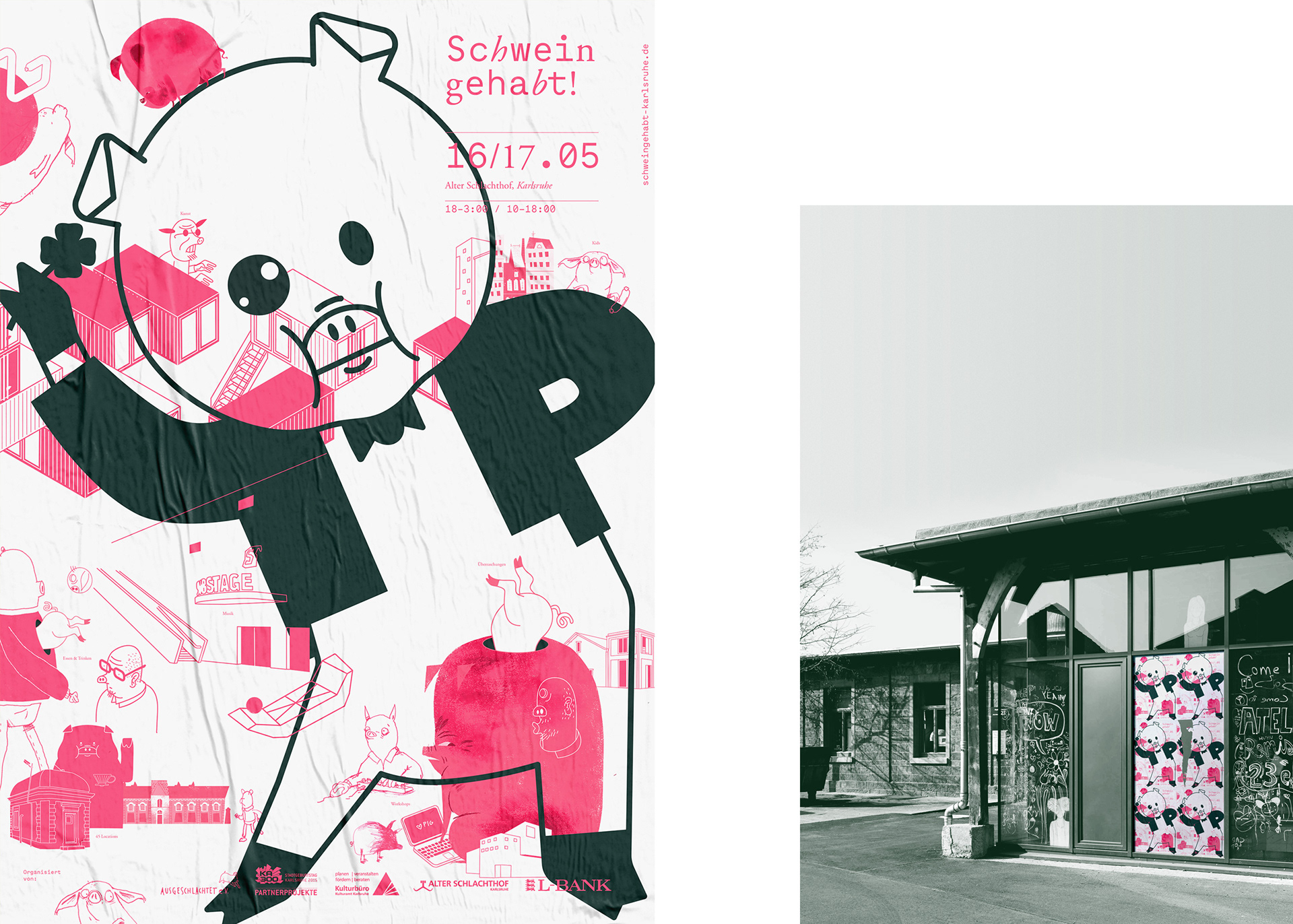
Poster V1 - A lucky Charm (right: Atelier Remise)
V2
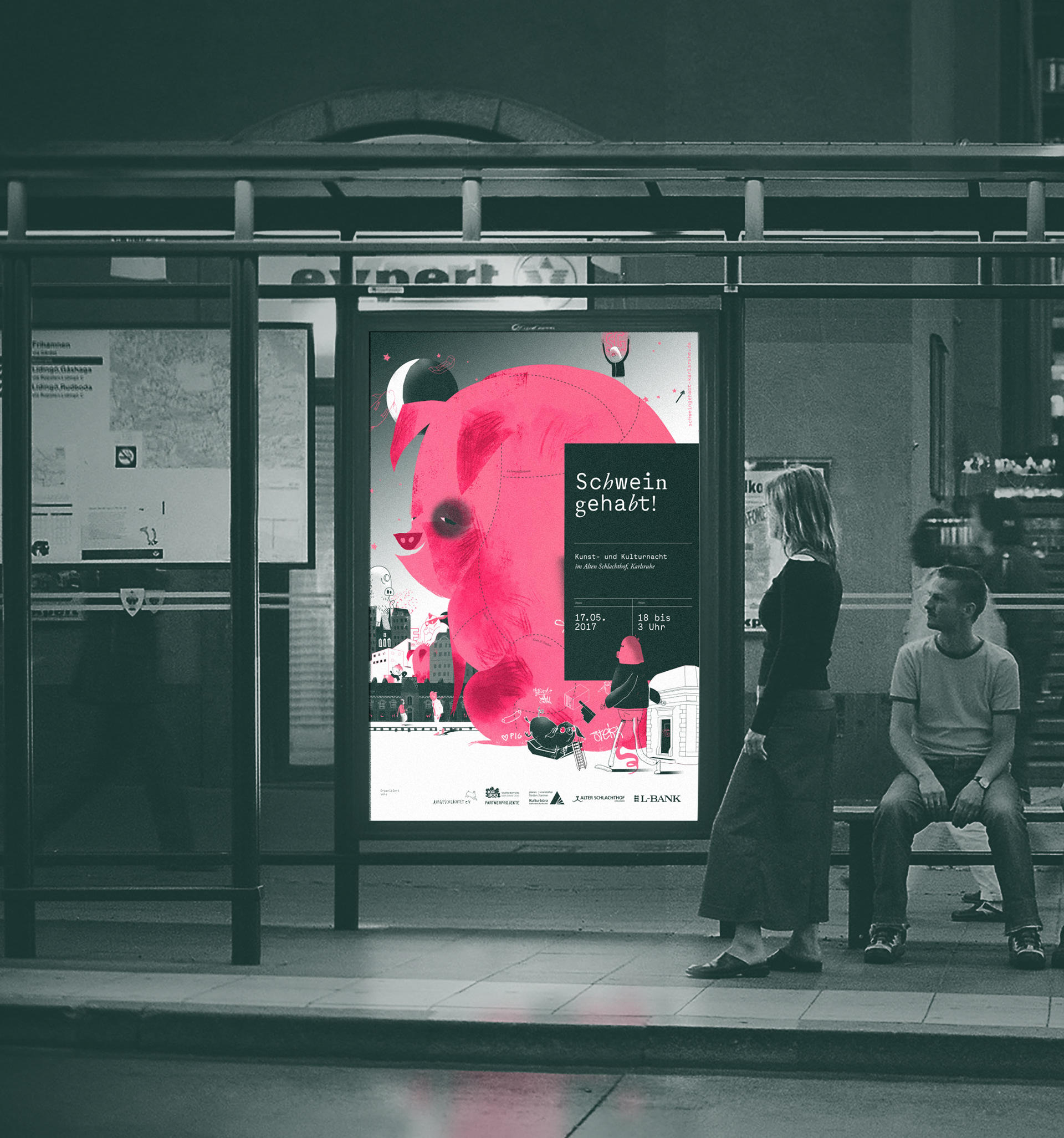
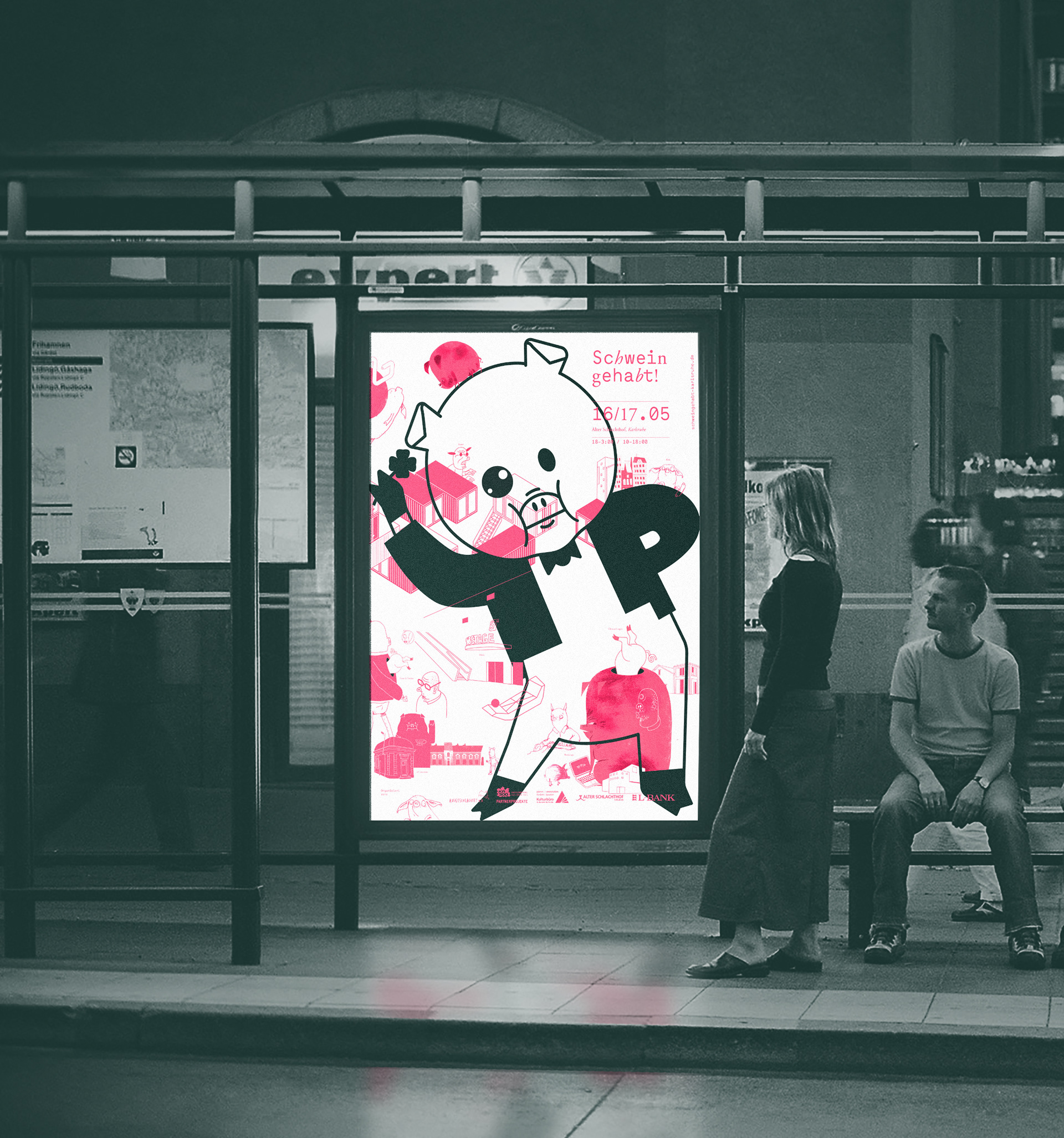
Poster V2 - Directive: Provide a stronger emphasis on the vital informations regarding the Event.
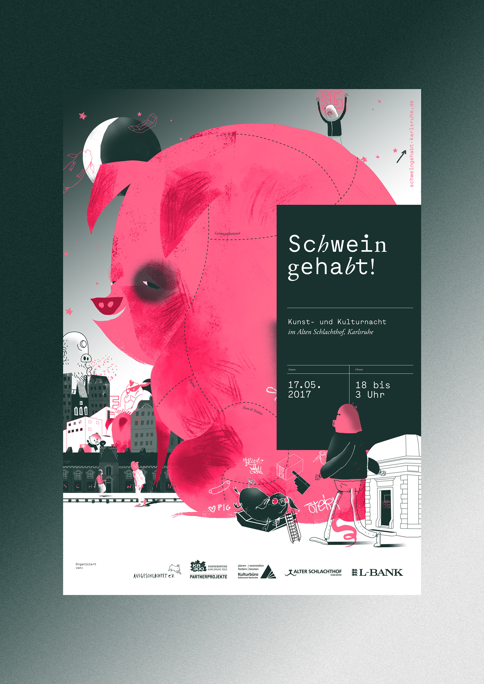
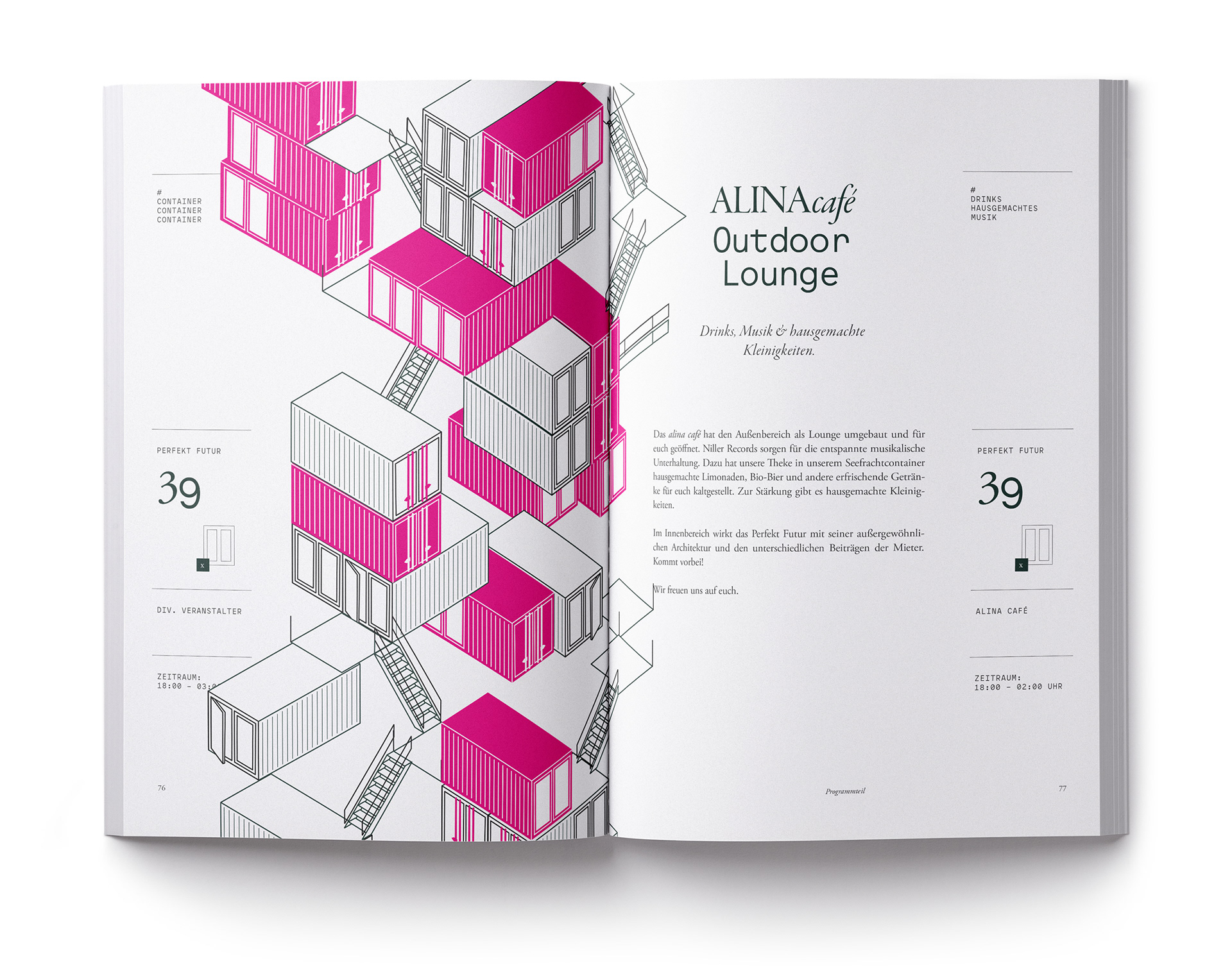
Poster V2 featuring a collage of architectural landmarks from the area
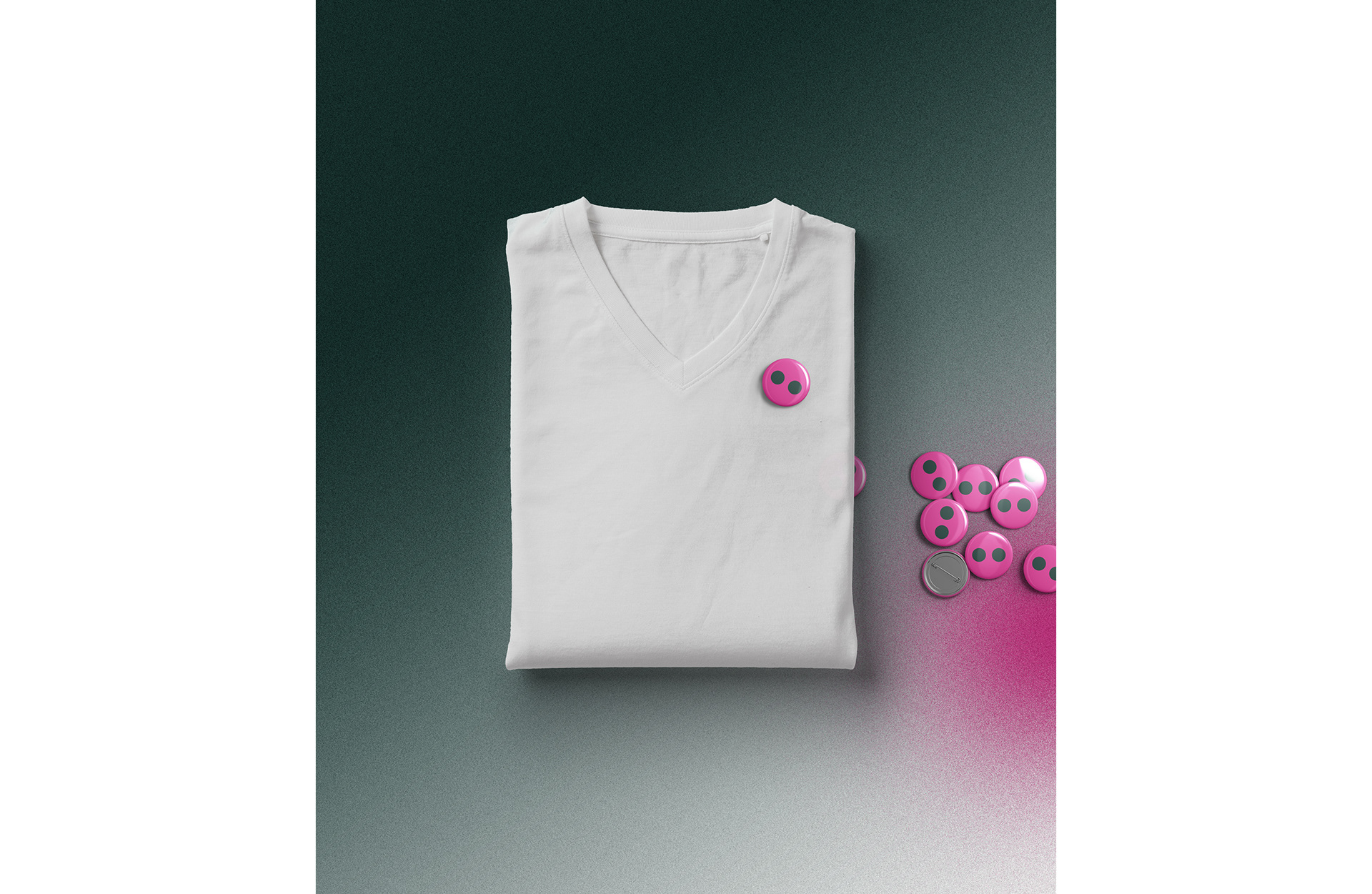
The identifying Marker:
A Button
Festival Guests had a choice between attending for free, limiting their entrance to regular Events -
or for a small Fee, buy a Button that would grant them Entrance into the bigger Happenings across the Area,
such as more prominent Concerts, Food Tastings and more…
Finding the right identifying design solution wasn't exactly a complicated process.
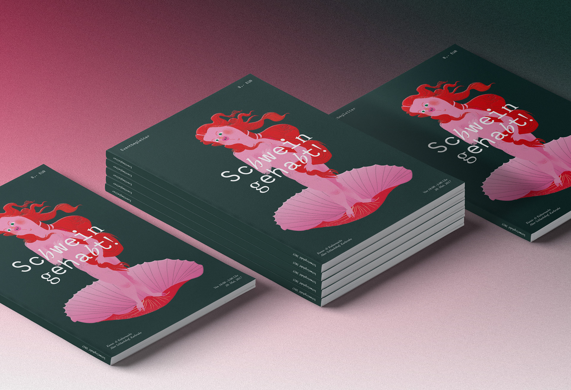
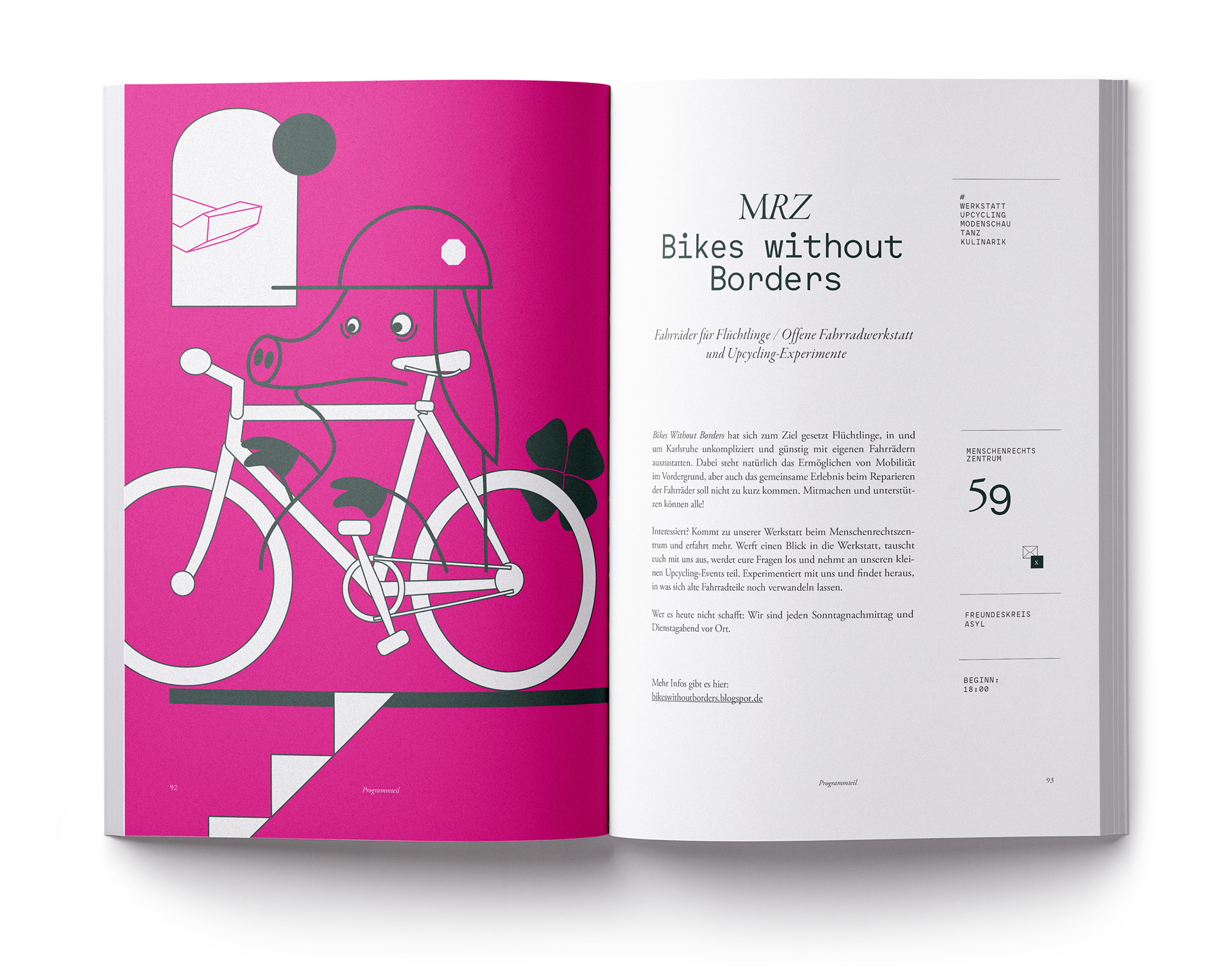
The Book
100+ Pages of Information & Illustration
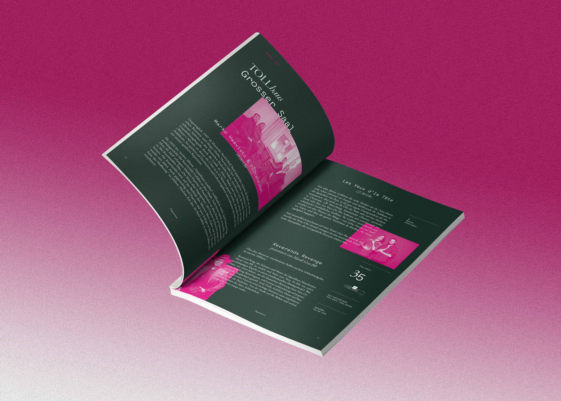
At the heart of the various design applications stood the festival guide, which in earlier years used to be a small booklet with concentrated information on the individual locations and events taking place during the festival. We decided to take it up a notch and created a more immersive experience in form of a small Din A5 book that provided the generous room for more illustrative work.
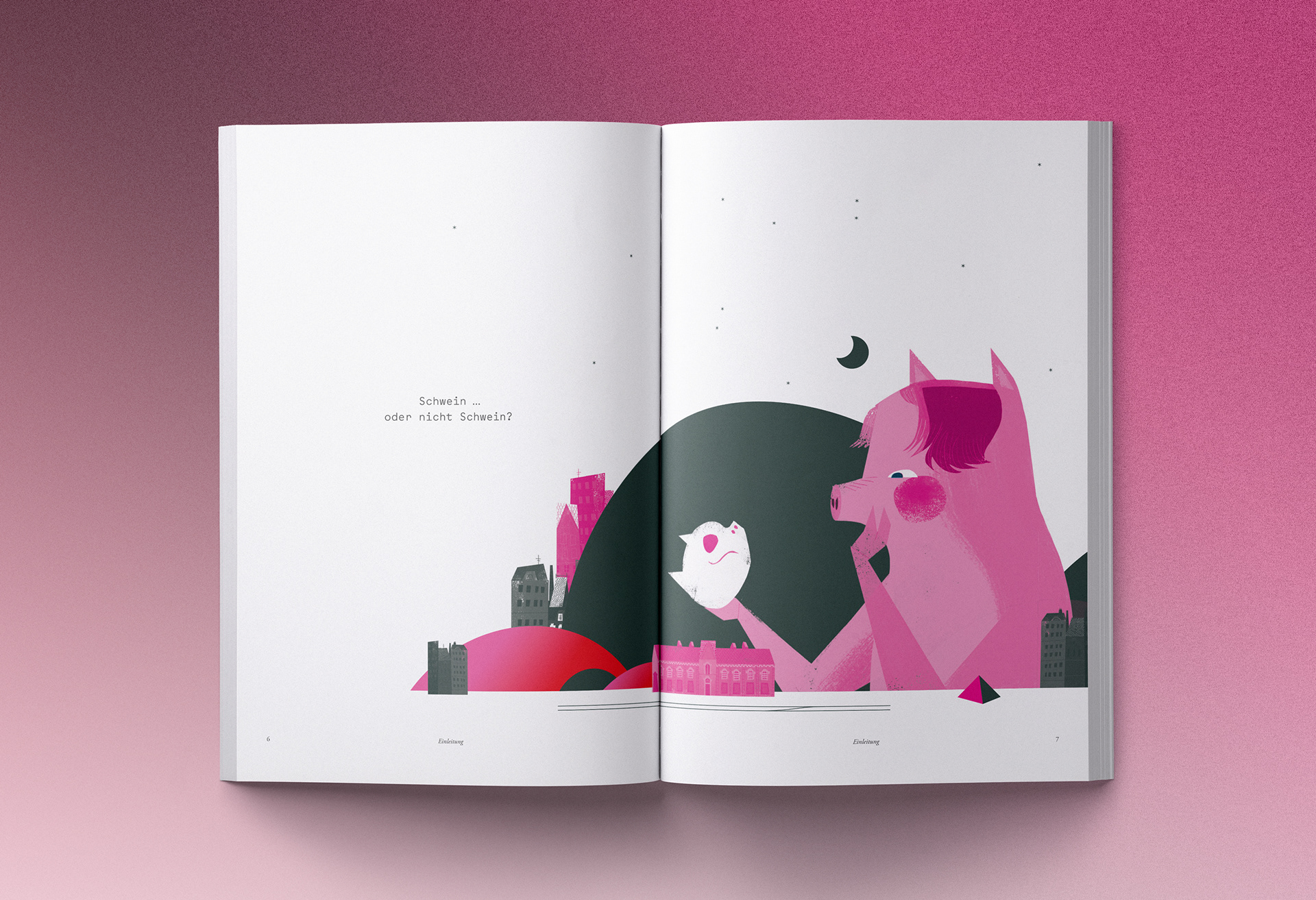
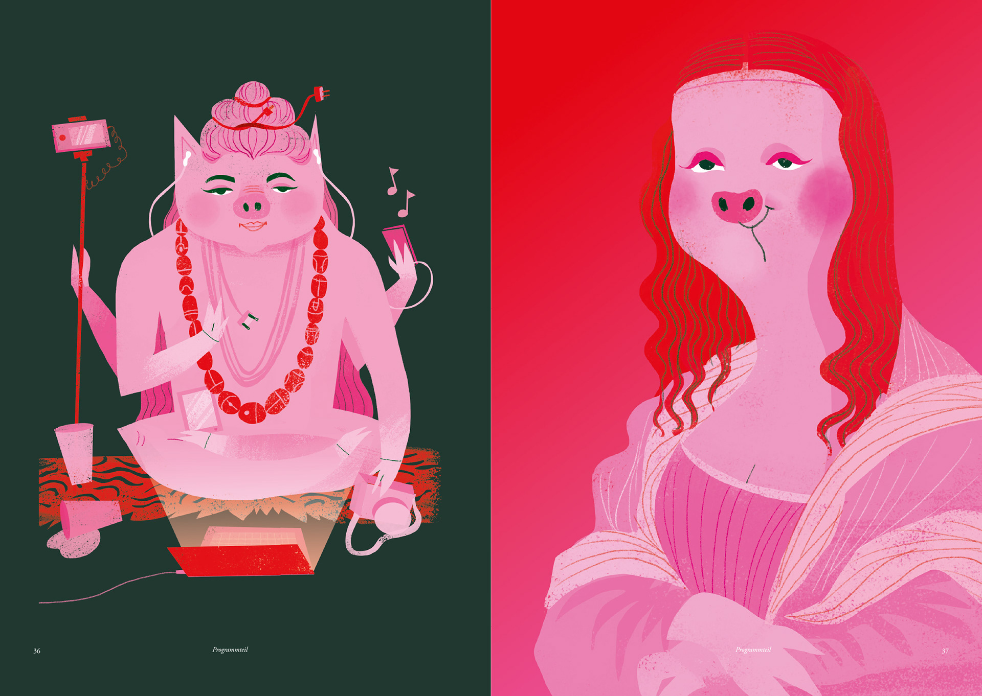
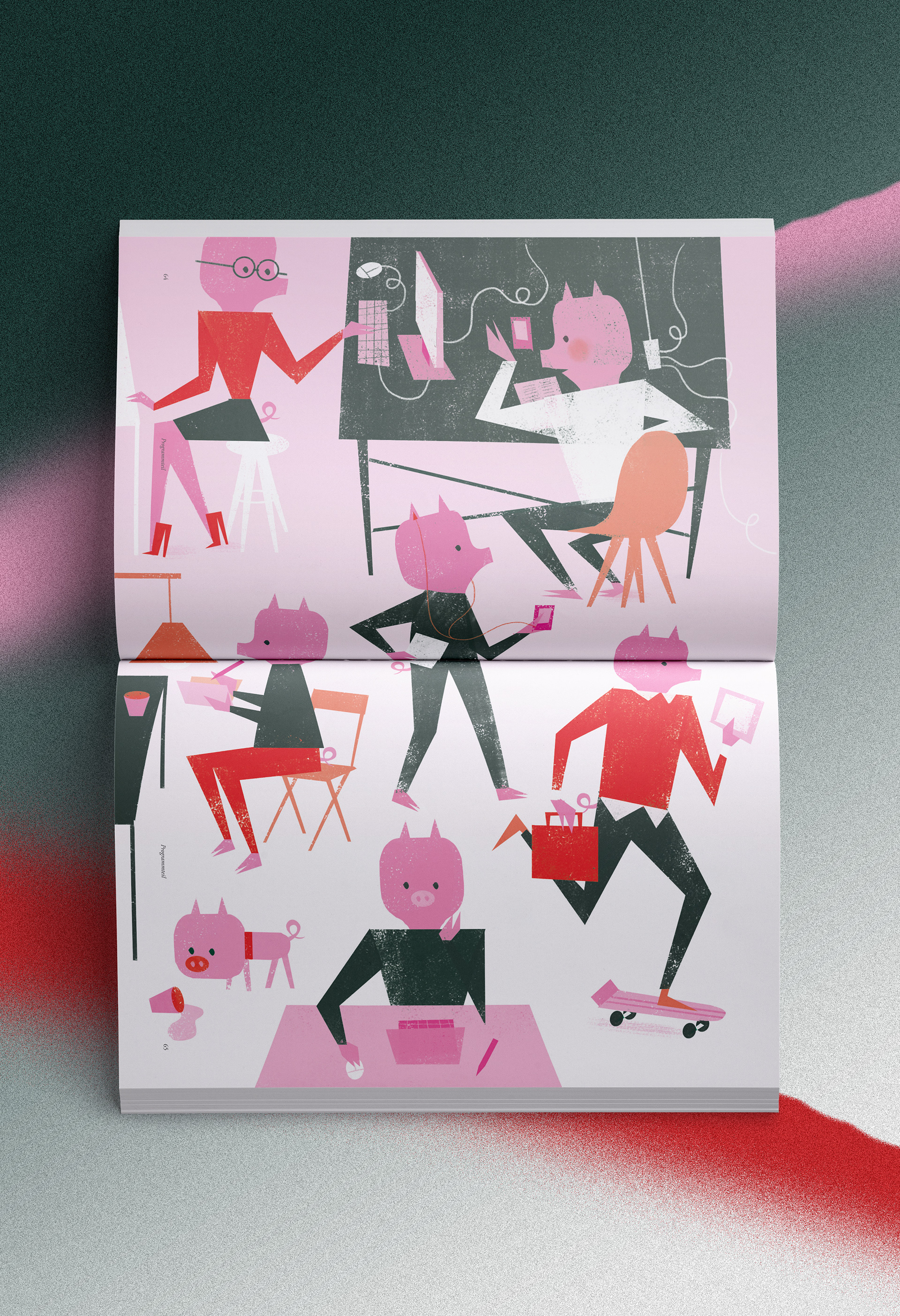
To be a Pig…, or to not be a Pig?

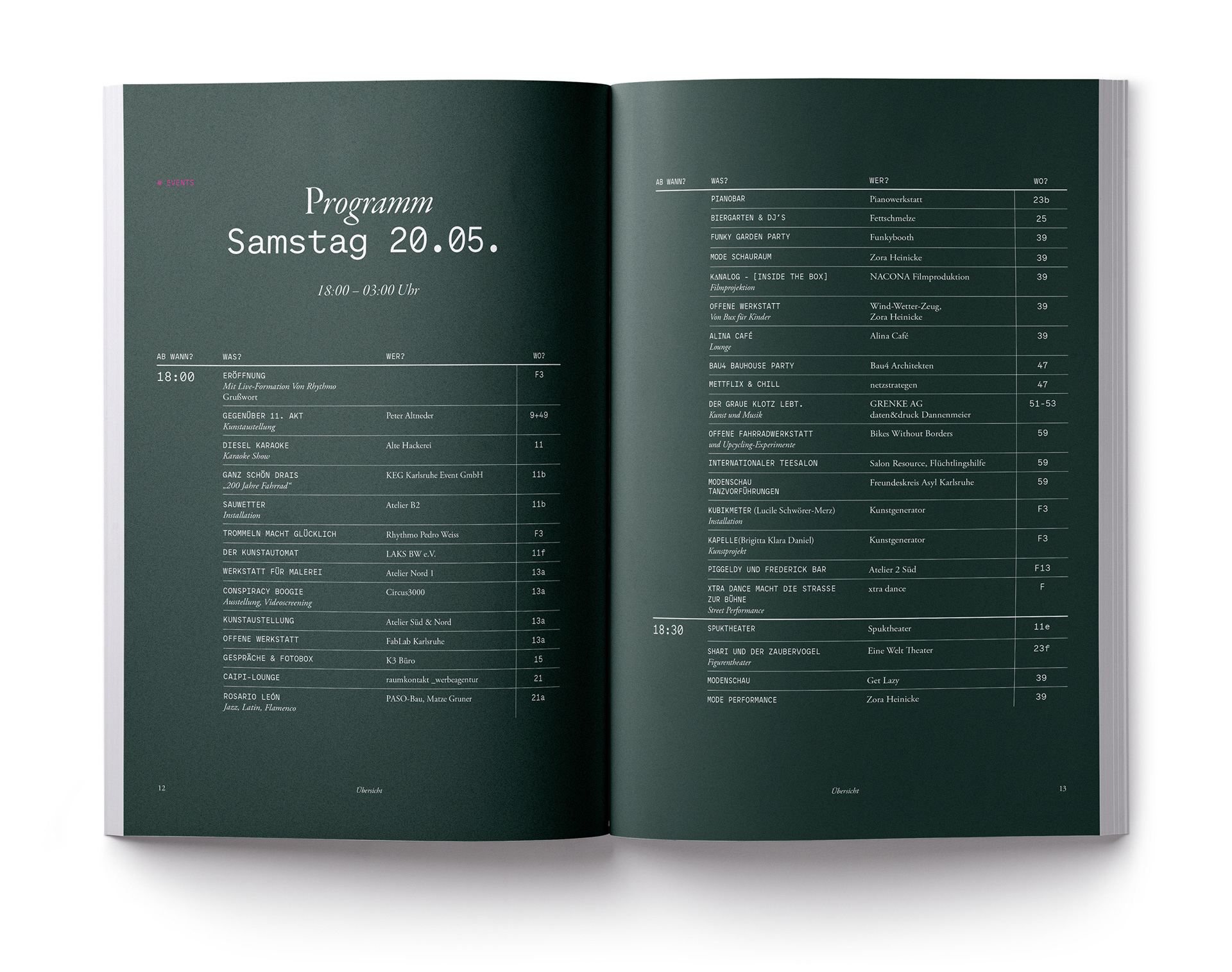
Index & Guidance System
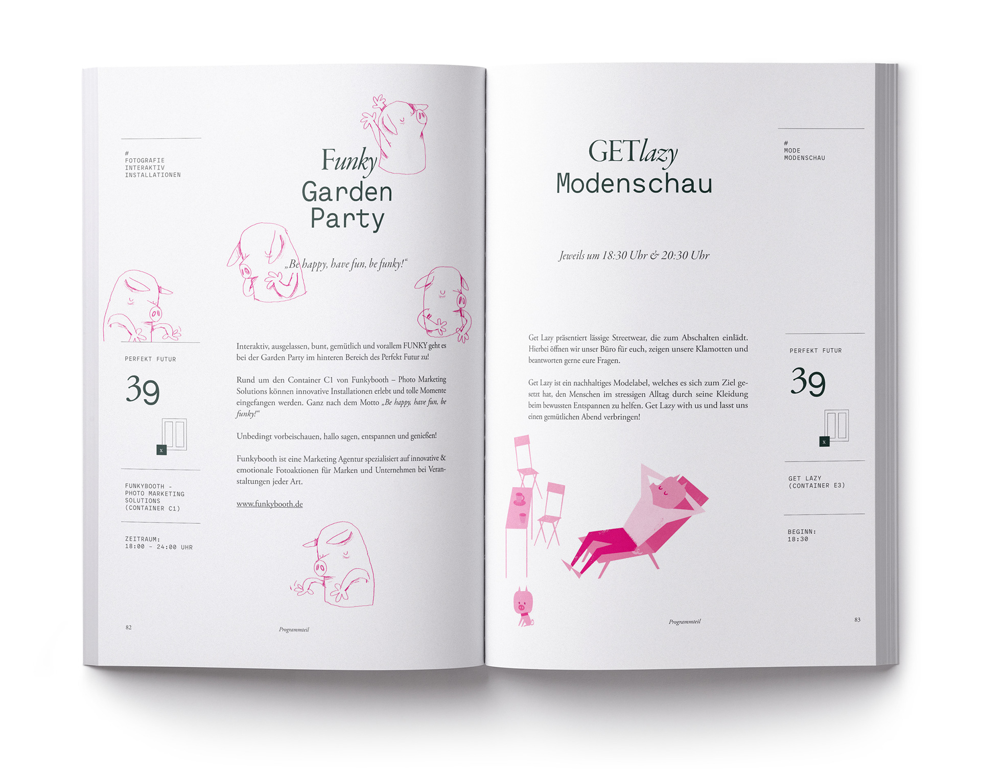
Locating Installations, culinary Pleasures & finding the main Events across
the different Buildings and open Spaces across the Area.

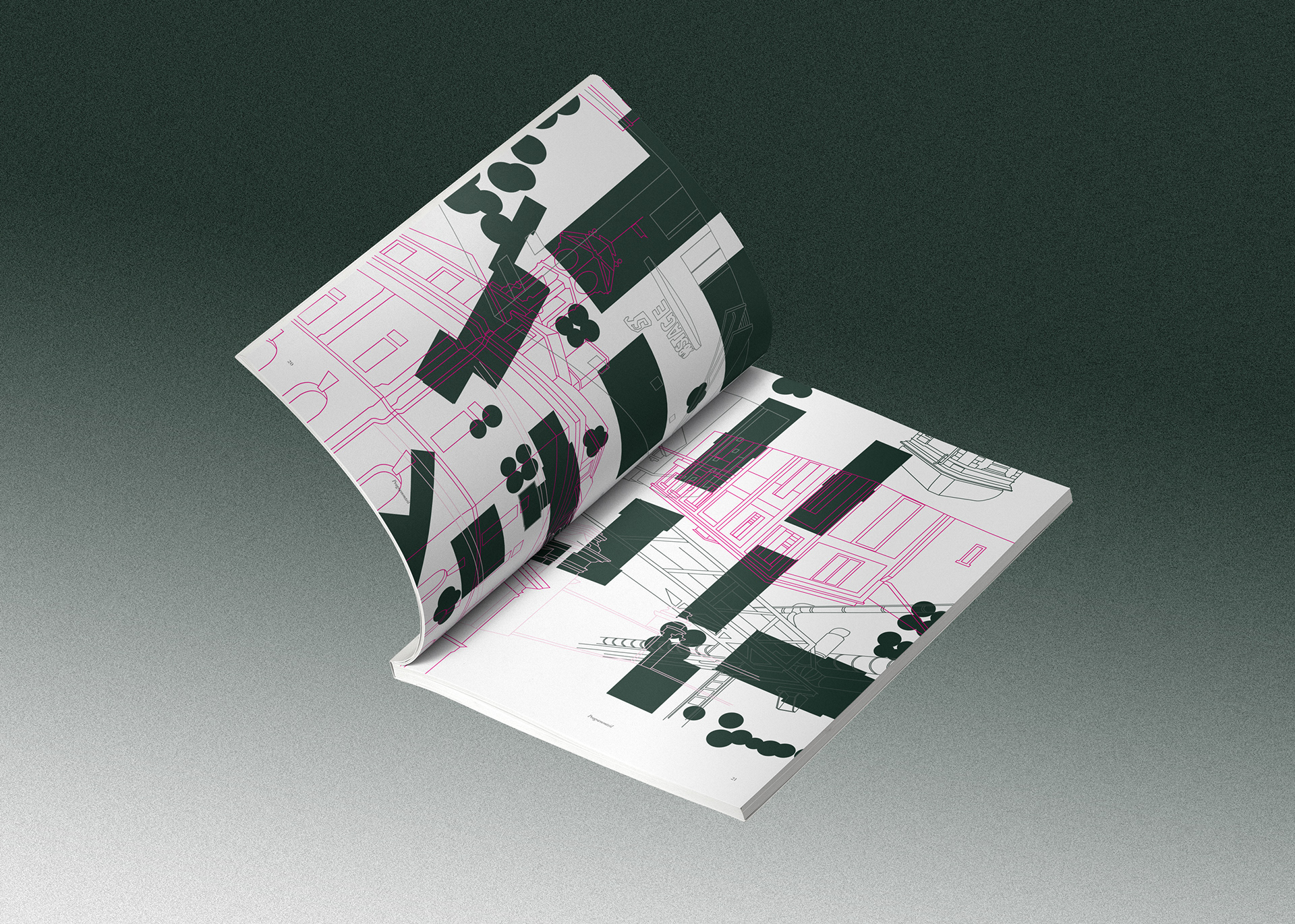
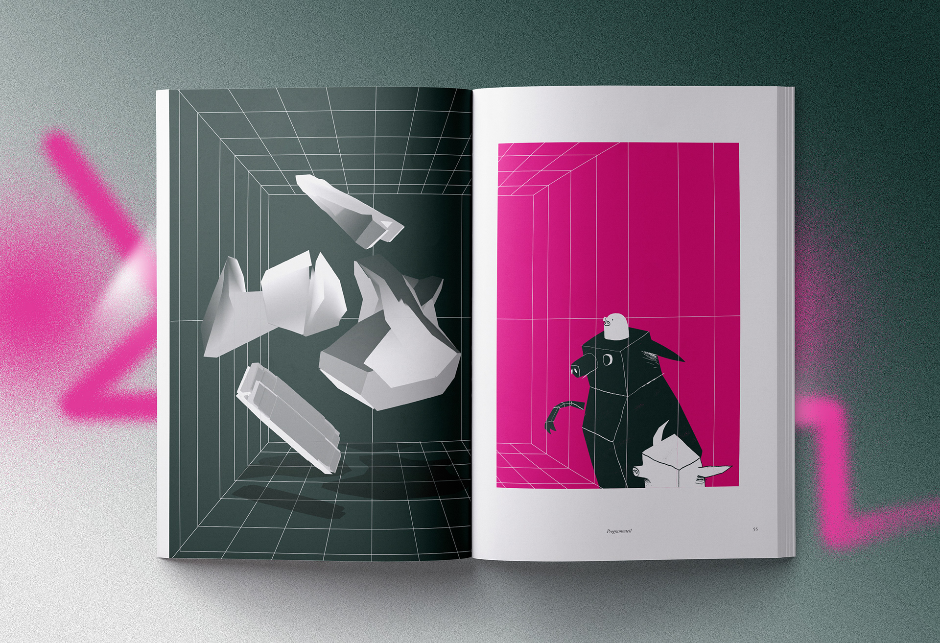
Disorientation
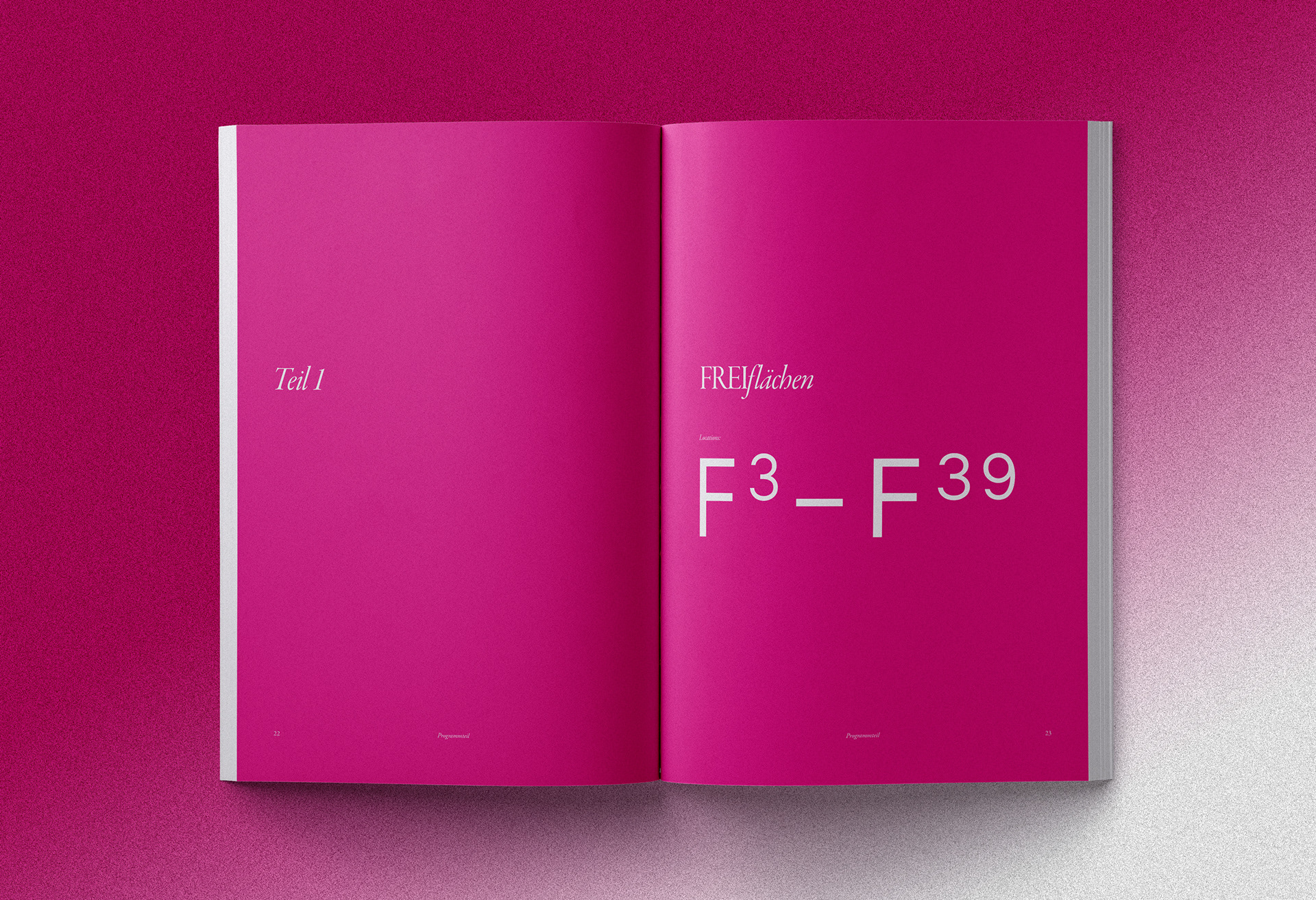
Divider Pages
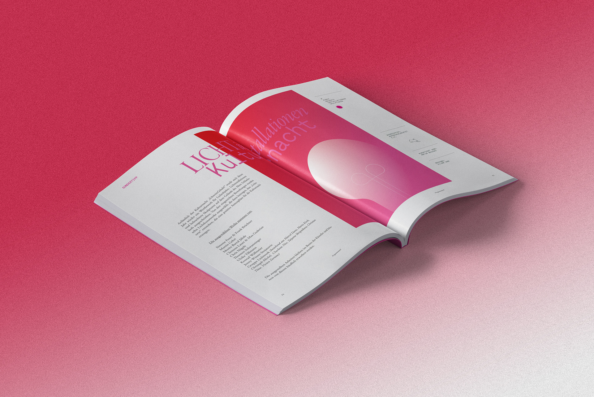
Informative Pages
The Work of Maria Karipidou
Emphasizing hero Locations with inverted Layouts
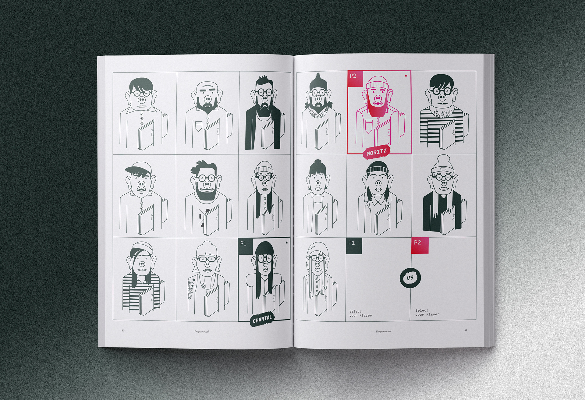
Creative Hipster Pig Knock Out!
(Characters by: André Rösler)

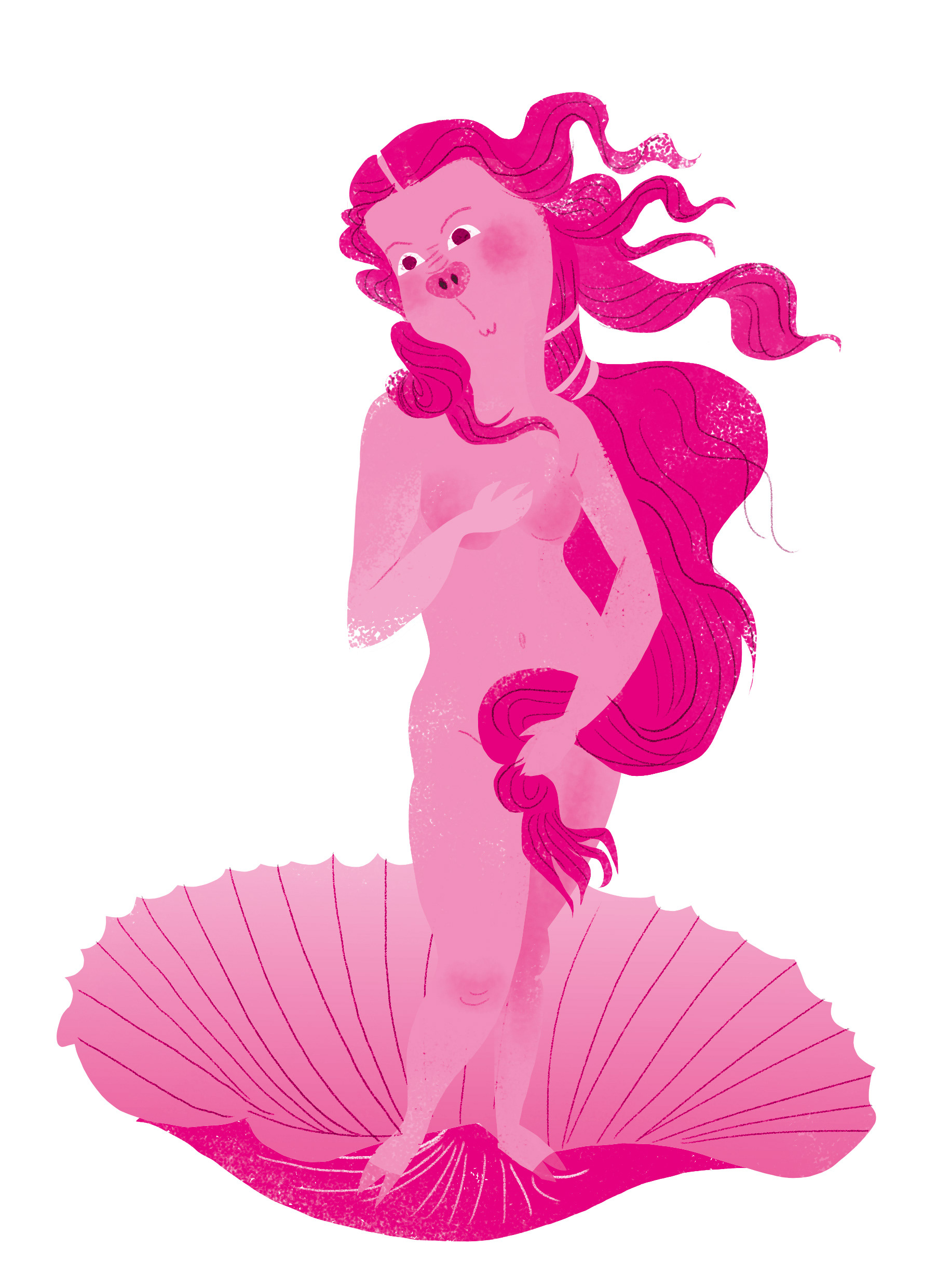
Pretty as a Pig
Discovering strangely hypnotic Art…
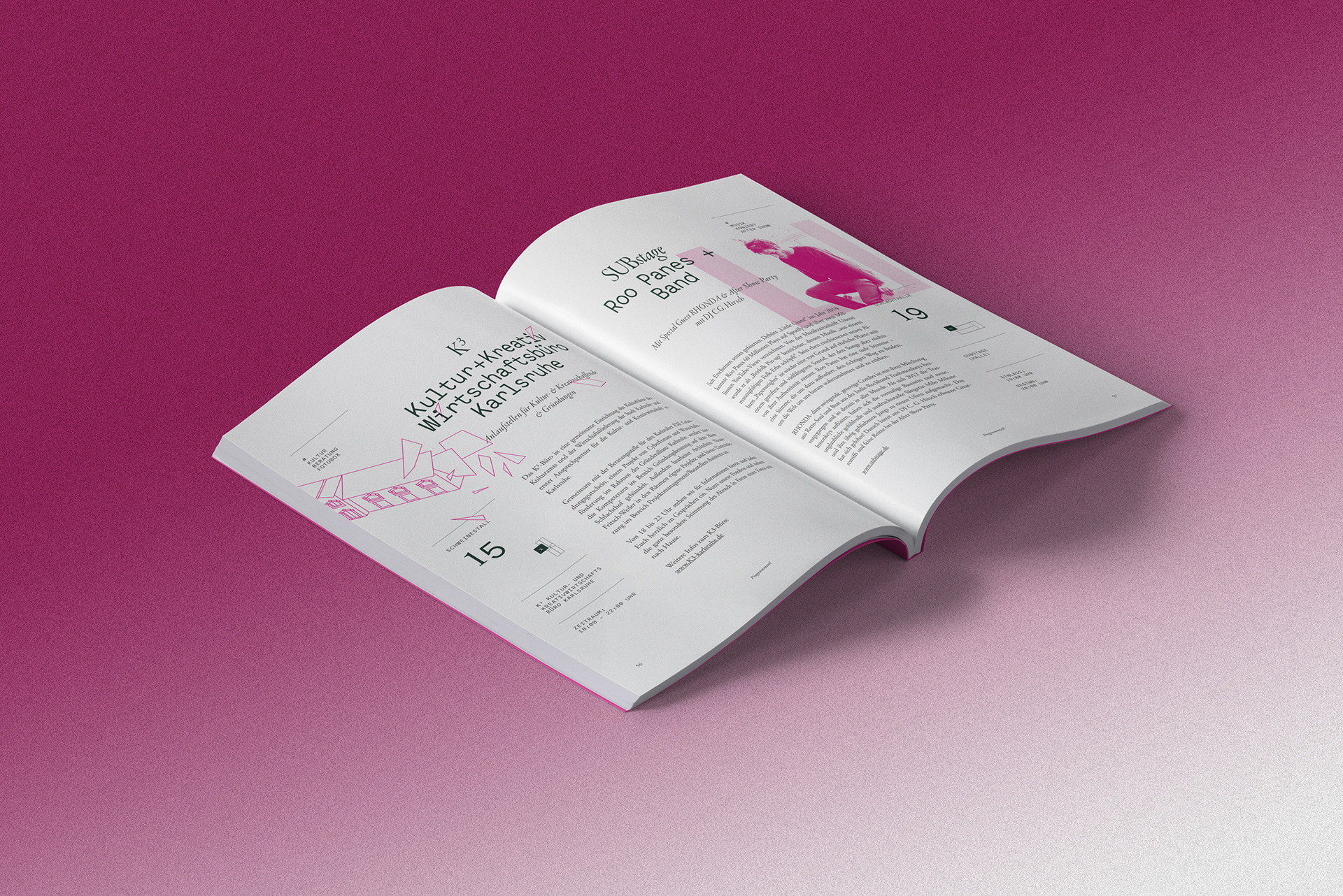
Main information Pages,
A clean layout is broken up by illustrative layers and duplex photography
Pig Business is Big Business
(Illustration: Maria Karipidou)
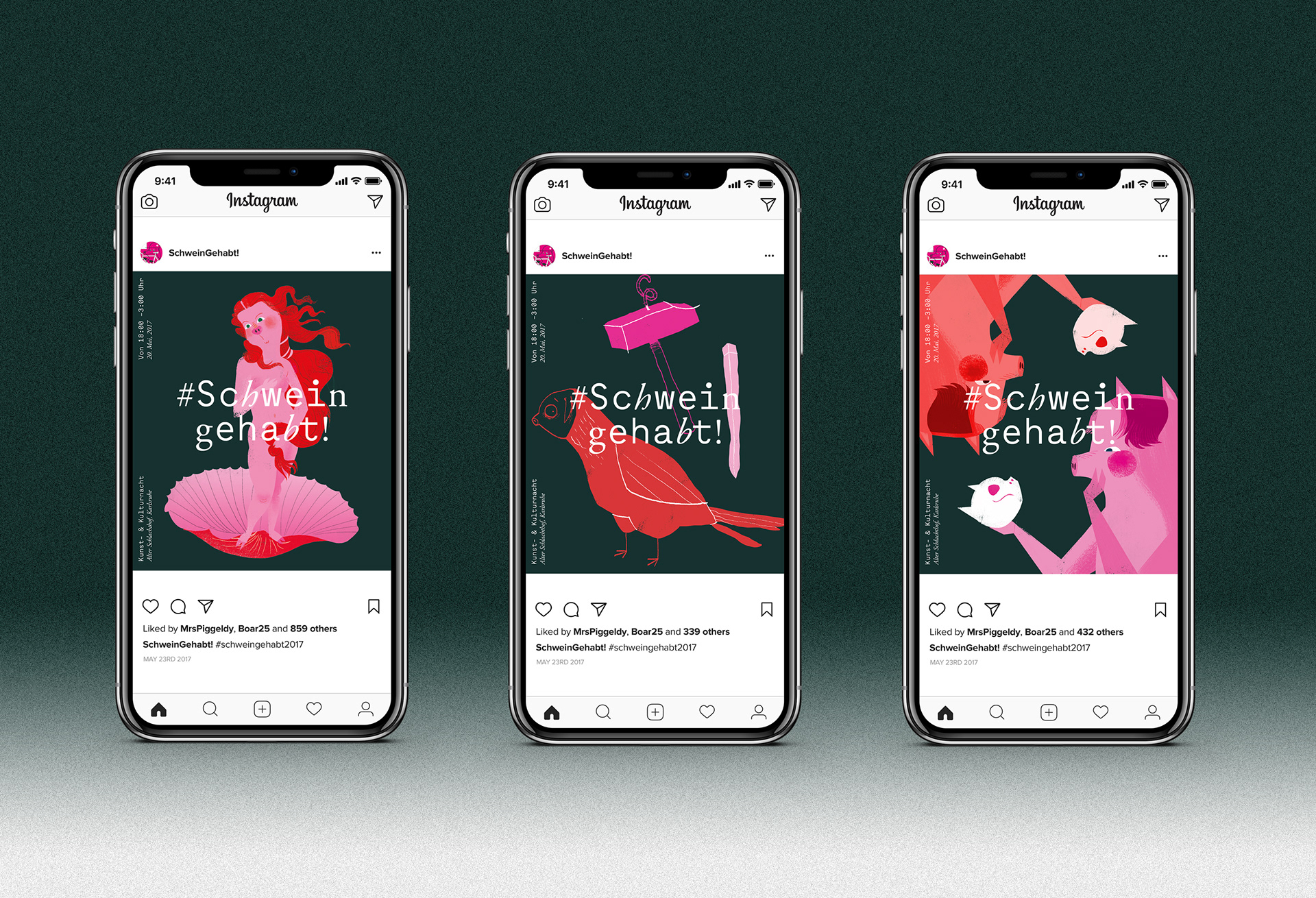
Social Media
Digital Presence…
Some of the motifs were adopted for social Channels,
such as Instagram or Facebook
Credits:
Branding, Art Direction & Layout by: Christoph Ruprecht
Illustrations by: Atelier Remise
(André Rösler, Maria Karipidou & Niko Renger)
Mockups: Courtesy of Pixeden.com
View more work:
nikorenger.com