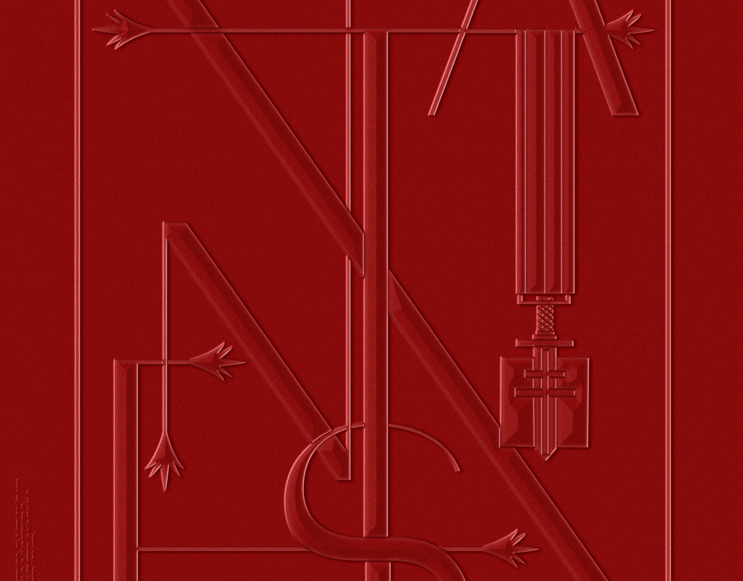
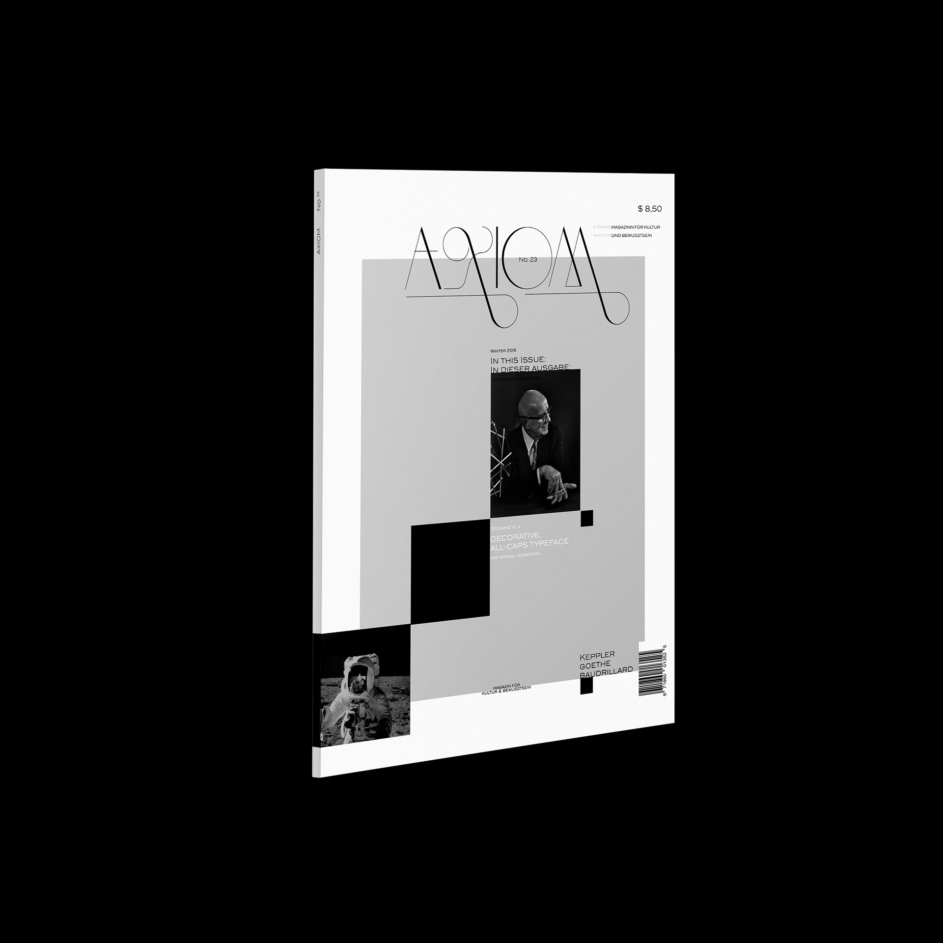
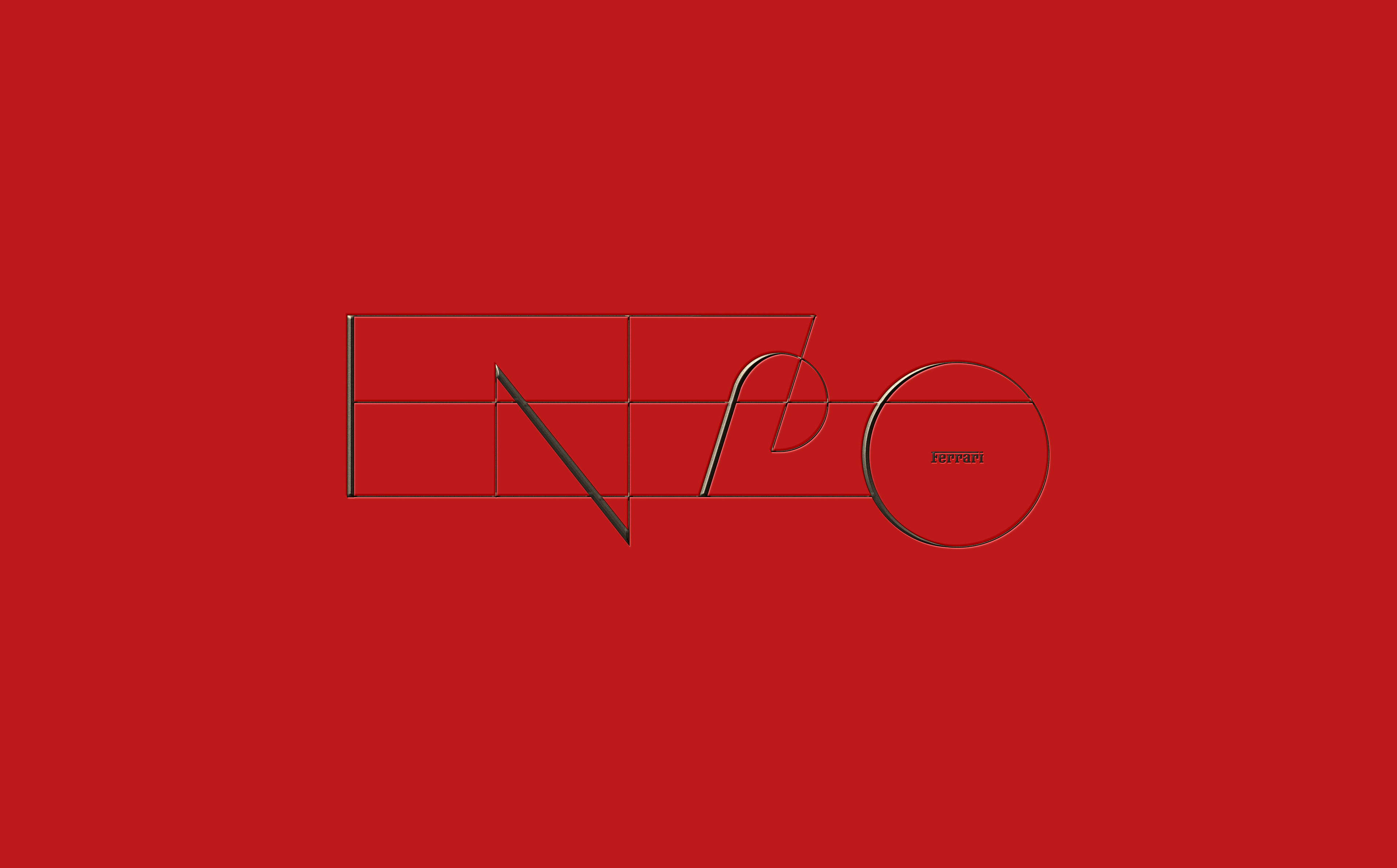
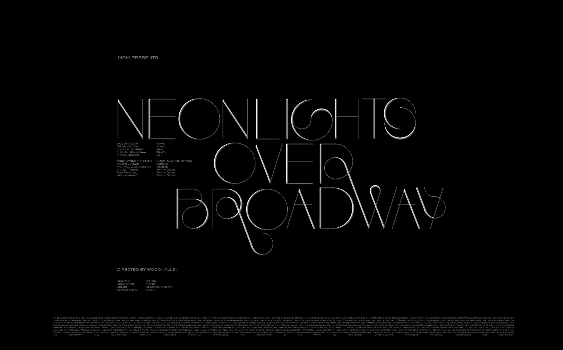
About:


Solyaris
A neoclassical Typeface


When I started working on the typeface as a side project in 2012, I knew I wanted to create a neo-classical look, refined and with a touch of avant garde. The mix between expressive and classical form was the most challenging as I didn't want to create just another fashionable display font, but a typeface for special occasions, making the distinct use of it more rewarding.


© 2012-2014 C.Ruprecht


Thank you for viewing!
More coming soon!

© 2012-2014

You may also like:

Aoki Takamasa : Reassimilation
Was listening to Aoki Takamasa the other day and created a fictional record cover and a typographic concept based on angles and lightning that I felt visualizes his style of music, which is very rhythmic and pattern based.
2014
Art Direction, Graphic Design, Typography
Logos & Marks 2020
A selection of different styles of identity marks I have been working on over the course of the past year. In 2019 / 2020 I was fortunate to, among others, work with a wide array of up and coming brands in field of luxury, beauty, technology, sport and consulting.  This year's set continues to reflect my passion for handcrafted typography solution in both custom word marks, as well as monograms and visual marks as well.
2020
Art Direction, Typography, Branding
Logos & Marks 2019
A selection of different styles of identity marks I have been working on over the course of the past year. In 2019 I was fortunate to, among others, work with a wide array of up and coming brands in the medical cannabis industries, an evolving market spanning health, finance and technology. Overall this set represents an exercise in contemporary minimalism and bespoke typography.
2019
Branding, Typography, Art Direction
Logos & Logotype Collection
Selected Logos & Logotypes for different clients and industries, ranging from 2010 – 2017. Large percentage is hand lettered and custom built.
2018
Branding, Graphic Design, Art Direction
#adobelive / bauhaus
I was recently invited by Adobe to join them for a three part live stream in Munich, Germany. The objective was to work on 3x 2 hour live sessions and create 3 individual projects incorporating the latest typekit fonts, resulting from a historic collaboration between the Bauhaus Dessau and Adobe. #adobehiddentreasures #adobelive
2018
Illustration, Graphic Design, Typography
Logos & Marks 2018
An selection of different styles of identity marks I have been working on over the course of the past year. The work ranges from experimental and decorative to traditionalist luxury, always with a focus on visual clarity.
2018
Art Direction, Typography, Branding
Narzissten & Neurotiker
The written text inspired the narcissistic looking letters and their obvious neurosis to hide behind an almost unecessary amount of decorative elements.
2010
Illustration, Typography
Show us your Type / Nantes
Different experimental approaches for SHOW US YOUR TYPE / NANTES EDITION. Creating various monotone posters with playful typography, exploring different styles and re-interperting elements from the cities' official logo and crest. Applying the same minimalist formula of simple vectors enhanced by stacked photoshop effects.
2018
Typography, Graphic Design, Art Direction
Logotypes & Lettering
Collection of various unused logos and logotypes aswell as a couple of custom typography exercises
2013
Graphic Design, Typography
type/philosophy
Ongoing explorations of different styles of experimental typography, put into a philosophical context
2015
Graphic Design, Typography
Back to Top