Optisure. 


Intuitive. Paperless. 
Insurance.


Optisure's independence from big contractors and paperless approach enables highly efficient processes and takes the strain out of an otherwise still medieval-feeling process.

I worked with their Brand initially, but didn't end up completing the final branding due to internal restructuring at the company. Below is the initial set-up I envisioned for the company. 

A modern, premium and minimalist look and feel with a touch of humanism, reflected in logotype, illustration and use of typography. The typical conservative color palette of the insurance market is elevated by use of transparency and soft gradients, to add a more technical note. 


© 2016-2017 C.Ruprecht
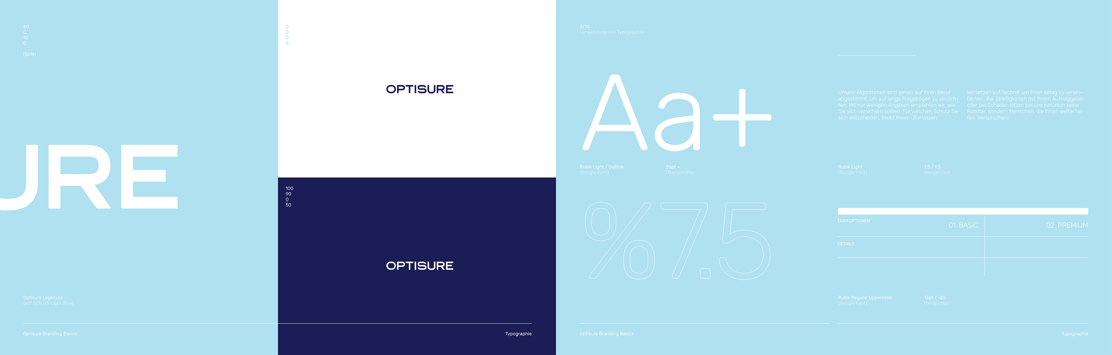
Branding Basics
Use of Typography / App Icon
Illustrations & Icons are technical, modern and reflect the Brands transparent approach.

A flat design approach is chosen but lightened up via use of soft gradients and transparency layering.
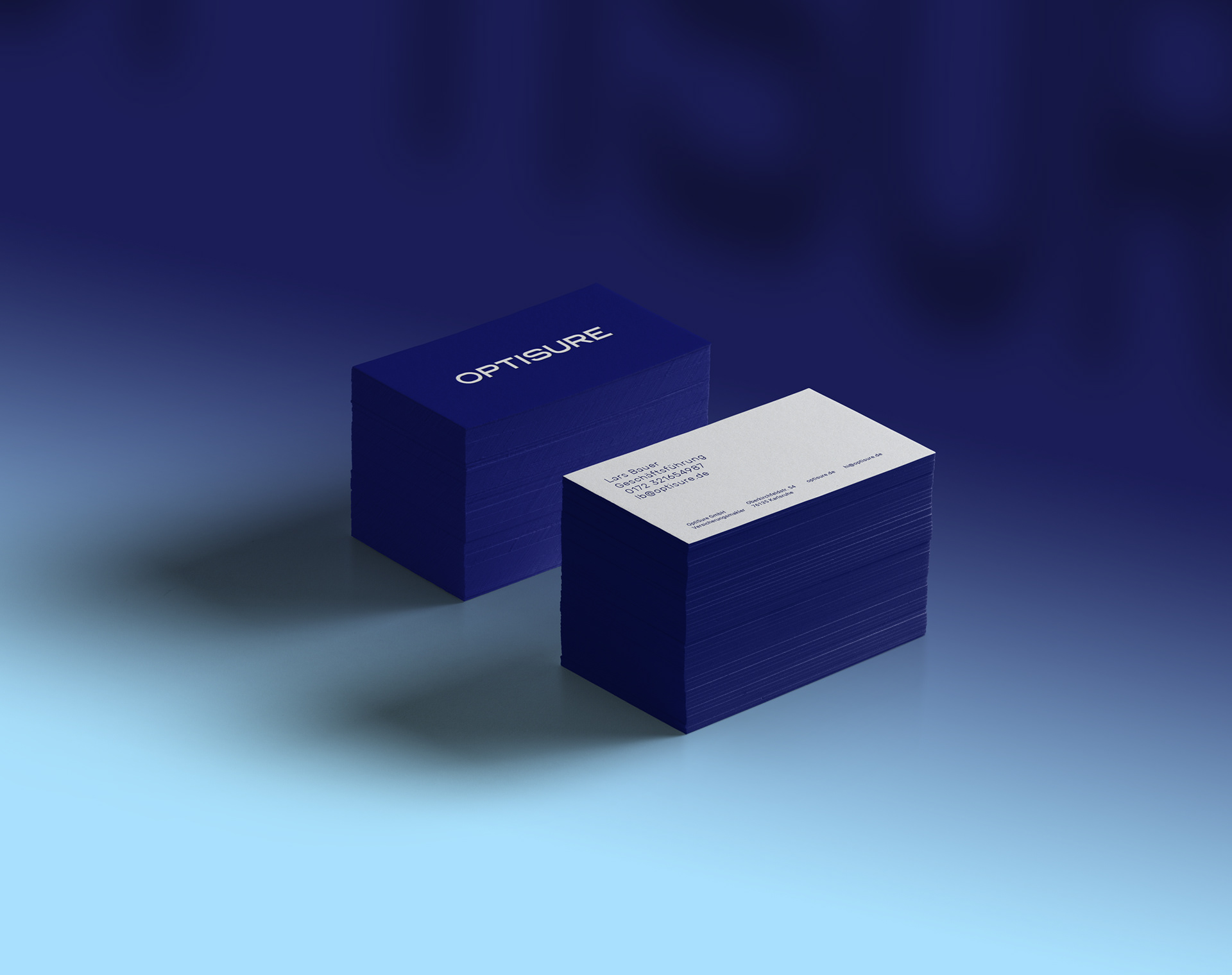
Business Cards, Slim Format
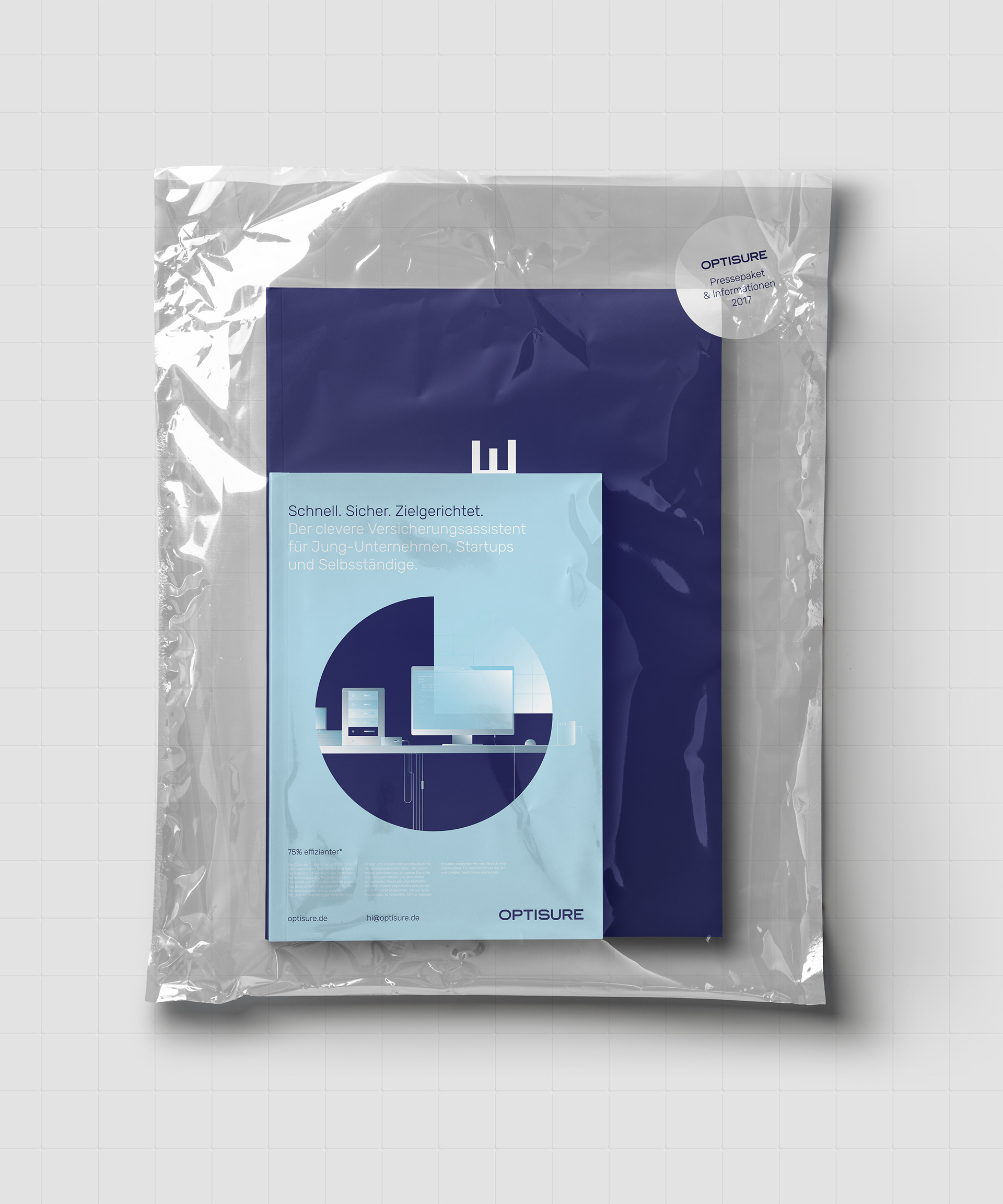
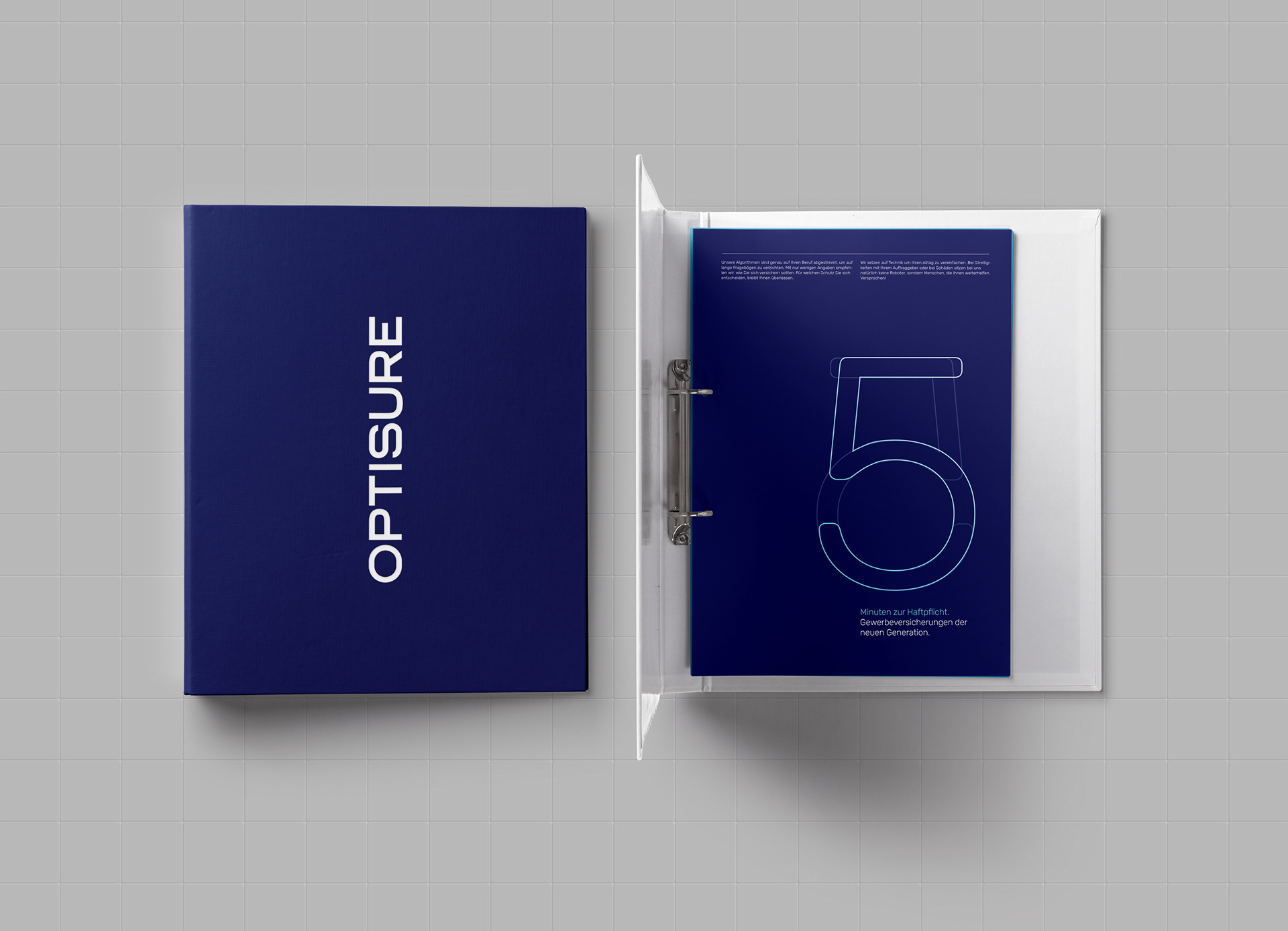
Initial Press Package
Interactive


Modern Insurance is digital.
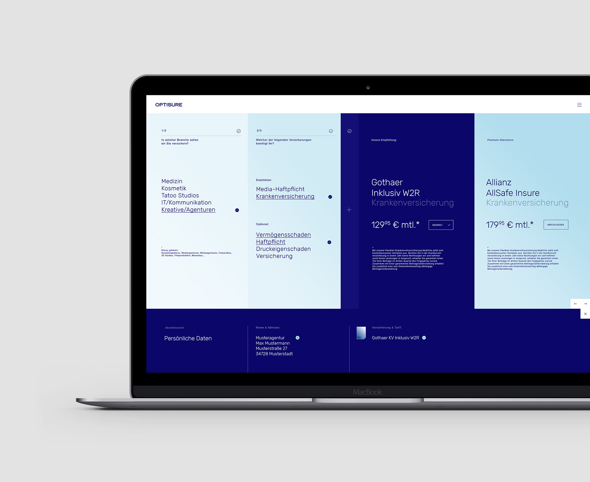
Website & App Visualization


Information and its' visual structuring are key. The Interactive interfaces are simple, yet typographically complex. 
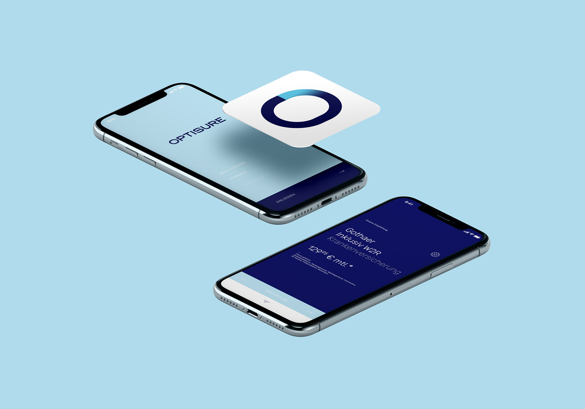
App Interface, Direction
Screen Design Principals
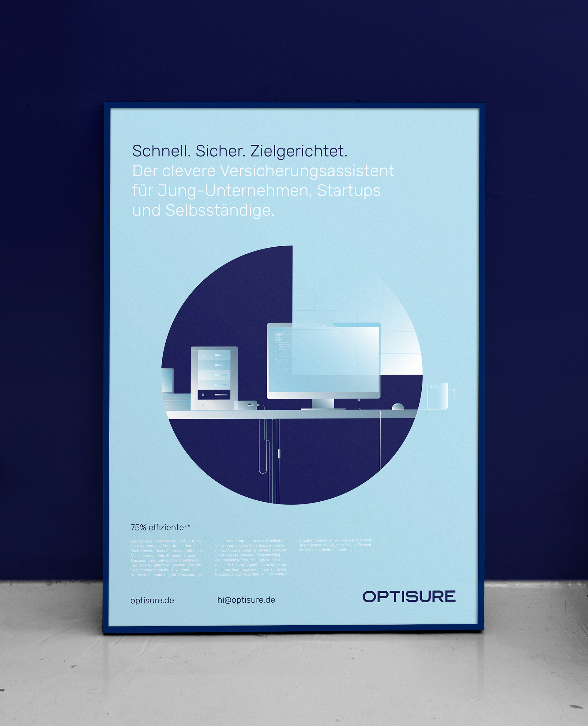
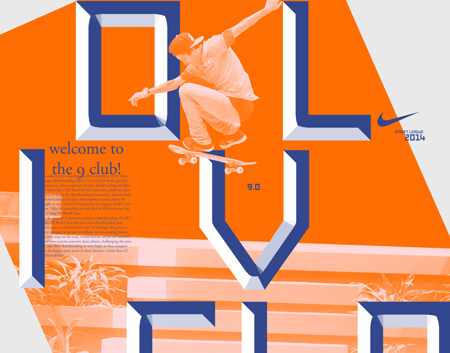
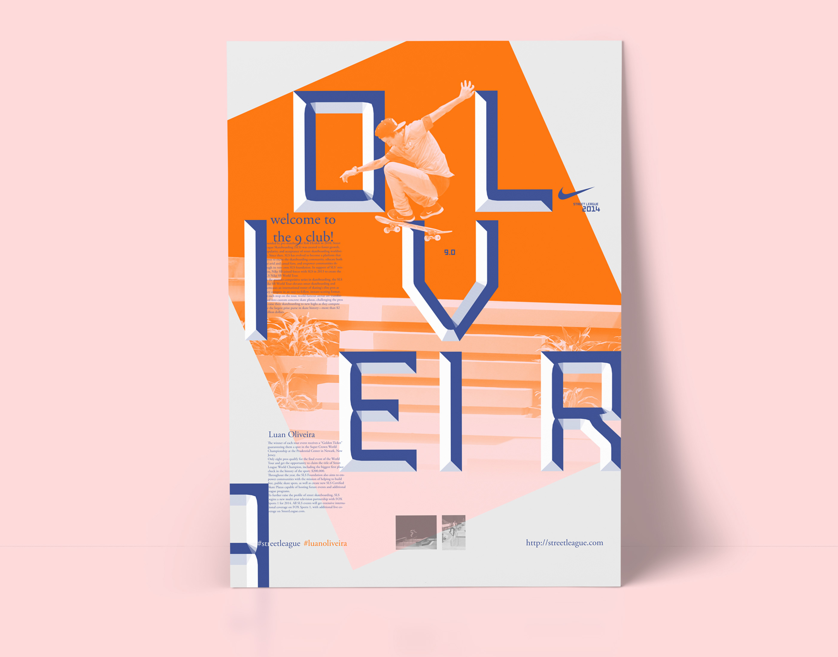
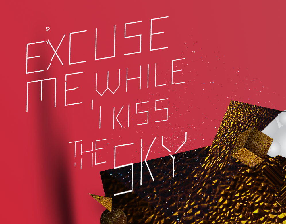
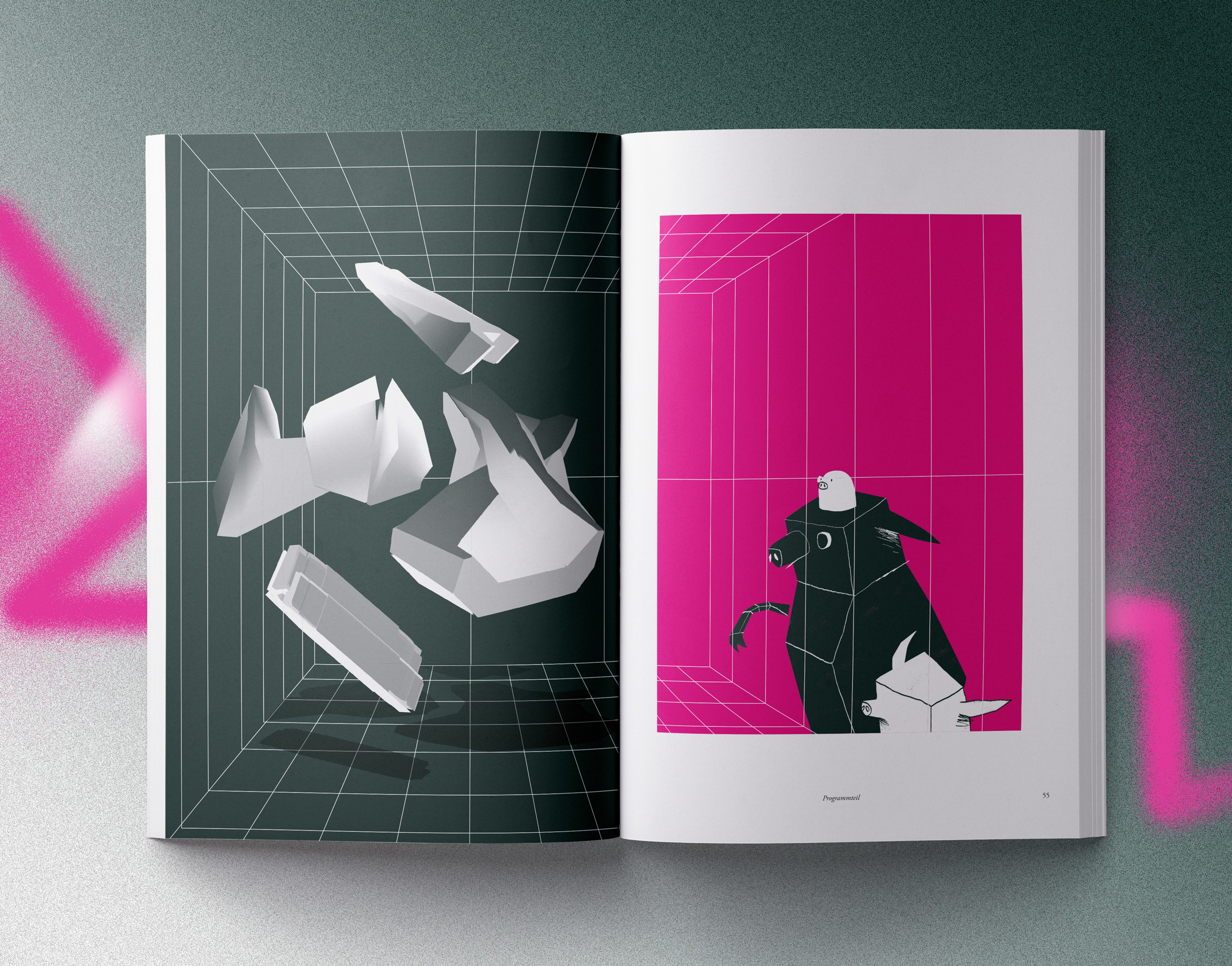
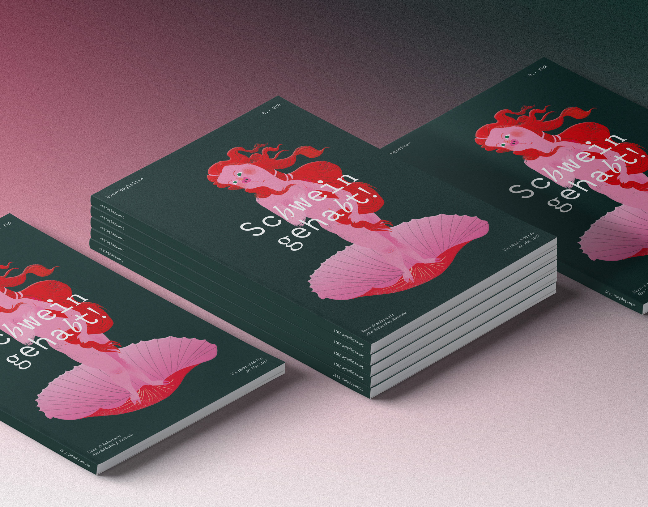
Practice Poster, 60x80cm

You may also like:

Nike® Street League: Posters
Ongoing personal project of quick practice posters inspired by Nike SB's Street League, portraying the main athletes in different settings, while playing with a font combination of Generation and Garamond. Will be updating again soon.
2014
Art Direction, Illustration, Typography
C16: Audioreactive lamp & iOS remote
C16 is a prototype concept playing with the perception of moving light-gradients inside of material. The Project was developed in cooperation with Andreas Rothaug
2013
Industrial Design, Interaction Design, Music
bestkept. Jewelry Concierge
Best Kept is a personal Jewelry Concierge Serving, coming to the Aid of the modern gentlemen, who is looking for the ideal surprise for their loved one. Based on in depth personal Dialogue the right type and style of Jewelry is determined and recommendations are given based on budget and aesthetic profiles initially based on intelligent Questionnaires.
2018
Branding, Graphic Design, Art Direction
Slate NYC
Slate is a full service creative photo agency in the heart of New York. This is a larger Case-Study, reflecting the Clients' wish to use a non-design, non-invasive approach across all communication points. 
2015
Art Direction, Web Design, Graphic Design
Nike Air® : Concept Boards
I wanted to create simple but surreal imagery that revolves around the topic gravity and floating, so I decided to pick out some former NBA Allstar Dunk Champions. The results are a mix of staged photography and tactile design.
2010
Art Direction, Graphic Design, Illustration
SchweinGehabt!
Every 2 years a creative festival is held on the grounds of an old slaughterhouse complex in Karlsruhe, Germany. The refurnished area is known to attract start-ups and creative businesses and has become increasingly popular with young entrepreneurs, artists and more.
2018
Art Direction, Branding, Illustration
Secret 7" - Max Richter
Album Art Concept and Case Study for 2016 Secret 7": The framework for the visual concept was based on Max Richters recent Record Sleeves that show a visual of the moon.
2016
Art Direction, Digital Art, Illustration
Marble Madness : Reimagined
Marble Madness, when it first came out in the 80's for the Atari® 1 System, did not only have a consequent isometric design, it also came with the first stero music ever to appear on an arcade game. Pure 8-bit pleasure.
2010
Illustration, Packaging, Fine Arts
Susanne Hartlieb : Podology
I was asked to create a visual branding for a boutique podology institute in Landau, Germany. The client's vision overlapped constructively with my own and in sharing the same goal of creating something that borrows from both worlds – the classical and the modern, the preciously detailed and a minimalist contemporary design philosophy. I created a bespoke monogram and logo, developed a typography setup, color-scheme, a visual/illustrative concept and developed various print collaterals, packaging designs and more from the elements.
2018
Branding, Art Direction, Packaging
Heimat Club : Case Study
Case study of a project for a night club that never made it through. There are those kind of projects that never go anywhere, and this was one of them - it ended in the presentation stage already. Here are some logos, first moods and quick posters from the process.
2013
Art Direction, Graphic Design, Typography
Back to Top