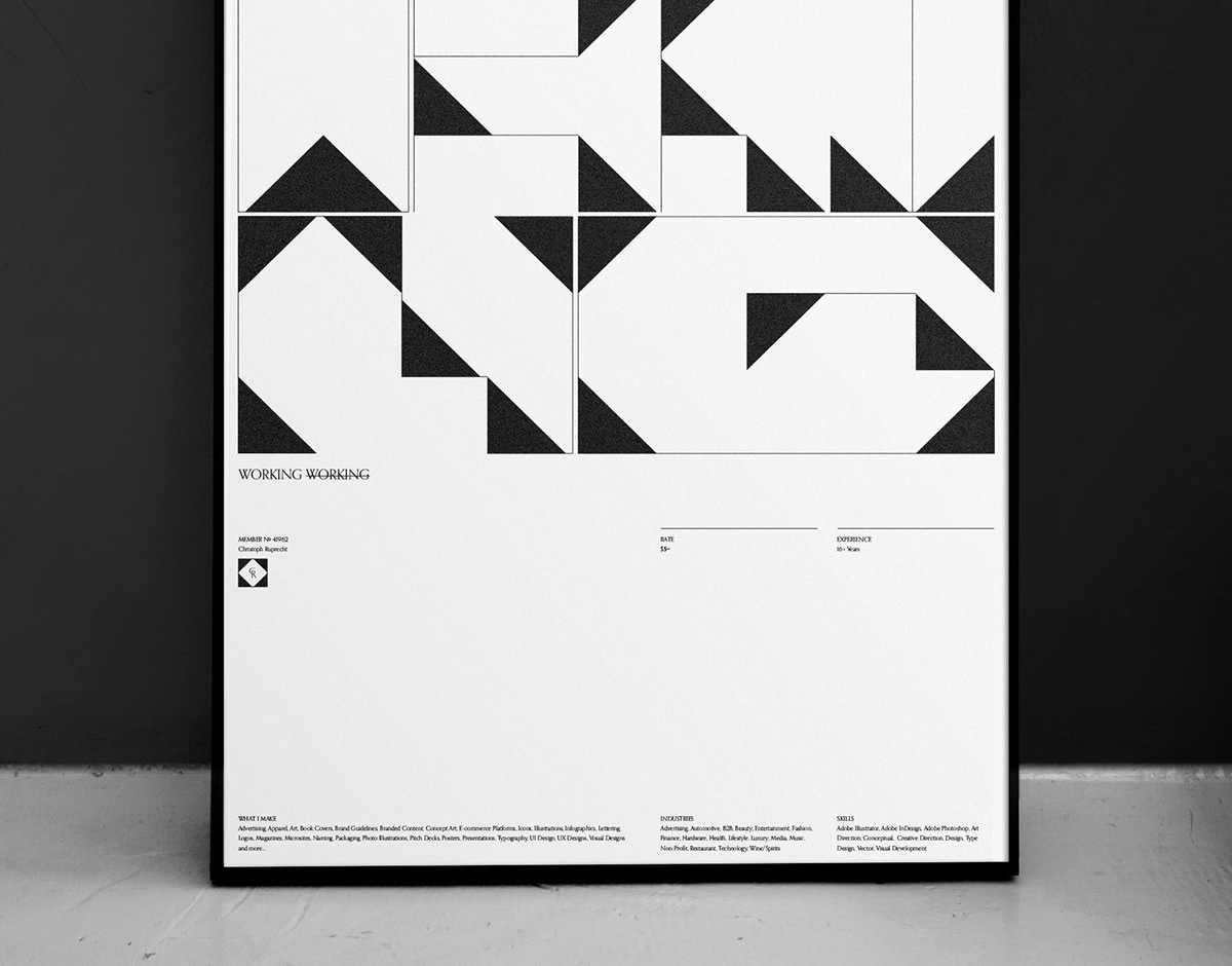
SELECTED
Logos, Marks
& Monograms
2017 – 2018
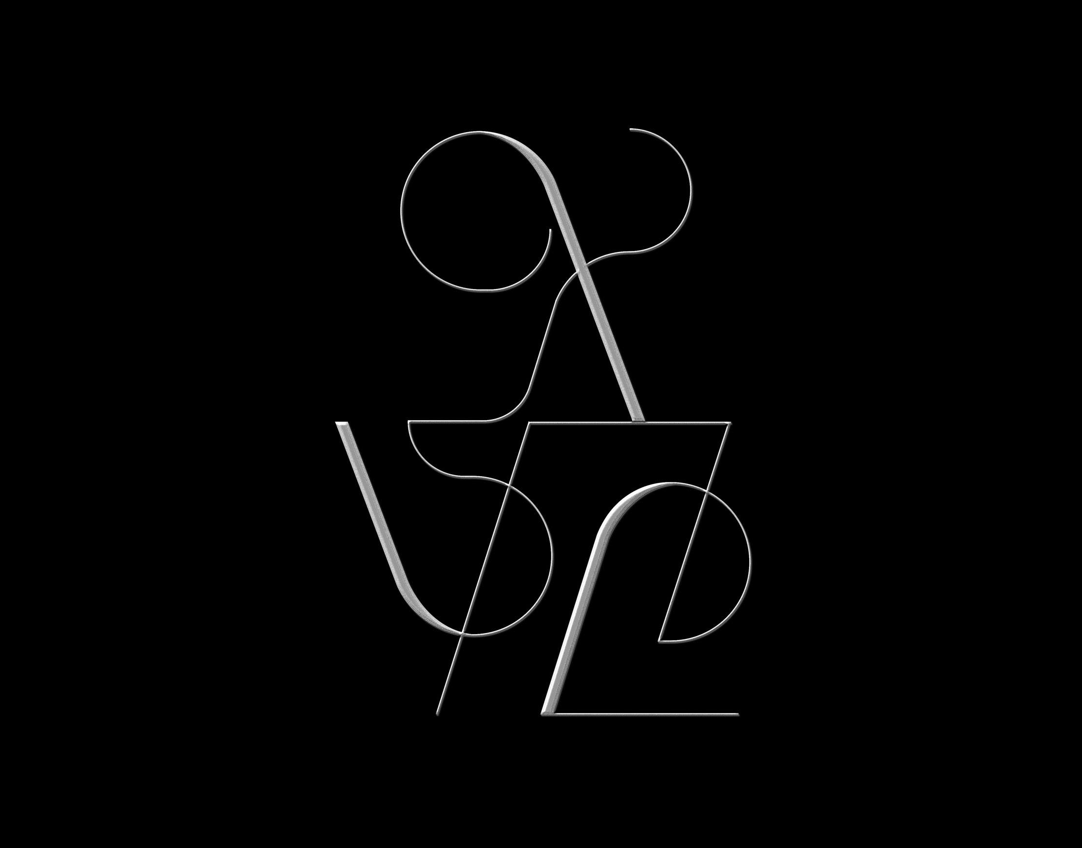
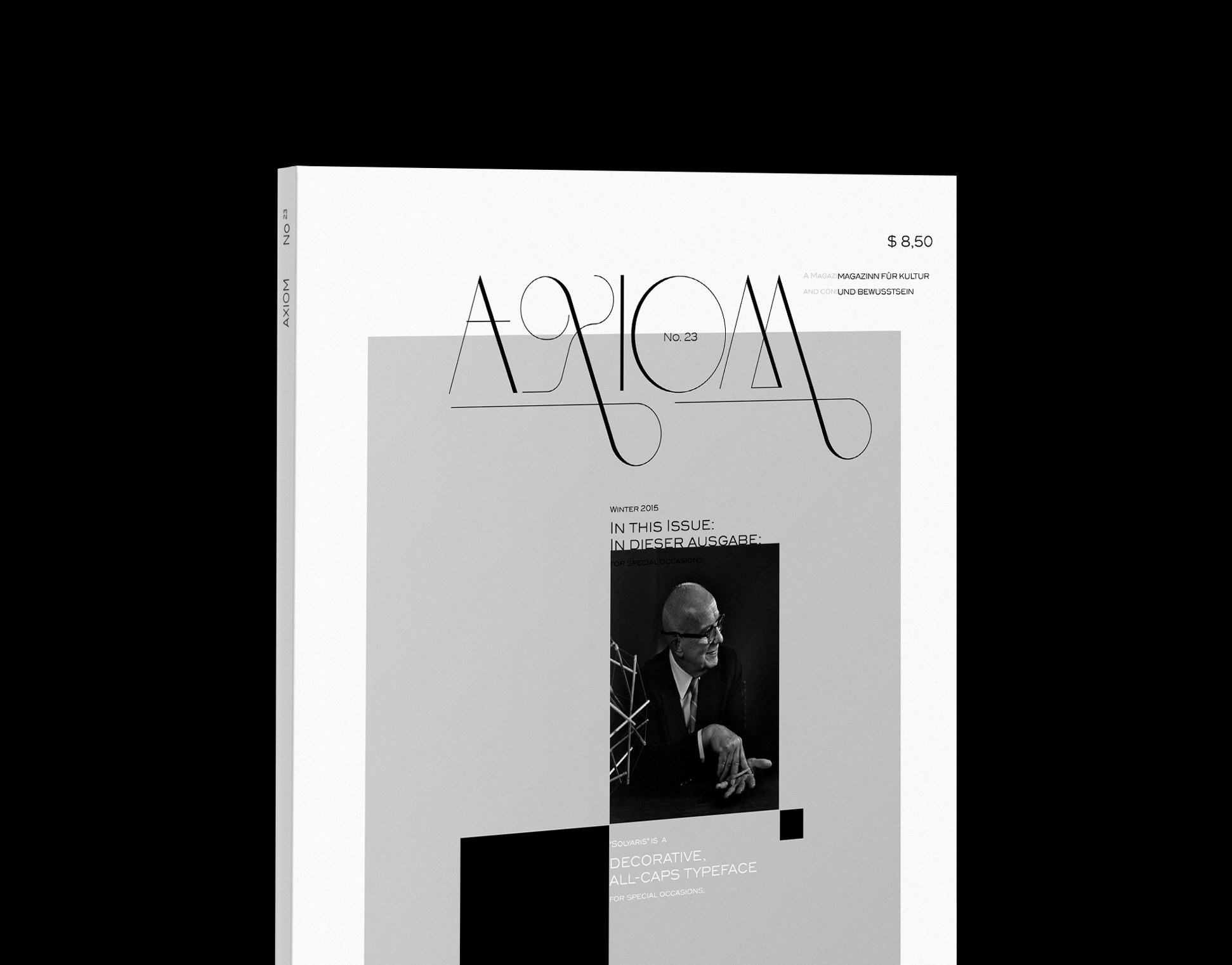
An selection of different styles of identity marks I have been working on over the course of the past year.
The work ranges from experimental and decorative to traditionalist luxury, always with a focus on visual clarity.
© christophruprecht.com studio { at } christophruprecht.com Instagram.com/ @christoph_ruprecht
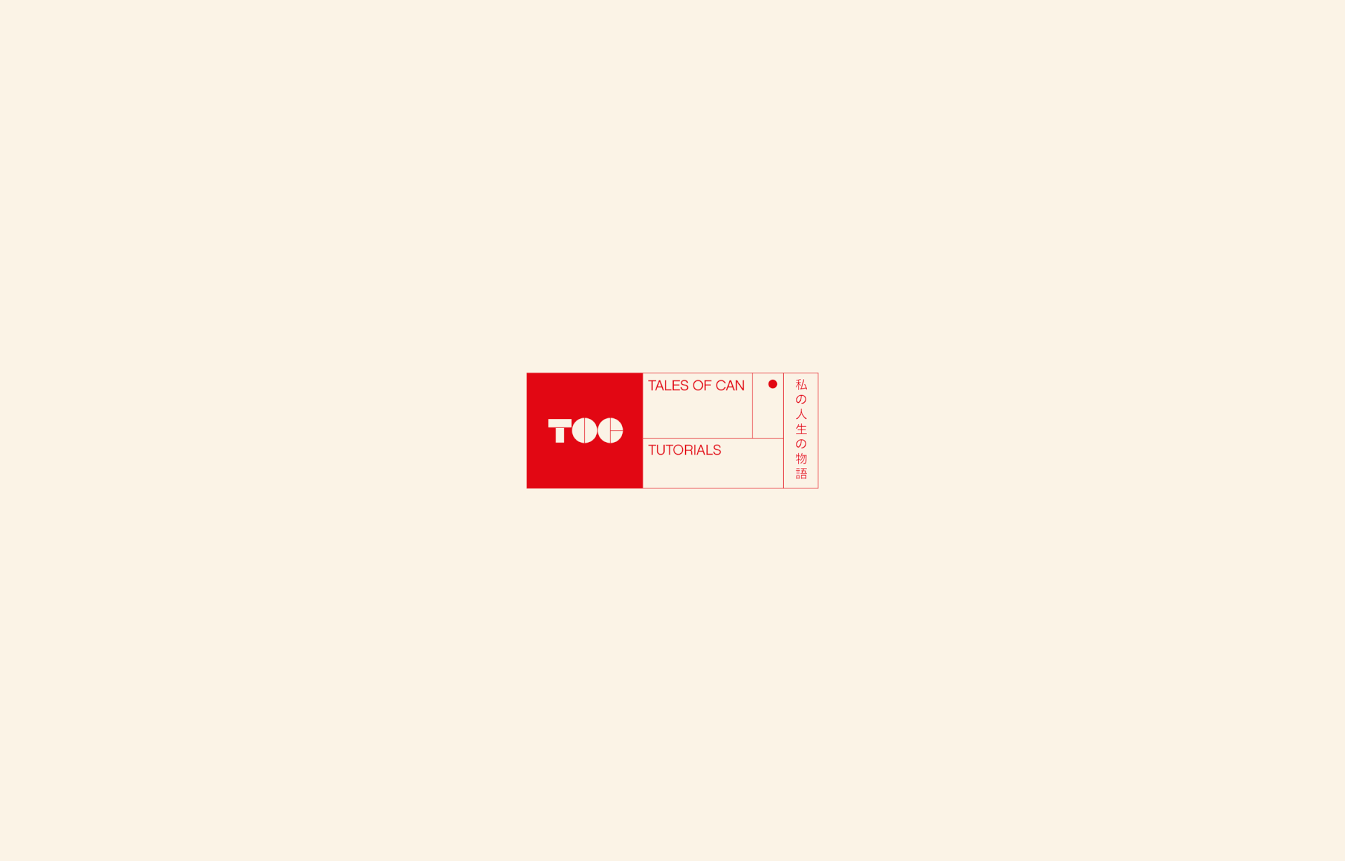
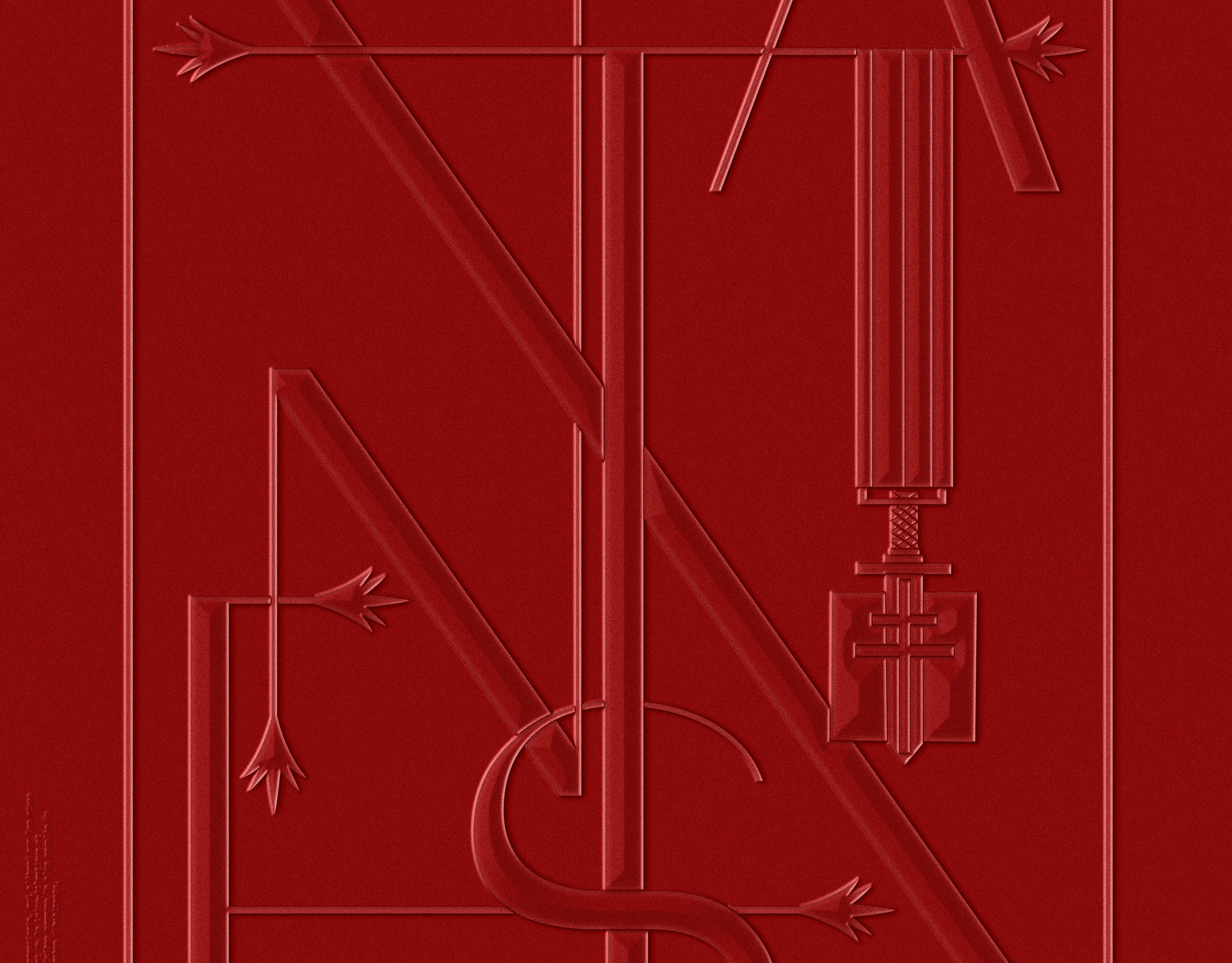
CLIENT
Tales of Can
MARKET / BUSINESS
YouTuber, Influencer, Adobe® Ambassador
THE CONCEPT
A dynamic modular system that consists of a minimal, yet playful bespoke logotype and additional sections that can adapt to the various
types of video content "Tales of Can" is producing. The Square section is used for social media avatars, and the bold TOC logo
guarantees good visibility down to the smallest sizes in the youtube comment section, on Instagram and more.
The client's love for japan and video production is also reflected in additional modules.
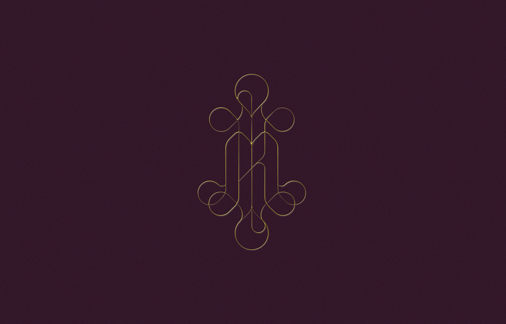
CLIENT
Michelle & Kaustubh Varma
MARKET / BUSINESS
Wedding Monogram
THE CONCEPT
The minute I heard my first love story,
I started looking for you, not knowing
how blind that was.
Lovers don’t finally meet somewhere.
They’re in each other all along.
I started looking for you, not knowing
how blind that was.
Lovers don’t finally meet somewhere.
They’re in each other all along.
RUMI

CLIENT
A T É N A
MARKET / BUSINESS
Fitness, Nutrition & Health
THE CONCEPT
Playing with a stylized A and a three-fold geometry to represent the mind-body-spirit connection the company has built their
philosophy around. The shown logos have fallen by the wayside during the process, however I still enjoy their simplicity
and visual impact. All were based on the idea of various elements coming together to form a strong, yet flexible concept.
Their tagline is "Aténa – The missing link."
CLIENT
bestkept
MARKET / BUSINESS
Jewelry Concierge Service
THE CONCEPT
A boutique,, yet established feel – A mix of both feminine and masculine aspects – contemporary yet with a timeless feel.
These were the main inception points for the bespoke logotype. Lowercase to give it a millennial up-and-coming feel,
classical contrast in weight but without the serifs to reflect a modern approach to jewelry.
CLIENT
Susanne Hartlieb
MARKET / BUSINESS
Institute for Podology & Wellness
THE CONCEPT
A traditional monogram with a touch of modern reductionism. Soft and soothing lines with a priority on symmetry bring a strong
harmony into the visual mark. The clarity of the composition reflects the medical aspect of the business, while choice of typeface
and contrasting line work convey luxury and indulgence. It was presented as one of two directions and was
after careful consideration considered to look too classical vs. the mark that it ended up being.
CLIENT
Erica James
MARKET / BUSINESS
Independent Interior Design Studio
THE CONCEPT
A dominantly used logotype that balances tradition with a touch of modern sharpness is accompanied by an additional monogram
element, inspired by the platonic solids, representing space itself, while paying homage to contemporary decorative
design trends with a strong emphasis on spatial geometry.
CLIENT
Lotus *
MARKET / BUSINESS
High-Tech Medical Apparel
THE CONCEPT
A contemporary logo element is paired with a semi-traditional lowercase logotype to radiate both, a modern, millennial feel with a minimalist touch,
as well as referencing a more conservative, traditionalist medical feel. The medical apparel has the lotus effect - it is spill repellent against all water based liquids.
The logo element was constructed from drops of fluid, forming a lotus blossom and revealing a medical cross in the center's negative space.
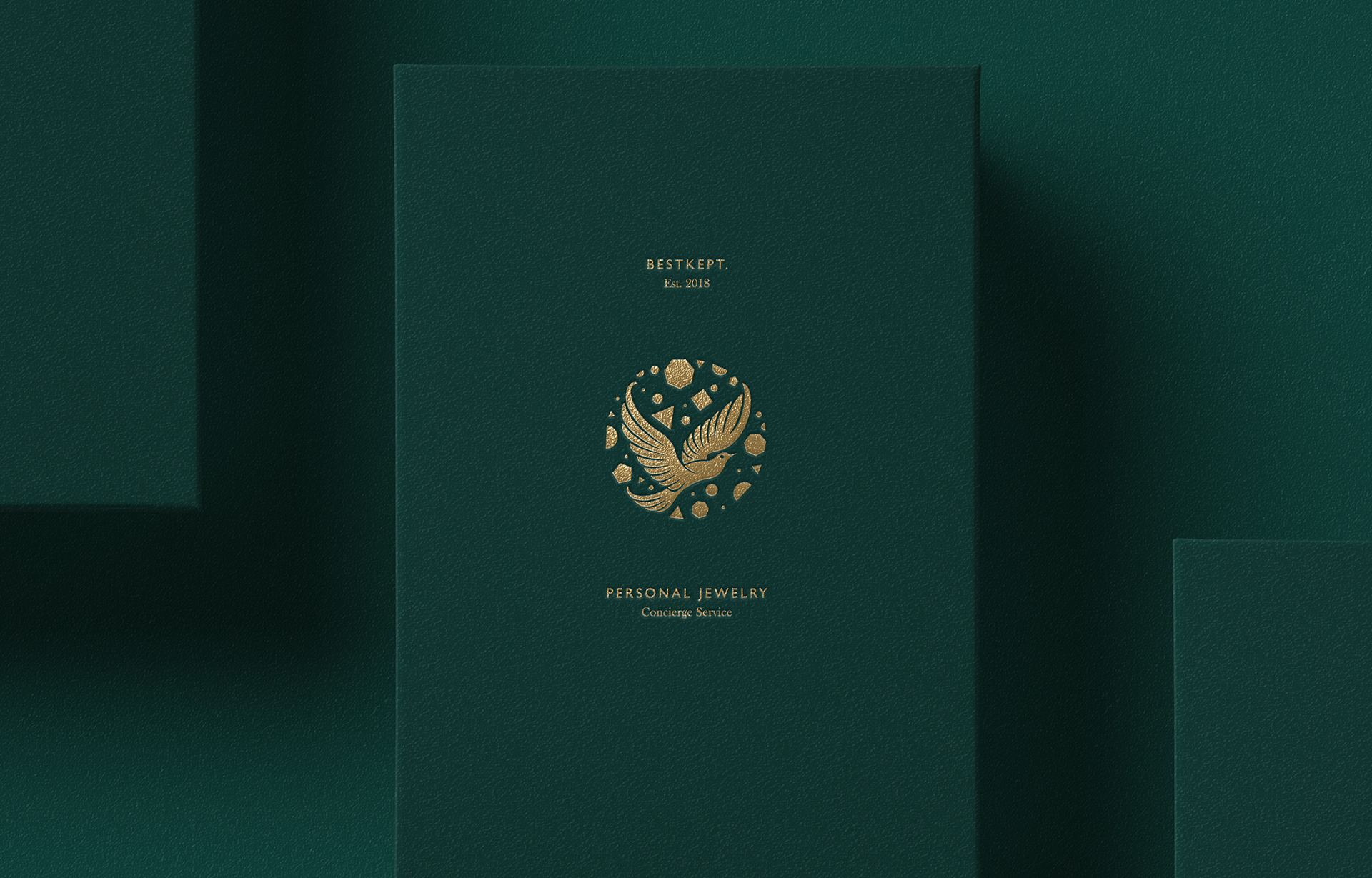
CLIENT
bestkept
MARKET / BUSINESS
Personal Jewelry Concierge Service
THE CONCEPT
I had been playing with a dove bringing a love letter in earlier phases, as a means to portray the personal concierge service aspect.
The final result shows the concierge browsing a plethora of different types of jewelry and coming back with just the right piece.
Simplified geometry for a modern touch meet an elegant symbolic bird for the fairytale feel.
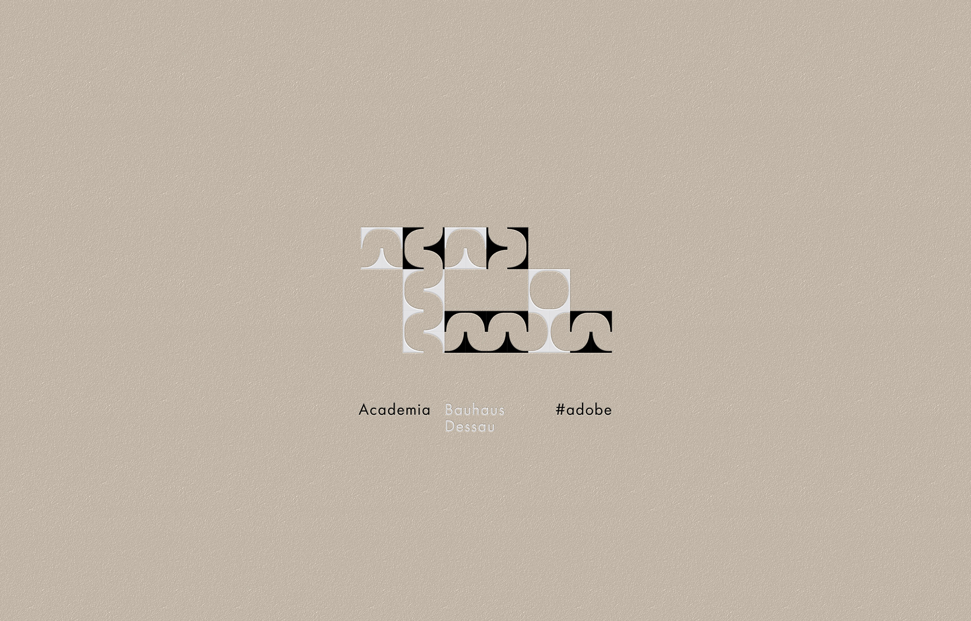
CLIENT
Adobe CC / Bauhaus / Typekit
MARKET / BUSINESS
Font-Management & Distribution
THE CONCEPT
Adobe invited me to test and demonstrate the use of new typekit fonts that were re-developed from old bauhaus archive drawings.
I completely deconstructed one of the available typefaces until only one serif corner remained; Enough to create a playful and minimalist
logo reminiscent of the design philosophy of function, developed and taught at the Bauhaus in Dessau, Germany.
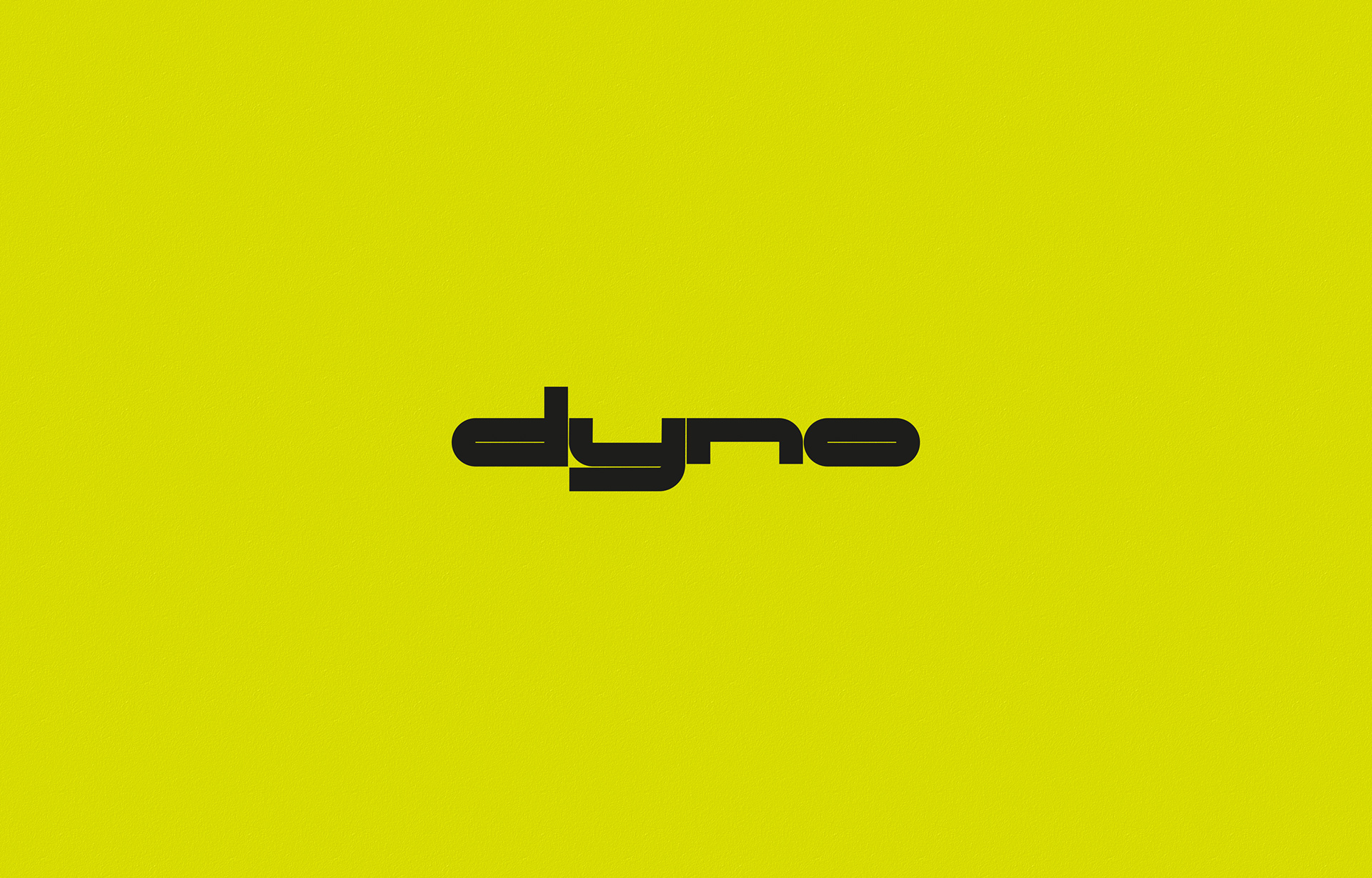
CLIENT
d y n o
MARKET / BUSINESS
E-Bikes
THE CONCEPT
Technical, bold, futuristic and fast. A bespoke monospaced and all lowercase logo that lends itself well to the design of the
crossbar on their E-Bikes which are aimed more towards the athletic rider vs. the casual user.
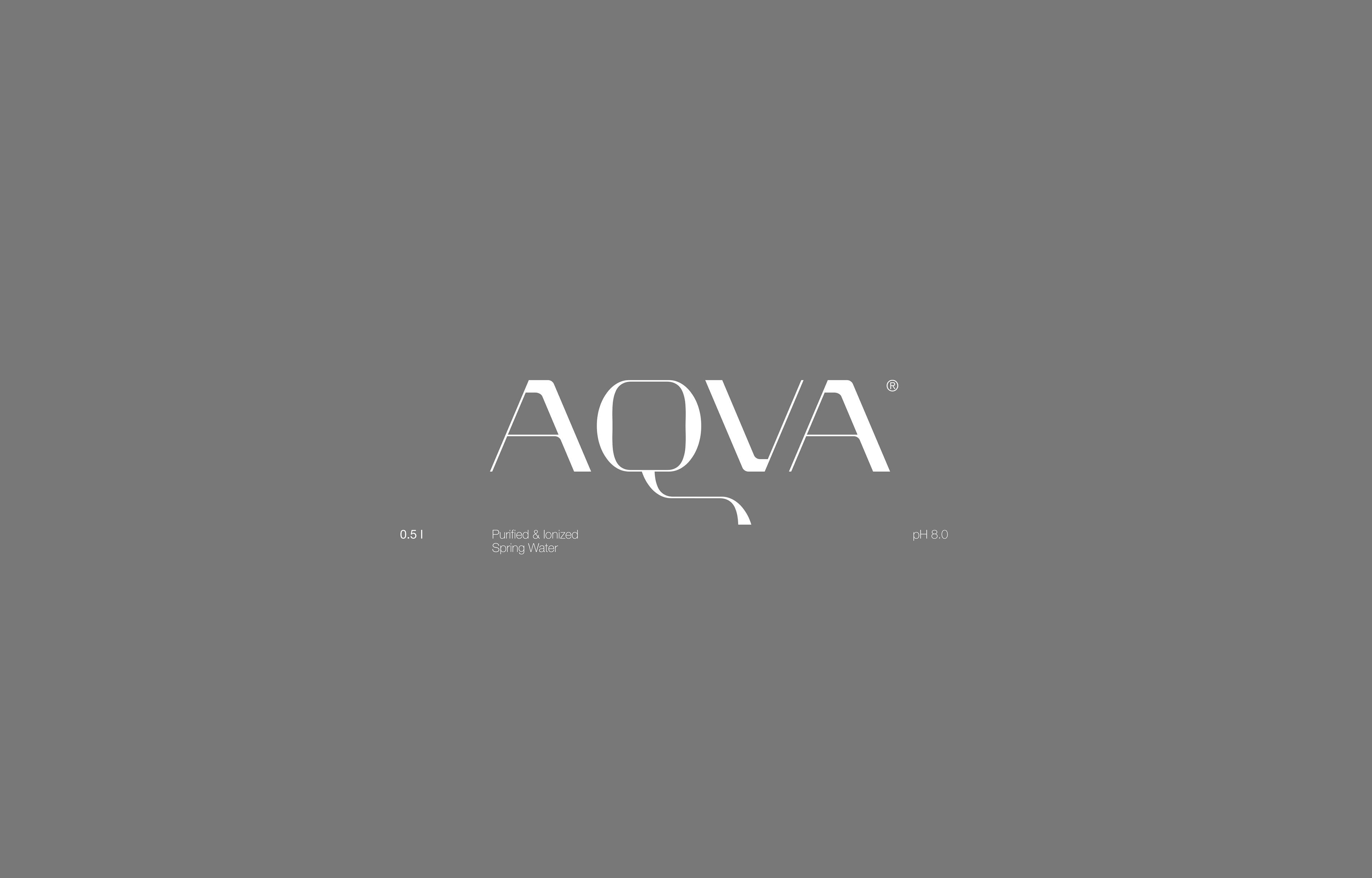
CLIENT
A Q V A
MARKET / BUSINESS
Premium Spring Water
THE CONCEPT
Luxury meets fluidity. The old meets the new. Artisan but with a scientific clarity.
Made from an semi extended cut of a bespoke typeface I have in the works.
CLIENT
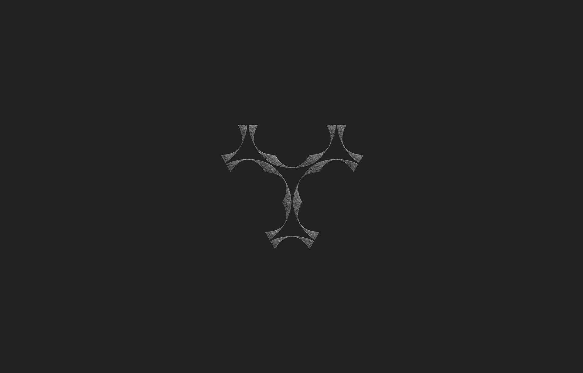
T3 Trinity
MARKET / BUSINESS
undisclosed
THE CONCEPT
T is for Trinity. The three-fold fractal approach for Infinity.
Modern reductionism meets historical patterns.